
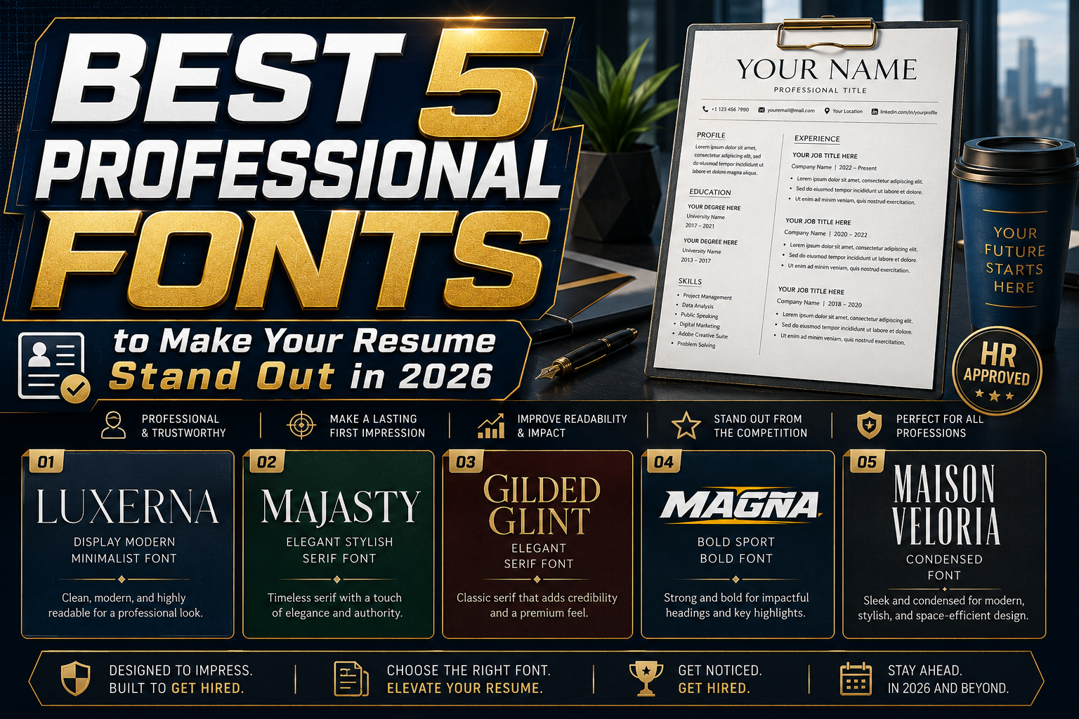
5 Best Fonts for Resumes in 2026
In today’s competitive job market, resumes are no longer judged only by experience and qualifications. Visual presentation now plays a major role in how recruiters perceive candidates. One of the most overlooked yet powerful elements in resume design is typography.
Choosing the best fonts for resumes in 2026 can dramatically improve readability, professionalism, and overall first impressions. A clean and well-structured resume instantly communicates attention to detail, organization, and modern professionalism.
Recruiters often review resumes in only a few seconds before deciding whether to continue reading. This means typography must help information feel clear, organized, and visually comfortable. Fonts that are too decorative, outdated, or difficult to read can reduce the effectiveness of even the strongest resume content.
Modern resume typography should balance:
- Readability
- Professional appearance
- Visual hierarchy
- Digital compatibility
- Print flexibility
In this article, we’ll explore five highly recommended fonts for resumes in 2026 and explain how typography can strengthen your personal branding and improve your resume presentation.
Why Fonts Matter in Resume Design
Typography is one of the first visual elements recruiters notice.
Before reading qualifications or work experience, hiring managers subconsciously evaluate:
- Clarity
- Layout organization
- Professional presentation
- Attention to detail
The right typography helps resumes appear:
- More professional
- Easier to scan
- More modern
- More trustworthy
Meanwhile, poor font choices can make resumes feel outdated or unorganized.
Typography Influences First Impressions
First impressions form quickly during recruitment.
A strong font creates immediate perceptions such as:
- Professionalism
- Competence
- Organization
- Modernity
Typography acts as part of personal branding. Even subtle design decisions can influence recruiter perception.
Resume Fonts Must Prioritize Readability
The best resume fonts focus on readability above everything else.
Recruiters often review resumes on:
- Desktop monitors
- Mobile devices
- Printed documents
- Applicant Tracking Systems (ATS)
Good typography ensures information remains clear across all formats.
Characteristics of Good Resume Fonts
Not every attractive font works effectively for professional resumes.
The best resume fonts in 2026 share several important qualities.
1. Clear Structure
Resume typography should organize information effectively using:
- Headlines
- Subheadings
- Body text
- Spacing hierarchy
2. Professional Appearance
Fonts should feel polished and modern without becoming distracting.
3. Digital Compatibility
Modern resumes must remain readable on:
- PDFs
- ATS systems
- Mobile screens
- Websites
4. Versatility
The best resume fonts work across multiple industries:
- Corporate jobs
- Creative industries
- Tech companies
- Freelance portfolios
1. Luxerna Display – Formal Yet Stylish

Luxerna Display combines elegant professionalism with modern styling.
Why It Works for Resumes
Its clean structure creates:
- Strong visual hierarchy
- Modern sophistication
- Professional presentation
Unlike overly decorative display fonts, Luxerna remains practical and readable.
Best Use
- Resume titles
- Main headings
- Portfolio headers
Visual Personality
Luxerna feels:
- Elegant
- Organized
- Modern
- Professional
This makes it highly suitable for resumes in corporate and creative industries alike.
2. Majasty – Modern with Classic Elegance

Majasty blends contemporary readability with subtle traditional charm.
Why It Works for Resumes
Its balanced proportions improve reading comfort during long text sections.
The font creates:
- Smooth readability
- Timeless presentation
- Refined professionalism
Best Use
- Resume body text
- Professional summaries
- Work experience descriptions
Typography Strength
Majasty performs especially well for:
- Academic CVs
- Business resumes
- Professional portfolios
3. Gilded Glint – Creative and Distinctive

Gilded Glint adds subtle artistic personality without sacrificing professionalism.
Why It Works for Resumes
Creative professionals often need typography that feels:
- Memorable
- Stylish
- Sophisticated
Gilded Glint provides visual uniqueness while remaining elegant.
Best Use
- Subheadings
- Creative resumes
- Portfolio accents
Design Personality
Its flowing details create softer and more expressive typography hierarchy.
4. Magna Bold – Geometric and Efficient

Magna Bold is a modern geometric font designed for clarity and strong structure.
Why It Works for Resumes
Geometric typography naturally communicates:
- Efficiency
- Organization
- Professionalism
- Modern thinking
This makes Magna Bold ideal for structured resume layouts.
Best Use
- Long-form resumes
- Corporate applications
- Technology industry resumes
Branding Advantage
Its clarity improves:
- ATS readability
- Digital presentation
- Resume hierarchy
5. Maison Veloria – Warm and Versatile

Maison Veloria combines simplicity with warmth and modern professionalism.
Why It Works for Resumes
Unlike colder minimalist fonts, Maison Veloria feels:
- Approachable
- Human
- Balanced
while still remaining professional.
Best Use
- Digital resumes
- Printed CVs
- Freelance portfolios
Typography Strength
Its versatility makes it highly adaptable for:
- Creative professionals
- Corporate applications
- Personal branding resumes
Quick Summary Table
| Font | Characteristics | Best Use |
|---|---|---|
| Luxerna Display | Formal, stylish | Titles, headings |
| Majasty | Modern, classic touch | Body text |
| Gilded Glint | Creative, elegant | Subheadings |
| Magna Bold | Geometric, efficient | Long text, professional branding |
| Maison Veloria | Warm, simple, versatile | Digital & print resumes |
How Typography Improves Resume Performance
Typography affects how recruiters process information.
Good resume typography helps:
- Improve scan speed
- Reduce reading fatigue
- Create cleaner hierarchy
- Increase professionalism
This improves overall readability and engagement.
ATS-Friendly Resume Typography
Modern companies frequently use Applicant Tracking Systems (ATS).
Fonts should remain:
- Machine-readable
- Cleanly formatted
- Technically compatible
Overly decorative typography may create parsing issues in ATS software.
Best Practices for Resume Typography in 2026
Keep Font Pairings Simple
Most professional resumes work best with:
- One primary font
- One secondary accent font
Too many fonts create inconsistency.
Maintain Strong White Space
Spacing improves readability and creates cleaner presentation.
Use Clear Font Hierarchy
Different sizes should distinguish:
- Name
- Section titles
- Subheadings
- Body text
Avoid Overdecorative Fonts
Creative fonts should only be used strategically in:
- Headings
- Portfolio elements
- Design-focused resumes
Choosing Resume Fonts by Industry
Different industries prefer different typography styles.
Corporate & Finance
Best typography:
- Clean sans-serif fonts
- Minimal serif fonts
- Geometric modern typography
Creative Industries
Creative resumes may use:
- Stylish display fonts
- Elegant serif typography
- Artistic accents
while still maintaining readability.
Technology & Startups
Tech resumes often favor:
- Modern sans-serif fonts
- Minimal layouts
- Efficient typography systems
Common Resume Typography Mistakes
Using Too Many Fonts
Too many typography styles create visual confusion.
Poor Readability
Thin or decorative fonts reduce clarity.
Inconsistent Formatting
Uneven typography hierarchy weakens professionalism.
Overusing Bold Typography
Bold text should guide attention, not overwhelm layouts.
Typography Trends for Resumes in 2026
Modern resume design increasingly emphasizes:
- Minimalist layouts
- Professional typography
- ATS-friendly formatting
- Strong hierarchy
- Balanced personal branding
The goal is clean professionalism with subtle individuality.
Final Thoughts
Choosing the best fonts for resumes in 2026 is essential for creating professional, readable, and visually polished job applications. Typography shapes first impressions and directly influences how recruiters perceive professionalism and organization.
Fonts like Luxerna Display, Majasty, Gilded Glint, Magna Bold, and Maison Veloria provide strong options for different resume styles, from formal corporate CVs to modern creative portfolios.
The most effective resume typography balances:
- Readability
- Structure
- Professionalism
- Modern visual appeal
When selected carefully, fonts become powerful tools for strengthening personal branding and helping candidates stand out in competitive hiring environments.
For more inspiration, creative resources, and practical design tips, visit Putracetol.com and explore creative resources that can elevate your next web project. Thank you for taking the time to read this article. If you are looking for more great articles, feel free to visit Putracetol Blog.
Additionally, if you want to explore some free typography options, you can check out Putracetol Studio on Dafont. Happy reading and designing!