
In the competitive world of editorial publishing, magazine cover design plays a crucial role in capturing a reader’s attention within seconds. But beyond imagery and layout, it’s the typography, the fonts themselves—that often define the magazine’s tone, audience, and prestige.
Choosing the right font for a magazine cover isn’t just an artistic decision, it’s a strategic branding choice. Fonts can evoke emotions, signal quality, and establish the visual rhythm of a publication. The typeface becomes the “voice” of the magazine, guiding how readers interpret its identity before they even turn a page.
This article showcases 20 curated fonts from Putracetol Studio, each carefully selected to inspire and elevate your editorial projects. From minimalist modern typefaces to elegant serifs and expressive display fonts, these choices offer versatility for everything from high-end fashion magazines to energetic lifestyle titles.
Typography in magazine design is more than aesthetics, it’s communication. The right font does three critical things:
Whether you’re designing a luxury fashion cover or a youth culture publication, the right typeface anchors your visual identity.
Each of the following fonts from Putracetol Studio offers a distinct aesthetic personality suitable for modern editorial design.

A timeless serif font with refined ligatures and elegant proportions. Perfect for high-end fashion or cultural magazines that value sophistication.
Minimal and modern, Flece is ideal for tech, architecture, or contemporary lifestyle publications with a clean aesthetic.

Vibrant and funky, Popdash channels 70s retro flair, perfect for creative youth magazines or indie art zines.

A geometric sans-serif that projects strength and clarity, suitable for modern editorials and startup-centered publications.

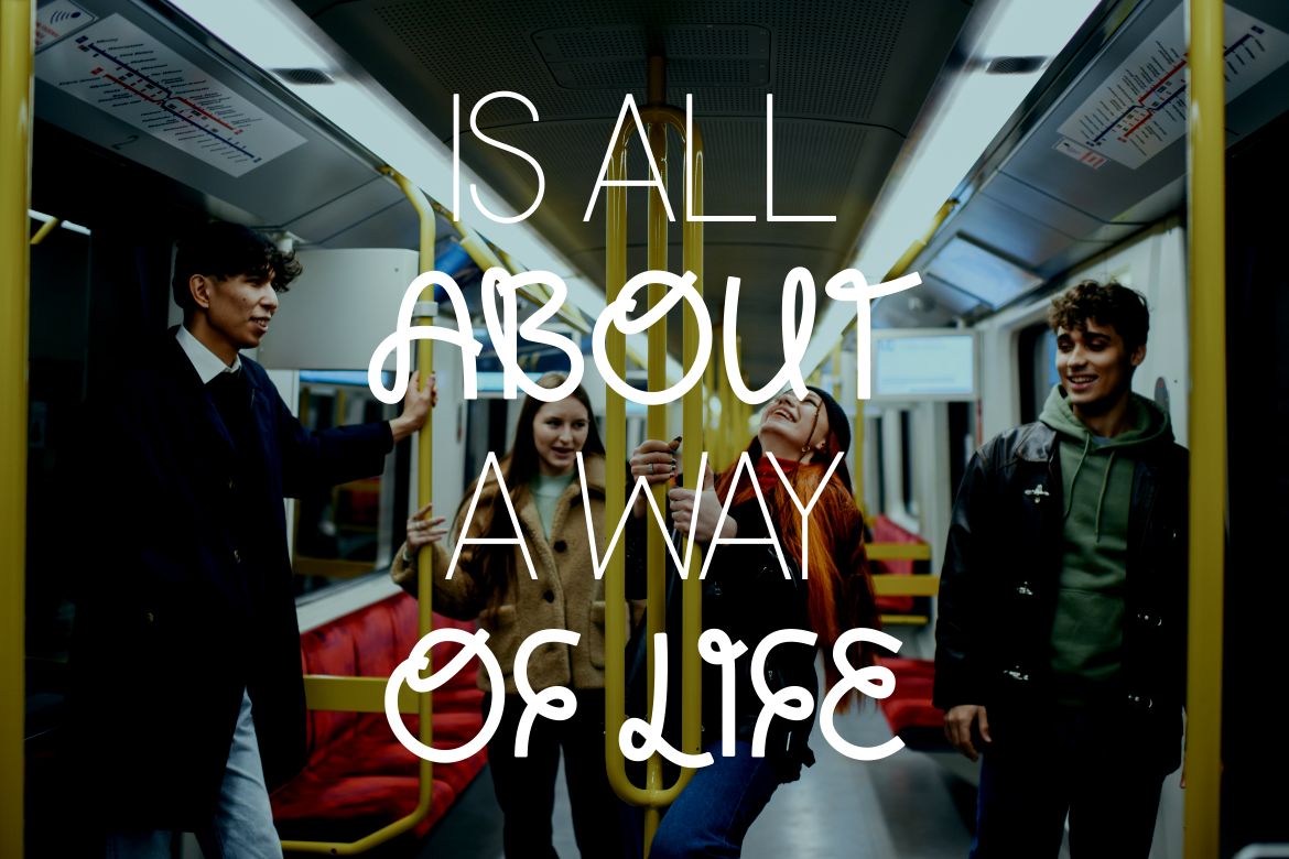
Playful and full of energy, this font brings a street-art vibe to covers targeting younger, trend-focused audiences.
Dynamic and rebellious, Wildfox adds an edge to lifestyle or fashion magazines that aim to break conventions.
With bold, futuristic strokes, Hyporia captures confidence, great for tech, automotive, or sports magazine titles.

A bright and uplifting typeface, ideal for wellness, mindfulness, and self-improvement editorials.
Clean, luxurious, and perfectly balanced, Luxerna exudes sophistication, ideal for fashion and design magazines.
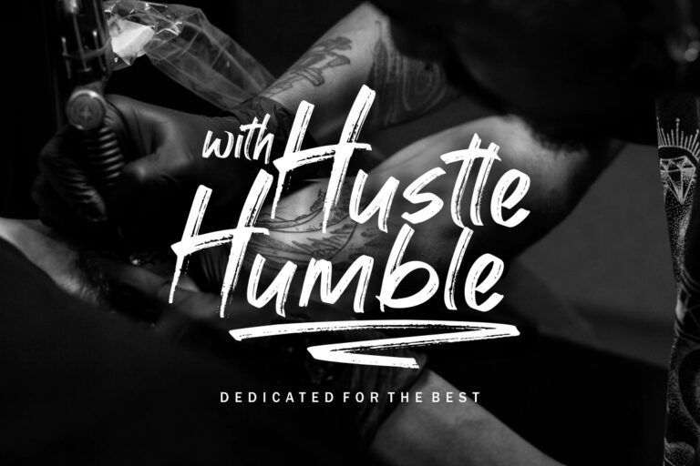
Handcrafted and expressive, Handistry offers a personal touch suited for lifestyle and creative editorials.
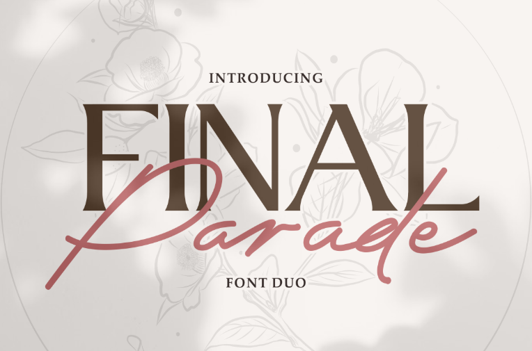
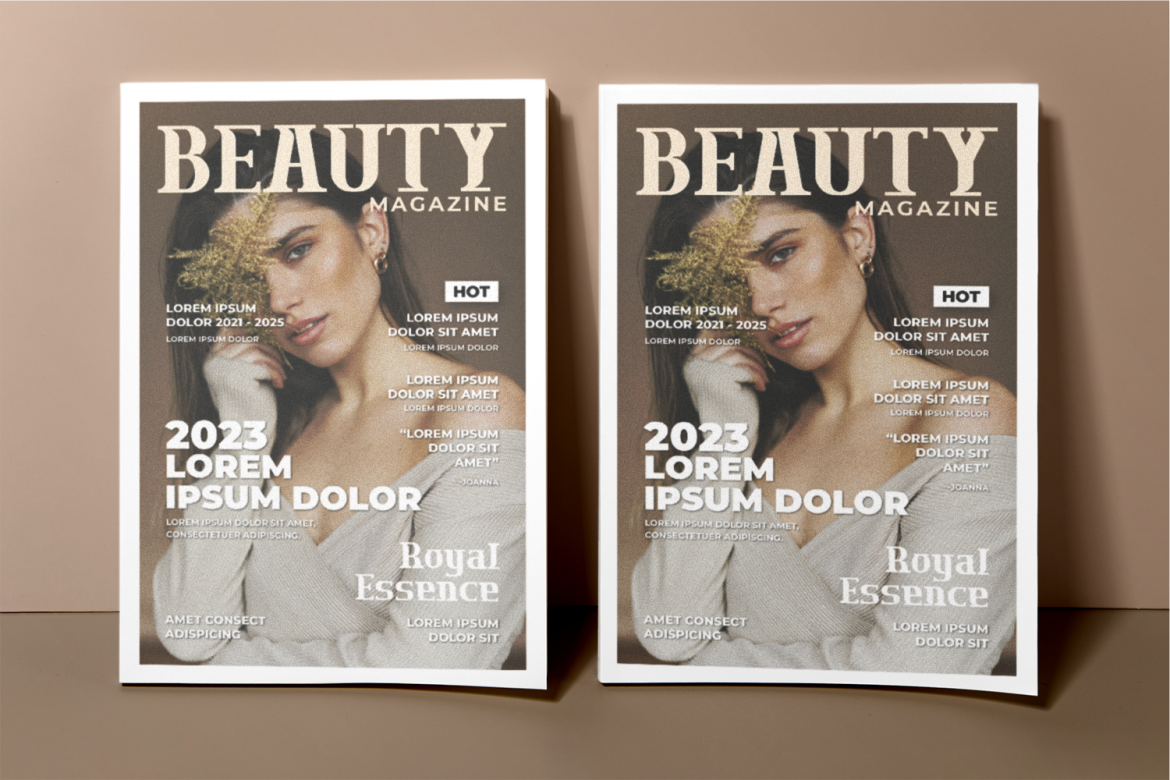
A pairing of serif and script that brings harmony and luxury, ideal for beauty or wedding magazines.
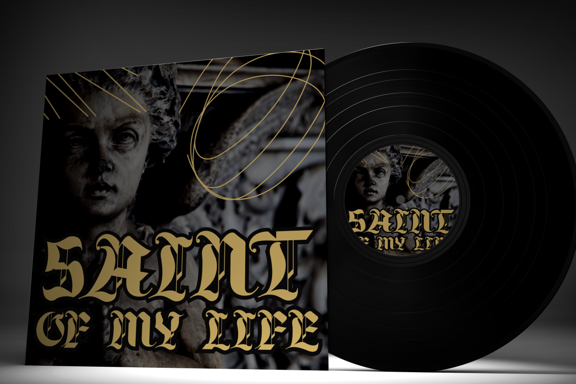
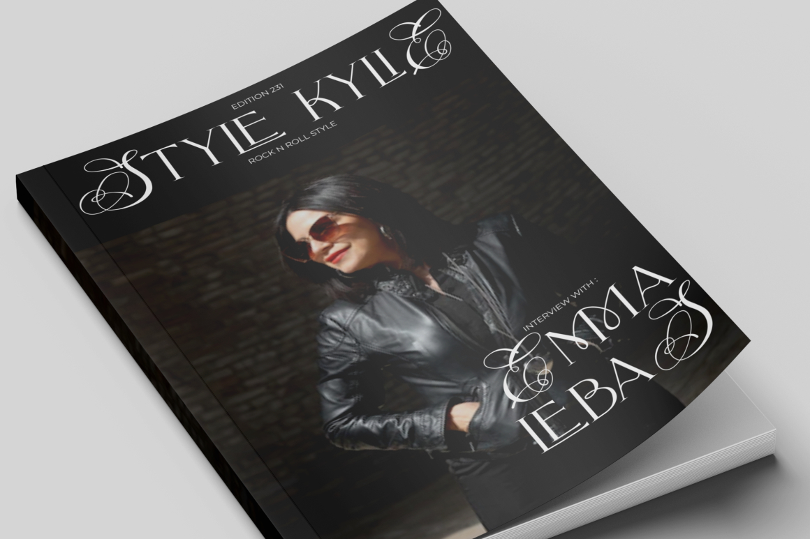
A dramatic gothic-inspired typeface that commands attention, great for alternative, music, or tattoo culture publications.
Modern yet timeless, Conventri’s balanced geometry suits tech-focused and luxury lifestyle magazines.

Stylish and sharp, this sans-serif font feels both editorial and commercial, perfect for fashion or business magazines.

Versatile and polished, Molard is a go-to choice for minimalist covers with a contemporary, chic touch.
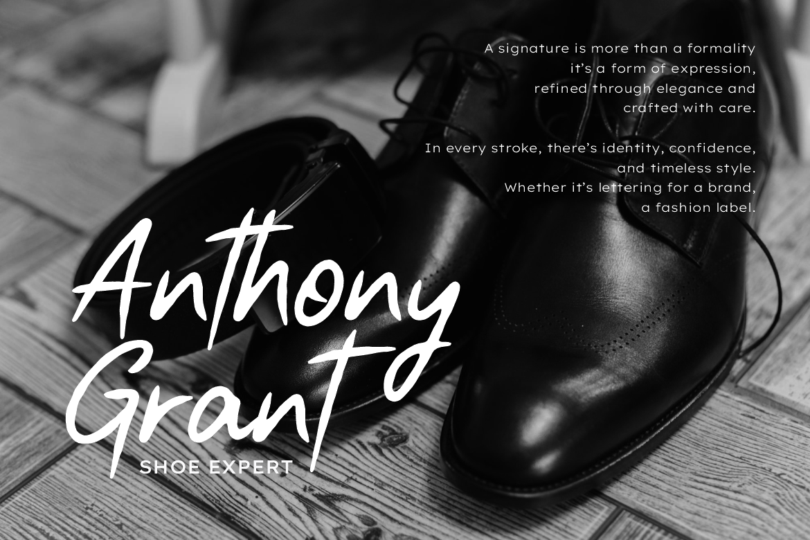
A combination of stylish script and clean serif that delivers contrast, ideal for feature articles and feminine covers.

Reliable and elegant, Rolever’s clarity makes it great for editorial layouts prioritizing readability.

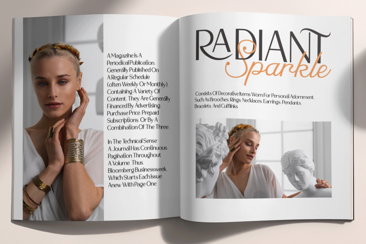
Elegant and refined, Aureline embodies luxury and grace, perfect for magazines focusing on fashion, lifestyle, and interior design.

Vivid and confident, this font suits upbeat, trend-driven editorials aiming to make a bold statement.

A unique blend of uppercase display and stylish script, ideal for magazine mastheads with premium or lifestyle focus.
1. Define the Magazine’s Personality
Is your magazine bold and daring, or refined and elegant? Match the font to your editorial tone. Fonts like Aureline or Luxerna convey luxury, while Funkyard or Popdash express energy and creativity.
2. Focus on Readability
While decorative fonts can add flair, they should never sacrifice clarity. Your masthead must remain legible even at a distance. Pair ornate display fonts with simple sans-serifs for balance.
3. Create Visual Hierarchy
Use font weight and size to separate key text elements. Headlines, taglines, and teasers should lead the reader’s eye in a natural flow.
4. Use Contrast Intelligently
Mixing two complementary fonts such as Firanza (serif) with Rolever (sans-serif) creates visual depth without clutter.
5. Color and Texture Matter
Typography isn’t just black and white. Experiment with metallic finishes, gradients, or subtle shadows to enhance impact, especially for luxury-themed covers.
In the digital age, a magazine’s visual identity extends beyond print, it lives across websites, social media, and branded merchandise. Fonts that are flexible across platforms ensure brand consistency.
For example:
Typography becomes a storytelling tool, each typeface reflecting not only style but also brand philosophy.
Choosing fonts for magazine covers goes beyond beauty, it’s a decision that defines the publication’s identity, tone, and audience appeal. The 20 fonts featured from Putracetol Studio offer diversity, elegance, and personality, each one capable of transforming your editorial vision into a striking visual statement.
From timeless serifs like Firanza and Aureline to modern sans-serifs like Rolever and Luxerna, these typefaces are more than design tools, they are branding instruments that connect your content with your readers on an emotional level.
Ultimately, great editorial design is not just about what readers see, it’s about what they feel. And with the right typography, your magazine cover can become an enduring symbol of that connection.
