
Typography plays a far greater role in branding than many people realize. While logos, color palettes, and layout designs are often the first things that come to mind when discussing brand identity, the font behind these elements is just as important. A corporate font is more than a stylistic choice, it’s a communication tool that shapes how audiences interpret a brand’s personality, professionalism, and credibility.
This article takes a closer look at why choosing the right corporate font matters so much, the key factors every brand should consider, and how curated typefaces from Putracetol.com can strengthen a company’s identity and communication strategy.
The Importance of Corporate Fonts
Corporate fonts help build a brand’s image from the moment a customer sees the logo or reads a headline. The right typeface reinforces brand values and supports long-term recognition across all platforms.
Reflect Brand Character
Typography should match the character and values of the company.
A luxury brand might choose a refined serif, a tech company might prefer bold and modern lettering, and a lifestyle brand might gravitate toward something creative and expressive. Your font becomes a direct reflection of who you are and what your business represents.
Improve Readability
Brand materials must remain readable across various formats websites, print materials, packaging, business cards, and mobile screens. Corporate fonts typically emphasize clarity and balanced letterforms, ensuring your message is always easy to understand.
Create Strong First Impressions
Typography shapes how people feel about your brand before they even process the words. A clean and professional typeface encourages trust and credibility, while a poorly chosen font can make a brand feel unpolished or inconsistent.
Differentiate From Competitors
Standing out in a crowded market requires more than a memorable logo. A unique and well-chosen corporate font reinforces your identity and helps audiences instantly distinguish your brand from others.
Key Factors to Consider When Choosing a Corporate Font
Selecting a corporate font requires strategy, not guesswork. Below are the most important considerations to ensure your choice supports your brand identity.
Industry Relevance
Every industry has its own visual tone.
- Fashion and luxury brands often lean toward elegant, modern fonts like Styvia.
- Technology companies may choose bold, structured fonts similar to Focused Block, which project strength and innovation.
- Corporate and financial services rely on clear, formal typography that communicates stability.
- Creative or lifestyle brands benefit from expressive, contemporary styles such as Glamiora or Boxer Punch.
Choosing a font that aligns with industry expectations helps build credibility while still allowing room for differentiation.
High Readability
Readability ensures your message is always accessible. A strong corporate font remains clear when scaled down on mobile screens or enlarged on signage. Rounded shapes, measured spacing, and clean structure are essential qualities, especially for typography used in logos.
Flexibility Across Platforms
A corporate font must work seamlessly across digital and print media. Whether it’s displayed on a business card, a billboard, a website header, or a social media post, the typography should remain consistent and visually appealing. Fonts like Project Of Code or Grey Jewelry offer the versatility required for multichannel branding.
Consistent Brand Voice
Typography should match your brand’s communication style. Is your tone formal, friendly, bold, or youthful? Your chosen font must support that voice. A serious corporate firm may prefer something structured and neutral, while a lifestyle brand could embrace a more expressive or nostalgic typeface.
Examples of Corporate Fonts from Putracetol.com
Putracetol.com offers a curated selection of fonts that fit a wide range of corporate identities. Here are standout choices that reinforce brand identity through style, structure, and personality:
Styvia – Elegant and Modern
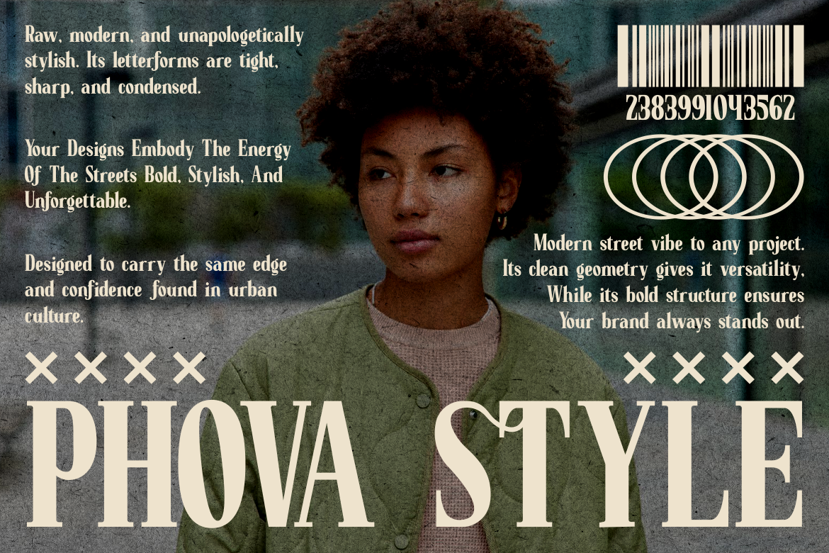
Styvia is a clean and sophisticated font that suits premium brands, fashion houses, modern corporations, and high-end lifestyle companies. Its elegant lines give logos a polished and professional finish.
Glamiora – Retro-Modern with Character

Glamiora blends retro aesthetics with a modern twist. This makes it ideal for brands seeking personality without losing professionalism. It works well for editorial design, creative agencies, and unique corporate identities.
Project Of Code – Nostalgic Yet Professional
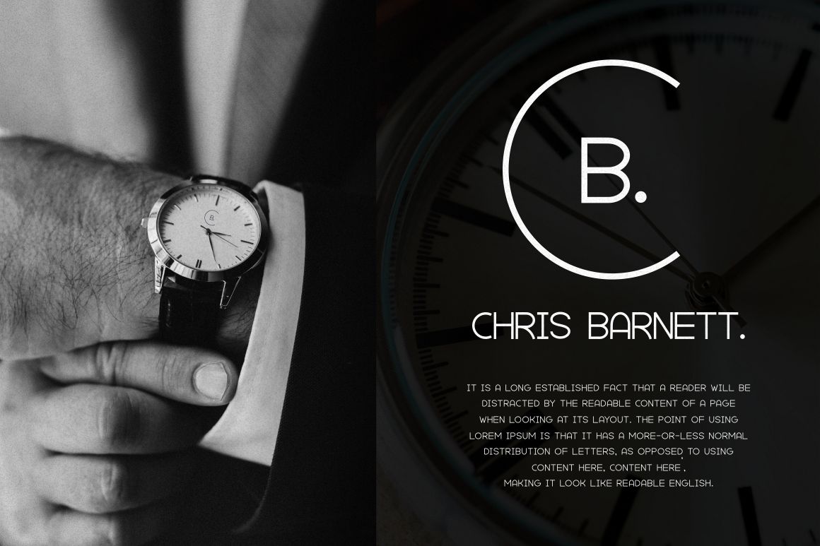
With subtle vintage influences, Project Of Code is perfect for brands that want something memorable and trustworthy. It adds personality without overwhelming the design.
Grey Jewelry – Stylish with a Retro Vibe
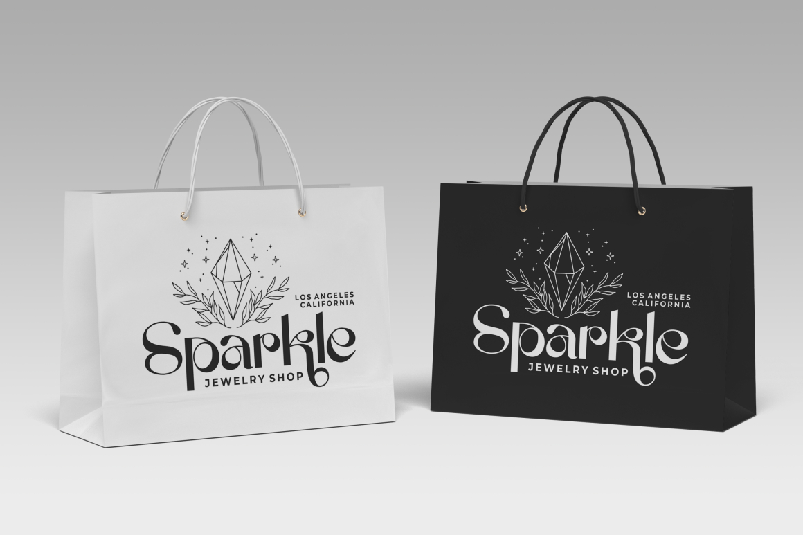
Grey Jewelry balances style and clarity. It reflects creativity and sophistication, making it suitable for luxury markets, artistic industries, and brand identities that lean toward expressive modernity.
Boxer Punch – Creative and Standout
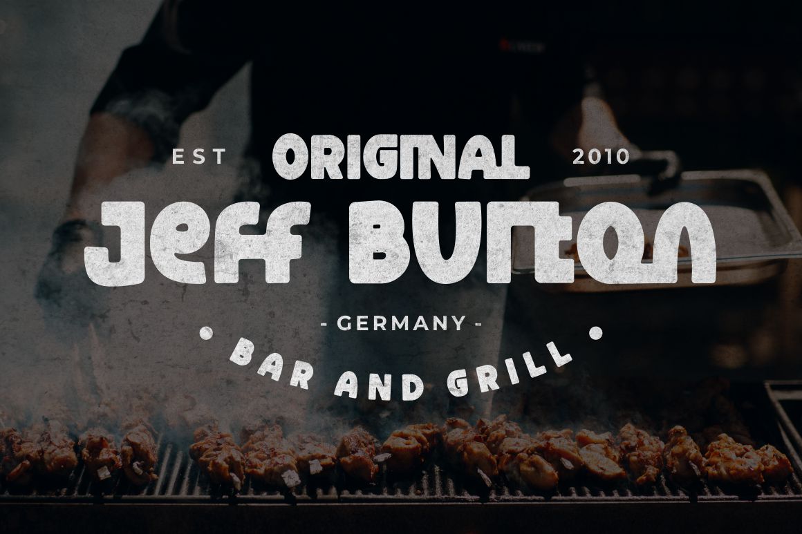
Boxer Punch offers bold shapes and vibrant personality. It suits energetic brands, startups, entertainment companies, and businesses looking to highlight creativity.
Round Rope – Playful Yet Professional
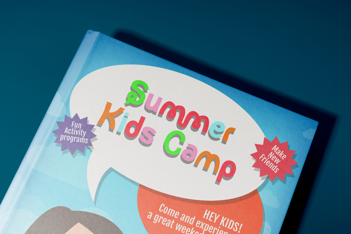
Round Rope adds a friendly and approachable tone. It’s a great pairing for hospitality, lifestyle, youth-oriented brands, or companies that want to project warmth and accessibility.
Focused Block – Strong and Trustworthy

With a solid structure and confident letterforms, Focused Block is ideal for corporate institutions, technology companies, and industries that rely on stability, trust, and precision.
How Typography Shapes Long-Term Brand Identity
Typography isn’t just about the immediate look of a logo, it influences the entire lifecycle of brand identity.
Builds Recognition
Consistent use of a signature font makes a brand instantly recognizable. When customers see your typography on packaging, ads, or social posts, they identify the brand through visual memory.
Strengthens Emotional Connection
Different fonts evoke different emotions. A warm, rounded font feels friendly, while a bold and heavy typeface feels reliable and powerful. Choosing the right emotion to communicate helps build a deeper connection with your audience.
Enhances Consistency
Using the same corporate font across all brand assets from website headers to printed stationery helps unify communication and maintains professionalism.
Supports Brand Storytelling
Typography helps communicate the story behind the brand. Whether the brand stands for luxury, innovation, heritage, or creativity, the font becomes a silent ambassador of these values.
Tips for Choosing the Right Corporate Font
To make the best decision for your brand, keep these practical considerations in mind:
Prioritize Simplicity
Simple fonts offer greater versatility and durability. They remain timeless, functional, and adaptable as your company grows.
Test On Different Backgrounds
Ensure the font maintains clarity across light, dark, textured, and colorful backgrounds.
Avoid Overly Trendy Styles
Trendy fonts may age quickly. Select a typeface that can remain relevant for years.
Pair Fonts Carefully
If using more than one font, ensure they complement each other. Use one for headlines and one for body text, keeping visual harmony in mind.
Think Long-Term
Your corporate font becomes part of your identity. Choose a typeface that aligns with long-term goals and future brand expansion.
Conclusion
Choosing the right corporate font is a strategic investment in your brand identity. Typography influences perception, builds recognition, and reinforces professionalism across every platform. When selected thoughtfully, a corporate font becomes a powerful communication tool that strengthens how your audience sees and trusts your brand.
With a curated selection of modern, elegant, and versatile typefaces from Putracetol.com including Styvia, Glamiora, Project Of Code, Grey Jewelry, Boxer Punch, and Focused Block businesses can build a typography system that reflects their values, enhances communication, and supports long-term branding.
Explore more premium corporate fonts at Putracetol.com to elevate your visual identity.
Thank you for taking the time to read this article. If you are looking for more great articles, feel free to visit Putracetol Blog
Additionally, if you want to explore some free typography options, you can check out Putracetol Studio on Dafont. Happy reading and designing!