
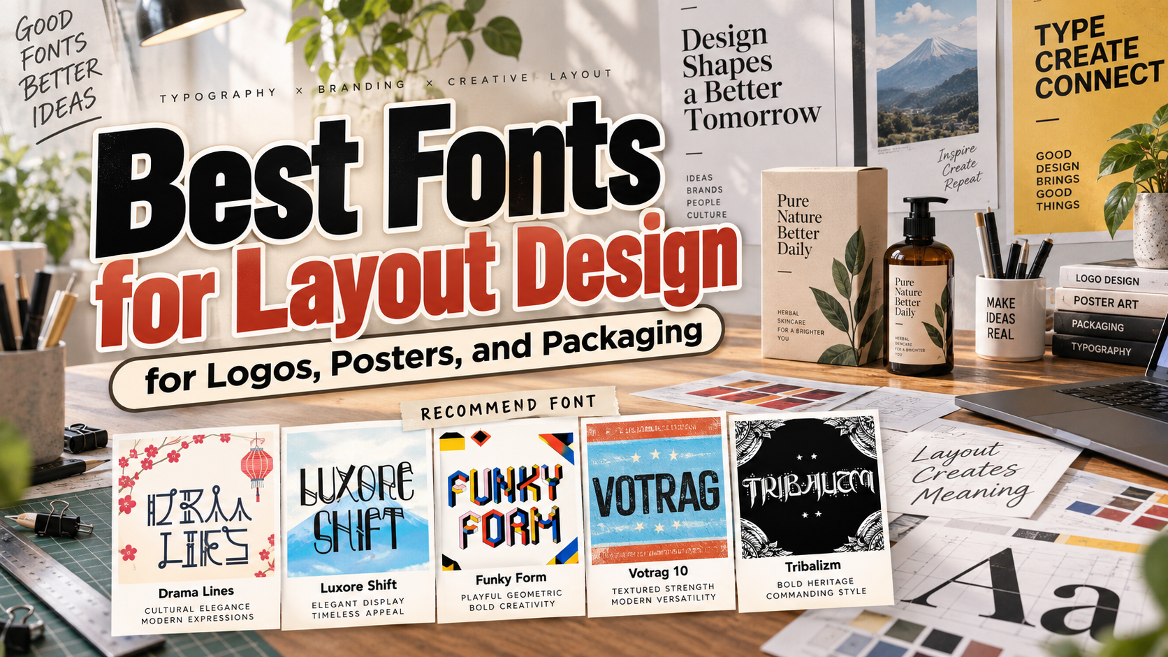
Best Fonts for Layout Design 2026: Balancing Character and Clarity
Decide What Each Font Must Do
Choosing the best fonts for layout design in 2026 starts with the message, not the specimen. Decide which text should attract attention, which should explain the offer, and which should help someone act.
Use expressive typography for logos, headlines, and product names. Choose a quieter companion for descriptions, prices, instructions, and navigation. Treat the following selection primarily as a toolkit for display-led layouts, not five interchangeable paragraph fonts.
For example, an event poster can feature an unusual title while keeping its date, venue, and booking information straightforward. The same hierarchy can guide packaging and social graphics without duplicating the entire composition.
What to Test Before Choosing a Layout Font
Set the actual brand name and longest headline before committing. Check repeated letters, numerals, punctuation, spacing, and the characters needed for every language in the project. Compare a full-size poster with a small label and mobile preview.
Establish a reading order through size, alignment, contrast, and space. Start in monochrome so effects do not distract from the underlying composition. For multilingual work, verify native-script coverage rather than assuming a culturally inspired font supports that language.
Jump to Recommended Fonts
Drama Lines | Luxore Shift | Funky Form | Votrag | Tribalizm
1. Drama Lines Korean Font

Drama Lines combines tall letterforms, geometric foundations, and looping terminals with a Korean-inspired visual direction. Its mix of structured shapes and decorative endings offers an alternative to neutral headline typography. Try it as the focal point of a poster or package, leaving supporting copy simple enough to balance the expressive title.
PROS: Tall proportions, distinctive terminals, geometric structure.
BEST FOR: Entertainment posters, themed packaging, book covers, and creative wordmarks.
2. Luxore Shift Display Font
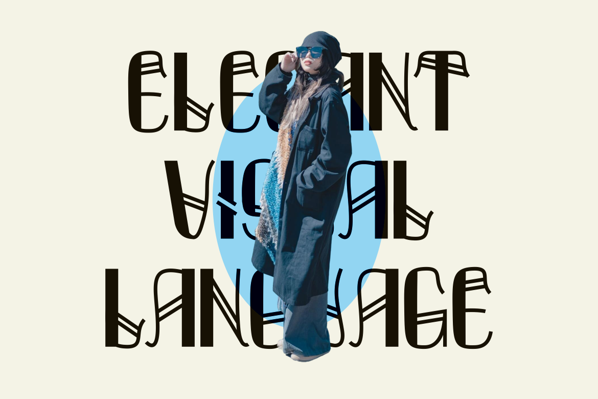
Luxore Shift pairs thick-to-thin contrast with overlapping details reminiscent of folded ribbons or embroidery. Its uppercase character set offers a refined direction for short, prominent titles. For a cosmetics concept, try the collection name in Luxore Shift above a restrained product description, giving its finer details space rather than surrounding them with ornament.
PROS: Refined contrast, distinctive overlaps, elegant uppercase forms.
BEST FOR: Fashion covers, beauty packaging, boutique identities, and editorial titles.
3. Funky Form Geometric Isometric Font
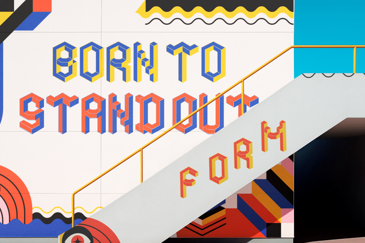
Funky Form builds its personality around block-like characters and an isometric appearance. Its dimensional geometry can make lettering serve as both headline and illustration. Consider using it for a short toy-brand name or event title, with a flat background and simple supporting text to keep the letter structures easy to inspect.
PROS: Isometric character, playful geometry, strong visual personality.
BEST FOR: Game-themed posters, creative packaging, children’s covers, and event graphics.
4. Votrag 10 Modern Font Collection
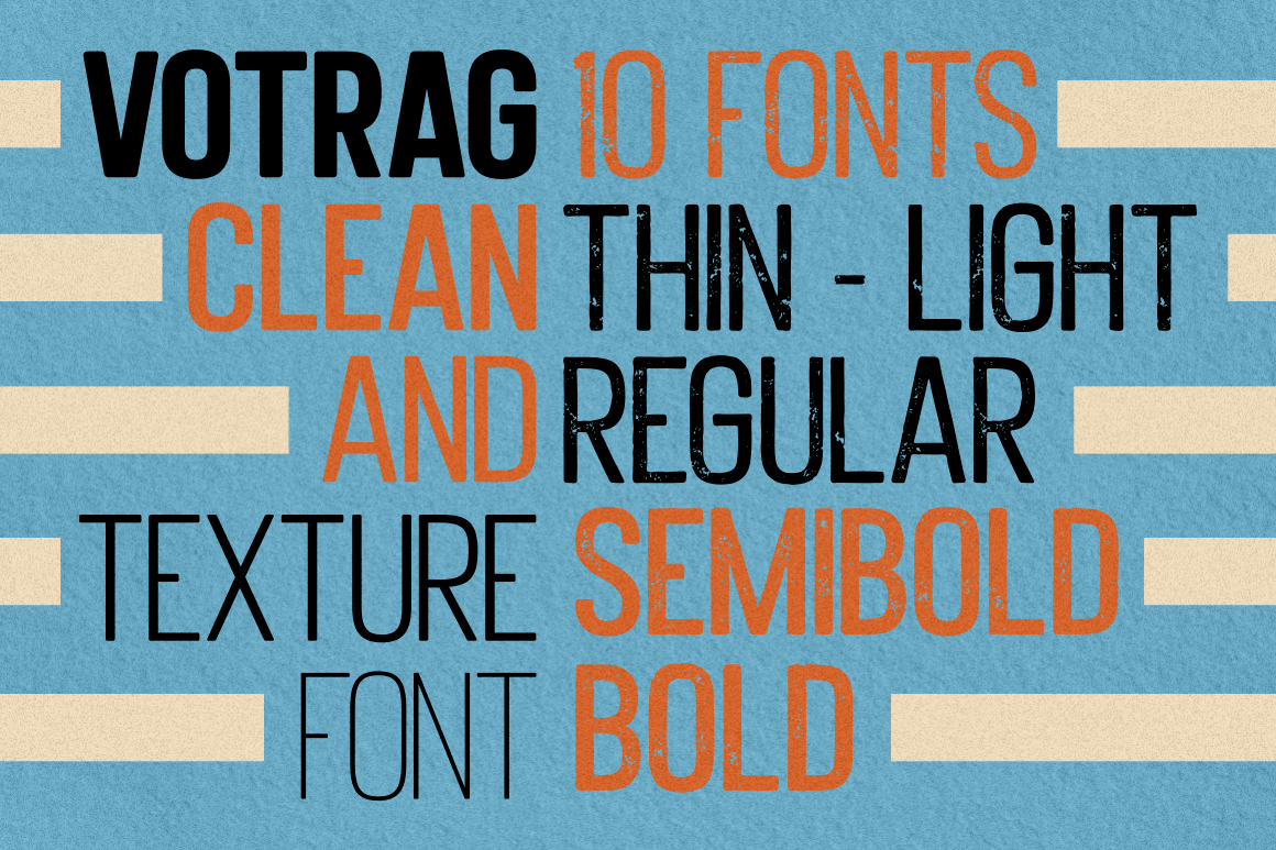
Votrag offers thin, light, regular, semibold, and bold weights, each in clean and textured versions, creating ten coordinated fonts. Rounded corners give the sans-serif construction a contemporary character. This range makes it my strongest starting point here for a repeatable hierarchy: test a clean bold headline, regular supporting copy, and textured accents for selected campaigns.
PROS: Five weights, ten variants, consistent family structure.
BEST FOR: Agency branding, packaging ranges, presentations, and coordinated editorial layouts.
5. Tribalizm New Tribal Concept Font

Tribalizm combines bold lines and geometric shapes with decorative references to masks and artifact patterns. Its emphatic forms offer a more atmospheric alternative to neutral corporate lettering. Use it selectively for an adventure-themed identity or fictional-world title, treating the design as an expressive concept rather than evidence of a specific culture’s authentic visual tradition.
PROS: Bold structure, patterned character, distinctive display presence.
BEST FOR: Concept posters, adventure branding, fantasy covers, and statement packaging.
Comparison
| Font | Suggested Layout Role | Pairing Direction |
|---|---|---|
| Drama Lines | Expressive cultural-themed title | Neutral sans serif |
| Luxore Shift | Premium collection headline | Restrained text family |
| Funky Form | Lettering as illustration | Simple flat typography |
| Votrag | Multi-weight hierarchy | Clean and textured variants |
| Tribalizm | Atmospheric focal point | Understated supporting text |
Common Mistakes
The first mistake is confusing versatility with using one font everywhere. A decorative title may work well on a poster yet overwhelm instructions or product details. Assign each typeface a role, then adapt line breaks and spacing for the format instead of shrinking the whole composition.
Another mistake is approving only a polished mockup. Review flat artwork, actual-size prints, mobile previews, and alternative crops. Keep essential names and contact information away from vulnerable edges. Before delivery, also check the selected license: PutraCetol distinguishes static artwork from embedded uses such as live webfonts, applications, and editable templates.
Conclusion
The best layout font is the one that gives important content character without making the rest harder to understand. Start with the communication task, compare these five PutraCetol Studio options using your actual words, and build a clear supporting hierarchy.
Explore the collection for your next logo, poster, or packaging project. Choose deliberately, test realistically, and document the rules so the identity remains recognizable across formats.
Explore these fonts and many more at PutraCetol.com to build a business identity that looks professional, trustworthy, and memorable.
Additionally, if you want to explore some free typography options, you can check out Putracetol Studio on Dafont. Happy reading and designing!