
The most effective way to explore fonts for graphic design is to decide what the typography must accomplish before opening a font marketplace or scrolling through inspiration boards.
A logo font has a different responsibility from a body typeface. A poster headline needs immediate visual impact, while a mobile-interface label must remain readable at a small size. A horror title may benefit from melting edges and irregular forms, but the date, venue, and ticket information still need a calmer companion.
Begin every project by assigning clear typographic roles:
- Primary display font: Logo, headline, campaign phrase, or product name
- Supporting font: Subheadings, descriptions, captions, and practical information
- Functional font: Navigation, forms, long reading, data, or interface labels
- Optional accent style: One alternate, italic, texture, or decorative treatment
This prevents the common habit of choosing a visually exciting typeface first and trying to force it into every part of the design.
Adobe’s typography guidance recommends establishing hierarchy through size, weight, spacing, and consistent text styles rather than treating every line equally. It also emphasizes restraint when combining typefaces so personality does not interfere with the reader’s experience.
Why Font Selection Is a Core Graphic Design Skill
Typography influences the way audiences interpret a design before they fully process its wording. Letter width, stroke weight, curves, spacing, contrast, and historical references can make the same message appear futuristic, luxurious, rebellious, playful, frightening, or trustworthy.
Consider the phrase:
ENTER THE NEXT ERA
A clean geometric font may make it feel like a technology launch. A condensed mechanical face can suggest robotics or motorsport. Blackletter typography may transform it into an underground fashion campaign, while melting horror lettering can make the phrase feel threatening.
The words remain unchanged, but the emotional entry point changes.
Typography also affects practical communication. A design may have excellent photography and color, yet still feel unprofessional when its text hierarchy is weak, its font pairing is inconsistent, or its spacing has not been refined.
To become more competitive, designers need to understand both sides of typography:
- Expression: Personality, emotion, recognition, and cultural context
- Function: Hierarchy, readability, accessibility, and production reliability
The strongest design work balances both.
Display Fonts, Text Fonts, and Functional Fonts
Display Fonts
The Display fonts are designed for short, prominent text at larger sizes. They often include unusual proportions, dramatic texture, decorative cuts, distinctive terminals, or experimental letter construction.
Use display fonts for:
- Logos
- Poster headlines
- Product names
- Packaging titles
- Social-media hooks
- Album covers
- Film titles
- Event identities
- Website hero sections
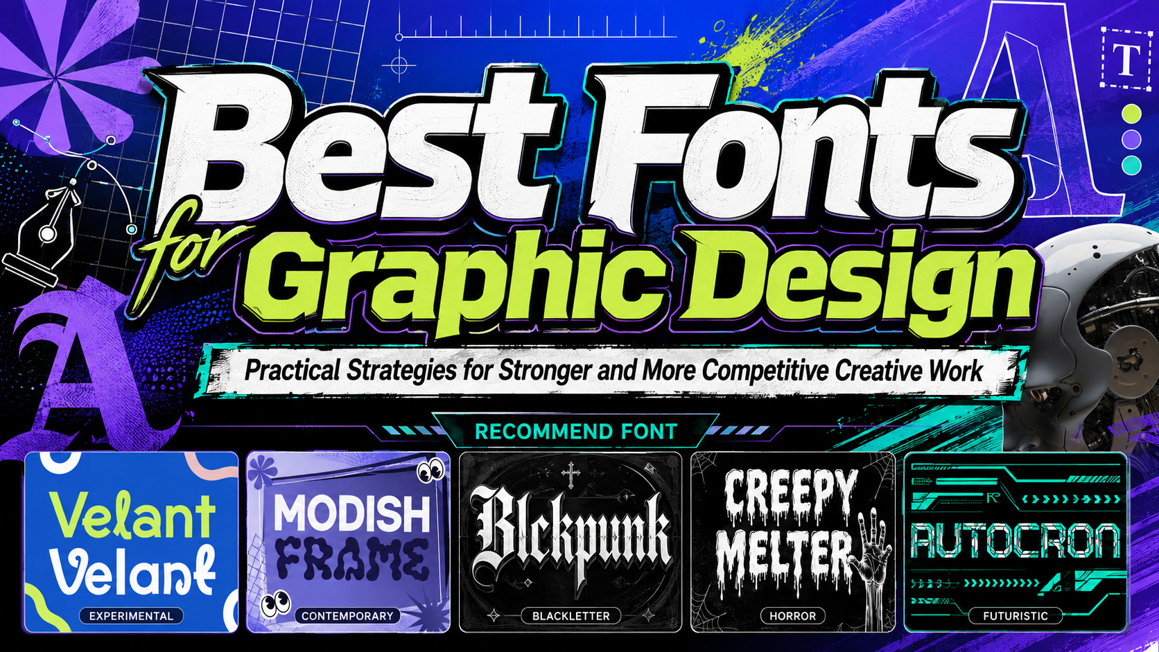
Velant, Modish Frame, Blckpunk, Creepy Melter, and Autocron all belong primarily in this expressive role.
Text Fonts
Text fonts are designed for sustained reading. Their structures tend to be more predictable, counters remain open, and spacing creates a steadier rhythm across sentences and paragraphs.
Use text fonts for:
- Articles
- Editorial body copy
- Product descriptions
- Instructions
- Reports
- Books
- Long captions
A dramatic display font can attract the audience, while a good text font keeps them reading.
Functional Interface Fonts
Functional fonts support fast scanning and accurate interaction.
They are useful for:
- Navigation
- Buttons
- Forms
- Tables
- Dashboards
- Prices
- Dates
- Data
- Error messages
- Small labels
These fonts should provide clear numerals, punctuation, and distinctions between characters such as uppercase I, lowercase l, and the number 1.
Do not expect one expressive typeface to perform all three roles equally well. A complete typographic system is usually stronger than a project built around one font used everywhere.
How to Choose Fonts for Graphic Design
1. Begin With the Communication Goal
Ask what the audience should understand and feel.
A technology conference may need to communicate innovation and precision. A streetwear label could prioritize rebellion and cultural energy. A Halloween campaign might need theatrical fear, while an experimental design studio may want to appear unconventional but still professional.
Write three personality words before selecting the font.
Examples include:
- Progressive, structured, and intelligent
- Raw, rebellious, and underground
- Sinister, theatrical, and unsettling
- Fluid, artistic, and contemporary
- Mechanical, fast, and futuristic
These words become criteria for evaluating each typeface.
2. Test the Real Content
Do not choose a font solely from its promotional specimen. Font specimens use carefully selected words that highlight attractive characters.
Test the actual:
- Brand name
- Product title
- Campaign headline
- Event date
- Price
- URL
- Numerals
- Punctuation
- Multilingual copy
A font may create a beautiful five-letter logo but become difficult to manage in a longer business name.
Pay particular attention to repeated letters, difficult capitals, narrow counters, and decorative collisions.
3. Compare the Font at Several Sizes
Review the typography as:
- A large poster headline
- A social-media thumbnail
- A packaging label
- A website title
- A small logo
- A monochrome mark
Experimental details may disappear when reduced. Thick outlines may merge, while narrow gaps can close.
A font that fails at a small size is not necessarily a poor typeface. It may simply require a simplified version or a different role.
4. Start in Black and White
Remove gradients, textures, photography, and color effects during the first evaluation.
Ask:
- Is the word recognizable?
- Is the silhouette balanced?
- Does one letter dominate unnecessarily?
- Are the counters open?
- Does the personality remain visible?
- Is the spacing intentional?
A strong typographic idea should work before decoration is added.
5. Adjust Kerning and Tracking
Font software provides default spacing, but logos and large headlines often require manual refinement.
Look closely at combinations such as:
AVTAWALYROTTVA
Experimental fonts require even more attention because fluid curves, extended strokes, and unusual cuts can create irregular spaces.
Tracking controls the overall openness of a word or line. Kerning corrects specific letter pairs. Both influence whether the typography feels polished or merely typed.
6. Choose Font Pairings by Contrast
A pairing becomes useful when the fonts have different responsibilities.
Strong combinations include:
- Experimental display + neutral sans serif
- Blackletter + modern grotesque
- Horror display + condensed sans serif
- Futuristic display + humanist sans serif
- Bold experimental font + restrained serif
Avoid pairing two fonts that compete through equally unusual details.
For example, Modish Frame already contains fluid, abstract forms. Pairing it with another highly distorted font may weaken both. A clean sans serif gives its unusual anatomy more room to stand out.
7. Use Hierarchy Before Effects
Make the headline larger, heavier, or more isolated before adding outlines, shadows, glows, and textures.
Hierarchy can be created through:
- Size
- Weight
- Position
- Alignment
- Spacing
- Case
- Color
- Contrast
Effects should strengthen a working hierarchy rather than compensate for a weak one.
Exploring Modern Font Trends Without Copying Them
Experimental Fluid Typography
Fluid and abstract letterforms challenge the rigid geometry commonly associated with modern branding.
This direction may use:
- Melting shapes
- Soft plastic forms
- Irregular curves
- Distorted counters
- Organic connections
- Unusual negative space
Modish Frame represents this approach through forms that resemble morphing pixels or flexible material. It is useful for fashion, youth campaigns, editorial layouts, contemporary packaging, and brands that want to appear progressive.
Readable Experimental Typography
Not every experimental font needs to be difficult to use.
Velant balances smooth curves, bold weight, controlled spacing, and selected irregular details. Its generous x-height helps it remain practical at medium and large sizes, making it useful for designers learning how originality and readability can coexist. PutraCetol currently presents it in its Freebies collection.
Modern Blackletter and Underground Branding
Blackletter is no longer limited to historical or ceremonial projects. Contemporary designers combine Gothic construction with punk, streetwear, tattoo, and music influences.
Blckpunk uses sharp edges, substantial curves, and heavy contrast to merge medieval blackletter character with modern underground culture. This makes it suitable for bold logos, posters, apparel, band artwork, and tattoo-inspired design.
Theatrical Horror Typography
Horror fonts communicate through damaged surfaces, unstable forms, dripping details, and distorted anatomy.
Creepy Melter uses jagged organic edges and descending streaks that resemble wax, slime, or other melting material. Its visual language is direct and theatrical, making it effective for horror films, Halloween graphics, haunted attractions, game covers, and event posters.
Mechanical and Futuristic Typography
Futuristic display fonts frequently use segmented strokes, condensed proportions, circuit-like details, and angular geometry.
Autocron is built around sharp cuts, layered strokes, and a mechanical digital rhythm. Its condensed construction makes it useful for gaming, technology, robotics, cyberpunk, automotive, and science-fiction projects that need a strong title without consuming excessive horizontal space.
Practical Typography Exercises for Designers
Exercise 1: One Brand, Five Visual Personalities
Choose one fictional brand name and set it in five directions:
- Experimental modern
- Fluid contemporary
- Underground blackletter
- Horror display
- Futuristic mechanical
Write one sentence explaining how each version changes the audience’s expectation.
For example, use the name NOVA DISTRICT.
Velant may make it feel like a creative startup. Modish Frame could turn it into an experimental fashion label. Blckpunk may suggest streetwear or music, while Autocron can position it as a technology platform.
This exercise teaches that font choice is part of strategy, not only styling.
Exercise 2: Display and Functional Pairing
Select one of the five recommended fonts and test it with three supporting families.
Evaluate:
- Personality contrast
- Body-copy readability
- Numerical clarity
- Small-size performance
- Overall visual balance
Do not judge only the logo. Create a mini system containing a headline, paragraph, price, button, and caption.
Exercise 3: Typography-Only Poster
Create a poster without photography or illustration.
Use:
- One display font
- One supporting font
- Two colors
- One short headline
- Date and location
- A clear CTA
The limitation forces scale, spacing, and hierarchy to carry the design.
Exercise 4: Trend Translation
Choose a current typographic trend and translate it into three different industries.
For example, apply fluid experimental typography to:
- Fashion
- Technology
- Food packaging
The forms may remain related, but the color, spacing, photography, and supporting typography should change.
This teaches you how to adapt a trend instead of copying one visual formula.
Exercise 5: Production Stress Test
Apply the same wordmark to:
- Large poster
- Mobile social thumbnail
- Packaging label
- T-shirt
- Website hero
- One-color stamp
Record which details survive and which need modification.
This exercise develops practical production judgment, which is often more valuable to clients than creating one impressive mockup.
Using Fonts in Branding
Typography can become one of the most recognizable elements of a brand identity.
A complete system may include:
- Primary wordmark
- Secondary wordmark
- Monogram
- Display typeface
- Supporting family
- Type scale
- Spacing rules
- Color behavior
- Examples of incorrect use
An experimental font should not appear in every possible location. Concentrate it in high-recognition moments, then allow the supporting system to create consistency.
For example, a streetwear brand could use Blckpunk in its wordmark, collection names, and large garment graphics. A clean grotesque can handle product sizes, prices, ecommerce navigation, and care information.
Using Fonts in Posters and Advertising
Posters allow expressive typography to become the central visual.
A practical hierarchy might use:
Primary: Event or campaign name
Secondary: Short explanation
Functional: Date, location, price, and website
Velant or Modish Frame can create artistic contemporary posters. Blckpunk supports underground fashion and music, Creepy Melter establishes immediate horror atmosphere, and Autocron works for gaming, racing, and technology events.
The more expressive the main font becomes, the simpler the functional layer should be.
Using Fonts in Social Media
Social-media typography needs to perform quickly and at a small size.
Use display fonts for:
- Reel covers
- Carousel hooks
- Product launches
- Event announcements
- Campaign phrases
- YouTube thumbnails
Keep the wording short enough for the typeface to remain large.
Examples include:
- NEW ERA
- SYSTEM FAILURE
- DARK SEASON
- DESIGN WITHOUT RULES
- ENTER THE FUTURE
Repeat essential information in captions rather than placing every detail inside the artwork.
Using Fonts in UI and Digital Design
Highly expressive display fonts can still belong in digital products, but their role should remain limited.
Use them for:
- Landing-page heroes
- Branded onboarding
- Product announcements
- Empty-state graphics
- Report covers
- Editorial modules
Avoid using experimental or horror display fonts for:
- Form labels
- Navigation
- Buttons
- Long paragraphs
- Tables
- Error messages
- Small data labels
For digital text, WCAG 2.2 specifies contrast of at least 4.5:1 for ordinary text and 3:1 for qualifying large text. Designers should also remember that irregular or thin characters may appear weaker in real rendering, even when a mathematical contrast check passes.
Building a More Competitive Graphic Design Portfolio
A typography project becomes more valuable when the portfolio shows the reasoning behind it.
Instead of presenting only a final logo, include:
- The original brief
- Target audience
- Brand personality
- Font categories explored
- Rejected alternatives
- Pairing experiments
- Kerning refinements
- Responsive versions
- Final applications
- Licensing and production considerations
This demonstrates that the designer can build a system rather than select a fashionable typeface.
A portfolio might include five specialized projects:
- Experimental lifestyle identity using Velant
- Fashion campaign using Modish Frame
- Underground record label using Blckpunk
- Horror festival using Creepy Melter
- Futuristic game or software identity using Autocron
Together, they demonstrate range while maintaining a clear focus on typography.
Jump to Recommended Fonts
Velant Unique Experimental Font | Modish Frame Contemporary Font | Blckpunk Blackletter Font | Creepy Melter Horror Font | Autocron Futuristic Font
1. Velant Unique Experimental Font
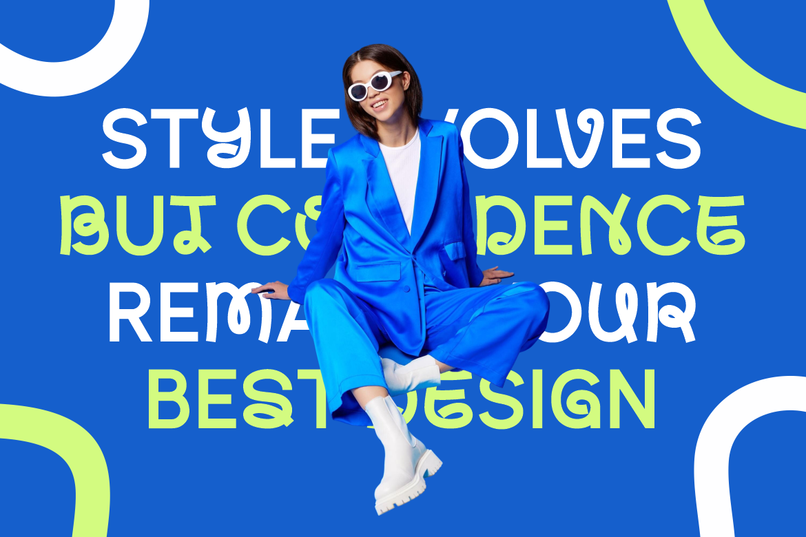
Velant is a modern experimental display font that combines confident weight with smooth curves, structured cuts, and subtle irregularity. Its generous x-height and balanced proportions help it remain readable at medium and large sizes, giving designers a practical way to add individuality without creating excessive visual complexity. It is currently included in PutraCetol Studio’s Freebies catalog, making it particularly useful for students, portfolio projects, and early-stage creative exploration.
PROS: Modern experimental character, balanced readability, strong x-height, confident silhouette, and versatile display performance.
BEST FOR: Startup branding, modern logos, social graphics, portfolio design, posters, editorial titles, creative studios, and contemporary packaging.
2. Modish Frame Contemporary Font

Modish Frame fuses futuristic experimentation with fluid, organic letter anatomy. Its forms resemble melting pixels or flexible plastic reshaping into bold silhouettes, creating a memorable visual system for brands that want to challenge conventional geometry. The family includes two styles and supports uppercase, lowercase, numerals, punctuation, and OpenType alternatives, giving designers room to customize logos and prominent headlines.
PROS: Two coordinated styles, fluid experimental forms, strong visual differentiation, OpenType features, and contemporary fashion appeal.
BEST FOR: Experimental logos, fashion campaigns, trend-led packaging, editorial layouts, zines, youth branding, lifestyle merchandise, and social-media art direction.
3. Blckpunk Blackletter Font
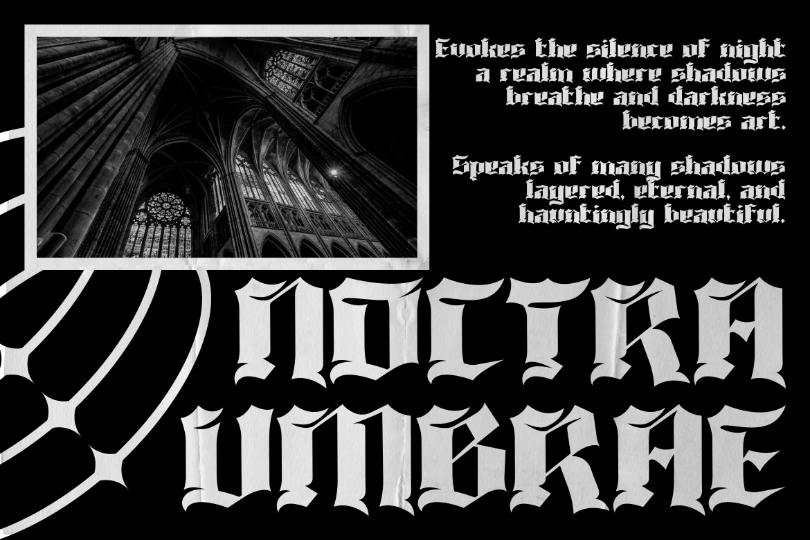
Blckpunk brings Gothic construction into modern underground design through sharp edges, bold curves, and pronounced stroke contrast. Its combination of medieval blackletter rhythm and punk attitude creates a dramatic wordmark that can feel historical, rebellious, and current at the same time. The font includes uppercase and lowercase letters, numerals, punctuation, and OpenType alternatives or ligatures for broader identity work.
PROS: Strong Gothic silhouette, punk energy, high visual contrast, alternate characters, and powerful logo recognition.
BEST FOR: Streetwear, underground music, tattoo studios, posters, album art, apparel, cultural events, alternative packaging, and rebellious brand identities.
4. Creepy Melter Horror Font
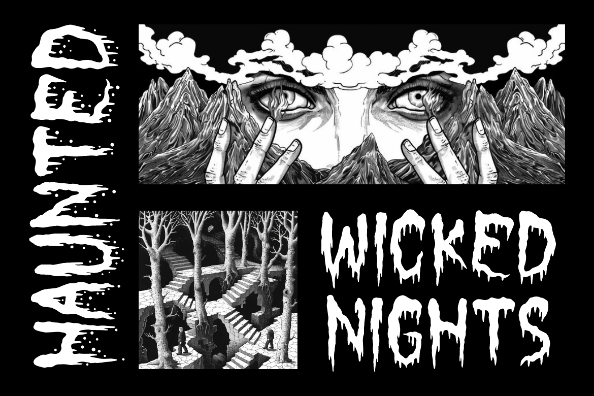
Creepy Melter is a bold horror display typeface shaped by dripping, deformed, and jagged organic contours. Its descending streaks can resemble melting wax, slime, or blood, allowing a short title to establish fear and theatrical tension immediately. The exaggerated details make it especially effective for large display use where the melting forms have enough space to remain recognizable.
PROS: Immediate horror atmosphere, dramatic melting details, bold visibility, organic irregularity, and strong genre recognition.
BEST FOR: Horror films, Halloween campaigns, haunted attractions, game covers, thriller posters, dark merchandise, event branding, and cinematic social graphics.
5. Autocron Futuristic Font

Autocron is a condensed futuristic display font built from sharp geometric cuts, angled lines, layered strokes, and segmented mechanical details. Circuit-like motifs and a controlled digital rhythm give it a mecha and cyberpunk personality while its narrow proportions help longer titles fit compact layouts. It is a strong choice when a project needs technical energy without relying entirely on neon effects or generic geometric typography.
PROS: Condensed proportions, mechanical construction, sharp geometry, space-efficient headlines, and recognizable cyber character.
BEST FOR: Gaming, robotics, AI campaigns, esports, automotive design, cyberpunk projects, technology events, science-fiction covers, and digital product launches.
Comparison
| Font | Main Direction | Visual Personality | Strongest Application | Recommended Companion |
|---|---|---|---|---|
| Velant | Readable experimental display | Modern, versatile, and expressive | Logos, portfolios, and contemporary branding | Neutral humanist sans serif |
| Modish Frame | Fluid contemporary display | Artistic, abstract, and progressive | Fashion, packaging, and editorial campaigns | Clean geometric sans serif |
| Blckpunk | Modern blackletter | Gothic, rebellious, and underground | Streetwear, music, tattoo, and apparel | Simple grotesque or condensed sans |
| Creepy Melter | Melting horror display | Sinister, theatrical, and disturbing | Horror posters, games, and Halloween campaigns | Clean condensed sans serif |
| Autocron | Futuristic mechanical display | Technical, fast, and cyber-inspired | Gaming, AI, robotics, and automotive design | Functional modern sans serif |
Best for Versatile Creative Practice
Velant offers the broadest balance between experimental personality and practical readability.
Best for Fashion and Abstract Branding
Modish Frame provides the most distinctive fluid anatomy and contemporary art direction.
Best for Underground Identity
Blckpunk creates the strongest connection between historical blackletter and current punk or street culture.
Best for Immediate Horror Storytelling
Creepy Melter communicates its genre before additional illustration or texture is introduced.
Best for Futuristic Projects
Autocron combines mechanical character with condensed efficiency for digital and technology-led design.
Common Mistakes
The first mistake is selecting fonts because they look fashionable without defining the role they must perform. A designer may use an experimental typeface for the logo, body copy, navigation, prices, and captions simply to keep the project consistent. The result is visually repetitive and harder to understand. Build consistency through a shared system of roles, spacing, color, and hierarchy rather than forcing one expressive font into every element.
Another common problem is downloading several unique fonts while neglecting spacing and composition. The most distinctive typeface can still look amateur when kerning is uneven, line breaks are accidental, or the surrounding layout gives every element equal importance. Test the real content, work in black and white, refine the word shape manually, and give unusual letterforms enough negative space. Typography becomes professional through editing, not through novelty alone.
The final mistake is ignoring accessibility, production, and licensing until the project is ready to publish. Fine details can disappear on small screens, blackletter counters may close during printing, and horror textures can become unclear over photographs. Test every design at its actual size and prepare simplified alternatives where necessary. PutraCetol’s current product selector also separates finished static work from uses such as registered logos, webfont embedding, digital advertising, applications, editable templates, broadcast, and online platforms, so the selected coverage should reflect how the design will actually be distributed.
Conclusion
The best fonts for graphic design do more than decorate a composition. They help define hierarchy, communicate personality, establish recognition, and guide the audience through information.
Designers become more competitive when they can explain why a font belongs in a project, which role it should perform, how it should be paired, and how it must adapt across different formats.
Velant demonstrates how experimental typography can remain versatile and readable. Modish Frame pushes contemporary lettering toward fluid abstraction, while Blckpunk connects Gothic tradition with underground culture. Creepy Melter offers direct horror storytelling, and Autocron creates a mechanical visual language for technology, gaming, and futuristic branding.
Fonts from PutraCetol Studio can support logo design, posters, packaging, editorial layouts, social media, and portfolio projects across a wide range of visual directions.
Start with the message, test the real words, refine the spacing, and build a hierarchy before adding effects. Explore trends to understand current visual culture, but translate them through your own audience, concept, and brand system.
A strong designer does not simply know which fonts look interesting.
A strong designer knows when, why, and how to use them.
Explore these fonts and many more at PutraCetol.com to build a business identity that looks professional, trustworthy, and memorable.
Additionally, if you want to explore some free typography options, you can check out Putracetol Studio on Dafont. Happy reading and designing!