
Build a Role-Based Typography System
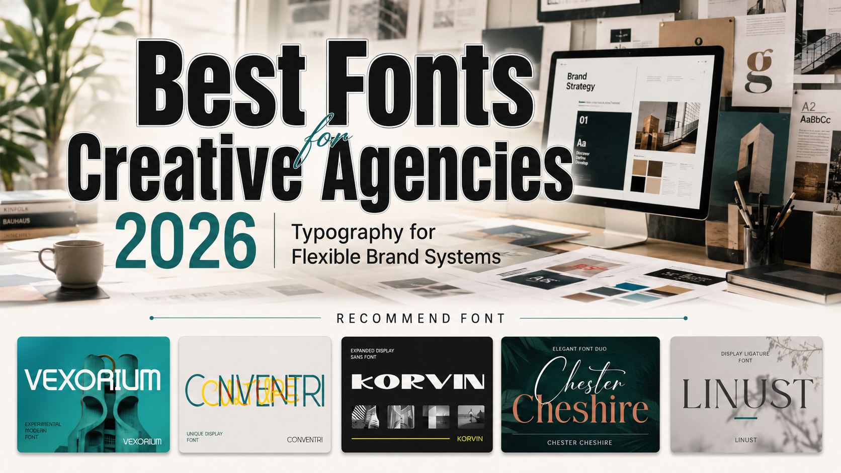
The best fonts for creative agencies 2026 should create recognition without forcing one typeface into every task. Use a distinctive display font for logos, campaign headlines, proposal covers, and presentation dividers. Pair it with a highly readable companion for strategy documents, body copy, charts, captions, and interface text.
Current design reports highlight custom typography, oversized headlines, serif-led simplicity, and more human-centered visual systems in 2026.
Before choosing a font, define three agency qualities, such as strategic, progressive, and clear. Test each candidate across real touchpoints rather than judging it from a specimen alone.
What Creative Agencies Need From Typography
Agency typography must work across websites, packaging, motion graphics, case studies, and pitch decks. Document font roles, capitalization, tracking, alternates, and fallback choices so collaborators can maintain one recognizable experience across channels.
Jump to Recommended Fonts
Vexorium | Conventri | Korvin | Chester Chesire | Linust
1. Vexorium Modern Experimental Font
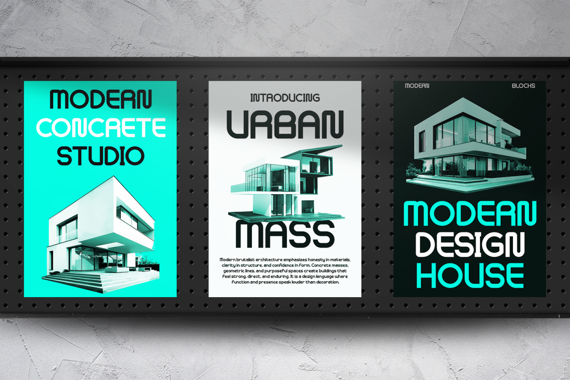
Vexorium combines architectural precision with tall proportions, consistent strokes, rounded corners, and balanced geometric curves. Its unusual structural details add a futuristic personality without sacrificing the clarity required for professional agency work.
PROS: Refined experimentation, balanced readability, architectural character.
BEST FOR: Creative studios, technology branding, property campaigns, presentations, posters, and packaging.
2. Conventri Modern Font
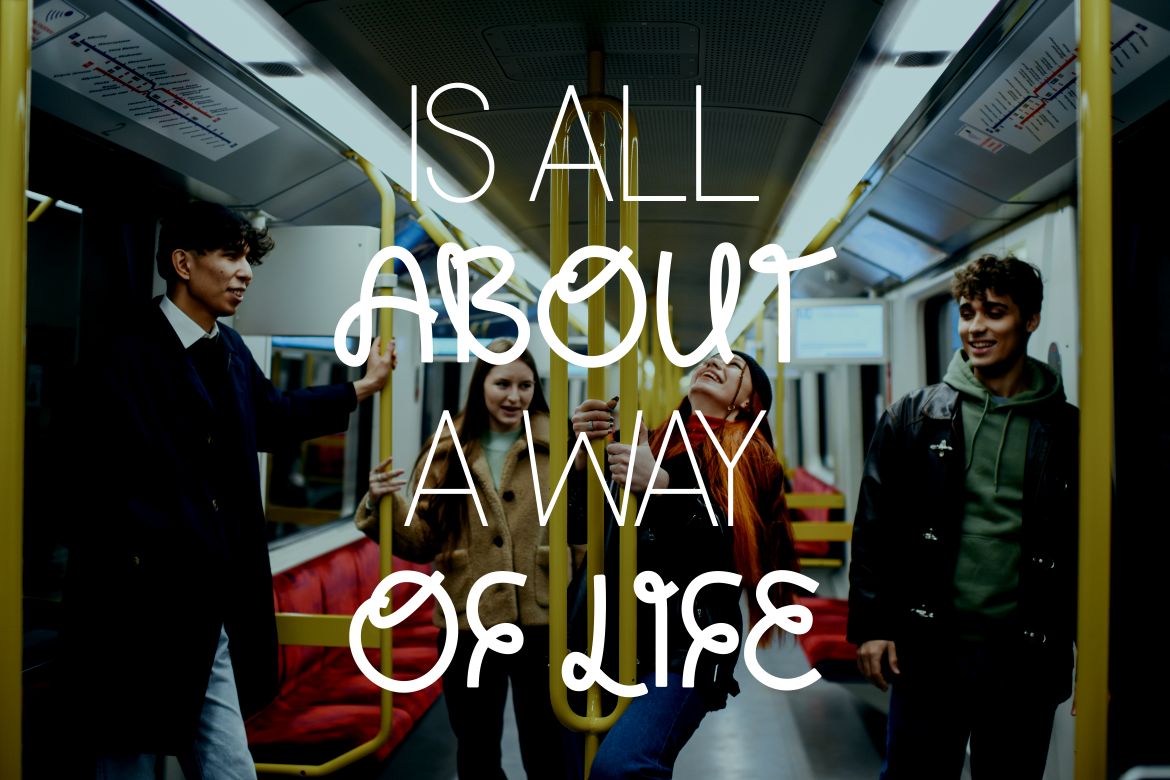
Conventri is a modern display sans with clean lines, playful curled details, two coordinated styles, and ligatures. It gives logos and campaign titles a lively signature while retaining an elegant, contemporary structure.
PROS: Two styles, useful ligatures, modern elegance, distinctive personality.
BEST FOR: Lifestyle branding, magazines, cultural campaigns, hospitality, and creative presentations.
3. Korvin Expanded Display Sans Font
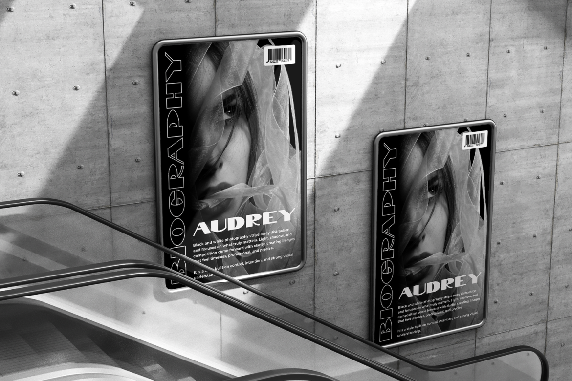
Korvin uses wide proportions, bold weight, clean strokes, open spacing, and selected angled cuts. Its expanded silhouette creates immediate authority while keeping major headlines organized and professional.
PROS: Strong presence, open spacing, geometric clarity, corporate confidence.
BEST FOR: Agency identities, startup pitches, automotive branding, architecture, signage, and campaign headlines.
4. Chester Chesire Elegant Font Duo

Chester Chesire combines an elegant serif with a coordinated script, giving agencies two complementary voices inside one family. Its alternates and ligatures support personalized titles, premium storytelling, and clear contrast between authority and emotion.
PROS: Built-in pairing, rich alternates, elegant contrast, flexible hierarchy.
BEST FOR: Fashion, beauty, weddings, luxury hospitality, editorial projects, and premium presentations.
5. Linust Display Modern Font
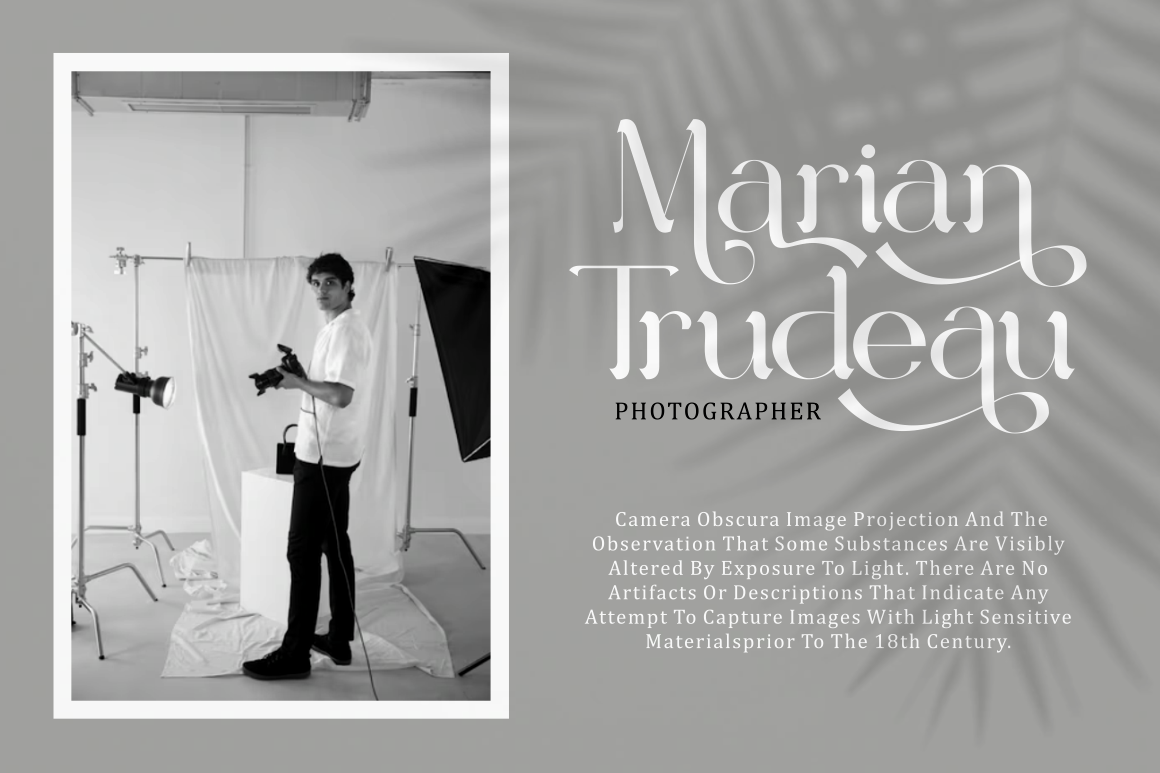
Linust combines contemporary elegance with a broad selection of alternate characters and ligatures. Its sleek construction works across logos, product labels, posters, invitations, and digital campaigns, making it a versatile choice for polished identities.
PROS: Extensive alternates, polished appearance, strong cross-format versatility.
BEST FOR: Hospitality, beauty, ecommerce, business branding, editorial covers, and campaign design.
Applying the Fonts Across Agency Work
Repeat one primary display font across the agency website, credentials deck, case studies, and campaign titles. Use a neutral companion for longer documents and interface text.
For clients, match the typeface to positioning: Vexorium feels future-facing, Korvin communicates scale, Conventri is expressive, Chester Chesire supports luxury storytelling, and Linust offers broad flexibility. Test real names and headlines in black and white, on mobile, in PDFs, and in print.
Comparison
| Font | Main Personality | Strongest Agency Role |
|---|---|---|
| Vexorium | Architectural and progressive | Innovation-led branding |
| Conventri | Elegant and playful | Expressive campaigns |
| Korvin | Wide and authoritative | Corporate pitches |
| Chester Chesire | Luxurious and emotional | Premium storytelling |
| Linust | Sleek and versatile | Multi-format systems |
Common Mistakes
The first mistake is selecting a font because it looks fashionable without checking whether it supports the client’s position. A highly experimental face can weaken trust in a conservative sector, while a neutral corporate font may erase the personality of a cultural brand. Begin with audience, message, and competitive context.
Another mistake is using the display font for every text layer. These typefaces are strongest in logos and headlines. Long proposals, charts, interfaces, and legal information need a calmer companion so creativity does not reduce comprehension.
The final mistake is ignoring handoff and licensing. Remote collaborators, client teams, websites, advertisements, and editable templates may require different permissions. Document authorized uses, provide fallback choices, and confirm the appropriate PutraCetol license before production.
Conclusion
The best fonts for creative agencies 2026 combine a memorable voice with enough flexibility for multichannel work. Vexorium offers architectural experimentation, Conventri adds playful elegance, Korvin creates broad authority, Chester Chesire provides a refined duo, and Linust delivers contemporary versatility.
Use these PutraCetol Studio fonts where identity matters most, then support them with readable typography and clear brand rules. The strongest agency font system connects strategy, storytelling, and execution across every client touchpoint.
Explore these fonts and many more at PutraCetol.com to build a business identity that looks professional, trustworthy, and memorable.
Additionally, if you want to explore some free typography options, you can check out Putracetol Studio on Dafont. Happy reading and designing!