
Separate Cover Typography From Interior Reading
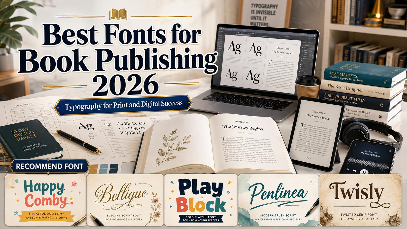
The best fonts for book publishing 2026 should help readers identify genre, mood, and professional quality before opening the book. However, the typeface that makes a cover memorable is rarely suitable for hundreds of interior pages.
Use an expressive display font for the title, series identity, or chapter opener, then choose a quieter family for sustained reading. Amazon KDP likewise recommends simple fonts for long passages and more elaborate typography for headings and chapter titles.
Hybrid publishing requires typography that works across ebooks, paperbacks, hardcovers, printed spines, retailer thumbnails, websites, and social campaigns. KDP requires separate interior and cover files for print production.
What Makes a Strong Publishing Font?
A cover font should remain recognizable at full size and as a small online thumbnail. Test the real title, subtitle, author name, numerals, punctuation, and repeated letters.
Interior type needs open counters, balanced spacing, clear italics, and a comfortable rhythm. Reflowable ebooks also require semantic structure and accessible presentation rather than a fixed print layout. Current W3C guidance covers accessibility requirements and discoverability metadata for EPUB publications.
Build a Practical Typography System
Use a cover display font for recognition, a supporting font for subtitles and author names, and a dedicated text family for the interior. The five PutraCetol choices below are strongest on covers, chapter openers, and campaign graphics.
Confirm licensing before production because physical-book use and embedded ebook use can require different coverage.
Jump to Recommended Fonts
Happy Comby | Bellique | Play Block | Penlinea | Twisly
1. Happy Comby Duo Font

Happy Comby combines a heavy rounded display sans with a flowing script companion. The bold style creates a clear title shape, while the coordinated script can highlight an author name, subtitle, or emotional keyword without introducing an unrelated family.
PROS: Built-in pairing, strong hierarchy, friendly personality.
BEST FOR: Cookbooks, lifestyle books, journals, gift books, and contemporary nonfiction.
2. Bellique Logo Script Font
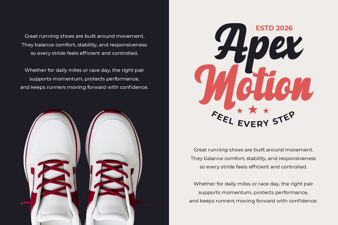
Bellique uses thick connected strokes, smooth curves, tapered endings, and a confident baseline. Its energetic silhouette suits short titles or author branding that needs a personal signature with more strength than a delicate calligraphic script.
PROS: Strong word shape, fluid movement, memorable rhythm.
BEST FOR: Memoirs, sports biographies, travel stories, motivational books, and lifestyle publishing.
3. Play Block Playful Display Font

Play Block features thick, compact letters with rounded edges, consistent weight, and slightly uneven curves. Its friendly geometry gives children’s covers an energetic building-block personality while remaining clear at large sizes.
PROS: Bold readability, cheerful structure, strong thumbnail visibility.
BEST FOR: Children’s books, activity books, educational publishing, comics, and family series.
4. Penlinea Modern Brush Script Font
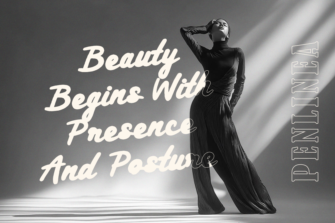
Penlinea uses flowing handwritten strokes, strong thick-to-thin contrast, and a gently moving baseline. Its brush texture gives covers a human, artistic, and emotionally direct quality.
PROS: Organic movement, expressive contrast, handcrafted character.
BEST FOR: Poetry, memoirs, travel books, creative guides, and inspirational nonfiction.
5. Twisly Twisted Serif Font

Twisly combines tall, slightly condensed proportions with high contrast and subtly distorted serif details. It preserves literary refinement while adding enough contemporary character to distinguish a premium cover.
PROS: Elegant contrast, distinctive terminals, editorial sophistication.
BEST FOR: Literary fiction, fashion books, art publishing, cultural essays, and premium nonfiction.
Comparison
| Font | Main Personality | Strongest Role |
|---|---|---|
| Happy Comby | Bold and friendly | Lifestyle cover system |
| Bellique | Personal and energetic | Author identity |
| Play Block | Playful and sturdy | Children’s cover |
| Penlinea | Handmade and expressive | Emotional title |
| Twisly | Elegant and experimental | Premium editorial cover |
Common Mistakes
The first mistake is choosing from a specimen without testing the real title. Long subtitles, repeated letters, narrow spines, and marketplace thumbnails can reveal poor spacing or unclear forms. Build the cover in black and white, refine kerning and line breaks, then review it at print and thumbnail sizes.
Another mistake is using a display font throughout the interior. Script, block, brush, and experimental serif styles can create excellent titles but become tiring across long passages. Reserve them for covers and chapter openings, then use a dedicated reading family for body text.
The final mistake is treating print, ebook, and marketing files as one layout. Print needs fixed trim, margins, bleed, and spine calculations, while reflowable ebooks adapt to reader settings. Prepare each format separately and confirm coverage for print, ebook embedding, advertising, and series branding.
Conclusion
The best fonts for book publishing 2026 combine genre recognition with production flexibility. Happy Comby offers a coordinated duo, Bellique creates energetic author presence, Play Block strengthens children’s publishing, Penlinea adds handcrafted emotion, and Twisly brings editorial elegance.
Use these PutraCetol Studio fonts where personality matters most, then support them with readable interior typography. A font cannot create a bestseller alone, but it can make a book look professional, recognizable, and ready for print and digital readers.
Explore these fonts and many more at PutraCetol.com to build a business identity that looks professional, trustworthy, and memorable.
Additionally, if you want to explore some free typography options, you can check out Putracetol Studio on Dafont. Happy reading and designing!