
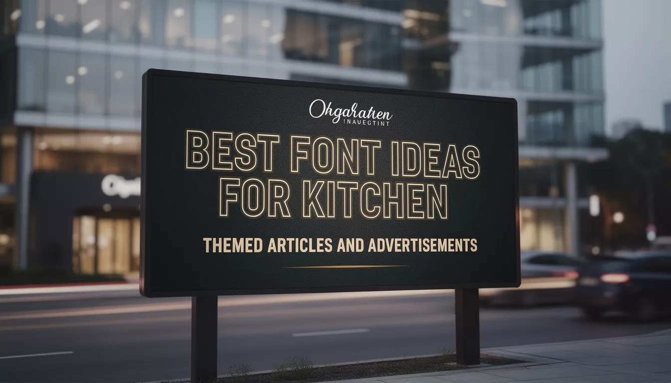
Typography is one of the strongest tools in visual communication. When it comes to kitchen-themed designs whether for articles, blog posts, restaurant ads, cooking tutorials, or lifestyle promotions the right font can dramatically influence how audiences experience the content. Good typography helps set the mood, supports clarity, and elevates the overall design.
This article explores why choosing the right fonts for kitchen-themed articles and ads is essential, what makes certain typefaces more effective, and how fonts from Putracetol.com can enhance both modern and traditional kitchen-related visuals.
Why Fonts Matter in Kitchen Articles & Ads
Kitchen content often aims to evoke atmosphere warmth, comfort, creativity, freshness, or modern elegance. Typography helps express these emotions visually before the audience even reads the message.
Create the Right Atmosphere
Typography sets the tone of the design. For example:
- A clean modern serif can make a kitchen article feel elegant.
- A playful handwritten style can make lifestyle content feel relaxed and friendly.
- A retro-inspired display font can add charm to vintage kitchen advertisements.
Fonts help define whether the kitchen content feels cozy, premium, rustic, modern, traditional, or artistic.
Improve Readability
Recipes, how-to articles, and kitchen design guides rely heavily on clarity. Readable fonts ensure that instructions and descriptions are easy to follow, especially on mobile devices.
Strengthen Visual Identity
Whether the content belongs to a brand, a cooking blog, a restaurant, or a kitchen product, consistent typography builds recognition. A strong visual identity makes the content look professional and cohesive.
Capture Audience Attention
Food and kitchen-themed designs are often used in competitive spaces digital ads, product packaging, cooking websites, and social media. Unique fonts help content stand out, encouraging viewers to stop scrolling and engage.
What Makes a Font Suitable for Kitchen-Themed Content?
Different kitchen themes call for different typography choices. The font you select should match the mood you want to create.
Warm and Cozy Typography
Great for:
- Family recipes
- Home cooking blogs
- Rustic or farmhouse kitchens
These designs often use handwritten, script, or vintage-inspired typefaces to communicate comfort and familiarity.
Modern and Minimal Typography
Great for:
- Premium kitchen brands
- Contemporary kitchen designs
- Lifestyle magazines
Clean serifs and sans serifs help create an elegant, upscale atmosphere.
Playful Typography
Great for:
- Children’s recipe books
- Creative food blogs
- Casual dining ads
These fonts add character, energy, and fun to the design.
Retro Typography
Great for:
- Vintage kitchen decor
- Classic recipe collections
- Nostalgic culinary branding
Retro typefaces highlight personality and charm.
Recommended Fonts from Putracetol.com
Here are some curated font choices from Putracetol.com that work beautifully for kitchen-themed articles, ads, and branding projects.
Gilded Glint – Elegant and Modern
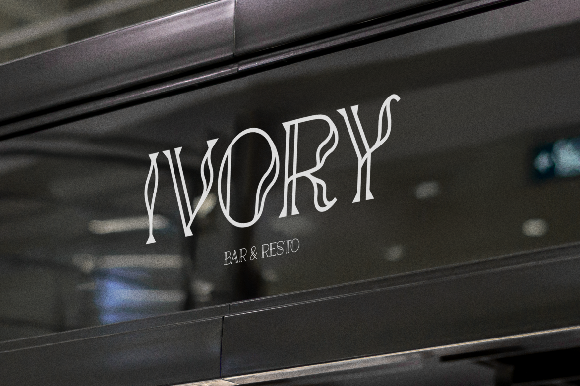
If your content is targeting premium kitchens, luxury cookware, or stylish lifestyle articles, Gilded Glint delivers elegance and clarity. Its soft curves and refined structure make it ideal for magazine-level visuals.
Sixty Niners – Retro-Modern Charm
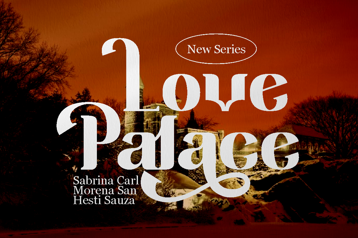
Perfect for creative ads, recipe blogs, or nostalgic kitchen designs. Sixty Niners brings a blend of retro character and modern usability, fitting well in posters, food packaging, and themed artwork.
Happy Groov – Nostalgic but Professional
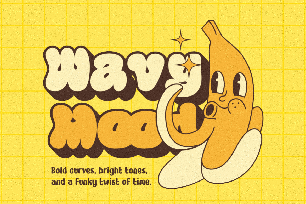
This font adds warmth and personality while remaining readable. It’s a great match for classic cooking articles, traditional recipe layouts, or kitchen stories that highlight culture and heritage.
Gothen – Stylish with Retro Vibes

Gothen feels artistic and expressive ideal for kitchen-related designs that want to stand out visually. Use it for restaurant posters, creative ads, or culinary event promotions.
Tuncho Plonko – Creative and Standout
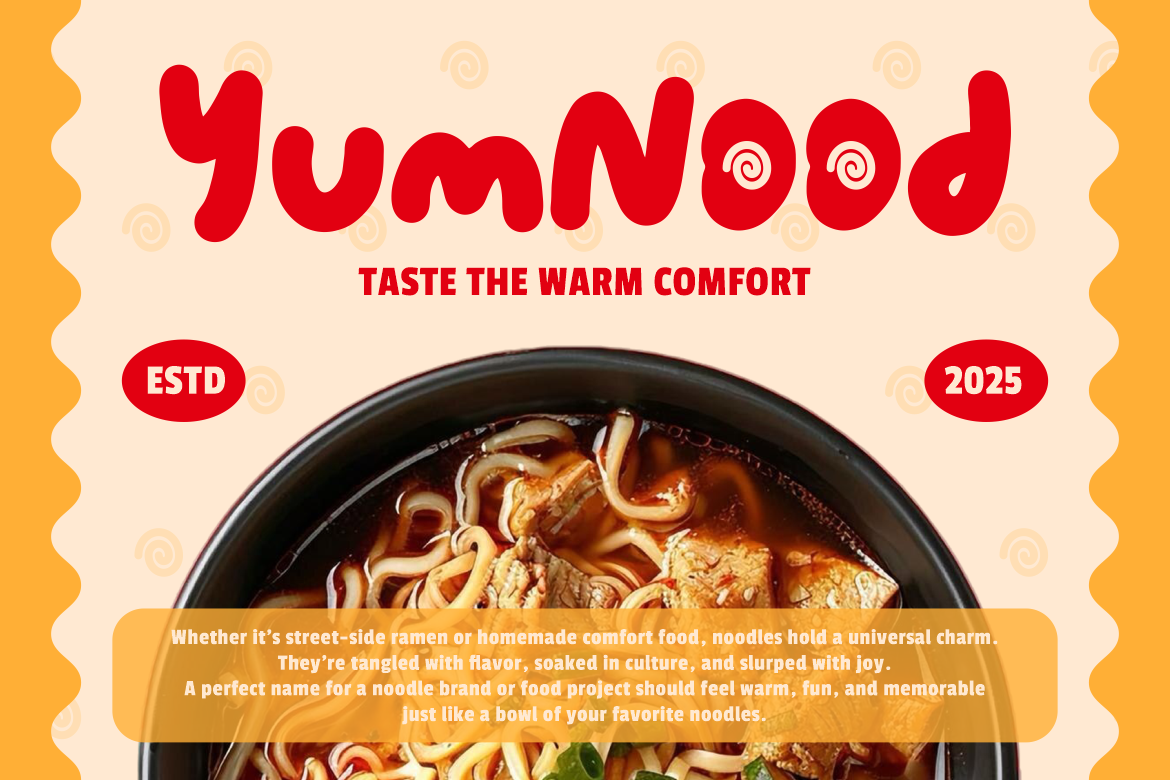
With its playful, eye-catching style, Tuncho Plonko works well in innovative food advertisements, cooking class promotions, and kitchen-themed social media posts that aim to grab attention quickly.
Funky Funny – Playful Yet Professional
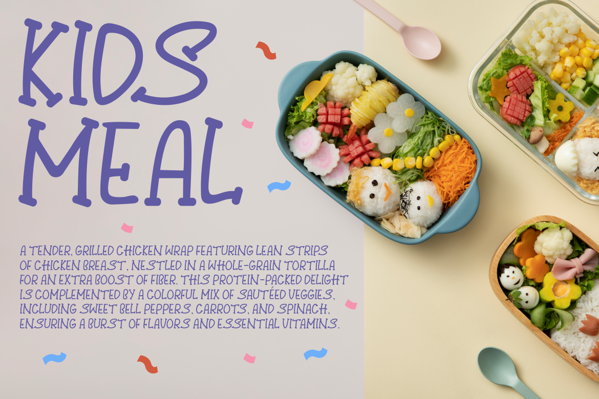
Great for casual, lifestyle-oriented kitchen content. Funky Funny adds charm and friendliness without losing clarity, making it perfect for blog banners, recipe highlights, or cooking tutorials.
Country Foody – Strong and Trustworthy
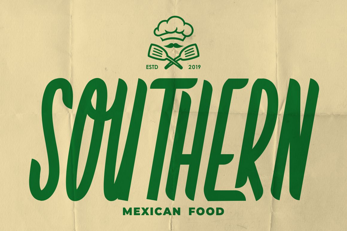
This font carries a sense of confidence and authenticity, perfect for culinary brands, organic food packaging, or farm-to-table restaurant ads. It gives kitchen-themed work a wholesome, reliable feel.
Applications of Kitchen-Themed Typography
Fonts shape how audiences interpret kitchen-related content across different design platforms. Here are some common applications:
Articles & Blogs
Fonts help define reading flow and emotional tone. A mix of readable body text with expressive headers keeps culinary articles engaging.
Advertisements
Whether digital or print, kitchen ads often rely on typography to express flavor, freshness, joy, or tradition. A strong font can make a food product instantly appealing.
Food Packaging
Typography on packaging affects buying decisions. Creative or elegant fonts bring visual personality to spices, kitchen tools, snacks, sauces, and beverages.
Recipe Cards
A well-chosen typeface makes recipes not only readable but collectible. Many cooking enthusiasts save recipe cards that look visually appealing.
Restaurant Menus
A menu’s typography reflects the restaurant’s style rustic, elegant, modern, or playful. The font improves both ambience and usability.
Social Media & Promotions
Typography is crucial for cooking tutorials, kitchen hacks, culinary tips, and food promotions on Instagram, YouTube, Pinterest, and TikTok. Stylish fonts increase shareability and engagement.
Tips for Choosing the Right Kitchen-Themed Font
To get the most out of typography in culinary content, consider these practical tips:
Match Font Style to Kitchen Theme
- Rustic kitchen → vintage or script fonts
- Modern kitchen → clean serif or sans serif fonts
- Playful kitchen content → quirky, bold typefaces
- Premium kitchen brand → elegant display fonts
Ensure Readability
Avoid overly decorative fonts for body text. Use expressive fonts for titles and clean fonts for paragraphs.
Use Hierarchy
Combine:
- A standout header font
- A supporting subheadline font
- A simple, readable body font
This helps organize content clearly.
Keep It Consistent
Use the same typography family or style across all visuals to build cohesion and brand recognition.
Consider Color Pairings
Typography looks stronger when paired with suitable colors warm tones for home cooking, black-and-white for modern kitchens, natural tones for organic brands.
Conclusion
Choosing the right font for kitchen-themed articles and advertisements is more than a design decision it is a strategy for improving communication, creating atmosphere, and strengthening visual identity. Typography influences how audiences feel, respond, and connect with the content.
With curated font collections from Putracetol.com, such as Gilded Glint, Sixty Niners, Happy Groov, Gothen, Tuncho Plonko, Funky Funny, and Country Foody, designers can craft visuals that match any kitchen aesthetic modern, rustic, playful, or nostalgic.
Explore more typefaces at Putracetol.com and elevate your next kitchen-themed project with typography that communicates flavor, warmth, and creativity.
Thank you for taking the time to read this article. If you are looking for more great articles, feel free to visit Putracetol Blog
Additionally, if you want to explore some free typography options, you can check out Putracetol Studio on Dafont. Happy reading and designing!