
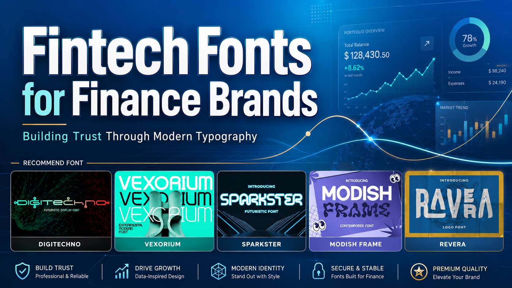
The most effective fintech fonts for finance brands do not try to perform every typographic role inside one family. A distinctive display font can make a digital bank, payment platform, investment product, or ESG fund easier to recognize, but everyday financial information requires a quieter and more functional typeface.
Begin by separating the typography into three roles:
- Brand display typography for the logo, campaign headlines, product names, reports, and launch materials
- Interface typography for navigation, forms, onboarding, notifications, and help content
- Data typography for balances, percentages, transactions, performance tables, and charts
This distinction allows a finance brand to look innovative without making customers decode account balances or investment data through experimental lettering.
A crypto platform may use a futuristic display font in its wordmark while keeping wallet addresses and transaction information in a highly readable companion. A wealth-management company could use an elegant logo font but rely on a neutral sans serif with clear numerals throughout its portal.
The expressive typeface creates recognition. The functional typefaces protect clarity and confidence.
Why Typography Matters in Financial Branding
Finance brands frequently ask customers to make important decisions, share personal information, move money, interpret risk, or commit to long-term plans. Typography influences how understandable and credible those interactions feel.
A font cannot make an unreliable company trustworthy. It can, however, help a well-run company communicate its value more clearly and consistently.
Strong financial typography should help users answer practical questions:
- What is the most important information on this screen?
- Is this amount positive, negative, pending, or unavailable?
- Which action will move or invest my money?
- Is this warning urgent?
- What fee or condition applies?
- Can I recognize the company across the app, website, documents, and campaigns?
When typography is inconsistent or overly decorative, customers may perceive the product as less mature. When it is too neutral, the brand may disappear among competitors using similar geometric sans serifs.
The objective is a controlled balance between distinction and predictability.
Trust Does Not Require Conservative Typography
Many finance companies default to navy blue, restrained serif logos, and traditional corporate layouts. These choices can communicate stability, but they are not the only way to create credibility.
A digital bank may build trust through a modern geometric identity if its interface is organized, its fees are transparent, and its financial information is easy to read. A crypto company can use experimental typography without appearing irresponsible when the visual system remains disciplined and the product clearly explains risk.
Typography should reflect the organization’s position:
| Brand Position | Suitable Typographic Direction |
|---|---|
| Established and discreet | Elegant serif or restrained logo font |
| Innovative and precise | Architectural experimental sans serif |
| Fast and digital | Futuristic geometric display font |
| Accessible and friendly | Rounded modern sans serif |
| Premium and advisory-led | Refined serif paired with neutral UI typography |
| Sustainable and human-centered | Calm contemporary type with organic supporting details |
| Decentralized and disruptive | Experimental display type with highly structured functional text |
Trust comes from the relationship between the typeface and the experience surrounding it. A modern font can feel highly credible when every product interaction supports the same promise.
What Makes a Strong Fintech Font?
Clear Numerical Characters
Financial products depend heavily on numbers. A typeface may look impressive in the company name but perform poorly when displaying balances, percentages, dates, and transaction references.
Test characters that are commonly confused:
- Uppercase
I, lowercasel, and number1 - Uppercase
Oand number0 - Letter
Sand number5 - Number
8and letterB - Hyphen, minus sign, and dash
- Decimal points and commas
- Parentheses used for negative figures
Use realistic test strings rather than only an alphabet:
$12,450.75−8.42%1.25% APYRp1.250.000€9.840,5008/17/2026TXN-7A90B41(2,350.00)
A separate functional typeface with tabular figures can help columns align in statements and dashboards. Confirm that feature directly in the font before building the interface around it.
Strong Hierarchy
Finance interfaces contain several levels of information: total balances, account names, transaction details, performance changes, warnings, explanations, and actions.
Typography should make these levels immediately distinguishable.
A practical hierarchy might use:
- Large semibold style for the primary balance
- Medium weight for account or portfolio names
- Regular weight for transaction descriptions
- Smaller but sufficiently dark text for metadata
- Semibold labels for actions
- Distinct status treatment for warnings and errors
Avoid making every number large and bold. If balances, returns, dates, fees, and promotional messages all compete at the same level, users cannot identify what deserves attention first.
Professional Character Without Anonymity
A neutral interface font is useful for repeated reading, but the full brand does not need to be generic.
A distinctive wordmark, campaign font, or editorial display face can provide memorability. The expressive details may appear through:
- Geometric cuts
- Unusual ligatures
- Contrasting strokes
- Rounded corners
- Architectural proportions
- Textured alternatives
- Controlled futuristic details
One recognizable feature is often more effective than several decorative techniques applied simultaneously.
Consistency Across Touchpoints
Customers may encounter a finance brand through an advertisement, application, website, investor report, payment confirmation, customer-support email, or downloadable statement.
Typography should make these materials feel connected.
The same display font can lead campaign headlines and report covers, while one approved functional family supports product communication. Documenting these roles prevents every marketing or product team from selecting unrelated typefaces.
Match Typography to the Financial Sector
Digital Banks
A digital-bank identity should feel clear, current, and dependable. Geometric or architectural display fonts can communicate innovation, while the interface needs highly readable labels, figures, and error messages.
Use the expressive font for the logo, onboarding headline, card design, and campaign system. Keep balances, transfer forms, account details, and authentication screens functional.
Avoid making security or verification steps look experimental. Customers should recognize exactly what the system needs and what will happen next.
Payment Platforms
Payment products often compete through speed, convenience, international reach, and merchant usability.
A futuristic display font can support launch campaigns and technology positioning, but the interface should make transaction states unmistakable:
- Completed
- Pending
- Refunded
- Declined
- Disputed
- Canceled
Do not rely on color alone to distinguish these states. Combine color with text, icons, or other visible indicators.
Investment and Wealth-Management Brands
Investment brands need to communicate expertise without making the experience intimidating.
An elegant contemporary logo font can suggest maturity and premium service. Supporting typography should make portfolio values, fees, returns, benchmarks, and disclosures easy to compare.
Wealth brands should avoid excessive delicacy. Thin serif strokes may look refined on a presentation screen but become difficult to reproduce on small reports, mobile interfaces, or low-resolution documents.
Crypto and Web3 Platforms
Crypto typography frequently uses sharp geometry, modular construction, circuit references, and futuristic details. These conventions can establish technological energy but are now common enough to become generic.
Choose a distinctive font because it matches the product’s position, not merely because it looks digital.
A trading platform may need precision and speed. A blockchain infrastructure provider could use a more architectural identity, while a community token may support a more experimental visual voice.
Keep wallet addresses, network names, values, and transaction details separate from the display typography.
ESG and Sustainable Finance
ESG funds and sustainable-finance platforms often need to balance financial authority with environmental and social responsibility.
The typography can feel contemporary, calm, and human rather than aggressively technical. An elegant logo font paired with clean functional text can communicate both professional investment management and long-term perspective.
Avoid depending entirely on green color to represent positive impact. Typography, labels, reporting structure, photography, and verified information should work together to communicate the position.
Enterprise Finance Software
Enterprise platforms handle dense workflows, role permissions, reporting, reconciliation, risk, and compliance.
The interface needs a dependable type system with clear hierarchy and stable metrics. A more expressive display font can appear in the master brand, product-launch pages, presentation covers, and event graphics.
Daily operational screens should prioritize scanning speed, legible numbers, and consistent components.
Build a Complete Fintech Typography System
Primary Display Font
Use the display font for high-recognition moments:
- Logo or wordmark
- Product name
- Homepage hero
- Campaign headline
- Conference booth
- Investor-presentation cover
- Report title
- Social launch graphic
Keep the message concise so the typeface has room to show its character.
Functional Interface Font
Use the interface family for:
- Navigation
- Forms
- Buttons
- Account names
- Transaction descriptions
- Notifications
- Help content
- Terms and disclosures
- Mobile UI
Select several practical weights, but avoid loading unnecessary variations. The family should remain clear under zoom, text resizing, and responsive layouts.
Data and Numerical Font
A finance product may use the same interface family for data when it provides suitable numerical features. Otherwise, introduce a compatible specialist style for tables and metrics.
Look for:
- Tabular figures
- Distinct zeros and capital O
- Clear decimal punctuation
- Currency symbols
- Mathematical symbols
- Positive and negative signs
- Sufficient weight range
- International character support
The data typeface should not appear unrelated to the rest of the interface.
Editorial and Reporting Typography
Annual reports, investment insights, ESG publications, and educational articles can support a slightly richer typographic hierarchy than application screens.
A refined serif can add authority to long-form editorial titles, while a readable sans serif handles charts, captions, and body text.
This is also an opportunity to use the brand display font in a more controlled way.
Accessibility in Financial Typography
Financial software should never sacrifice usability for a fashionable visual identity.
WCAG 2.2 specifies a contrast ratio of at least 4.5:1 for normal text and 3:1 for qualifying large text. It also requires web content to remain functional when text is resized up to 200 percent and when users apply increased line, paragraph, letter, and word spacing. Color should not be the only way information or actions are communicated.
These requirements are particularly relevant to finance because customers must interpret precise information and avoid costly mistakes.
Avoid Extremely Light Text
Light grey labels on white backgrounds may create a clean aesthetic but can make account details, fees, and instructions difficult to read.
Reserve lighter tones for genuinely secondary decoration. Use stronger contrast for every item required to understand or complete a financial task.
Keep Live Text in the Interface
Avoid placing essential amounts, instructions, or account information permanently inside images.
Live text can scale, reflow, be translated, and work more effectively with assistive technology. Use text in graphics only when the visual treatment is essential and provide an equivalent accessible presentation.
Test Text Spacing and Zoom
A finance interface should remain usable when customers enlarge text or apply customized spacing.
Check whether:
- Balances overlap account names
- Buttons clip longer labels
- Table columns become unreadable
- Currency values wrap unpredictably
- Dialogs hide important actions
- Navigation becomes inaccessible
- Chart labels disappear
Do not lock the layout around one ideal font size.
Use More Than Color in Charts
Red and green alone should not represent losses and gains.
Add direct labels, plus and minus signs, arrows, markers, line patterns, or text summaries. The same principle applies to risk ratings, account status, and ESG classifications.
Typography for Financial Dashboards
A financial dashboard should help users identify what changed, why it matters, and what action may be required.
Typography can support this by distinguishing:
- Current value
- Comparison period
- Percentage change
- Target or benchmark
- Status
- Supporting explanation
For example:
Portfolio Value$84,250.00+2.8% this monthCompared with +1.9% benchmark
The total value should lead. The change and benchmark should remain visible but secondary.
Avoid placing several typefaces inside one dashboard. Variety should come primarily from scale, weight, position, and controlled color.
Typography for Finance Marketing
Marketing allows more visual expression than daily product interfaces.
A campaign for a new digital wallet might use a futuristic display font, energetic motion, and oversized typography. A wealth-management report may use an elegant logo face with restrained editorial composition.
The marketing design should still match the product experience.
A campaign that promises simplicity should not lead to a complicated onboarding form. A premium visual identity should be supported by dependable service, clear pricing, and polished customer communication.
Typography creates an expectation that the business must fulfill.
Test the System Before Launch
Test Real Financial Content
Do not approve a font using placeholder text alone.
Include:
- Long customer names
- Multiple currencies
- Negative values
- Percentage changes
- Decimal values
- Large balances
- Account references
- Localized dates
- Legal disclosures
- Error messages
- Small chart labels
Test Multiple Languages and Regions
A platform operating internationally should test currency symbols, accented characters, non-English names, and local number formats.
The meaning of 1,250.50 differs visually from 1.250,50, even when the value is equivalent. The design must support both without confusion.
Test Physical and Digital Output
Review the typography on:
- Mobile apps
- Desktop dashboards
- Printed statements
- Payment cards
- Investor reports
- Social media
- Event signage
- Packaging where applicable
A font that works in a large brand presentation may require a simplified version for smaller applications.
Jump to Recommended Fonts
Digitechno | Vexorium | Sparkster | Modish Frame | Revera
1. Digitechno

Digitechno is a futuristic display typeface influenced by digital technology, networks, and science-fiction aesthetics. Its alternate glyphs allow selected characters to receive a more customized technical treatment, while OTF, TTF, and WOFF files support a range of branding and digital-production workflows. Use it to create a clear high-tech focal point, then pair it with a neutral interface family for financial data and customer tasks.
PROS: Futuristic personality, alternate glyphs, digital-brand recognition, multilingual Latin support, and webfont file availability.
BEST FOR: Digital-bank campaigns, crypto products, financial APIs, cybersecurity tools, payment technology, fintech events, and innovation reports.
2. Vexorium Modern Experimental Font

Vexorium combines architectural precision with a progressive experimental character. Its tall proportions, consistent strokes, rounded corners, and controlled geometric details allow finance brands to appear innovative without becoming chaotic or informal. This balance is useful for products that need to communicate structured technology, modern infrastructure, and professional ambition.
PROS: Architectural geometry, professional experimentation, distinctive letter construction, balanced spacing, and forward-looking brand character.
BEST FOR: Fintech SaaS, digital banks, investment platforms, financial infrastructure, enterprise technology, ESG analytics, and innovation consultancies.
3. Sparkster Futuristic Font
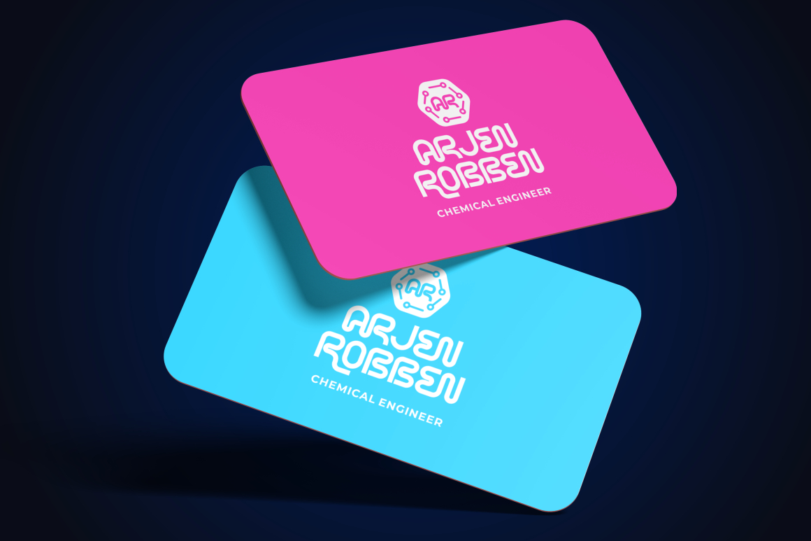
Sparkster uses bold, sleek forms inspired by modern digital technology. Uppercase and lowercase characters, OpenType alternates, ligatures, multilingual support, and webfont files provide flexibility for logos, packaging, titles, UI-related promotional visuals, and digital campaigns. Its confident silhouette makes it effective for fast-moving financial products that want a stronger technology identity.
PROS: Bold futuristic silhouette, alternates and ligatures, broad character support, webfont format, and strong campaign visibility.
BEST FOR: Payment platforms, crypto exchanges, trading campaigns, financial apps, digital-wallet launches, technology conferences, and fintech social media.
4. Modish Frame Contemporary Font

Modish Frame brings a more fluid and artistic direction to finance branding. Its contemporary display construction combines futuristic oddity with expressive forms, helping a brand move beyond predictable circuit-board or corporate typography. It is most effective for short campaign statements and innovation-led identities where creativity is part of the value proposition.
PROS: Fluid experimental forms, high memorability, modern artistic character, strong visual differentiation, and campaign impact.
BEST FOR: Web3 communities, experimental fintech, creator-finance tools, innovation labs, youth-focused payment products, financial events, and limited campaigns.
5. Revera Logo Font

Revera is a modern logo typeface that combines clean lines with contrasting thin and bold strokes. Its controlled, minimalist construction can make a finance identity feel elegant and professional without depending on traditional institutional typography. The family’s clean and textured presentations also provide room for polished corporate use or more editorial campaign treatments.
PROS: Elegant construction, dynamic stroke contrast, clean logo performance, professional tone, and adaptable modern character.
BEST FOR: Wealth management, ESG funds, financial advisory, premium banking, investment reports, insurance, consulting, and executive communications.
Comparison
| Font | Visual Personality | Strongest Finance Role | Ideal Brand Category | Use With Care |
| Digitechno | Digital, futuristic, and technical | High-tech identity and campaign headlines | Crypto, APIs, cybersecurity, and digital banking | Avoid for small balances and long interface text |
| Vexorium | Architectural, progressive, and precise | Distinctive professional branding | SaaS, fintech infrastructure, investment, and ESG analytics | Pair with a simpler data typeface |
| Sparkster | Bold, sleek, and energetic | Product launches and promotional identity | Payments, wallets, exchanges, and trading | Keep functional screens restrained |
| Modish Frame | Fluid, experimental, and artistic | Innovation campaigns and cultural differentiation | Web3, creator finance, and youth fintech | Reserve for short display text |
| Revera | Elegant, controlled, and professional | Premium logos and editorial communication | Wealth, advisory, insurance, and ESG funds | Test thin details in small or low-resolution output |
Common Mistakes
The first mistake is using a futuristic display font throughout the entire financial interface. A strong technology font may create an effective logo or launch headline, but unusual cuts, tight counters, and experimental proportions can slow down the reading of balances, transaction histories, disclosures, and form instructions. Assign the display font a clear branding role, then use a dependable companion for daily financial tasks. The more experimental the logo becomes, the calmer the interface typography should be.
Another mistake is treating typography as a substitute for genuine trust. An elegant serif cannot repair hidden fees, just as a digital font cannot make an unreliable crypto product appear safe. Typography should reinforce observable business qualities such as transparency, security, accuracy, accessibility, and responsive service. Avoid copying category clichés without considering the brand’s real position. A sustainable investment fund, payment app, and trading platform may all operate in finance, but they should not communicate the same emotional promise.
The final mistake is approving the typography before testing accessibility, localization, technical delivery, and licensing. Check actual monetary values, currencies, translated content, data tables, mobile layouts, contrast, zoom, and print reproduction. PutraCetol’s current coverage selector distinguishes uses such as finished static work, webfont embedding, logo or trademark use, digital advertising, application or software use, and online platform or SaaS deployment. Select coverage according to the real implementation rather than assuming that one general license automatically covers every fintech touchpoint.
Conclusion
The best fintech fonts for finance brands create recognition without compromising the clarity required for financial decisions.
Digitechno communicates digital infrastructure and technical innovation. Vexorium offers a more architectural and progressive identity, while Sparkster gives fast-moving products a bold futuristic presence. Modish Frame supports experimental finance brands that want to challenge predictable visual conventions, and Revera provides the elegance needed for wealth, advisory, ESG, and premium financial services.
The correct choice depends on the business model and audience. A trading platform may need speed and technological confidence. An ESG fund may require calm authority and human relevance. A digital bank should balance innovation with clarity, while a wealth-management company may place greater emphasis on discretion and long-term trust.
Use expressive PutraCetol fonts where identity matters most: logos, campaign headlines, report covers, product launches, and branded storytelling. Support them with readable interface and data typography for navigation, forms, financial values, charts, and disclosures.
When the type system is clear, accessible, and consistent, typography becomes more than a decorative brand asset. It helps customers recognize the company, understand its information, and interact with financial products with greater confidence.
Explore these fonts and many more at PutraCetol.com to build a business identity that looks professional, trustworthy, and memorable.
Additionally, if you want to explore some free typography options, you can check out Putracetol Studio on Dafont. Happy reading and designing!