

The best way to choose from these 7 feminine fonts is to define the exact personality the design needs before comparing decorative details.
A bridal studio may want romantic calligraphy with expressive swashes. A skincare company might need a refined serif that feels calm and premium. A children’s lifestyle brand could use playful hand lettering, while a fashion label may prefer sharper editorial forms that communicate confidence rather than softness.
Feminine typography is not limited to pink colors, thin strokes, or elaborate scripts. It can be graceful, bold, playful, minimalist, nostalgic, artistic, or authoritative. The appropriate direction depends on the audience, product, price point, and emotional promise of the brand.
Write down three qualities the identity should express, such as:
- Romantic, personal, and delicate
- Refined, confident, and luxurious
- Playful, friendly, and imaginative
- Modern, artistic, and editorial
- Warm, handcrafted, and nostalgic
These words provide a better selection framework than choosing a font simply because it has flourishes or elegant curves.
What Makes a Font Feel Feminine?
A feminine visual character can emerge from several typographic qualities. Curved terminals can add softness, while generous spacing creates a calmer and more refined composition. High stroke contrast often feels editorial and luxurious, whereas handwritten movement can communicate personality and intimacy.
Decorative details can also shape the mood. Swashes, ligatures, alternate characters, and unusual letter connections give designers opportunities to create a wordmark that feels more personal. However, these features should support the brand name rather than make it harder to recognize.
The surrounding design is equally important. A typeface may appear romantic when paired with blush, ivory, floral photography, and generous white space. The same font can feel more contemporary when combined with monochrome colors, a strict grid, and minimal product photography.
Typography should therefore be evaluated as part of a complete identity system, not as an isolated specimen.
Major Feminine Typography Directions
Romantic Script Fonts
Script fonts imitate handwriting, brush lettering, or calligraphy. Their connected characters and changing stroke weights can make a logo feel personal and emotionally expressive.
They are particularly effective for weddings, beauty services, florists, candles, personal brands, stationery, and gift products. Because script letters can become dense at small sizes, they are best reserved for names, short headlines, signatures, and selected decorative phrases.
Refined Serif Fonts
Serif typography can communicate elegance without relying on handwriting. Graceful curves, controlled contrast, sharp terminals, and balanced proportions can create a sophisticated identity suitable for premium branding.
This direction works well for fashion, beauty, jewelry, hospitality, fragrance, editorial design, and luxury packaging. A refined serif can also make a brand feel more established and confident than a delicate script.
Modern Stylish Serifs
Modern serif fonts frequently introduce unusual cuts, distinctive alternates, experimental proportions, or editorial details. They retain the refinement of traditional serif typography while giving the brand a more current personality.
Use this style when the identity should feel feminine but not conventionally romantic. It can support independent fashion labels, creative studios, contemporary beauty products, magazines, and culture-led campaigns.
Playful Hand-Lettered Fonts
Not every feminine identity needs to be delicate or luxurious. Bold, irregular, and cheerful hand-lettered fonts can express imagination, friendliness, and youthful energy.
They are useful for children’s fashion, craft businesses, birthday products, stationery, educational projects, family brands, and colorful lifestyle campaigns. Pair them with an organized layout so the result remains professional.
How to Choose the Right Feminine Font
Test the Actual Brand Name
A font specimen may use a carefully selected word that shows its best characters. Your brand name will contain a different combination of capitals, repeated letters, ascenders, descenders, and spacing challenges.
Type the complete name before making a decision. Check whether the first letter is too dominant, whether swashes collide, and whether repeated characters create an awkward rhythm.
Try the standard characters first. Then introduce alternates or ligatures only where they improve balance, readability, or distinction.
Match the Font to the Customer Experience
Typography creates expectations. A delicate calligraphic logo may promise personalized, premium service. A strong editorial serif may suggest expertise and confidence, while an irregular hand-lettered font can create a more casual and playful impression.
The actual customer experience should support that visual promise. A luxury serif will not compensate for poor packaging, confusing service, or inconsistent communication.
Build a Clear Typographic Hierarchy
An expressive feminine font should not be responsible for every piece of communication. Use it for the brand name, campaign headline, collection title, or packaging focal point.
Pair it with a simpler typeface for:
- Product descriptions
- Website navigation
- Ingredients and instructions
- Prices and dates
- Contact details
- Legal information
- Long-form editorial content
This division keeps the identity distinctive while protecting readability.
Think Beyond Predictable Color Palettes
Blush, pink, cream, and rose gold can support feminine branding, but they are not the only options.
Deep burgundy can feel romantic and mature. Forest green can give a beauty brand a botanical personality. Navy and ivory create restrained elegance, while black and soft white can make feminine typography feel more editorial.
A children’s or craft brand may use coral, lavender, mint, yellow, or bright blue. The color system should express the brand’s specific personality instead of repeating a generic feminine formula.
Test Real Production Conditions
Fine strokes and decorative terminals may look clear on a large monitor but disappear on product labels, foil stamping, embroidery, or social media thumbnails.
Evaluate the design at its actual size. Check it on light and dark backgrounds, in monochrome, and on the material where it will be printed. Create a simplified logo variation when detailed alternates cannot survive smaller applications.
Jump to Recommended Fonts
Beauty And Love | Child Krafter | Zeviero | Werd | Reske Wuite | Chiralla | Grey Jewelry
1. Beauty And Love

Beauty And Love is a coordinated three-part family rather than a single romantic script. It combines a modern script with extensive alternate characters, a cute playful sans serif, and a dingbat font containing 52 heart symbols, allowing designers to build wordmarks, supporting text, and decorative motifs within one system. Ligatures, multilingual support, and OTF, TTF, and WOFF formats make it particularly useful for projects that need both emotional lettering and practical design flexibility.
PROS: Script and sans serif pairing, 52 heart symbols, alternate characters, ligatures, and multilingual support.
BEST FOR: Wedding invitations, beauty branding, Valentine campaigns, stationery, greeting cards, romantic packaging, and social media graphics.
2. Child Krafter

Child Krafter demonstrates that feminine typography can be bold, cheerful, and imaginative rather than delicate. Its uneven hand-lettered construction and playful rhythm give titles an approachable handcrafted personality, while OpenType alternates and ligatures allow repeated words to feel less mechanical. The family includes uppercase and lowercase characters, numbers, punctuation, symbols, multilingual support, and OTF, TTF, and WOFF files.
PROS: Playful hand-lettered appearance, bold readability, OpenType options, and broad character support.
BEST FOR: Children’s fashion, craft businesses, birthday products, family brands, stationery, educational materials, and cheerful packaging.
3. Zeviero

Zeviero is a stylish serif family available in regular and textured versions, giving designers a choice between a cleaner presentation and a more tactile vintage treatment. Its confident display personality can bring elegance to a brand without becoming as delicate as a calligraphic script. The coordinated styles make it useful for developing polished primary branding alongside more expressive campaign or packaging variations.
PROS: Clean and textured styles, elegant serif personality, strong display value, and flexible visual storytelling.
BEST FOR: Fashion labels, beauty packaging, editorial covers, wedding businesses, boutique products, greeting cards, and lifestyle branding.
4. Werd Modern Stylish Serif Font

Werd is a substantial six-style family that includes a regular font, two display variations, and textured versions of all three directions. Its swashes, stylistic sets, stylistic alternates, contextual alternates, and ligatures provide extensive control over logos and prominent typography without requiring a completely custom typeface. With multilingual support and several coordinated treatments, Werd can carry a sophisticated identity across clean packaging, tactile campaigns, editorial layouts, and branded merchandise.
PROS: Six styles, clean and textured options, extensive OpenType features, and broad identity-system flexibility.
BEST FOR: High-fashion branding, premium cosmetics, editorial design, book covers, fragrance packaging, apparel, and sophisticated promotional campaigns.
5. Reske Wuite
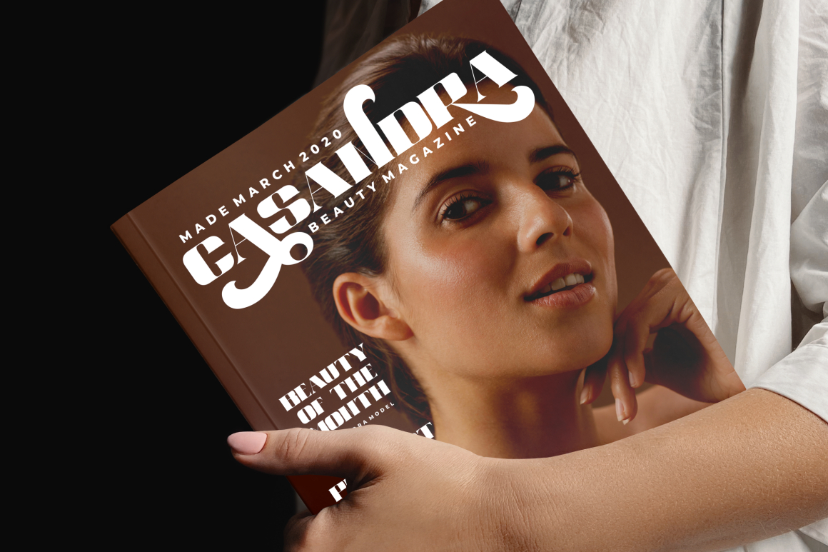
Reske Wuite combines an elegant serif foundation with regular and stamped styles. The clean treatment supports polished logos and refined packaging, while the stamped version introduces texture for brands that need a more handcrafted, vintage, or artisanal mood. Its substantial forms make it effective for headings, logotypes, product packaging, book covers, apparel, and album artwork.
PROS: Regular and stamped styles, elegant structure, tactile character, and strong headline presence.
BEST FOR: Artisan beauty products, perfume, boutique food, heritage fashion, handmade goods, book covers, and premium rustic branding.
6. Chiralla
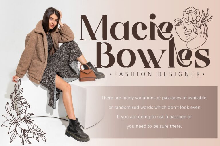
Chiralla is an elegant and classy serif inspired by modern luxury typography. Its OpenType system includes swashes, stylistic sets, stylistic alternates, contextual alternates, and ligatures, giving designers many ways to personalize a wordmark while maintaining one consistent typeface. Multilingual support and OTF, TTF, and WOFF formats make it suitable for coordinated print and digital identity work.
PROS: Rich OpenType selection, luxury personality, multilingual support, and extensive wordmark customization.
BEST FOR: Bridal studios, luxury beauty, premium invitations, fashion, florists, elegant packaging, editorial titles, and boutique hospitality.
7. Grey Jewelry Stylish Beautiful Serif

Grey Jewelry is a modern luxury serif family with regular and display styles, allowing designers to create both controlled supporting typography and more prominent brand moments. Its swashes, stylistic sets, stylistic and contextual alternates, and ligatures provide several paths for customizing names, headlines, and packaging titles. The font also supports multiple languages and is supplied in OTF, TTF, and WOFF formats for varied design applications.
PROS: Regular and display styles, extensive alternates, polished luxury character, and multilingual coverage.
BEST FOR: Jewelry brands, cosmetics, fashion campaigns, perfume packaging, beauty editorials, wedding stationery, and premium lifestyle identities.
Comparison
| Font | Typographic Direction | Main Personality | Standout Feature | Strongest Application |
|---|---|---|---|---|
| Beauty And Love | Script, sans serif, and dingbat family | Romantic and affectionate | 52 heart symbols and coordinated font styles | Weddings and romantic branding |
| Child Krafter | Bold hand-lettered display | Playful and youthful | Uneven forms with OpenType alternates | Kids, crafts, and family products |
| Zeviero | Stylish serif | Elegant and tactile | Regular and textured versions | Fashion and lifestyle branding |
| Werd | Modern serif family | Editorial and sophisticated | Six coordinated clean and textured styles | Fashion, beauty, and premium campaigns |
| Reske Wuite | Elegant serif | Refined and handcrafted | Regular and stamped treatments | Artisan and heritage-inspired brands |
| Chiralla | Luxury serif | Graceful and expressive | Extensive swashes and alternates | Bridal, beauty, and luxury identities |
| Grey Jewelry | Modern luxury serif | Polished and fashionable | Regular and display styles | Jewelry, cosmetics, and editorial work |
Common Mistakes When Using Feminine Fonts
The first mistake is assuming that a feminine identity must use thin pink calligraphy. This narrow approach can make unrelated brands look interchangeable and may conflict with the product’s real personality. A fitness brand, creative children’s label, luxury jewelry company, and botanical skincare business can all use feminine typography, but each needs a different combination of weight, structure, color, and emotional tone. Begin with the audience and brand position, then decide whether femininity should feel romantic, bold, playful, natural, artistic, or authoritative.
Another common mistake is applying every available swash, ligature, and alternate character to one wordmark. OpenType features are valuable because they can improve difficult letter combinations and create selected signature moments, not because every letter needs decoration. Begin with standard characters, adjust the spacing, and introduce alternates only where they improve the silhouette. The same restraint should guide the wider identity. Use the expressive typeface for major brand moments and a simpler companion for instructions, body copy, prices, and functional digital content.
The final mistake is approving typography from a large mockup without testing actual production. Fine serifs can disappear in foil stamping, script connections can become crowded in a small social profile, and textured details may fill during printing or embroidery. Test every logo at realistic sizes and prepare simplified, monochrome, horizontal, stacked, and icon-sized versions where necessary. Before commercial production, also confirm that the selected license covers the intended logo or trademark, website embedding, packaging quantities, merchandise, advertising, or editable products.
Conclusion
These 7 feminine fonts demonstrate that feminine typography can communicate far more than delicacy. It can be romantic, playful, editorial, luxurious, handcrafted, contemporary, or confidently expressive.
Beauty And Love provides a coordinated romantic system, while Child Krafter brings bold and youthful energy. Zeviero combines polish with tactile texture, and Werd offers a broad family for sophisticated identity systems. Reske Wuite supports refined artisan storytelling, Chiralla provides extensive luxury customization, and Grey Jewelry brings a fashionable finish to premium branding.
Choose the font according to the customer, product, and emotional promise rather than a generic idea of femininity. Test the real brand name, use alternates selectively, pair display typography with a readable supporting font, and evaluate the design in every intended format.
Fonts from PutraCetol Studio can help beauty, fashion, wedding, lifestyle, and creative brands build identities that feel elegant and memorable without losing their individual character.
Explore these fonts and many more at PutraCetol.com to build a business identity that looks professional, trustworthy, and memorable.
Additionally, if you want to explore some free typography options, you can check out Putracetol Studio on Dafont. Happy reading and designing!