
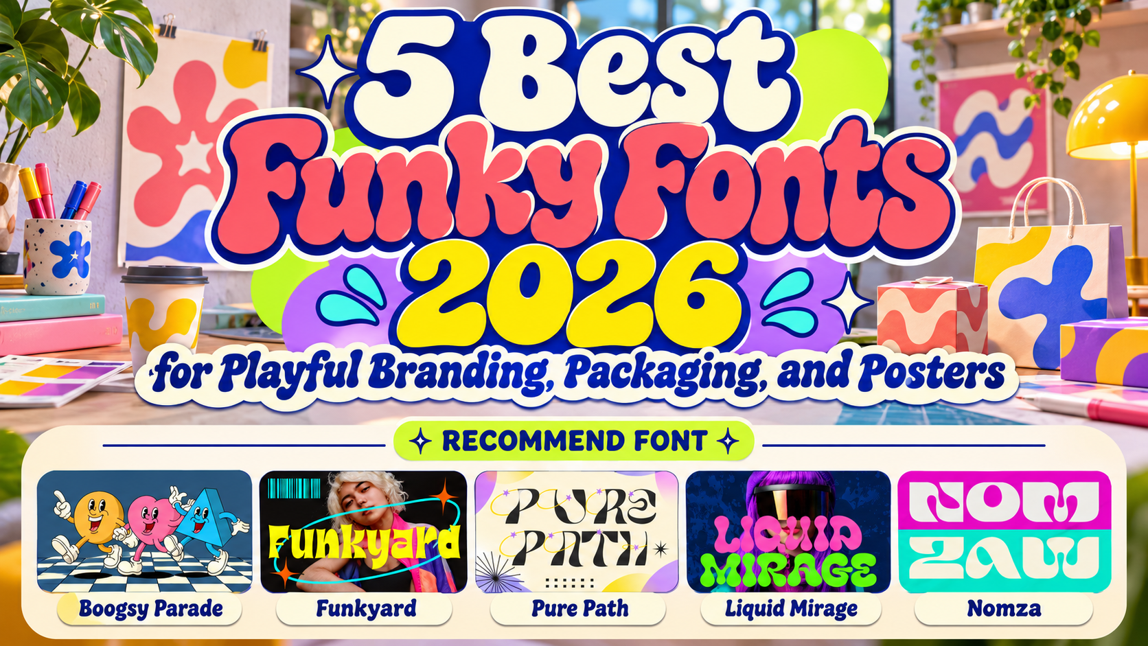
Best Funky Decorative Fonts for Branding 2026
Funky typography is not designed to disappear quietly into a layout.
It uses exaggerated shapes, unexpected curves, oversized counters, fluid forms, decorative details, and unconventional proportions to turn words into visual objects. For modern brands competing for attention on packaging shelves, social feeds, event posters, and ecommerce campaigns, that expressive quality can be extremely valuable.
The best funky decorative fonts for branding 2026 combine personality with enough structure to keep the brand recognizable.
The category is also broader than classic 1970s groovy typography. Contemporary funky fonts can feel futuristic, psychedelic, Y2K-inspired, experimental, or digitally surreal. Choosing the right one depends on the emotion the brand needs to communicate.
Decide What Kind of “Funky” Fits the Brand
Start with personality rather than decoration.
A beverage startup may need fluid, colorful typography. A fashion label might benefit from experimental geometry, while a retro café could use inflated psychedelic forms. Youth-oriented campaigns can support much more visual exaggeration than premium corporate branding.
Also consider how often the font will appear.
A distinctive decorative typeface is excellent for logos, packaging names, campaign headlines, event graphics, and social-media covers, but the same complexity can become exhausting in long paragraphs.
Let the funky typeface become the hero, then support it with simpler typography.
Jump to Recommended Funky Decorative Fonts
1. Nomza Modern Bold Display Font

Nomza combines chunky weight, rounded construction, soft corners, curved cuts, and playful negative spaces to create a bold contemporary silhouette. Its broad structure gives short names strong recognition, while experimental counters and unusual internal shapes add a pop-inspired, slightly futuristic personality. PutraCetol positions it for logos, advertising, posters, magazine covers, stickers, social graphics, product campaigns, entertainment, food, drinks, games, and creative technology.
Nomza is particularly useful when a brand wants to feel young and unconventional without leaning completely into retro nostalgia.
PROS: Heavy visual impact, rounded experimental geometry, strong short-word recognition, modern playful energy.
BEST FOR: Ecommerce launches, snack brands, beverages, entertainment, creative studios, youth campaigns, digital products.
2. Liquid Mirage Psychedelic Style Font
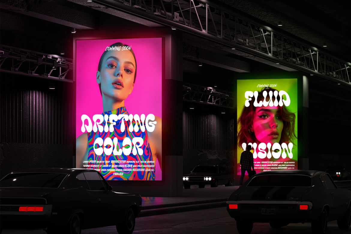
Liquid Mirage is the most fluid and surreal option in this collection. Its wide letterforms use thick rounded strokes, melting curves, soft edges, bulb-like terminals, and inflated shapes that create a continuous psychedelic rhythm. The font mixes retro groovy influence with futuristic energy, making it especially effective when typography needs to become the central visual element rather than simply support an illustration.
Its immersive movement works particularly well with bold colors, gradients, nightlife graphics, and experimental layouts.
PROS: Fluid organic rhythm, wide expressive forms, memorable psychedelic identity, excellent headline presence.
BEST FOR: Music, festivals, nightlife, beverage packaging, album covers, cafés, entertainment, experimental campaigns.
3. Pure Path Contemporary Font

Pure Path takes funky typography toward a more contemporary experimental direction. It combines sharp geometric cuts with flowing curves and decorative star swashes, creating a visual rhythm that feels artistic, playful, and slightly retro-futuristic rather than conventionally groovy.
This balance makes it useful for brands that want unusual typography while retaining enough clarity for modern campaign work.
PROS: Experimental geometry, flowing shapes, decorative accents, contemporary retro-futuristic personality.
BEST FOR: Fashion, creative studios, music covers, posters, youth branding, editorial graphics, digital campaigns.
4. Funkyard Funky Font

Funkyard combines retro nostalgia with a stronger Y2K and pop-culture influence. Its exaggerated letterforms use sharp curves, wide counters, lively proportions, and bold movement, giving each word an energetic silhouette while keeping the overall structure readable. The family includes two styles and supports OpenType features such as alternates or ligatures, giving designers extra flexibility when building logos or campaign headlines.
Funkyard is especially useful when a project needs to feel playful, youthful, and unmistakably graphic.
PROS: Bold Y2K energy, two styles, expressive proportions, strong readability, OpenType options.
BEST FOR: Packaging, music, fashion, magazines, posters, food branding, events, playful advertising.
5. Boogsy Parade Retro Psychedelic Font
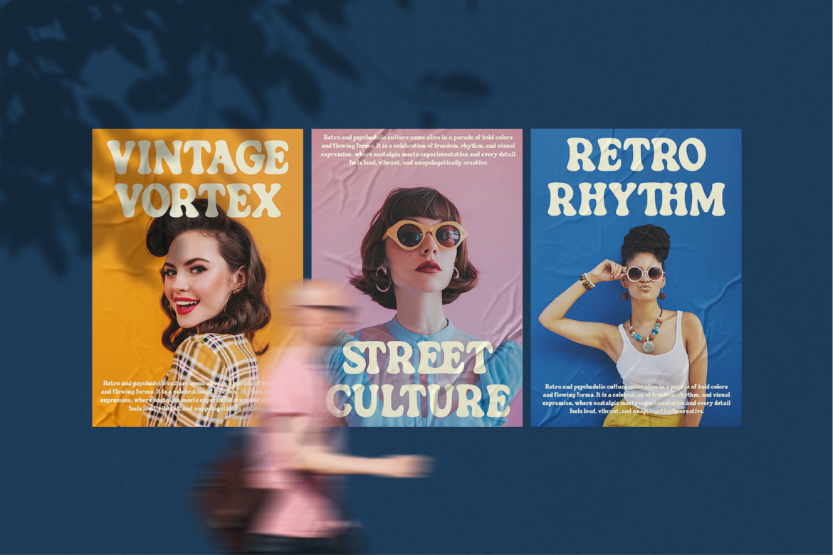
Boogsy Parade brings a more nostalgic psychedelic personality through thick rounded strokes, broad proportions, inflated curves, and gently uneven contours. Its strong silhouette makes short words highly recognizable, while the flowing shapes give layouts the movement associated with retro festival posters and groovy 1970s-inspired graphics.
Unlike more chaotic experimental fonts, Boogsy Parade retains enough structural simplicity to work effectively across signs, logos, packaging, and promotional campaigns.
PROS: Thick rounded forms, retro psychedelic rhythm, broad silhouette, strong visual recognition.
BEST FOR: Retro cafés, festivals, vintage stores, music venues, lifestyle brands, event graphics, packaging.
Comparison: Which Funky Font Fits Your Brand?
| Font | Main Personality | Strongest Direction |
|---|---|---|
| Nomza | Bold, modern, playful | Youth and product branding |
| Liquid Mirage | Fluid, psychedelic | Music and entertainment |
| Pure Path | Experimental, contemporary | Fashion and creative campaigns |
| Funkyard | Y2K, energetic | Packaging and pop branding |
| Boogsy Parade | Retro psychedelic | Events and nostalgic lifestyle |
Choose Nomza for contemporary commercial impact, Liquid Mirage for maximum visual fluidity, Pure Path for experimental fashion-oriented design, Funkyard for Y2K energy, and Boogsy Parade for stronger retro nostalgia.
How to Make Funky Typography Work in Branding
Funky fonts are already visually active, so the supporting design often benefits from restraint.
Give the lettering space. Use simple grids, controlled color systems, and fewer competing decorative elements. When packaging already contains illustration, photography, patterns, and bright colors, the typography should still have a clear hierarchy.
Designers can explore these fonts through PutraCetol Studio and test real brand names before deciding. Word shape matters enormously with decorative fonts because a typeface that looks excellent in one short name may behave very differently in another.
Common Mistakes
One common mistake is using “funky” as a substitute for brand strategy. A playful font can attract attention, but its personality still needs to match the audience and product. Psychedelic typography may work brilliantly for a music festival but feel confusing for a brand that needs quiet professionalism.
Another mistake is making every visual element equally expressive. Funky typography, colorful illustration, distorted photography, gradients, stickers, and patterns can quickly compete with one another. Decide which element should dominate and allow the others to support it.
Finally, test decorative fonts at real sizes. Complex counters, swashes, and unusual cuts can lose clarity on small labels, mobile ads, and social thumbnails. A memorable brand still needs to be recognizable after the artwork becomes small.
Conclusion
The best funky decorative fonts for branding 2026 prove that expressive typography can take many different forms.
Nomza brings bold contemporary energy, Liquid Mirage creates psychedelic fluidity, Pure Path combines modern experimentation with decorative geometry, Funkyard delivers lively Y2K character, and Boogsy Parade introduces nostalgic groovy rhythm.
The strongest choice is the font whose personality feels naturally connected to the brand.
When typography, product, audience, and visual system all point in the same direction, funky lettering becomes much more than decoration. It becomes part of the identity people remember.
Explore these fonts and many more at PutraCetol.com to build a business identity that looks professional, trustworthy, and memorable.
Additionally, if you want to explore some free typography options, you can check out Putracetol Studio on Dafont. Happy reading and designing!