
Best Fantasy Fonts 2026: Typography for Magical Worlds
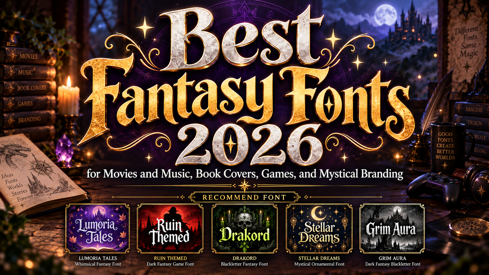
Choose the World Before the Typeface
The best fantasy fonts 2026 should communicate a specific world, not merely look decorative. Decide whether the project belongs to a luminous fairy tale, an ancient ruined kingdom, a celestial dreamscape, a rebellious Gothic realm, or a darker supernatural universe.
Use the font for a logo, book title, game name, poster headline, or opening sequence. Pair it with a simpler serif or sans serif for descriptions, menus, credits, and longer reading. This keeps the atmosphere strong without sacrificing clarity.
What Makes a Fantasy Font Effective?
A successful fantasy typeface combines recognizable letters with unusual details suggesting myth, magic, history, or mystery. These may include ornamental curves, pointed serifs, strong contrast, irregular contours, celestial symbols, or distressed surfaces.
Flowing curls suit enchanted worlds, while angular blackletter works better for dark castles and powerful factions. Test the real title in one color and at thumbnail size before adding glow, metal, smoke, or texture.
Jump to Recommended Fonts
Lumoria Tales | Ruin Themed | Drakord | Stellar Dreams | Grim Aura
1. Lumoria Tales Magical Fantasy Font
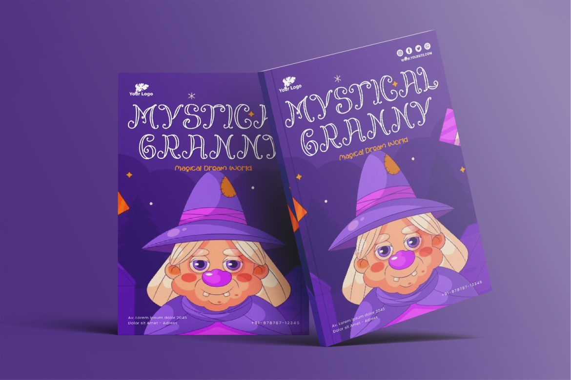
Lumoria Tales uses whimsical ornamental letterforms with elaborate curls and a fairy-tale personality. Its character set includes uppercase, lowercase, numerals, punctuation, and multilingual support for flexible titles, packaging, and campaign graphics.
PROS: Decorative charm, broad character support, playful elegance.
BEST FOR: Fairy-tale books, children’s fantasy, magical packaging, party posters, and enchanted logos.
2. Ruin Themed Logo Game Font
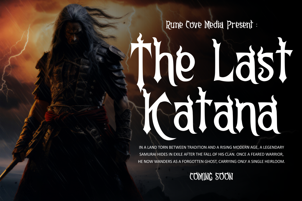
Ruin Themed uses tall proportions, sharp terminals, firm vertical emphasis, and contrast between heavy stems and narrower curves. Subtle irregularities create a weathered atmosphere while preserving structure for forceful names and headlines.
PROS: Strong silhouette, controlled distress, dramatic readability.
BEST FOR: RPG logos, ruined kingdoms, action games, fantasy films, posters, and apparel.
3. Drakord Blackletter Font
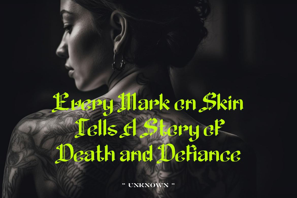
Drakord reinterprets classic blackletter through sharp high-contrast strokes, daring curves, and a rebellious modern edge. It carries the drama of medieval manuscripts into contemporary branding and entertainment graphics.
PROS: Gothic authority, energetic curves, strong title presence.
BEST FOR: Dark fantasy, tattoo art, rock covers, horror branding, game factions, and film titles.
4. Stellar Dreams Mystical Font
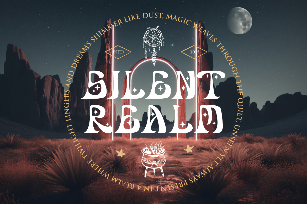
Stellar Dreams combines flowing organic shapes, whimsical stars, moonlike curves, and subtle retro-serif influence. Its irregular rhythm feels ethereal yet legible, making it suitable for designs that need wonder rather than aggression.
PROS: Celestial details, elegant movement, imaginative rhythm.
BEST FOR: Astrology, tarot branding, mystical books, invitations, dreamlike packaging, and magical campaigns.
5. Grim Aura Dark Fantasy Blackletter Font
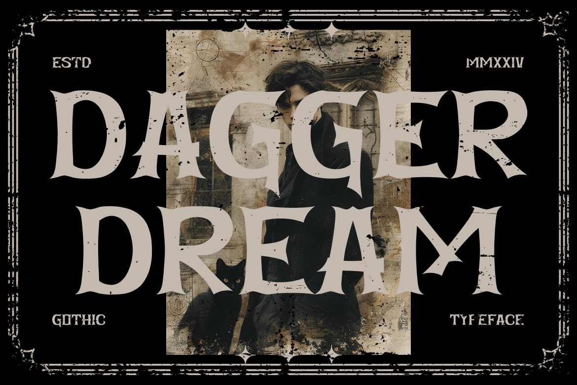
Grim Aura features tall proportions, angular strokes, heavy serifs, and pointed edges that evoke manuscripts, castles, and supernatural legends. Refined spacing balances its historical influence, producing a dark identity that remains readable at display sizes.
PROS: Commanding structure, sophisticated darkness, refined spacing.
BEST FOR: Dark-fantasy novels, Gothic posters, metal branding, Halloween products, film titles, and game worlds.
Comparison
| Font | Main Mood | Strongest Application |
|---|---|---|
| Lumoria Tales | Whimsical and magical | Fairy-tale covers and playful branding |
| Ruin Themed | Powerful and weathered | Game logos and cinematic titles |
| Drakord | Rebellious and Gothic | Music, tattoos, and dark entertainment |
| Stellar Dreams | Celestial and elegant | Mystical lifestyle and editorial design |
| Grim Aura | Ancient and ominous | Dark-fantasy publishing and games |
Common Mistakes
The first mistake is choosing a fantasy font only because it contains dramatic ornaments. A typeface may look impressive in a specimen but become unclear on a long title, narrow spine, mobile thumbnail, or game menu. Test the exact wording, check repeated letters, refine spacing, and simplify effects at smaller sizes.
Another mistake is mixing too many fantasy languages inside one identity. Celestial curves, distressed ruins, Gothic blackletter, metallic runes, and fairy-tale flourishes can each work, but combining them makes the world inconsistent. Select one dominant tradition and let color, illustration, symbols, and typography reinforce the same narrative.
The final mistake is using the display font everywhere. Fantasy letterforms work best where atmosphere and recognition matter, while body copy, instructions, subtitles, and interface controls need simplicity. Pair the expressive PutraCetol font with functional typography, and confirm that the license covers publishing, logos, webfonts, advertising, merchandise, apps, or games.
Conclusion
The best fantasy fonts 2026 turn typography into part of the imagined world. Lumoria Tales creates playful enchantment, Ruin Themed delivers weathered strength, Drakord adds rebellious Gothic drama, Stellar Dreams introduces celestial elegance, and Grim Aura builds a commanding dark-fantasy atmosphere.
Use these PutraCetol Studio fonts for book covers, game identities, posters, packaging, campaigns, and multimedia titles. The strongest choice is not simply the most ornamental font, but the one whose shapes and rhythm make the fantasy world believable before the full story begins.
Explore these fonts and many more at PutraCetol.com to build a business identity that looks professional, trustworthy, and memorable.
Additionally, if you want to explore some free typography options, you can check out Putracetol Studio on Dafont. Happy reading and designing!