
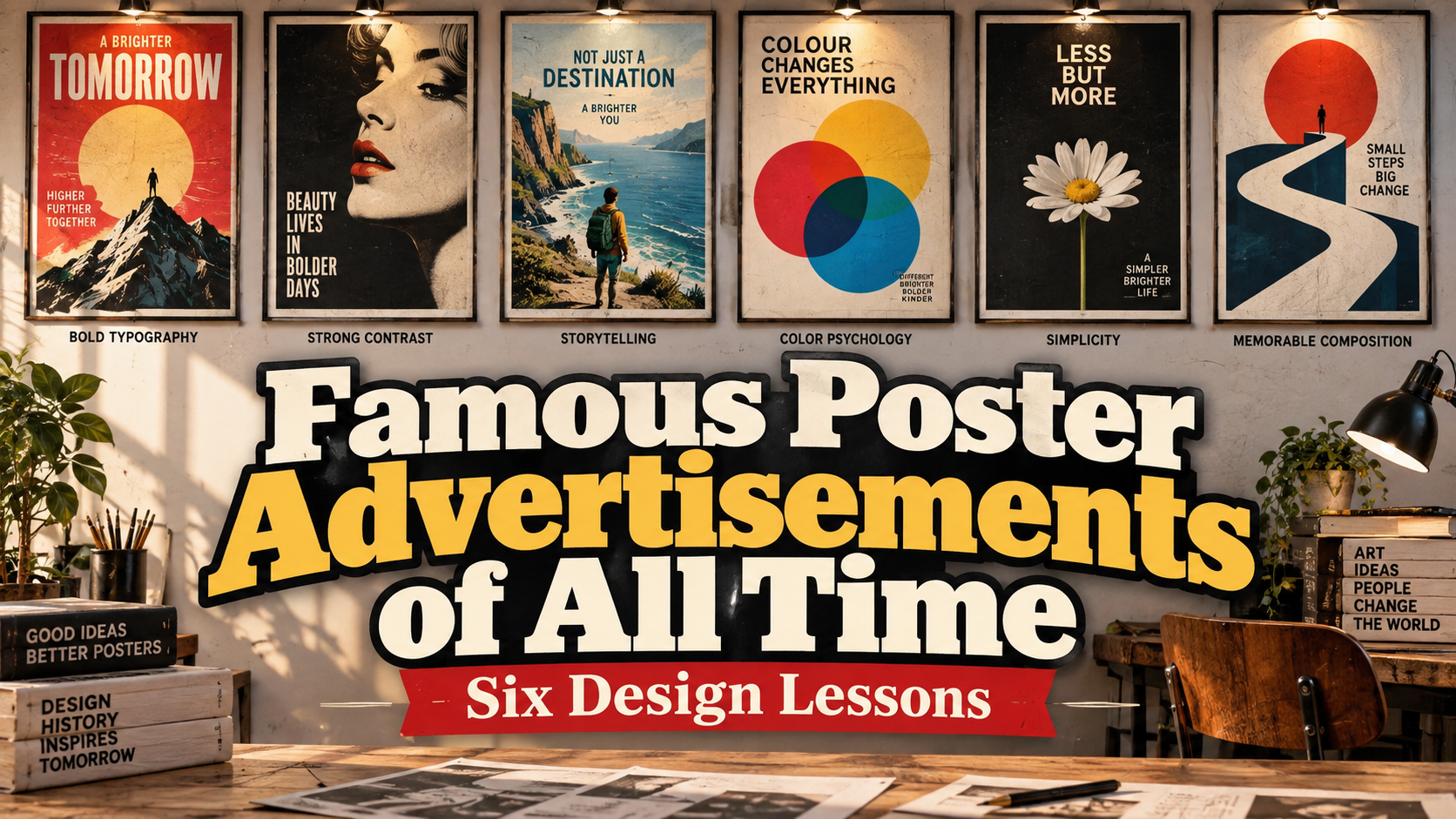
Famous Poster Advertisements of All Time: Six Lessons in Visual Persuasion
Study the Message Before the Style
When studying famous poster advertisements, ask three questions: what is being promoted, what should the audience feel, and which visual decision communicates that promise?
Do not start by copying vintage colors or decorative lettering. Identify the underlying idea, then reinterpret it for your audience.
These six influential designs span products, entertainment, and travel; they are not ranked by sales.
Six Iconic Advertising Posters Worth Studying
1. Moulin Rouge: La Goulue, 1891
Henri de Toulouse-Lautrec created this advertisement for the Parisian dance hall. The Metropolitan Museum of Art identifies the large lithograph as the commission that launched his poster-making career. Bold lettering, silhouetted spectators, and performers make the venue’s atmosphere central to the composition.
Design lesson: Sell the experience, not merely the address. For an event campaign, show the energy visitors can expect while keeping the name unmistakable.
2. Gismonda, 1894–1895
Alphonse Mucha designed this theatre poster in late 1894; it appeared across Paris on January 1, 1895. Its elongated format, restrained pastel palette, and dignified portrayal of Sarah Bernhardt offered an unusually composed promotional image. The Mucha Foundation documents how its reception led to a continuing professional collaboration.
Design lesson: Distinction can come from restraint. When competitors use aggressive color and crowded layouts, a quieter composition may offer a useful alternative. Build the typography, border, and image around one coherent personality.
3. Priester Matches
Lucian Bernhard reduced the advertisement to two matches against a plain background, with the brand name above. Cooper Hewitt identifies the design as an influential example of the object poster, where a central product and minimal wording carry the message.
Design lesson: Give the product a clear visual role. For a packaging launch or social advertisement, try one recognizable object, one name, and enough space to separate them. Add supporting claims only when they answer a genuine buying question.
4. Nord Express, 1927
A. M. Cassandre’s railway poster uses imposing locomotive forms and strong diagonals to convey modern transport. MoMA dates the lithograph to 1927.
Design lesson: Turn a functional benefit into a visual feeling. Instead of listing “fast” and “powerful,” explore perspective, direction, and scale. This approach offers a useful starting point for transport, logistics, technology, and automotive campaigns.
5. Vertigo, 1958
Saul Bass’s campaign for Alfred Hitchcock’s film uses a spiral and falling figures to suggest psychological instability. The design adapted its arrangement across poster formats while preserving the central motif. It demonstrates how one visual idea can connect promotional material with the film’s identity.
Design lesson: Find a symbol for the story’s central tension. For a contemporary campaign, choose a motif that can support posters, motion graphics, thumbnails, and opening titles without needing an entirely new concept for each format.
6. Jaws, 1975
The familiar shark-and-swimmer image originated in Roger Kastel’s illustration for the novel’s paperback edition and was subsequently used to promote the film. Its composition places an apparently vulnerable swimmer above a threatening shark, making danger understandable without a long explanation.
Design lesson: Create a clear relationship between two elements. Contrast safety with danger, expectation with surprise, or a problem with its solution. Let the viewer grasp the conflict before reading supporting copy.
Apply the Lessons to Modern Branding
Start with a sentence describing the audience, offer, and emotional promise. Sketch three compositions before choosing effects or software treatments.
Test the strongest concept as a printed poster and a small mobile preview. Check the headline, brand name, and next action. Adapt the arrangement to each format instead of shrinking the entire artwork.
Explore PutraCetol Studio for distinctive headline typography, then pair your selection with a readable supporting face. Aim for a visual voice that belongs to your brand rather than an imitation of historical lettering.
Comparison
| Poster | Main Creative Approach | Practical Application |
|---|---|---|
| Moulin Rouge | Communicate atmosphere | Events and entertainment |
| Gismonda | Distinctive restraint | Premium and cultural campaigns |
| Priester | Product-focused simplicity | Retail and product launches |
| Nord Express | Direction and scale | Transport and technology |
| Vertigo | Symbolic tension | Story-led campaigns |
| Jaws | Immediate visual conflict | Film and dramatic storytelling |
Common Mistakes
The first mistake is copying appearance without understanding purpose. A distressed texture or ornamental border cannot rescue an unclear offer. Translate the principle into your own brief, and create original artwork instead of closely reproducing a recognizable campaign.
Another mistake is equating fame with proven commercial performance. Museum recognition, cultural influence, and sales impact are different measures. Study these posters as communication examples, then evaluate your campaign through audience understanding, brand recognition, and relevant business outcomes.
Conclusion
The most useful lesson from famous poster advertisements is how decisively they organize attention. Start with one meaningful idea, give typography a clear role, and make the visual relationship understandable.
Combine those principles with original imagery and carefully selected PutraCetol Studio typography. A successful contemporary poster should feel relevant to its audience, not simply resemble a collectible from the past.
Explore these fonts and many more at PutraCetol.com to build a business identity that looks professional, trustworthy, and memorable.
Additionally, if you want to explore some free typography options, you can check out Putracetol Studio on Dafont. Happy reading and designing!