
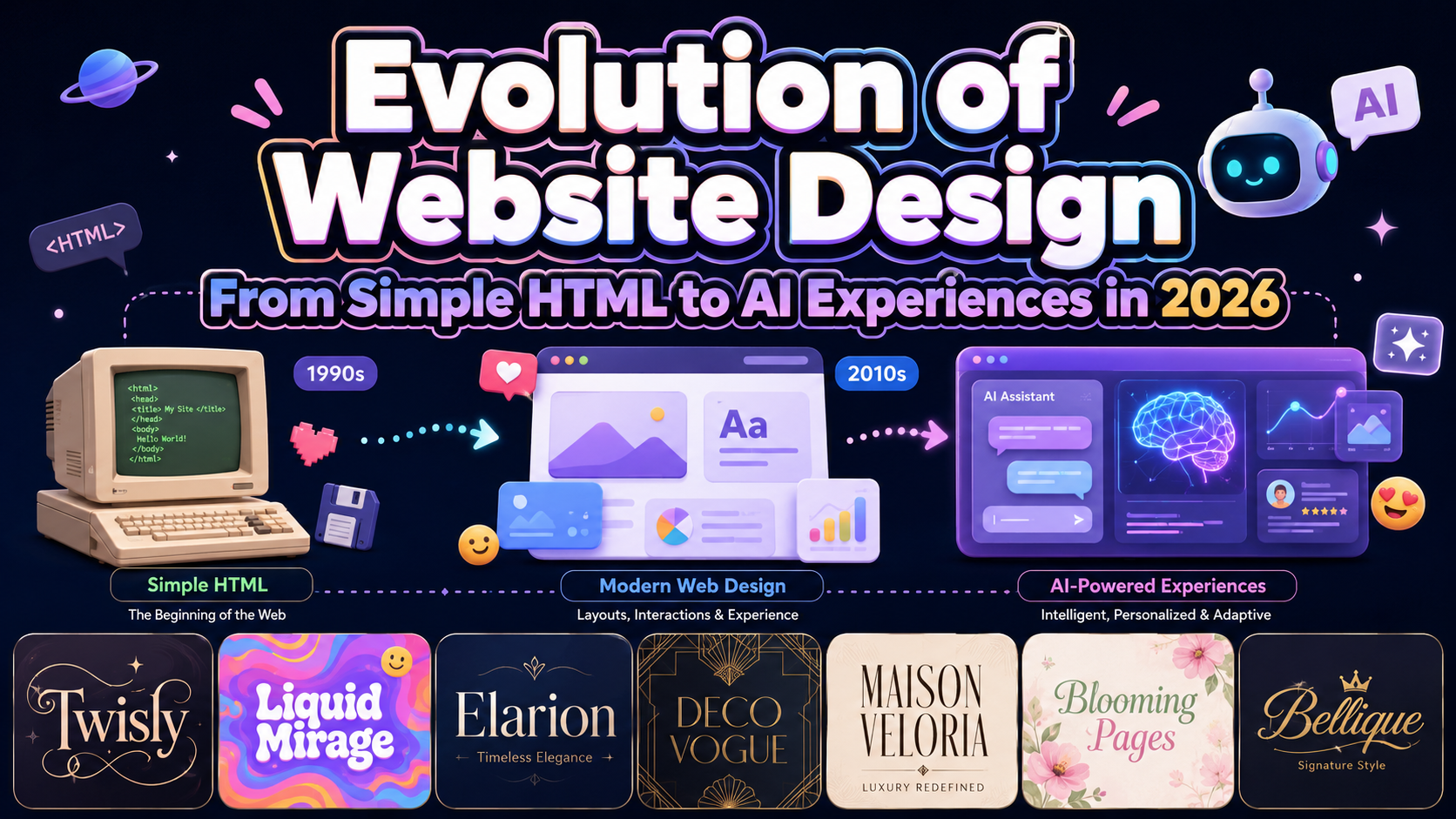
The most useful way to understand the evolution of website design is not to memorize visual trends. Instead, examine the limitations each generation of designers tried to overcome.
Early websites prioritized access to information. Table-based layouts gave designers more control. Flash introduced movement and immersive storytelling. Responsive design answered the growth of mobile devices. Design systems helped large teams maintain consistency. Today, AI and multimodal interfaces are changing how websites respond to individual users.
Before following a new trend, identify the problem it solves. A feature should improve comprehension, accessibility, speed, or task completion. Technology that adds complexity without improving the experience is decoration, not progress.
The Early HTML Era: Information Before Visual Identity
The earliest websites were primarily collections of text and hyperlinks. Pages had little visual hierarchy, limited typography, and almost no layout control. Yet their purpose was clear: connect documents and make information accessible across computers.
CERN’s preserved first website shows this original model clearly. It introduces the World Wide Web project through headings, short descriptions, and links to related documents. There are no elaborate visual effects because the value comes from the information structure itself.
This era established a principle that remains important in 2026: content should still make sense before visual styling is added.
Tables, GIFs, and CSS: The Search for Visual Control
As commercial websites appeared, businesses wanted pages that looked more like magazines, advertisements, and branded environments. Designers began using HTML tables for page layout, along with background images, animated GIFs, decorative buttons, and browser-specific techniques.
These solutions produced more visual freedom but often created rigid, complicated pages. CSS offered a better direction by separating document structure from presentation. The first CSS proposal appeared in 1994, and CSS Level 1 became a W3C Recommendation in December 1996.
This separation allowed one content structure to support different colors, spacing, typography, and layouts. It also created the foundation for modern responsive interfaces and webfont implementation.
The Flash Era: Websites Became Cinematic
Flash transformed websites into animated experiences. Brands used motion graphics, music, games, interactive menus, and cinematic introductions to create strong emotional impact.
The period proved that a website could be an experience rather than a static document. However, many Flash sites depended on browser plugins, loaded slowly, performed poorly on some devices, and made basic navigation difficult. Content could also be harder for search engines and assistive technologies to interpret.
Adobe ended support for Flash Player on December 31, 2020, as open technologies such as HTML5, WebGL, and WebAssembly matured. The lesson was not that animation is bad. It was that creativity should not depend on technology that restricts access.
Web 2.0: Users Became Participants
During the Web 2.0 era, websites developed from digital publications into platforms. Blogs, social networks, wikis, reviews, comments, user profiles, and web applications allowed visitors to create and organize content.
Tim O’Reilly described this transition through contrasts such as publishing versus participation, personal websites versus blogging, and content management systems versus wikis.
Design therefore needed to support accounts, feeds, notifications, forms, moderation, community interaction, and constantly changing information. The website was no longer a finished collection of pages. It became a living service shaped by both the company and its users.
Responsive and Mobile-First Design
The growth of smartphones exposed the limitations of fixed-width desktop layouts. Maintaining a separate mobile website for every device was difficult, expensive, and inconsistent.
In 2010, Ethan Marcotte introduced responsive web design as a combination of fluid grids, flexible images, and media queries. One experience could adapt across different screens instead of being recreated for every device.
Modern responsive design now considers more than screen width. It also addresses touch input, content priority, readable typography, device performance, orientation, and accessibility. Mobile design became a strategic starting point rather than a smaller version of desktop design.
Design Systems and Scalable Consistency
As websites expanded into complex product ecosystems, individual page mockups were no longer enough. Teams needed reusable buttons, forms, navigation patterns, spacing rules, colors, typography, and interaction states.
Design systems turned these decisions into shared components and documented standards. Design tokens made values such as color, radius, spacing, and type scale reusable across design and development tools. In October 2025, the Design Tokens Community Group published its first stable vendor-neutral format for exchanging these decisions between tools.
This phase changed the designer’s role. Designers were no longer creating only pages. They were building flexible systems that could produce thousands of consistent experiences.
Website Design in 2026: AI, Voice, and the Ambient Web
In 2026, website design is moving from responsive layouts toward responsive behavior. AI can assist with translation, content summarization, search, onboarding, support, recommendations, and contextual interface changes. Chrome’s built-in AI work includes browser-level language detection, translation, summarization, prompting, writing, and rewriting capabilities at different stages of availability.
Voice interaction is also becoming more connected to AI agents, immersive content, and alternative control methods. W3C discussions in 2026 have explored smarter voice interfaces, natural dialogue, 3D accessibility, gaze-aware systems, and agent-based interaction.
This contributes to the ambient web, where a digital experience may continue across websites, wearables, smart displays, voice assistants, vehicles, augmented reality, and connected objects. WCAG 3.0 remains a working draft, but its scope already considers wearables, Web of Things devices, virtual reality, augmented reality, and alternative forms of control.
The future website may not always look like a traditional page. However, transparency, user control, privacy, accessibility, and clear feedback must remain central.
Jump to Recommended Fonts
Twisly Twisted Serif Font | Liquid Mirage Psychedelic Style Font | Elarion Elegant Serif Font | Deco Vogue Art Deco Line Font | Maison Veloria Condensed Font | Blooming Pages Spring Font | Bellique Logo Script Font
Distinctive typography can connect modern web technology with a memorable brand identity. Use expressive fonts for logos, hero headlines, campaigns, and editorial moments, then pair them with a simpler typeface for navigation, forms, and long-form content.
1. Twisly Twisted Serif Font

Twisly combines a high-contrast serif structure with curved distortions, unusual terminals, and slightly condensed proportions. It gives modern websites an editorial, experimental personality while maintaining the sophistication needed for premium branding and fashion-led storytelling.
PROS: Distinctive structure, premium character, memorable headlines.
BEST FOR: Fashion websites, portfolios, magazines, beauty brands, and creative studios.
2. Liquid Mirage Psychedelic Style Font
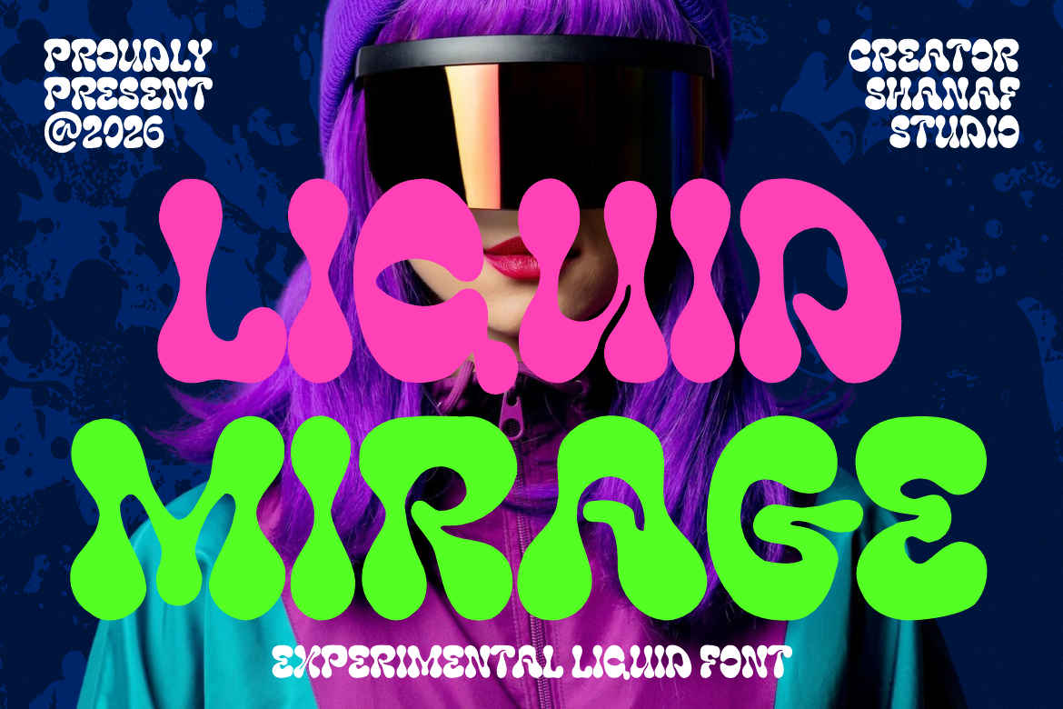
Liquid Mirage uses thick rounded strokes, melting curves, and organic forms inspired by liquid movement and psychedelic graphics. Its inflated silhouette can transform a landing-page headline into the main visual element, making it valuable for immersive and entertainment-focused web experiences.
PROS: Strong visual movement, expressive forms, high campaign impact.
BEST FOR: Music, festivals, beverages, nightlife, gaming, and experimental portfolios.
3. Elarion Elegant Serif Font

Elarion features tall letterforms, refined contrast, graceful curves, and balanced spacing. It offers the calm authority needed for sophisticated websites while giving logos, editorial headlines, and premium product pages a polished visual voice.
PROS: Elegant contrast, clear display readability, trustworthy personality.
BEST FOR: Luxury brands, hotels, galleries, architecture, beauty, and jewelry.
4. Deco Vogue Art Deco Line Font
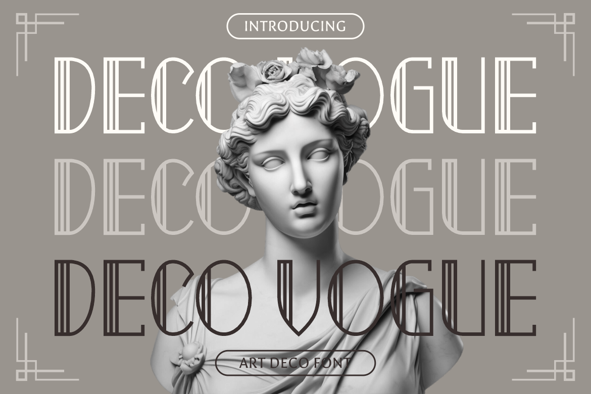
Deco Vogue combines elongated proportions, thin linear construction, geometric structure, and decorative Art Deco influence. Its airy appearance creates glamour without excessive visual weight, making it effective for elegant hero sections and architectural branding.
PROS: Architectural elegance, light visual texture, distinctive geometry.
BEST FOR: Luxury property, exhibitions, fashion, events, and boutique websites.
5. Maison Veloria Condensed Font

Maison Veloria uses tall, narrow letterforms with smooth strokes and subtle vintage warmth. Its condensed structure allows longer headings or brand names to fit limited spaces while preserving clarity and a refined handcrafted atmosphere.
PROS: Space-efficient, polished, readable, and versatile.
BEST FOR: Cafés, bakeries, hospitality, artisan products, menus, and editorial websites.
6. Blooming Pages Spring Font
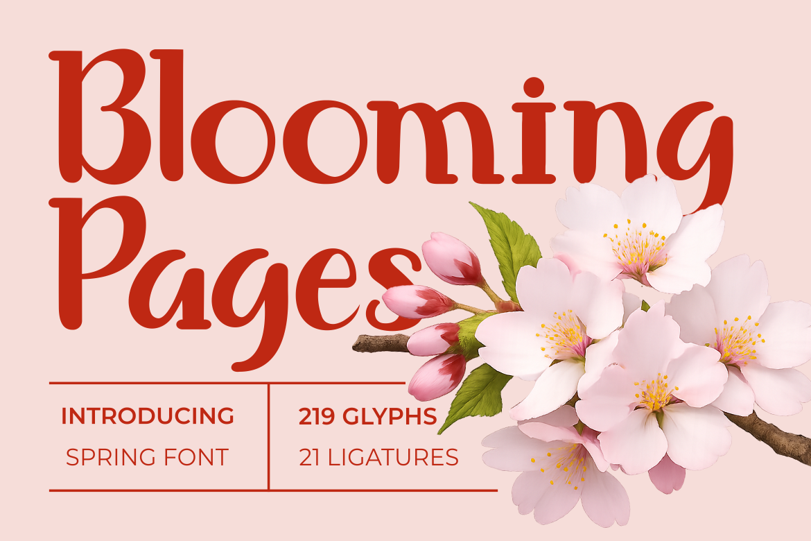
Blooming Pages blends slim serif forms, soft curves, rounded terminals, decorative alternates, and gentle ligatures. It adds botanical warmth and romantic personality to digital storytelling without losing the structured silhouette needed for polished branding.
PROS: Graceful appearance, decorative flexibility, warm brand personality.
BEST FOR: Florists, wellness brands, weddings, boutiques, beauty, and seasonal campaigns.
7. Bellique Logo Script Font
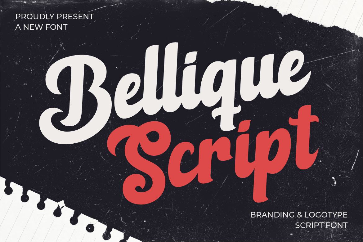
Bellique is a bold connected script with smooth curves, tapered endings, and an energetic baseline. Its flowing construction gives digital brands a recognizable logotype while communicating speed, movement, and human expression.
PROS: Dynamic rhythm, strong logo presence, expressive movement.
BEST FOR: Sports, fitness, footwear, active lifestyle, and promotional websites.
Comparison
| Font | Design Personality | Strongest Website Role | Ideal Direction |
|---|---|---|---|
| Twisly | Editorial and experimental | Fashion hero headings | Premium creativity |
| Liquid Mirage | Fluid and psychedelic | Immersive campaign titles | Entertainment |
| Elarion | Elegant and authoritative | Luxury brand identity | Refined trust |
| Deco Vogue | Geometric and glamorous | Architectural headlines | Art Deco luxury |
| Maison Veloria | Condensed and artisanal | Space-efficient branding | Hospitality |
| Blooming Pages | Botanical and romantic | Lifestyle storytelling | Soft elegance |
| Bellique | Energetic and expressive | Digital logotypes | Active branding |
Common Mistakes
One common mistake is copying the visual appearance of a historical era without understanding its limitations. A retro table layout, Flash-inspired animation, or Web 2.0 glossy button may be useful as an aesthetic reference, but recreating the original usability problems adds no value. Historical inspiration should be rebuilt with semantic HTML, responsive CSS, accessible interaction, and modern performance standards.
Another mistake is treating AI, motion, or personalization as a substitute for information architecture. A website can generate recommendations and conversational responses while still having confusing navigation, unclear pricing, inaccessible controls, or weak content. AI features should explain what they are doing, request only necessary data, allow correction, and provide a reliable non-AI path for essential tasks.
The final mistake is allowing expressive typography to dominate every interface element. A decorative font may create an excellent hero headline but become difficult to read in menus, forms, product descriptions, or mobile buttons. Use display fonts strategically, pair them with a neutral companion, test them across actual screen sizes, and select the correct webfont coverage before embedding font files.
Conclusion
The evolution of website design is a continuous movement from static documents toward adaptive digital environments. HTML made information linkable, CSS created visual control, Flash explored immersion, Web 2.0 encouraged participation, responsive design supported multiple devices, and design systems introduced scalable consistency.
In 2026, AI, voice interaction, wearables, and ambient interfaces are expanding the web beyond conventional pages. Yet the purpose of good design remains unchanged: help people understand, decide, and act with confidence.
Fonts from PutraCetol Studio can give these modern experiences a recognizable visual character. The strongest results come from combining expressive typography with clear structure, inclusive interaction, responsible technology, and a deep understanding of the user.
Explore these fonts and many more at PutraCetol.com to build a business identity that looks professional, trustworthy, and memorable.
Additionally, if you want to explore some free typography options, you can check out Putracetol Studio on Dafont. Happy reading and designing!