
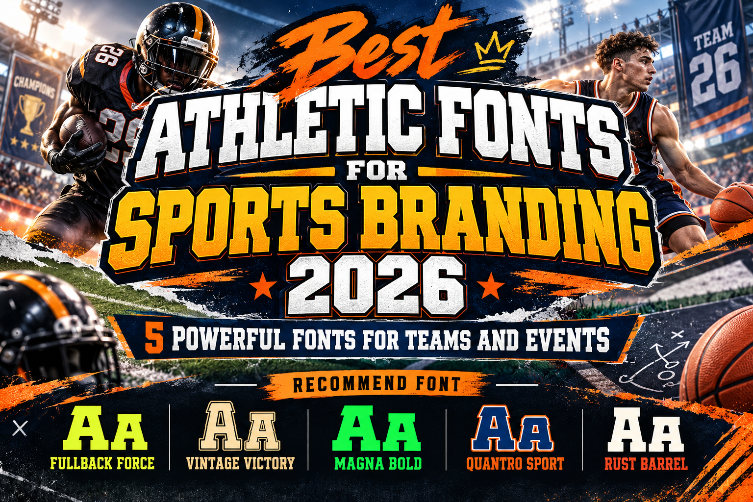
Best Athletic Fonts for Sports Branding 2026
Sports typography needs to communicate before the audience has time to study the details.
A team logo should suggest strength. A tournament poster needs instant visibility. Jersey numbers must remain recognizable from a distance, while merchandise needs enough personality to feel connected to the club or athletic brand.
That makes the best athletic fonts for sports branding 2026 different from ordinary display typography.
Successful sports fonts often use heavy strokes, wide proportions, angular cuts, slab serifs, geometric construction, or vintage varsity references to create energy and authority.
But not every sports brand should look equally aggressive. A heritage baseball club, modern fitness company, American football team, and motorsport brand all require different typographic personalities.
Initial Suggestion: Define the Sport Before Choosing the Font
Start with the culture surrounding the sport.
American football often works naturally with block lettering and heavy slab serifs. Baseball can support more nostalgic varsity typography, while esports and fitness brands frequently benefit from sharper, more contemporary forms.
Then test the font in the places where it will actually appear.
A typeface that looks excellent on a poster may lose clarity when reduced to a cap embroidery or jersey number. Check logos, uniforms, social graphics, signage, merchandise, and mobile screens before finalizing the identity.
The strongest solution usually combines one expressive athletic font with a simpler supporting typeface.
Jump to Recommended Athletic Fonts
1. Fullback Force Superbowl Sport Font

Fullback Force is built specifically around the visual language of American football. It uses solid geometric characters, strong weight, sharp edges, and assertive serif details to communicate competition and physical power. The family includes Regular and Rounded styles, giving designers some flexibility between a harder athletic look and a softer version while maintaining the same identity. MyFonts
Its clear structure makes it especially effective for large team names, championship graphics, jersey applications, and event promotions.
PROS: Strong geometric construction, two coordinated styles, excellent headline impact, distinctly athletic personality.
BEST FOR: American football, rugby-inspired branding, jerseys, team logos, championship posters.
2. Vintage Victory Vintage Sport Font

Vintage Victory takes a more nostalgic direction. It is a bold slab-serif sports family inspired by classic athletic typography, combining robust characters with an old-school competitive atmosphere. The family includes seven styles, making it particularly useful for layered sports identities that need variation across uniforms, merchandise, packaging, posters, and promotional graphics. MyFonts
This is an excellent option when a sports brand wants to communicate tradition rather than futuristic speed.
PROS: Seven styles, classic athletic personality, strong slab-serif construction, flexible retro branding.
BEST FOR: Baseball, heritage teams, vintage sportswear, varsity branding, retro tournaments.
3. Magna Bold Sport Bold Font
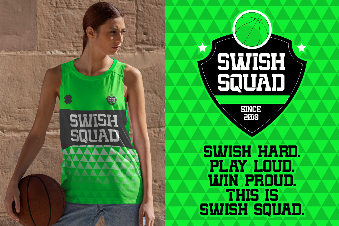
Magna Bold is one of the strongest choices for modern high-impact sports branding. Its heavy slab-serif construction, geometric edges, solid letterforms, and strong vertical weight create an assertive appearance without sacrificing headline readability. PutraCetol specifically positions it for team apparel, tournaments, esports, gyms, basketball graphics, fitness campaigns, and sports-oriented logos. PutraCetol Studio
Its biggest strength is versatility. Magna Bold feels athletic without being limited to one particular sport.
PROS: Heavy weight, excellent visibility, clean geometric structure, highly versatile sports character.
BEST FOR: Gyms, basketball, esports, tournament graphics, fitness campaigns, athletic merchandise.
4. Quantro Sport Bold Classic Sport Font
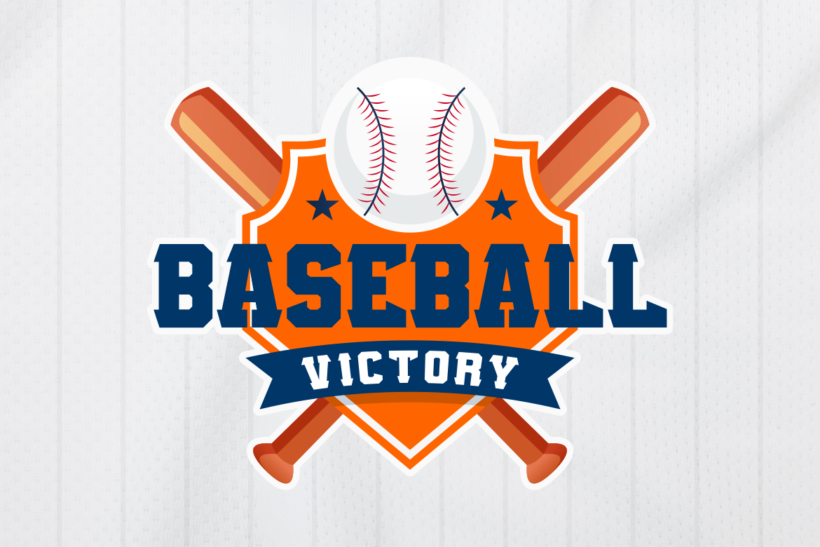
Quantro Sport combines classic American sports typography with a more modernized structure. Its slab-serif construction, angular forms, wide stance, uppercase emphasis, and line-shadow styling create the kind of bold silhouette associated with vintage baseball graphics and traditional varsity branding. It also includes numerals and multilingual support, which makes it practical for broader identity systems. MyFonts
Quantro Sport works particularly well when a team wants to look established and competitive without appearing overly aggressive.
PROS: Classic sports aesthetic, wide stance, strong numerals, excellent distance readability.
BEST FOR: Baseball teams, youth clubs, varsity apparel, championship banners, sports magazines.
5. Rust Barrel Slab Industrial Typeface
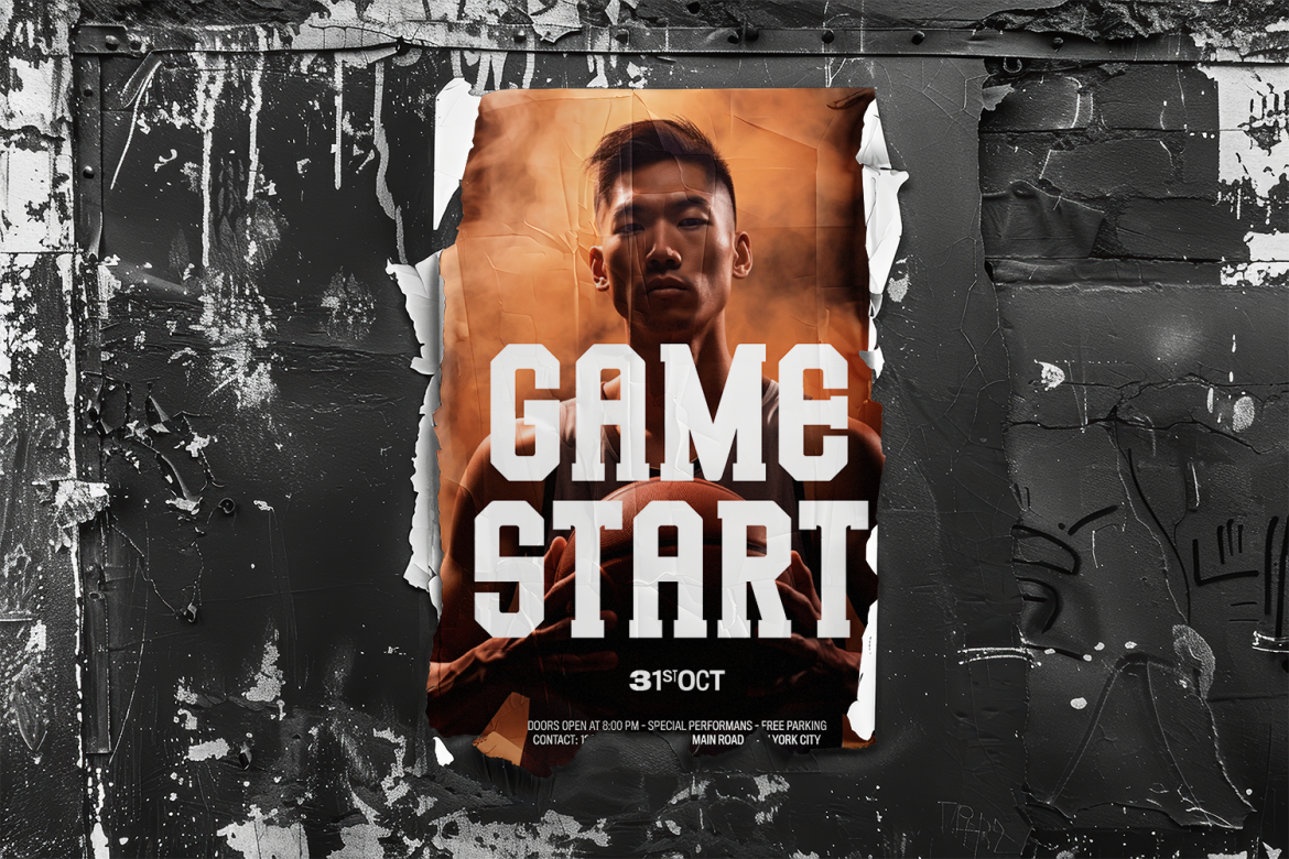
Rust Barrel is the most sports-adjacent rather than purely athletic option in this collection. Its bold slab-serif and industrial personality communicates durability, toughness, manufacturing, and physical strength. PutraCetol specifically associates it with industries such as construction, manufacturing, and brands that want to communicate security and resilience. PutraCetol Studio
That industrial quality can translate extremely well into certain sports identities, particularly strength training, motorsport, CrossFit-style branding, garages, or rugged outdoor competition.
PROS: Industrial strength, sturdy slab construction, authoritative personality, strong heritage feel.
BEST FOR: Strength sports, motorsport, gyms, rugged outdoor events, industrial sportswear.
Comparison: Which Athletic Font Fits Your Brand?
| Font | Main Personality | Best Branding Direction |
|---|---|---|
| Fullback Force | Powerful, competitive | Football and championships |
| Vintage Victory | Nostalgic, athletic | Heritage and varsity sports |
| Magna Bold | Modern, dominant | Fitness and multi-sport branding |
| Quantro Sport | Classic, professional | Baseball and team identity |
| Rust Barrel | Industrial, rugged | Strength and motorsport |
For pure football energy, Fullback Force is the clearest choice. Vintage Victory and Quantro Sport are stronger for heritage identities, Magna Bold provides the most flexible modern direction, and Rust Barrel works when industrial toughness is part of the brand story.
Make Sports Typography Work Across the Entire Brand
A sports identity rarely lives in one format.
The same font may need to appear on jerseys, social media, merchandise, event banners, sponsorship graphics, websites, tickets, and signage.
That means scalability matters.
Test team names and numbers at very small and very large sizes. Make sure similar characters such as 3, 8, 6, 9, O, and 0 remain distinguishable, especially when numerals are important.
Also test one-color versions. Sports logos often need to work in embroidery, vinyl cutting, screen printing, or monochrome applications where gradients and effects disappear.
Common Mistakes
One common mistake is choosing the most aggressive font available without considering the sport. A youth baseball team, luxury golf event, combat-sports brand, and esports organization should not automatically use the same visual language. Athletic typography should reflect the sport’s culture and the audience around it.
Another mistake is adding too many effects. Outlines, bevels, shadows, strokes, textures, and gradients can quickly overwhelm already heavy sports fonts. Build the identity from the letterforms first, then add effects only if they improve hierarchy or help the typography function on uniforms and promotional materials.
Finally, consider licensing before using a font across a complete sports identity. Team logos, merchandise, jerseys, social promotion, websites, and large-scale production may require different usage coverage. Choose the appropriate modules through PutraCetol Studio according to how the typeface will actually be deployed.
Conclusion
The best athletic fonts for sports branding 2026 combine strength, visibility, and a personality appropriate to the sport.
Fullback Force brings football intensity, Vintage Victory delivers classic nostalgia, Magna Bold provides modern versatility, Quantro Sport captures traditional athletic confidence, and Rust Barrel introduces industrial toughness.
Explore these fonts at PutraCetol Studio and build the wider identity around consistent typography, colors, uniforms, merchandise, and promotional graphics.
A strong sports font should do more than look powerful. It should help the team or brand become instantly recognizable.
Explore these fonts and many more at PutraCetol.com to build a business identity that looks professional, trustworthy, and memorable.
Additionally, if you want to explore some free typography options, you can check out Putracetol Studio on Dafont. Happy reading and designing!