
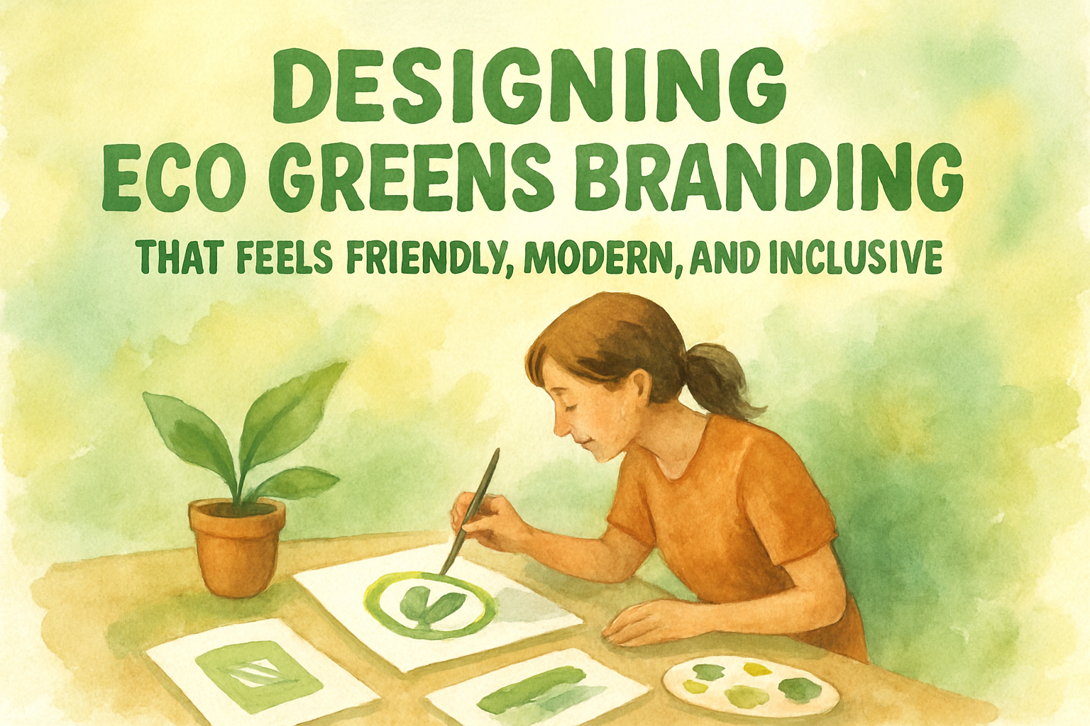
Eco-focused brands are no longer niche. Today, sustainability touches everyday life, from food and household products to lifestyle stores and community-driven initiatives. As eco-conscious choices become more mainstream, branding for green businesses must evolve as well. It is no longer enough to look ethical or environmentally friendly. A successful eco brand must also feel welcoming, relatable, and easy to engage with.
This article explores an eco greens branding visual identity designed for greens and eco-focused stores or products. The project emphasizes approachability, warmth, and inclusivity, showing how visual design can communicate sustainability without feeling rigid, exclusive, or intimidating. Developed with guidance and typography inspiration from Putracetol.com, the branding balances eco values with modern, community-oriented design.
Understanding the Eco Greens Branding Concept
Eco Greens branding starts with a simple but powerful idea: sustainability should feel accessible. Many eco brands unintentionally appear overly serious or exclusive, which can distance everyday consumers. This project takes the opposite approach by creating a visual identity that feels relaxed, friendly, and human.
The goal of the Eco Greens identity is to:
- Communicate eco values in a light and positive way
- Feel welcoming to all audiences, not just eco experts
- Build trust through simplicity and clarity
- Reflect a modern lifestyle rooted in nature and community
By prioritizing emotional connection alongside environmental messaging, the brand creates space for inclusivity and long-term engagement.
Eco Greens Identity Concept from Putracetol.com
Easy-Going Identity
The foundation of the Eco Greens branding is an easy-going personality. The visuals avoid harsh contrasts, aggressive typography, or overly technical design language. Instead, the brand feels calm, friendly, and comfortable.
This approach helps customers feel:
- Relaxed when engaging with the brand
- Curious rather than overwhelmed
- Open to learning more about eco-friendly choices
The identity communicates that sustainable living does not have to be complicated or restrictive.
Approachable Visuals
Approachability is achieved through a careful balance of typography, color, and layout. Everything is designed to feel soft, natural, and familiar. Clean typefaces and gentle graphic elements support clarity while maintaining warmth.
Rather than using sharp or rigid shapes, the visual system favors:
- Rounded forms
- Organic spacing
- Natural flow
This creates an inviting experience across packaging, signage, digital platforms, and promotional materials.
Inclusive Communication
Eco Greens branding avoids niche language and intimidating visuals. The design encourages inclusivity by making the brand feel open to people from all backgrounds.
Inclusivity is reflected in:
- Clear and readable typography
- Friendly color choices
- Playful supporting graphics
- Simple, honest messaging
The visual identity reinforces the idea that eco-conscious living is for everyone, not just a select group.
Modern Aesthetics
While the branding feels relaxed, it is still professional and contemporary. Modern design principles ensure the brand remains relevant and credible.
This balance allows Eco Greens to appeal to:
- Young urban consumers
- Families
- Community-focused shoppers
- Lifestyle-oriented audiences
The result is a brand that feels current without chasing trends.
Key Design Elements
Clean Typography
Typography plays a central role in shaping the Eco Greens identity. Clean, readable fonts help communicate transparency and trust. The typography system avoids unnecessary complexity, ensuring information is easy to scan and understand.
Clean typography supports:
- Product labeling
- Educational content
- Store signage
- Digital interfaces
Clarity in type reflects clarity in values.
Warm Color Palette
Color choices are inspired by nature and calm environments. Soft greens, warm yellows, muted earth tones, and gentle neutrals form the base of the palette.
These colors:
- Evoke calm and balance
- Reinforce natural associations
- Reduce visual stress
- Support long-term brand recognition
The palette avoids overly saturated or artificial tones, keeping the brand grounded and authentic.
Simple Logo Design
The Eco Greens logo is designed to be simple and memorable. Rather than relying on complex symbols, the logo focuses on clean forms and subtle organic references.
A simple logo:
- Works well across different sizes
- Is easy to recognize
- Feels approachable rather than corporate
- Reflects connection and harmony
This simplicity supports flexibility across packaging, signage, and digital platforms.
Supporting Graphics
Supporting graphic elements add personality without overwhelming the design. These visuals are playful, soft, and subtle, reinforcing the brand’s friendly tone.
They help:
- Add visual interest
- Guide attention
- Create a consistent brand language
- Enhance storytelling
The graphics feel like natural extensions of the brand rather than decorative extras.
Font Recommendations from Putracetol Studio
Typography is essential in eco branding, as fonts strongly influence emotional perception. The following fonts from Putracetol Studio align well with the Eco Greens visual identity.
World Madly
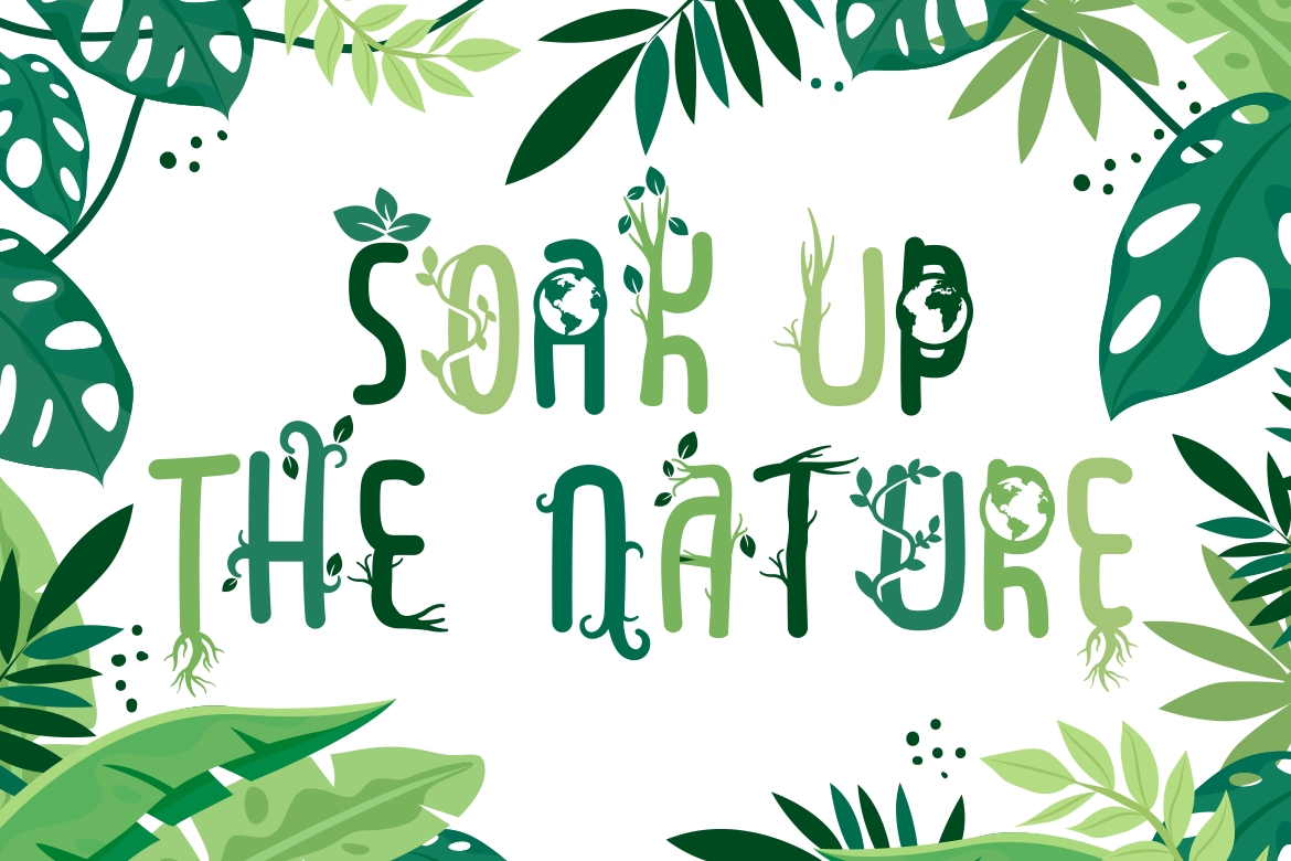
A relaxed and expressive font that feels human and friendly. Suitable for headlines, packaging highlights, or community-focused messaging.
Green Delight

Designed with organic curves and gentle structure, this font reinforces eco-friendly themes and works well for branding and signage.
Green Ecosystem
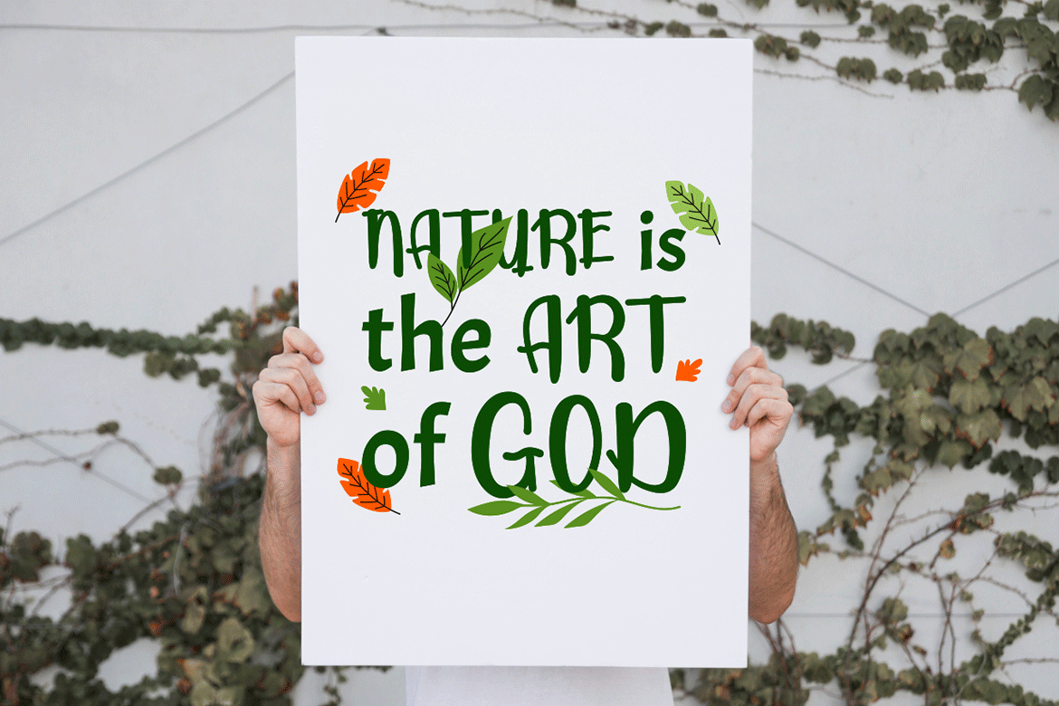
A clean and modern font inspired by nature-driven concepts. Ideal for educational content, labels, and supporting text.
Weathered Sunshine
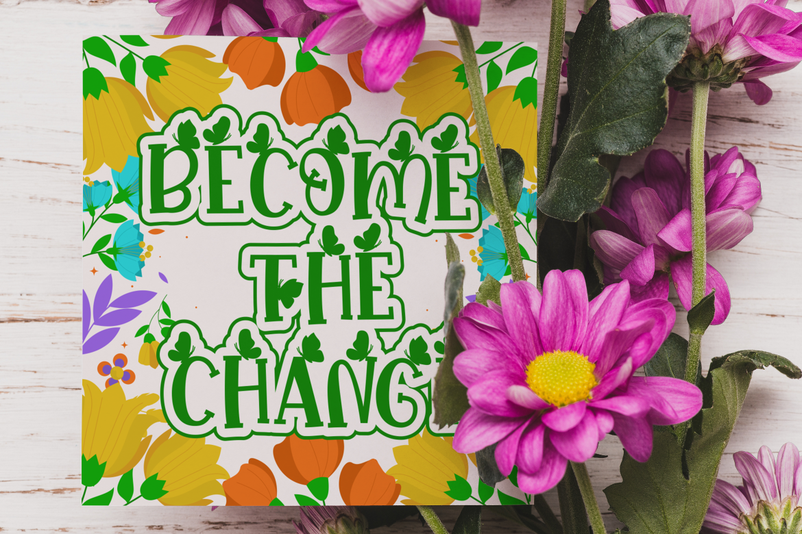
Brings warmth and a slightly handcrafted feel. Works well for eco brands that want to feel optimistic and approachable.
Lush Garden

A decorative yet readable font that evokes growth and freshness. Suitable for lifestyle visuals and creative applications.
Fern Fronds
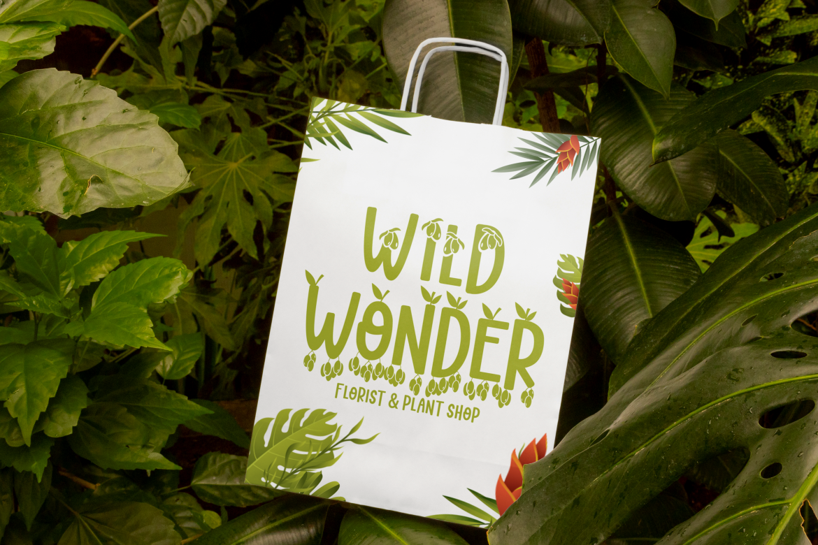
Inspired by natural forms, this font adds organic character without sacrificing clarity. Ideal for eco storytelling and brand accents.
Using a combination of these fonts allows designers to maintain consistency while introducing variation and personality.
Why Approachability Matters in Eco Branding
Eco brands often focus heavily on ethics and sustainability, but emotional connection is equally important. An approachable visual identity helps:
- Reduce barriers to entry
- Build trust faster
- Encourage repeat engagement
- Create positive brand associations
When people feel comfortable with a brand, they are more likely to support its mission. Eco Greens branding demonstrates how design can translate values into visual language that feels inclusive rather than instructive.
Applications Across Eco Greens Branding
The visual identity is designed to work seamlessly across multiple platforms:
- Store signage and interiors
- Product packaging
- Social media content
- Website and e-commerce
- Educational materials
- Community events
Each application reinforces the same tone: calm, friendly, and trustworthy.
Conclusion
The Eco Greens branding visual identity from Putracetol.com successfully demonstrates how eco-focused brands can be approachable, inclusive, and modern without losing credibility. Through clean typography, warm colors, simple logo design, and playful supporting graphics, the brand communicates sustainability in a way that feels human and inviting.
Supported by thoughtful font choices from Putracetol Studio, the identity builds strong emotional connections while maintaining professional clarity. For eco stores and green product brands seeking to connect with their communities, this approach proves that sustainable branding works best when it feels open, warm, and accessible.
Thank you for taking the time to read this article. If you are looking for more great articles, feel free to visit Putracetol Blog
Additionally, if you want to explore some free typography options, you can check out Putracetol Studio on Dafont. Happy reading and designing!