
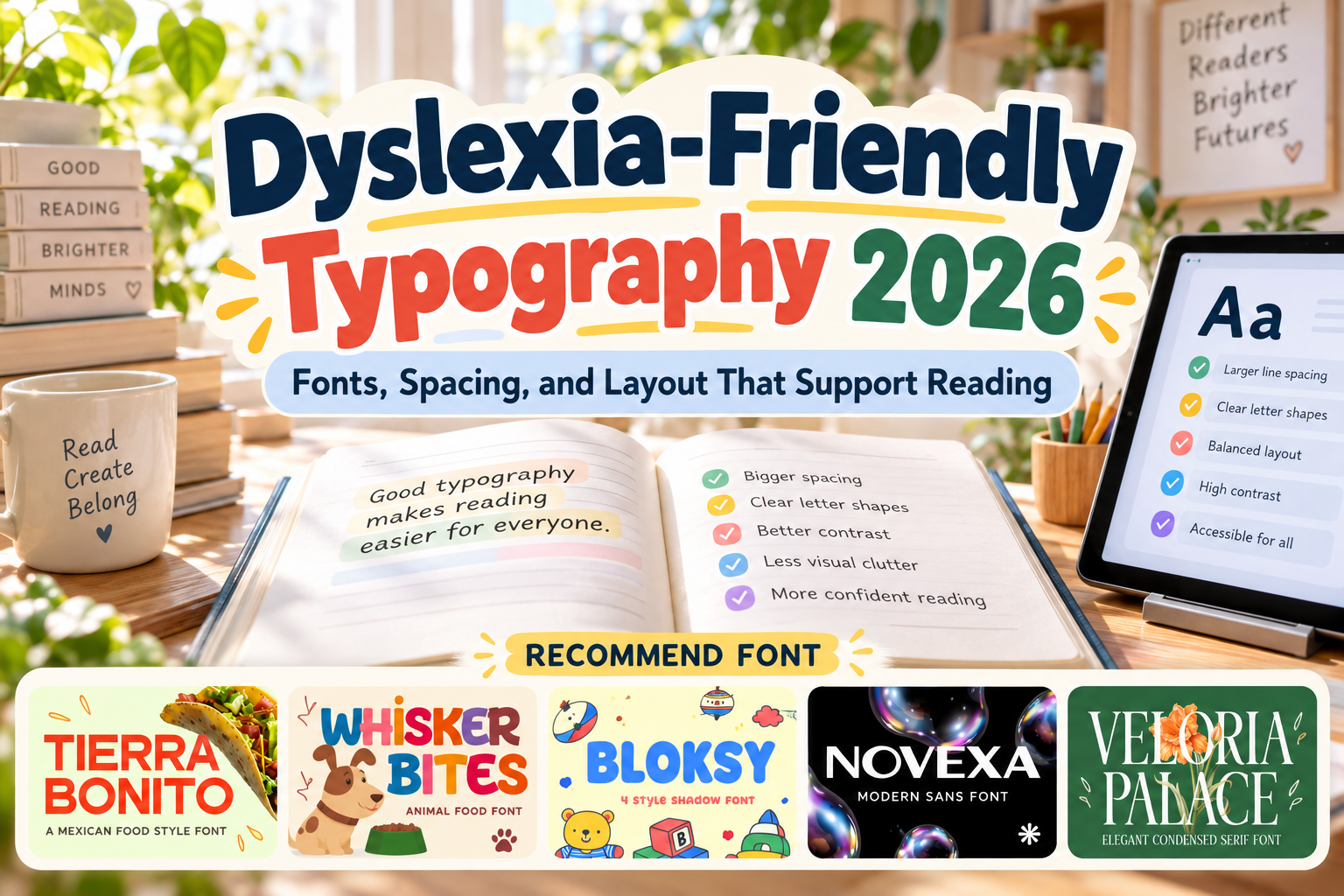
Dyslexia Friendly Fonts 2026: Designing for More Comfortable Reading
Accessible typography is not simply about choosing one special font. For people with dyslexia, the complete reading environment can matter, including letter shapes, spacing, font size, line length, alignment, contrast, and the amount of information presented at once.
That makes dyslexia friendly fonts 2026 an important topic for educators, designers, publishers, UX teams, and organizations creating inclusive content.
It is also important to separate marketing claims from evidence. A 2026 meta-analysis covering 15 studies and 688 participants found no consistent or reliable improvement in reading speed or accuracy from specialized dyslexia fonts such as OpenDyslexic and Dyslexie compared with conventional fonts. PubMed
The better approach is therefore to create a flexible, readable typographic system and allow individual preferences where possible.
Initial Suggestion: Design the Whole Reading Experience
Start with readability rather than searching for a magical typeface.
The British Dyslexia Association recommends clear sans serif fonts and identifies options such as Arial, Verdana, Tahoma, Trebuchet, Calibri, Century Gothic, and Open Sans. Its style guidance also recommends approximately 12 to 14 point text or an equivalent digital size, increased character and line spacing, left-aligned text, and avoiding long passages in italics, underlining, or all capitals. BD Dyslexia
This means typography should be treated as a system.
A beautiful font may work very well for a heading but become tiring across several paragraphs. Conversely, an understated body font may offer excellent reading comfort even if it has little visual personality.
What Makes Typography More Dyslexia Friendly?
Useful characteristics generally include clear character shapes, sufficient spacing, recognizable differences between similar letters, comfortable text size, and uncluttered layouts.
Avoid compressing lines tightly together or stretching paragraphs across the full width of a large desktop monitor. White space can help readers identify sections and maintain their position.
Left alignment is usually preferable to fully justified text because justification creates irregular spaces between words. The British Dyslexia Association also recommends shorter sentences, regular headings, and avoiding dense multi-column layouts. BD Dyslexia
Most importantly, allow personalization when possible. E-readers and digital interfaces can let users change font size, spacing, brightness, or typeface according to their individual preferences. British Dyslexia Association
Jump to Recommended Fonts
The following PutraCetol fonts were provided as creative references. They are not clinically validated or specifically designed as dyslexia fonts, so they should not replace evidence-based accessible body typography. Their strongest role is in headings, branding, educational covers, labels, and visual hierarchy paired with a simpler reading font.
1. Novexa Modern Sans Font
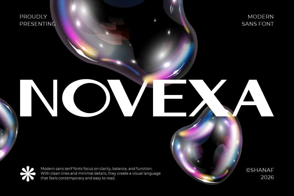
Novexa is the strongest option in this group when a project needs cleaner contemporary typography. Its wide proportions, smooth curves, balanced geometric construction, and relatively simple letterforms create an organized visual character without excessive decoration. PutraCetol describes it as suitable for branding, editorial work, presentations, website headers, and supporting information. PutraCetol Studio
For accessibility-oriented projects, use Novexa primarily for headings, navigation labels, or short statements, then test it with actual readers before considering longer passages.
PROS: Clean geometry, spacious character, restrained visual style.
BEST FOR: Website headings, educational covers, presentations, accessible branding.
2. Tierra Bonito Mexican Food Font
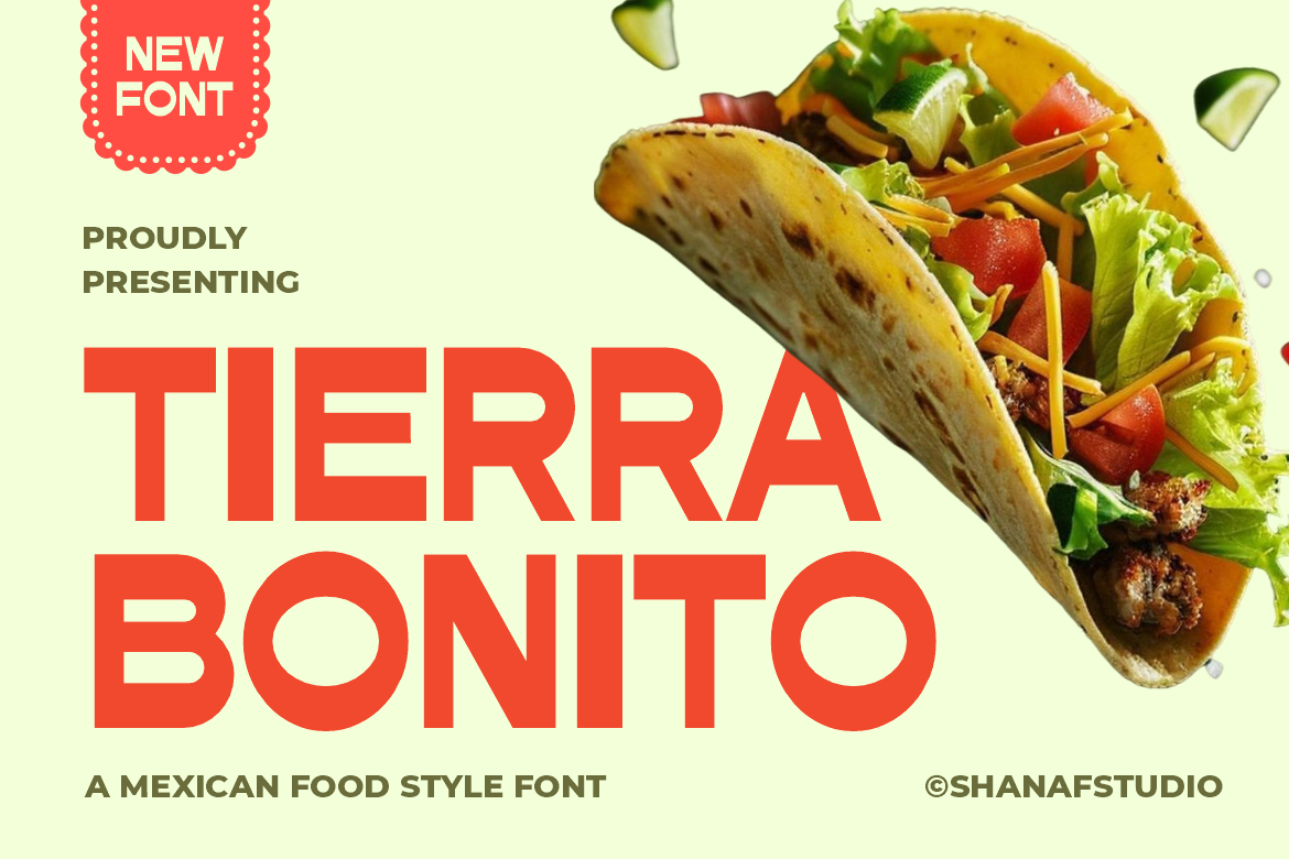
Tierra Bonito uses thick uniform strokes, broad proportions, rounded counters, and a strong geometric structure. Its bold characters create excellent visibility for short phrases, and PutraCetol specifically notes its wide proportions and clean readability for signage and promotional titles. PutraCetol Studio
Because of its heavy display personality, it is better suited to headings than long instructional or educational text.
PROS: Wide characters, bold visibility, clear short-word impact.
BEST FOR: Large headings, educational posters, signs, section titles.
3. Whisker Bites Animal Food Font
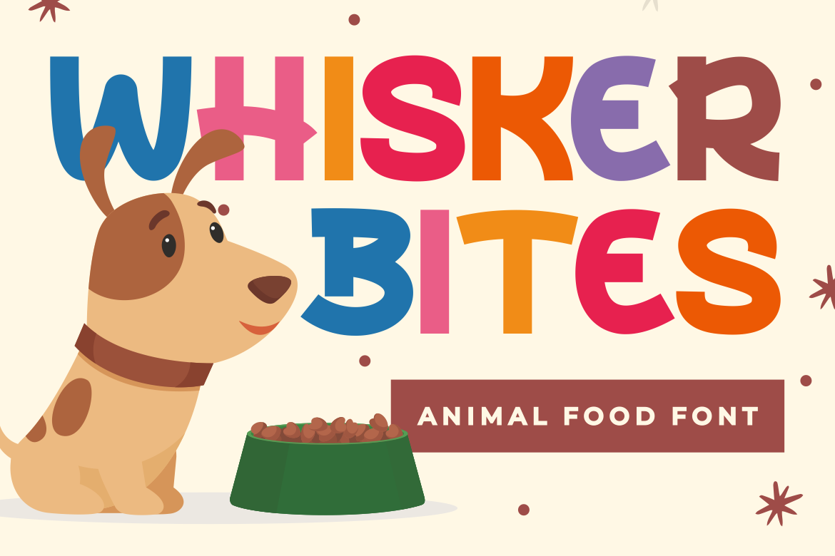
Whisker Bites combines chunky letterforms with rounded corners, soft edges, and balanced spacing. Its cheerful cartoon-inspired proportions can make children’s materials feel welcoming while maintaining strong visual presence in headlines. PutraCetol Studio
Use it to create friendly hierarchy around content rather than setting entire reading passages in it.
PROS: Soft forms, friendly personality, strong headline recognition.
BEST FOR: Children’s covers, classroom posters, activity sheets, playful headings.
4. Bloksy 4 Style Shadow Font

Bloksy uses thick rounded forms and includes four shadow variations, giving designers flexibility for playful branding and children’s content. Its strong structure can make large words easy to notice, but decorative shadows introduce extra visual information. PutraCetol Studio
For accessibility-focused layouts, the simplest version without elaborate effects is the safer choice.
PROS: Chunky forms, rounded edges, several visual styles.
BEST FOR: Titles, children’s graphics, covers, short callouts.
5. Veloria Palace Classic Serif Font
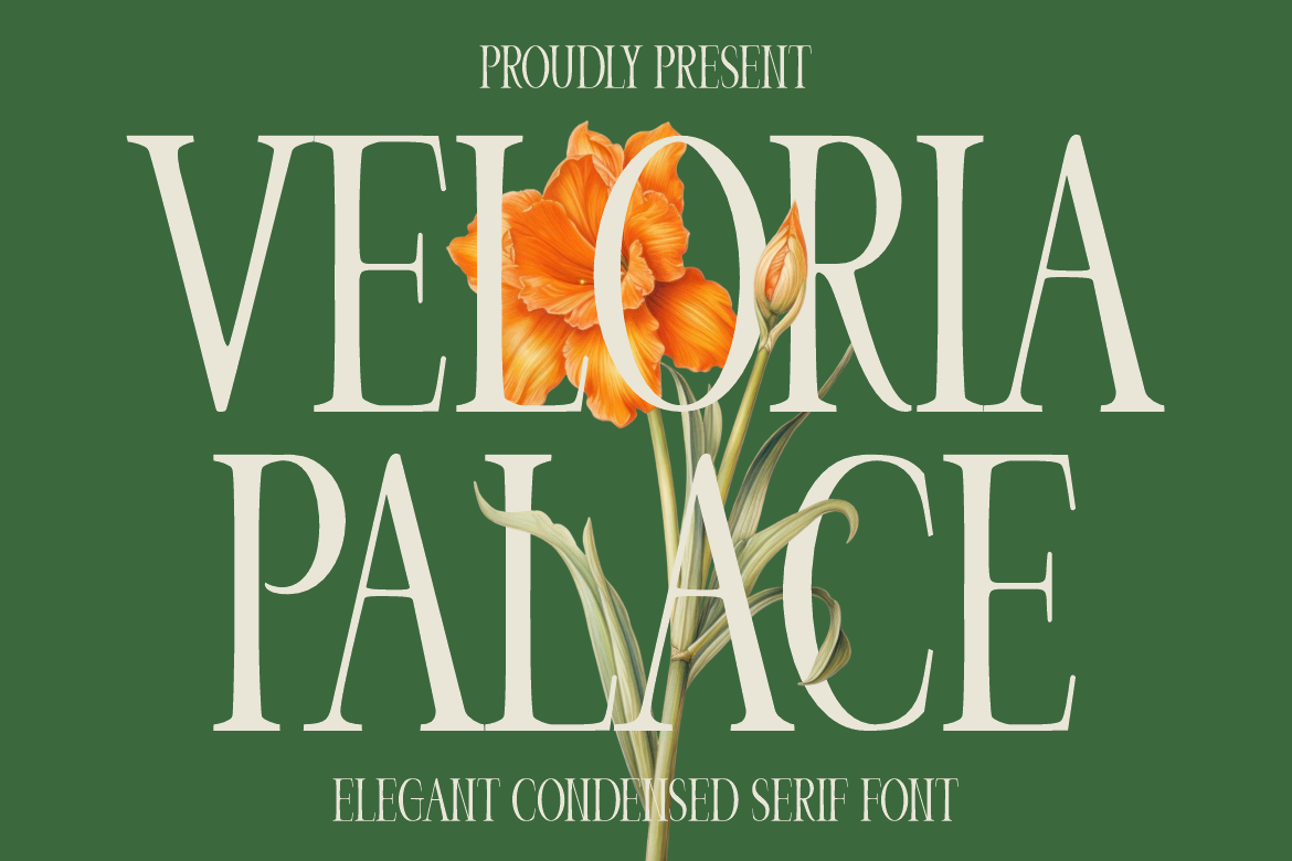
Veloria Palace offers a tall, condensed serif structure with strong contrast and a refined editorial personality. It works beautifully for luxury branding, magazine titles, book covers, and sophisticated headings. PutraCetol Studio
However, it is the least suitable of these five for extended dyslexia-oriented reading because its narrow proportions, serif construction, and contrast prioritize elegance over maximum reading simplicity.
PROS: Elegant appearance, strong editorial character, sophisticated hierarchy.
BEST FOR: Book covers, chapter titles, literary branding, decorative headings.
Comparison: Which Font Fits an Accessible Layout?
| Font | Character | Recommended Role |
|---|---|---|
| Novexa | Clean, geometric | Headings and short supporting text |
| Tierra Bonito | Bold, wide | Large titles and posters |
| Whisker Bites | Rounded, playful | Children’s headings |
| Bloksy | Chunky, decorative | Short callouts and covers |
| Veloria Palace | Elegant, serif | Decorative literary titles |
For longer reading, a conventional clear sans serif remains the safer starting point.
Common Mistakes in Dyslexia-Friendly Typography
The first mistake is believing that one font automatically makes content accessible. Research has repeatedly found that specialized dyslexia fonts do not consistently improve reading speed or accuracy. An earlier study of OpenDyslexic also found no measurable reading advantage over Arial or Times New Roman. PubMed Accessibility requires typography, layout, language, contrast, spacing, and user preferences to work together.
Another mistake is making text excessively large or widely spaced without testing it. More spacing is not always better. Excessive tracking can break words into isolated letters and make reading slower. The goal is comfortable separation, not maximum distance between characters.
Finally, avoid forcing one visual solution on every dyslexic reader. Dyslexia varies between individuals. Digital products should offer adjustable font size, spacing, contrast, and reading modes whenever practical.
Conclusion
The most useful way to think about dyslexia friendly fonts 2026 is not as a search for one perfect typeface, but as an inclusive typography strategy.
Start with clear letterforms, comfortable spacing, left alignment, sensible line lengths, simple language, and flexible display settings. Use distinctive fonts strategically for headings and branding while preserving a calmer typeface for long reading.
PutraCetol Studio offers expressive options such as Novexa, Tierra Bonito, Whisker Bites, Bloksy, and Veloria Palace for building recognizable visual hierarchy. When accessibility is the priority, combine that creative personality with evidence-based reading practices and real-user testing.
Explore these fonts and many more at PutraCetol.com to build a business identity that looks professional, trustworthy, and memorable.
Additionally, if you want to explore some free typography options, you can check out Putracetol Studio on Dafont. Happy reading and designing!