
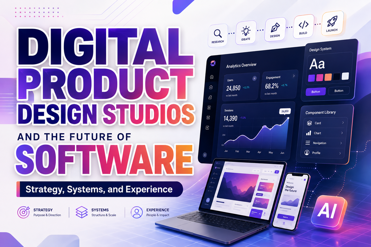
The most effective way to work with a digital product design studio is to identify the business or product risk before requesting screens.
A startup may need to prove that customers understand its new service. A SaaS company might struggle with onboarding and feature adoption. A fintech platform may need to make complex financial information easier to trust, while a healthcare product could require a safer and more accessible patient journey.
These are not simply visual problems. They involve product positioning, user behavior, information architecture, technical constraints, operational processes, and customer confidence.
A stronger project brief might say:
This is more useful than:
We need a modern dashboard.
The first statement defines a customer outcome and creates a measurable design challenge. The second requests a deliverable without explaining what the design must improve.
The phrase digital product design studios future software reflects a broader shift in the industry. Product studios are no longer hired only to make software look polished. They increasingly help companies define what should be built, how the experience should work, how product decisions should scale, and how trust should be protected as software becomes more adaptive and AI-assisted.
What Is a Digital Product Design Studio?
A digital product design studio is a specialized partner that helps organizations research, define, design, test, and improve software products.
Its work can include:
- Product discovery
- Market and user research
- UX strategy
- Service design
- Information architecture
- User flows
- Interface design
- Prototyping
- Design systems
- Accessibility
- Design engineering
- AI interaction design
- Product measurement
- Brand integration
- Launch support
A traditional graphic design studio may focus primarily on visual communication. A software development agency may concentrate on technical implementation. A digital product design studio connects business strategy, customer needs, interface behavior, brand identity, and engineering feasibility.
The objective is not merely to deliver a set of attractive screens. It is to help build a product that people can understand, trust, adopt, and continue using.
Why Digital Product Studios Matter to the Future of Software
Software is becoming easier to generate but harder to differentiate.
AI tools can produce layouts, code, content, and prototypes faster than traditional workflows. However, speed does not automatically create a useful product. Companies still need to decide which customer problem deserves attention, how the experience should behave, which risks require human oversight, and what makes the software meaningfully different from competing products.
Current design and development directions include AI-assisted workflows, automated design-to-development handoffs, agentic interfaces, component-driven layouts, performance improvements, and stronger accessibility expectations. These changes increase the importance of strategic design because teams must coordinate more capabilities within one understandable experience.
Product Strategy Before Screen Production
A studio helps transform a broad business idea into a focused product proposition.
This may involve answering questions such as:
- Who has the most urgent problem?
- What outcome is the customer trying to reach?
- Which part of the problem should the product solve first?
- Why would someone switch from an existing method?
- What evidence would make the customer trust the solution?
- Which features are essential for the first release?
- What should be postponed?
- How will the company know whether the product is working?
Without this strategic layer, teams can spend months developing features that are technically functional but poorly understood or rarely used.
A design studio can help reduce this risk through interviews, journey mapping, prototype testing, product framing, and prioritized experience principles.
Research That Connects Customer Needs With Business Reality
User research should not be treated as a ceremonial phase completed once at the beginning of a project. It should help the team understand how people currently solve the problem, where they experience friction, what they fear, and what evidence influences their decisions.
A studio may combine:
- Customer interviews
- Stakeholder interviews
- Support-ticket analysis
- Product analytics
- Competitor reviews
- Workflow observation
- Usability testing
- Survey data
- Sales feedback
- Operational constraints
The studio then translates the findings into design decisions.
For example, research might reveal that customers abandon a financial onboarding process not because the form is too long, but because they do not understand why certain personal details are required. The solution may involve clearer explanations and better progress feedback rather than simply removing fields.
Involving users early also helps teams discover accessibility barriers and real-world interaction patterns that internal product teams may overlook. W3C recommends including users with disabilities throughout projects because their experiences can lead to more effective and broadly useful design solutions.
Designing the Product as a Complete System
Information Architecture and User Flows
Future software will contain more data, automation, settings, and personalized behavior. Without clear information architecture, these capabilities become difficult to navigate.
A digital product studio helps organize:
- Navigation
- Page hierarchy
- Feature relationships
- Permissions
- Account structures
- Search behavior
- Filters
- Notifications
- Settings
- Help content
- Error recovery
The studio should design around the customer’s mental model rather than the company’s internal department structure.
A user trying to resolve a billing issue should not need to understand which internal team owns payments, subscriptions, or account administration. The product should organize the journey around the customer’s goal.
Design Systems as Product Infrastructure
A design system is more than a component library. It is a shared collection of standards, reusable patterns, visual rules, content principles, and coded elements that helps teams build consistent experiences.
Figma describes design systems as building blocks and standards that create a unified language for designing and developing products at scale. A mature system can reduce duplicated work while improving consistency across teams and platforms.
A digital product design studio may define:
- Color tokens
- Typography scales
- Spacing rules
- Layout grids
- Buttons and form controls
- Navigation patterns
- Tables and charts
- Loading states
- Empty states
- Error messages
- Accessibility behavior
- Motion principles
- Content standards
- Component documentation
This becomes increasingly important in AI-assisted workflows. When AI tools have access to approved components, tokens, and brand rules, generated interfaces are more likely to remain relevant and consistent instead of producing generic layouts. Figma has specifically identified connected design systems as an important foundation for AI-powered product workflows.
Design Engineering Reduces the Gap Between Concept and Code
One of the most valuable capabilities in a modern product studio is design engineering: the ability to connect interaction design with working front-end behavior.
Design engineers can prototype realistic interactions, understand technical limitations, collaborate directly with software engineers, and help translate design-system decisions into reusable production components.
This reduces several common problems:
- Designs that cannot be implemented efficiently
- Inconsistent components between design and production
- Missing responsive states
- Unclear animation behavior
- Accessibility regressions
- Repeated interpretation during handoff
- Visual quality that disappears after development
As design and code tools become more closely connected, the relationship between designers and engineers becomes less like a one-way handoff and more like a shared product-building process.
Designing AI-Native and Agentic Software
AI is changing software from a collection of static commands into a system that can interpret, recommend, generate, summarize, and sometimes act on behalf of a user.
This creates new design questions.
A traditional interface might ask the customer to choose a filter and review the results. An AI-assisted interface may accept a natural-language question, interpret the customer’s intent, retrieve information, recommend an action, and offer to complete it.
The studio must then decide:
- What can the AI do?
- What should require confirmation?
- How should the product explain its reasoning?
- How does the user correct a mistaken interpretation?
- Which sources or data influenced the answer?
- How should uncertainty be displayed?
- What happens when the model cannot complete the task?
- How can an action be reversed?
- When should the experience transfer to a human?
These are interaction-design and governance questions, not merely model-selection questions.
Human Oversight Must Be Designed Into the Experience
A responsible AI product should make the roles of the user, model, and organization understandable.
The NIST AI Risk Management Framework organizes AI risk work around four connected functions: Govern, Map, Measure, and Manage. It also emphasizes defining human roles and intervention where systems cannot reliably identify or correct their own errors.
A product studio can translate these governance ideas into interface behavior:
- Clearly label AI-generated material
- Show editable drafts instead of silently applying changes
- Require confirmation for consequential actions
- Preserve access to original information
- Provide a visible undo path
- Allow users to report incorrect output
- Explain data use and personalization
- Escalate high-risk situations to qualified people
For fintech and healthcare, these decisions directly influence trust. An AI system that moves money, interprets medical information, or changes access permissions requires a different level of control from an AI tool that suggests a color palette.
Accessibility as a Product Requirement
Accessibility should be included during product strategy, system design, development, testing, and ongoing maintenance.
It affects:
- Color contrast
- Typography
- Keyboard interaction
- Focus order
- Forms
- Error messages
- Authentication
- Charts
- Tables
- Captions
- Alternative text
- Screen-reader compatibility
- Motion
- Cognitive clarity
- Touch-target size
- Customer support
W3C recommends addressing accessibility early and throughout the design and development process rather than treating it as a final compliance check.
A capable digital product studio should not rely exclusively on automated scanners. It should combine standards-based evaluation with manual testing, assistive-technology review, and participation from people with disabilities.
Accessible software is not only more inclusive. It is often clearer, more resilient, and easier to use in varied situations, including small screens, temporary injuries, slow connections, noisy environments, and unfamiliar languages.
Brand Identity Inside Product Experience
Software branding is more than a logo in the navigation bar.
The brand appears through:
- Typography
- Color
- Motion
- Illustration
- Writing style
- Error messages
- Loading states
- Onboarding
- Data visualization
- Customer support
- Security communication
- Product terminology
A brand that promises simplicity must provide understandable navigation and language. A premium enterprise platform should not feel inconsistent or unfinished. A healthcare brand that promises care must communicate difficult information with clarity and empathy.
The digital product studio helps convert brand values into repeatable interface behavior.
For example:
| Brand Value | Product Experience |
|---|---|
| Transparent | Clear pricing, data use, status, and limitations |
| Intelligent | Relevant assistance without unnecessary complexity |
| Personal | Useful preferences and contextual guidance |
| Secure | Understandable controls and visible confirmation |
| Fast | Efficient workflows and immediate feedback |
| Inclusive | Accessible interaction and multiple ways to complete tasks |
| Premium | Consistent detail, reliability, and thoughtful recovery |
Typography contributes strongly to this perception. A distinctive display font can create memorable launch campaigns and product storytelling, while a highly readable interface family maintains clarity during daily use.
Product Measurement and Continuous Improvement
A studio should help define how the organization will measure whether the experience is improving.
Visual approval is not enough. A redesigned workflow should be connected to product outcomes such as:
- Activation
- Task success
- Error reduction
- Time to value
- Feature adoption
- Customer effort
- Retention
- Support volume
- Conversion
- Accessibility performance
- Customer trust
Google’s HEART framework organizes user-experience measurement around Happiness, Engagement, Adoption, Retention, and Task Success. It also encourages teams to connect product goals with signals and metrics rather than tracking numbers without a clear decision behind them.
A product studio can use this approach to create a measurement plan.
For example:
| Product Goal | User Signal | Possible Metric |
| Make onboarding easier | New users progress without assistance | Completion rate and support contacts |
| Increase initial value | Customers complete a meaningful workflow | Activation rate and time to value |
| Improve trust | Customers understand system actions | Confirmation success and trust survey |
| Reduce friction | Fewer users repeat or abandon tasks | Error rate and task completion time |
| Strengthen adoption | Customers return to valuable features | Feature frequency and retained usage |
The studio should continue learning after launch. Product analytics, interviews, customer support, and usability testing can reveal where the design system or journey needs to evolve.
A Practical Digital Product Studio Workflow
Phase 1: Discovery
The studio examines the business model, market, users, technology, operational constraints, and current product performance.
Typical outputs: Research plan, stakeholder alignment, customer insights, risk map, opportunity areas, and success criteria.
Phase 2: Product Strategy
The team defines the product proposition, audience priorities, experience principles, scope, and roadmap.
Typical outputs: Product narrative, prioritized journeys, value proposition, service blueprint, feature strategy, and measurement framework.
Phase 3: Experience Architecture
The studio organizes information, user flows, permissions, navigation, and system behavior.
Typical outputs: Sitemap, journey maps, task flows, information architecture, content hierarchy, and low-fidelity prototypes.
Phase 4: Prototyping and Validation
Interactive prototypes allow the team to test product assumptions before committing to full development.
Typical outputs: Usability findings, revised flows, interaction models, accessibility risks, and validated design direction.
Phase 5: Interface and Design System
The visual language is applied through reusable components and documented standards.
Typical outputs: Interface designs, component library, tokens, typography, content patterns, accessibility specifications, and responsive behavior.
Phase 6: Design Engineering and Delivery
Designers and engineers collaborate to translate the approved system into production.
Typical outputs: Coded components, implementation guidance, QA reviews, interaction specifications, and design-system documentation.
Phase 7: Launch and Optimization
The studio reviews real product performance and helps prioritize future improvements.
Typical outputs: Analytics review, usability testing, experiment roadmap, system updates, and adoption improvements.
How Product Studios Support Different Industries
SaaS
SaaS companies often need help simplifying complex workflows, improving onboarding, organizing feature-heavy interfaces, and increasing adoption.
A studio may redesign the journey from trial registration to first value, create role-based onboarding, improve empty states, and build a design system that supports frequent product releases.
Fintech
Fintech software must communicate security, status, risk, fees, and transaction behavior with exceptional clarity.
A product studio can simplify financial information, improve verification flows, design safer AI recommendations, and make important actions easier to review and reverse.
Healthcare
Healthcare products require accessibility, privacy, understandable language, and careful handling of emotionally sensitive information.
A studio may improve appointment booking, patient onboarding, medical-result communication, care-plan navigation, or clinician workflows while involving healthcare professionals and patients in validation.
Enterprise Technology
Enterprise products frequently contain complex permissions, large data sets, legacy systems, and workflows involving several roles.
A studio can create scalable information architecture, simplify administrative tools, unify inconsistent modules, and build reusable components that several internal teams can maintain.
How to Choose a Digital Product Design Studio
Look beyond the studio’s visual portfolio. Attractive interfaces are important, but they do not reveal how the studio makes decisions.
Evaluate whether the studio can explain:
- The customer problem behind the work
- The research method
- The business objective
- The rejected alternatives
- The technical constraints
- The accessibility approach
- The product metrics
- The collaboration with engineers
- The result after launch
A strong partner should ask difficult questions before proposing a visual solution.
The studio should also demonstrate:
- Product strategy capability
- Research experience
- Design-system thinking
- Cross-functional collaboration
- Accessibility knowledge
- AI interaction and governance awareness
- Clear communication
- Realistic implementation planning
- Post-launch measurement
The best studio is not necessarily the one producing the most visually dramatic portfolio. It is the one capable of connecting customer needs, business goals, design quality, and technical reality.
Jump to Recommended Fonts
Hangul Street Korean Style Font | Lyros Greek Font | Golden Dynasty Chinese Style Font | Sukhara Thai Style Font | Sacred Obsidian Ethnic Tribal Display Font | Bushido Stroke Japanese Brush Display Font | Pueblo Trails Mexican Font
Distinctive typography can help a digital product studio create stronger launch campaigns, concept presentations, editorial landing pages, cultural products, and brand systems. These are expressive display fonts, so they are best used for logos, large headlines, product names, and campaign moments rather than long interface text, tables, form labels, or dense documentation.
1. Hangul Street Korean Style Font
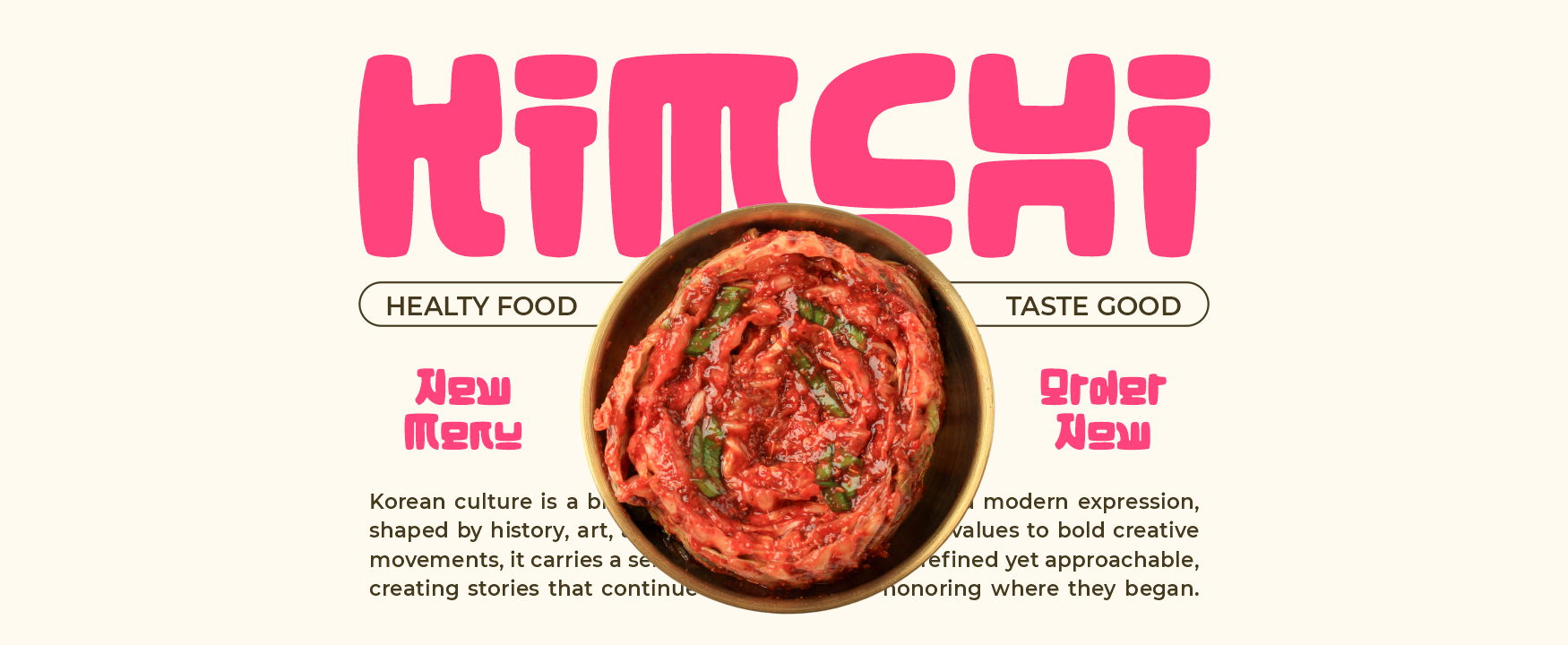
Hangul Street uses thick strokes, compact proportions, wide characters, and soft rounded geometry to create a strong visual block. Its playful and pop-driven personality can give a digital product or launch campaign a youthful international presence without relying on complicated decorative effects. The open counters and friendly corners help large headlines remain clear while preserving a distinctive Korean street-inspired visual direction.
PROS: Bold visibility, compact geometry, approachable curves, strong digital impact, and youthful branding energy.
BEST FOR: Entertainment platforms, creator tools, food-delivery apps, youth products, social communities, event technology, and Korean-inspired launch campaigns.
2. Lyros Greek Font
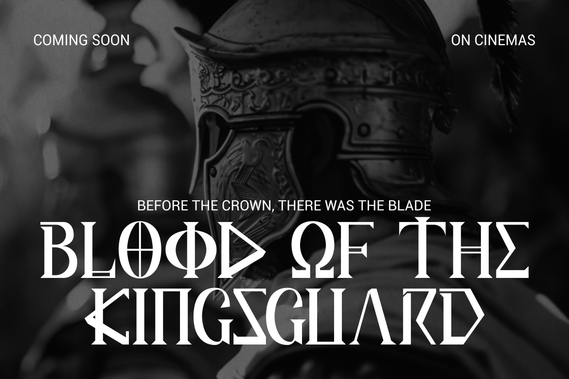
Lyros combines tall proportions, strong vertical emphasis, sharp angles, solid strokes, and carved terminals influenced by classical Greek inscriptions. Its monumental construction can give a studio presentation, game title, cultural platform, or premium software launch a sense of authority and historical scale. The disciplined geometry feels cinematic and distinctive while remaining effective for large display typography.
PROS: Monumental silhouette, clear geometry, strong authority, cinematic personality, and premium headline presence.
BEST FOR: Cultural technology, museum platforms, education products, historical games, architecture software, premium presentations, and heritage-focused branding.
3. Golden Dynasty Chinese Style Font
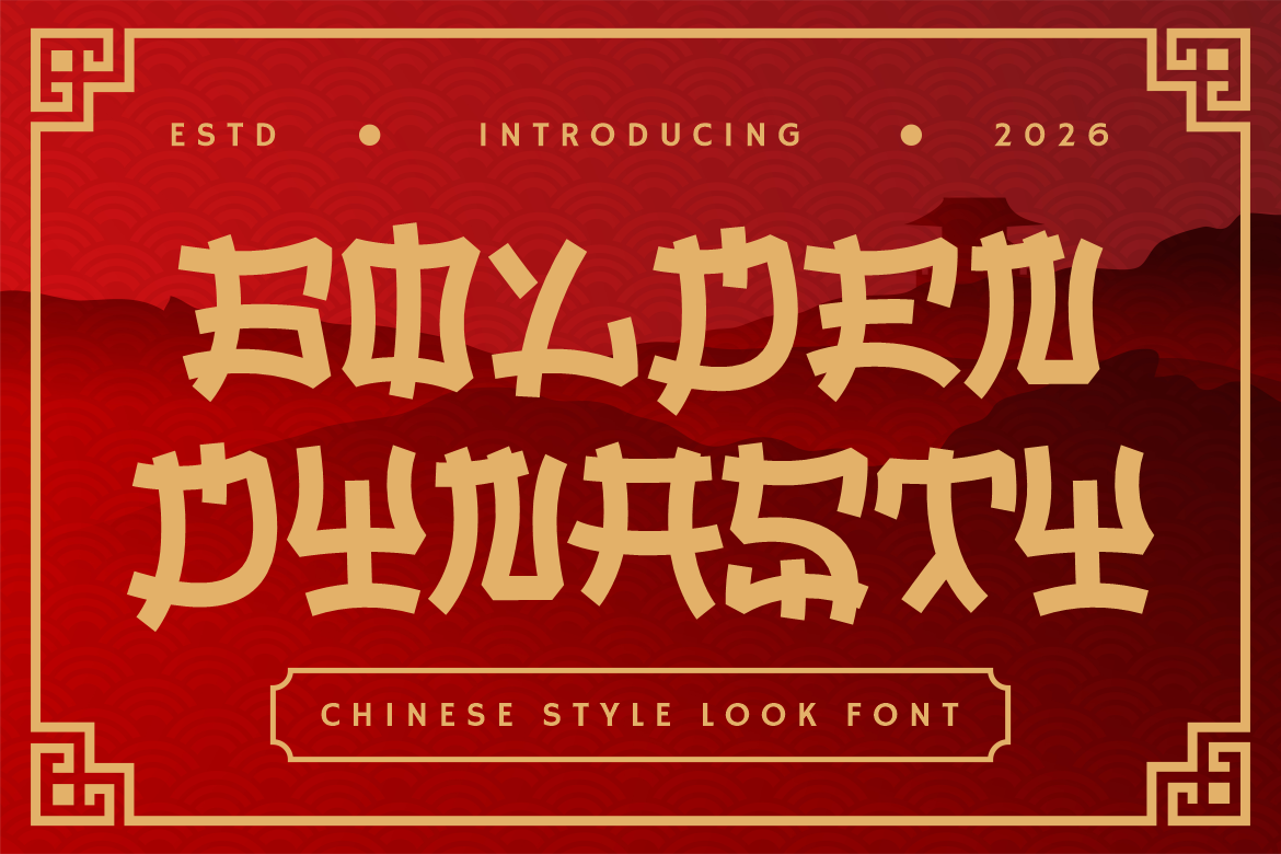
Golden Dynasty uses bold strokes, angular cuts, structured forms, and ornamental edges to create a dramatic Chinese-inspired display identity. Its powerful silhouette can make product names, event headings, campaign graphics, and packaging-related software concepts immediately recognizable. The font works particularly well when a studio needs a confident cultural atmosphere supported by simpler functional typography.
PROS: Strong visual structure, bold readability, decorative character, high campaign visibility, and memorable cultural energy.
BEST FOR: Restaurant technology, Asian ecommerce, festival platforms, food-ordering software, travel products, games, and Chinese-inspired brand campaigns.
4. Sukhara Thai Style Font
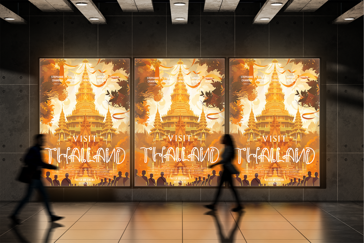
Sukhara uses flowing ornamental details and an elegant Southeast Asian-inspired visual character. Its decorative rhythm can soften technical product presentations and bring a more welcoming, crafted atmosphere to hospitality, wellness, and cultural software. Use it for short brand names or hero statements, then pair it with a simpler interface font for practical information.
PROS: Graceful movement, decorative personality, refined cultural mood, and strong hospitality appeal.
BEST FOR: Resort platforms, travel apps, wellness products, booking software, restaurant systems, cultural campaigns, and premium service experiences.
5. Sacred Obsidian Ethnic Tribal Display Font

Sacred Obsidian features carved letterforms, angular cuts, hand-drawn edges, and tall irregular proportions. Its artifact-like appearance can give concept decks, fictional product worlds, exhibitions, and heritage storytelling a tactile quality that contrasts with generic technology typography. Because culturally specific claims require care, the font is strongest for researched heritage projects, gallery identities, or fictional creative systems that do not misrepresent living communities.
PROS: Carved appearance, handcrafted irregularity, symbolic atmosphere, strong visual texture, and memorable display identity.
BEST FOR: Museum software, gallery platforms, fictional games, archaeology projects, cultural archives, craft marketplaces, and heritage storytelling.
6. Bushido Stroke Japanese Brush Display Font
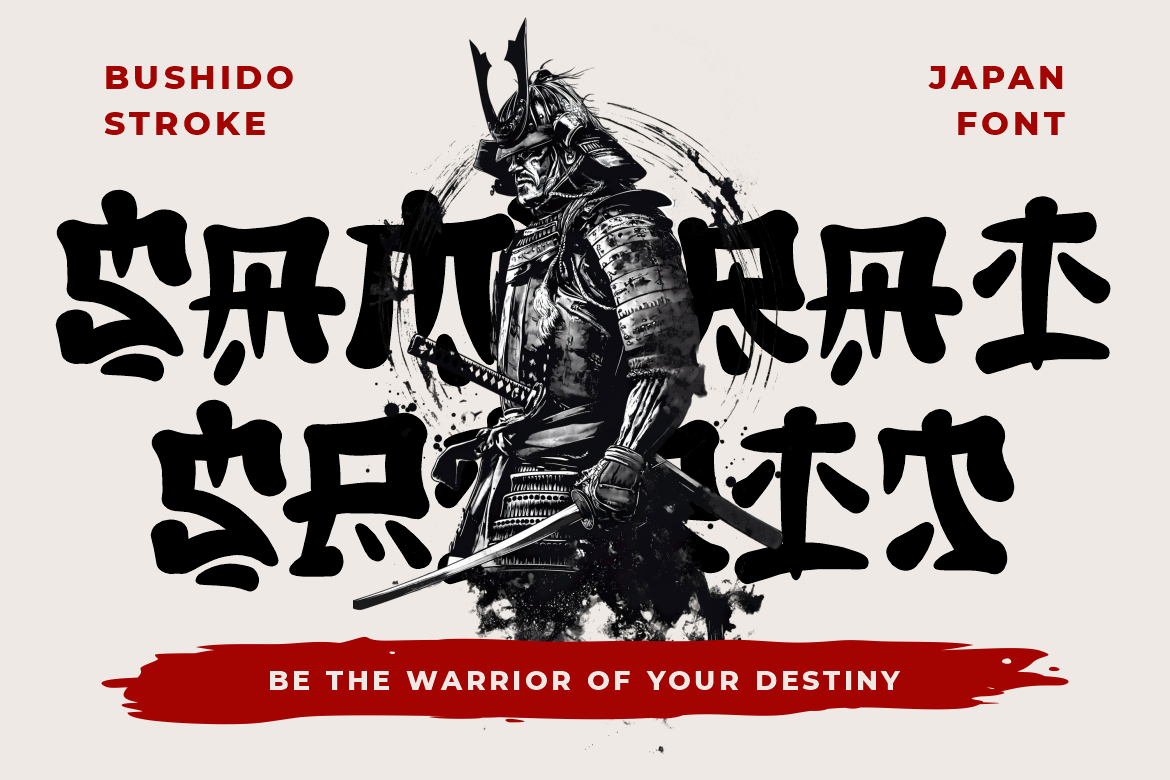
Bushido Stroke uses expressive handcrafted forms to create a strong Japanese brush-inspired personality. Its energetic marks can introduce movement and human character into product-launch graphics, game interfaces, food applications, and entertainment campaigns. The family is available in two styles, allowing studios to build related visual treatments across several branded assets.
PROS: Expressive brush energy, bold movement, handcrafted personality, two coordinated styles, and strong campaign impact.
BEST FOR: Gaming products, martial-arts platforms, Japanese food apps, anime communities, entertainment software, film campaigns, and dynamic event branding.
7. Pueblo Trails Mexican Font
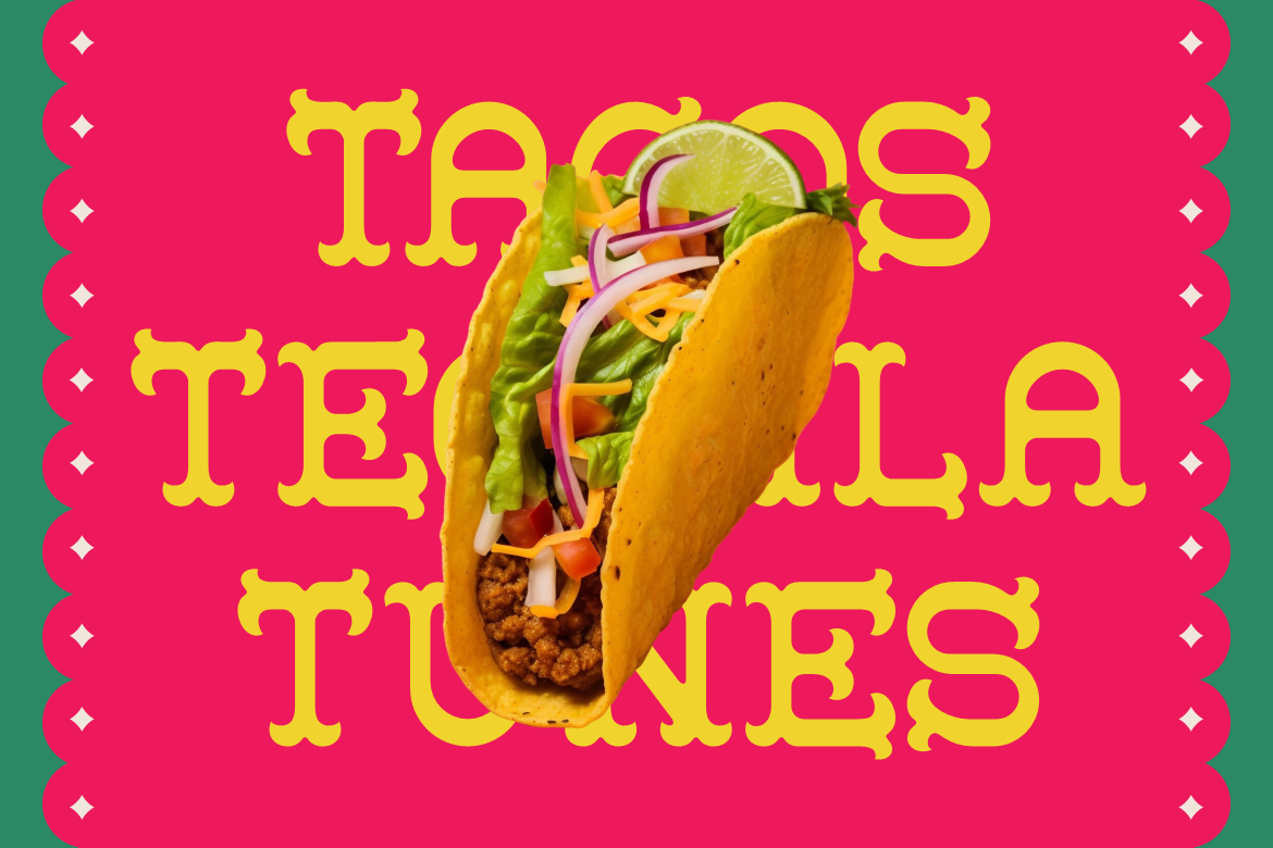
Pueblo Trails combines thick structured characters, decorative serifs, tall proportions, and generous spacing. Its handcrafted festive appearance feels warm and expressive while preserving enough clarity for product names, campaign titles, and large promotional headings. It can help digital products related to food, tourism, events, and culture appear more distinctive and approachable.
PROS: Festive serif details, strong readability, warm personality, tall silhouette, and versatile promotional character.
BEST FOR: Restaurant platforms, event software, tourism products, food ecommerce, local marketplaces, cultural campaigns, and Mexican-inspired branding.
Comparison
| Font | Visual Personality | Strongest Product-Studio Role | Ideal Software or Brand Direction |
| Hangul Street | Rounded, bold, and youthful | Launch campaigns and social product branding | Entertainment, creators, youth, and food tech |
| Lyros | Monumental, classical, and authoritative | Premium presentations and cinematic product titles | Culture, education, architecture, and games |
| Golden Dynasty | Angular, structured, and dramatic | High-impact product campaigns | Food, travel, ecommerce, and events |
| Sukhara | Flowing, graceful, and decorative | Hospitality and wellness storytelling | Booking, travel, wellness, and service software |
| Sacred Obsidian | Carved, irregular, and artifact-like | Cultural concept worlds and exhibition branding | Museums, archives, games, and craft platforms |
| Bushido Stroke | Energetic, handcrafted, and dynamic | Action-oriented launch graphics | Gaming, entertainment, food, and events |
| Pueblo Trails | Festive, warm, and structured | Community and cultural product branding | Tourism, restaurants, retail, and marketplaces |
Common Mistakes
The first mistake is hiring a digital product design studio only after the product strategy and technical architecture have already been fixed. At that stage, the studio may be asked to decorate workflows that are unnecessarily complicated, based on untested assumptions, or poorly aligned with customer needs. Involve the design team while the problem, scope, data requirements, and product behavior can still change. Early research and prototyping can prevent the company from investing heavily in the wrong feature set or information structure.
The second mistake is evaluating the engagement through the number of screens produced. A studio can generate hundreds of polished interfaces while leaving the company without a clear product strategy, reusable system, accessibility plan, or measurement framework. Quality should be evaluated through customer understanding, task success, product adoption, implementation consistency, and the ability of the internal team to maintain the result. Screens are outputs; improved product behavior is the outcome.
The final mistake is treating AI generation, accessibility, design systems, and brand expression as separate concerns. Future software must connect them. AI behavior should use approved components and clear governance, accessibility should be built into those components, and typography should reinforce the brand without obstructing functional content. Decorative PutraCetol fonts can create memorable launch moments, but daily interface text should remain highly readable. The studio should also confirm that font, image, and AI-tool licenses cover the intended website, application, advertising, logo, and commercial-product uses.
Conclusion
The future of software will not be determined by technology alone. It will be shaped by how clearly that technology helps people understand information, complete tasks, make decisions, and maintain control.
Digital product design studios give organizations a structured way to connect customer research, business strategy, software behavior, interface design, accessibility, engineering, AI governance, and brand identity.
Their role begins before screen design. They help define the product opportunity, test assumptions, organize complex workflows, create reusable systems, and establish how success will be measured. As AI makes interface and code generation faster, these strategic responsibilities become more important rather than less important.
The keyword digital product design studios future software therefore represents a shift from design as visual production to design as product infrastructure.
Typography can support that infrastructure by giving product launches, presentation decks, editorial pages, and campaign materials a recognizable voice. Hangul Street adds youthful pop energy, Lyros creates monumental authority, Golden Dynasty provides dramatic structure, and Sukhara introduces graceful hospitality. Sacred Obsidian builds an artifact-like atmosphere, Bushido Stroke adds dynamic handcrafted movement, and Pueblo Trails brings festive cultural warmth.
Fonts from PutraCetol Studio can help product studios move beyond generic technology branding and create more distinctive visual experiences. When expressive typography is combined with strong product strategy, accessible interaction, and scalable systems, software can feel both functionally reliable and emotionally memorable.
Explore these fonts and many more at PutraCetol.com to build a business identity that looks professional, trustworthy, and memorable.
Additionally, if you want to explore some free typography options, you can check out Putracetol Studio on Dafont. Happy reading and designing!