

The most practical lesson from the evolution of digital accessibility is that inclusion works best when it begins before the interface is designed. Accessibility should influence research, content, typography, components, procurement, development, and quality assurance rather than appearing as a final checklist before launch.
Set a clear accessibility target, assign responsibilities across the team, and include people with disabilities in research and testing. W3C recommends integrating accessibility throughout the production lifecycle and evaluating it early, when barriers are easier and less expensive to correct. Legal obligations vary by jurisdiction and organization, so businesses should also review the rules that specifically apply to their products and markets.
From Civil Rights Protection to Digital Participation
1973–1998: The Rehabilitation Act Establishes a Foundation
The Rehabilitation Act of 1973 became an important foundation for disability rights in the United States. Section 504 prohibited disability-based discrimination in programs and activities receiving federal financial assistance. Section 508 was added in 1986 as government agencies became increasingly dependent on electronic office technology, then strengthened in 1998 to require accessible federal electronic and information technology.
This period introduced an idea that would shape later digital standards: equal access depends not only on whether a service exists, but also on whether people with disabilities can use the systems through which it is delivered.
1990: The ADA Expands Disability Rights
The Americans with Disabilities Act was signed into law on July 26, 1990. It established broad civil-rights protections across employment, government services, public accommodations, transportation, and other areas of public life.
Although the original ADA was not written as a technical web standard, digital services increasingly became part of how covered organizations interacted with the public. That relationship became more explicit in 2024, when the U.S. Department of Justice adopted a Title II rule requiring state and local government web content and mobile apps, with limited exceptions, to meet WCAG 2.1 Level AA on compliance timelines ending in 2027 or 2028.
1997–1999: WAI and WCAG Bring Structure to Web Accessibility
The World Wide Web Consortium launched the Web Accessibility Initiative in 1997 to coordinate technical guidance, education, and industry participation around an accessible web. WCAG 1.0 followed in May 1999 with 14 guidelines and supporting checkpoints.
This was a major shift. Web accessibility was no longer addressed only through individual fixes or assistive technologies. Designers and developers now had a shared framework for building accessible content at its source.
2008: WCAG 2.0 Introduces Technology-Neutral Principles
WCAG 2.0 was published in December 2008. Rather than focusing on one generation of HTML, it organized accessibility around four durable principles: digital content should be perceivable, operable, understandable, and robust.
These principles encouraged teams to consider different ways people receive information and control an interface. Someone may use a screen reader, keyboard, voice input, magnification, captions, switch device, or a customized visual presentation. WCAG 2.0 was designed to support multiple technologies and to be evaluated through both automated checks and human judgment.
2018–2024: WCAG Expands for Mobile and Modern Interaction
WCAG 2.1 arrived in June 2018 with additional guidance for mobile interaction, low vision, and cognitive or learning disabilities. It addressed issues such as content reflow, text spacing, non-text contrast, orientation, pointer gestures, and labels that match accessible names.
WCAG 2.2 was published in October 2023 and updated in December 2024. It extended the earlier standards with criteria concerning focus visibility, dragging alternatives, minimum target size, consistent help, redundant entry, and accessible authentication. W3C recommends using the current WCAG version as the conformance target for new and updated work.
2025: The European Accessibility Act Broadens Market Responsibility
The European Accessibility Act began applying on June 28, 2025. It introduced common accessibility requirements for covered products and services, including computers, smartphones, payment and self-service terminals, e-readers, electronic communications, consumer banking, ecommerce, e-books, and parts of passenger transport services.
This milestone reinforced accessibility as both a rights issue and a market requirement. Organizations serving European customers now need to consider accessibility across websites, applications, devices, support information, purchasing journeys, and third-party systems.
Accessibility in the AI Era
AI can support caption generation, speech recognition, image descriptions, content simplification, translation, personalization, and conversational navigation. These capabilities may reduce barriers when they are accurate, transparent, and compatible with assistive technology. WCAG 2 also applies to AI-powered web interfaces, not only conventional static pages.
However, AI does not make a product accessible automatically. Generated alternative text may miss context, automated captions may misrepresent important speech, and personalized interfaces may create unpredictable navigation. W3C states that evaluation tools cannot check every accessibility requirement and that knowledgeable human judgment remains necessary.
The modern accessibility process should therefore combine automated scanning, keyboard testing, screen-reader review, zoom and reflow checks, manual content evaluation, and testing with people who have disabilities.
Why Accessibility Is Also a Business Strategy
Accessible products can extend market reach, strengthen brand reputation, support innovation, improve usability, and reduce legal or operational risk. Features such as captions, readable content, clear navigation, larger controls, and flexible input methods often help people beyond the audience for whom they were initially designed.
Accessibility also improves internal discipline. Clear headings strengthen content structure. Semantic components reduce inconsistency. Keyboard support exposes interaction problems. Accessible error messages make forms easier for everyone to complete.
Jump to Recommended Fonts
Twisly Twisted Serif Font | Liquid Mirage Psychedelic Style Font | Elarion Elegant Serif Font | Deco Vogue Art Deco Line Font | Maison Veloria Condensed Font | Blooming Pages Spring Font | Bellique Logo Script Font
Expressive fonts can give an inclusive brand personality, but they should be assigned carefully. Use distinctive display typography for logos, large headings, campaign graphics, and editorial moments, then pair it with a highly readable interface font for navigation, forms, instructions, and long content.
1. Twisly Twisted Serif Font
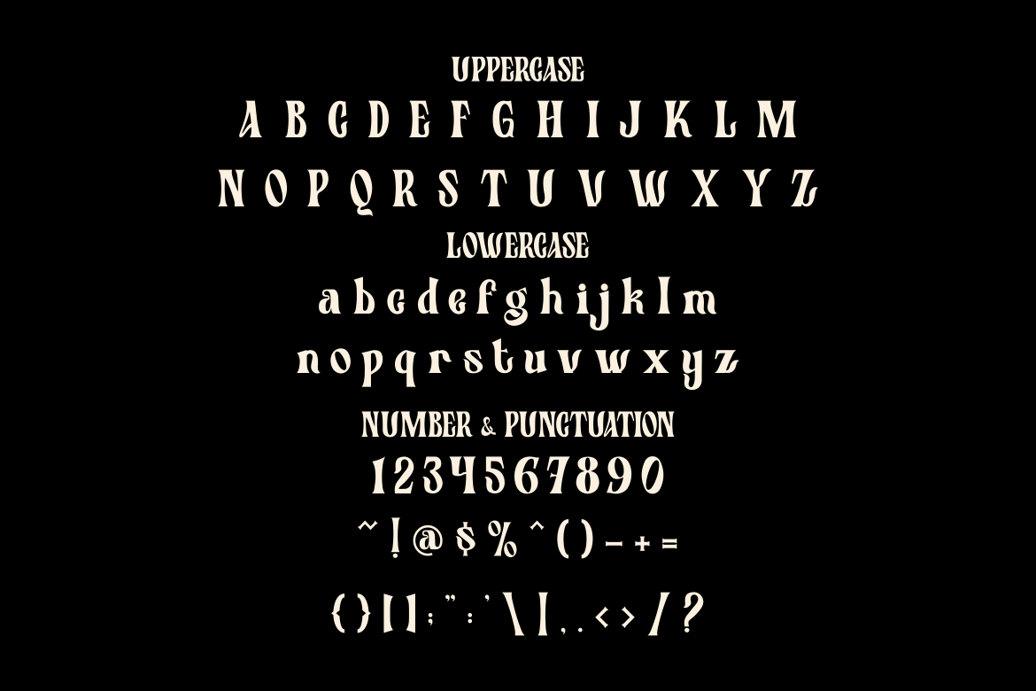
Twisly combines classic serif refinement with an experimental contemporary character. Its unusual curves and distinctive details can give accessibility campaigns, creative reports, and editorial websites a sophisticated identity without relying on predictable corporate typography. Keep it at generous display sizes so its visual personality remains clear.
PROS: Distinctive structure, premium personality, strong editorial impact.
BEST FOR: Design studios, cultural platforms, fashion brands, reports, and campaign headlines.
2. Liquid Mirage Psychedelic Style Font
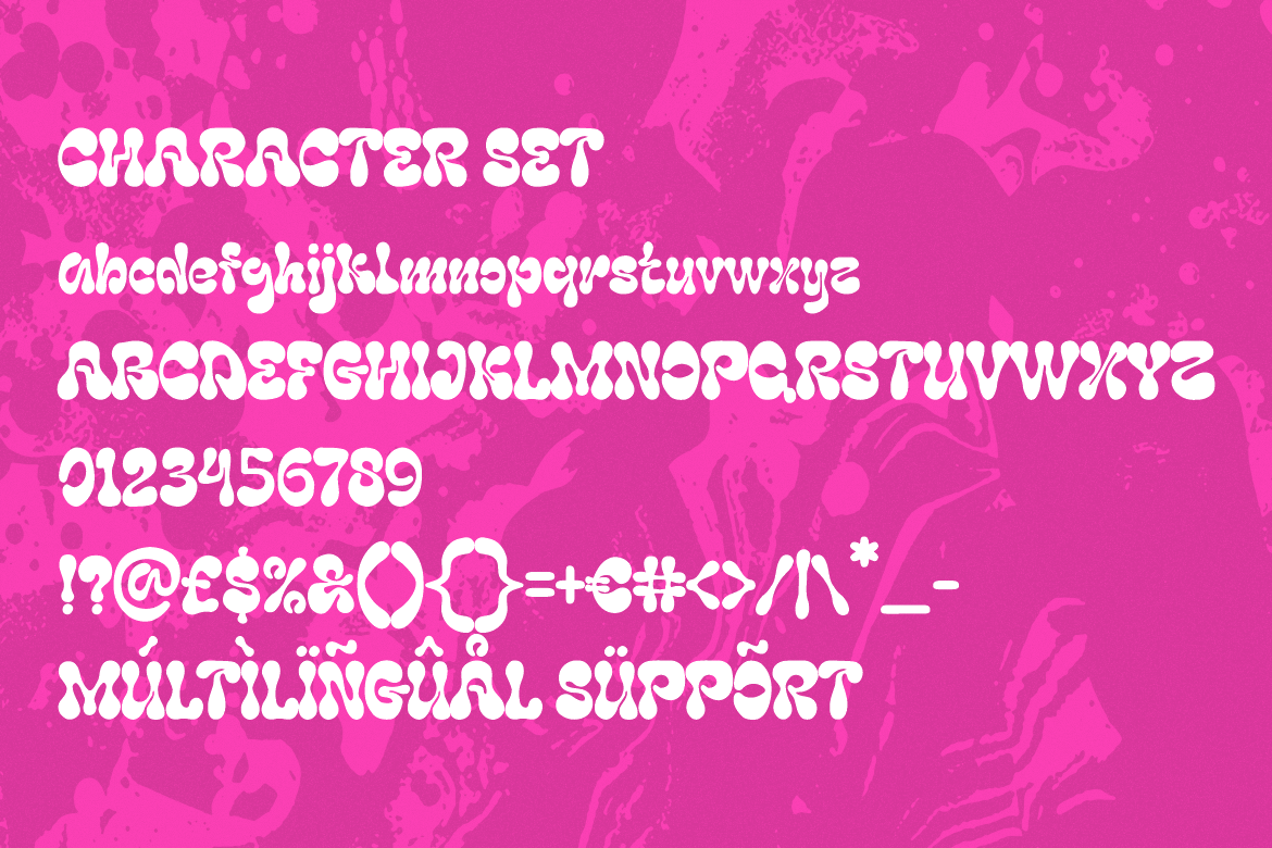
Liquid Mirage uses flowing forms inspired by liquid movement and retro experimental lettering. It can turn a short campaign message into a memorable visual centerpiece, especially for brands discussing creativity, technology, or new forms of interaction. Its expressive construction is best reserved for concise display text.
PROS: Fluid movement, high visual impact, unconventional personality.
BEST FOR: Festivals, entertainment, creative technology, posters, and awareness campaigns.
3. Elarion Elegant Serif Font
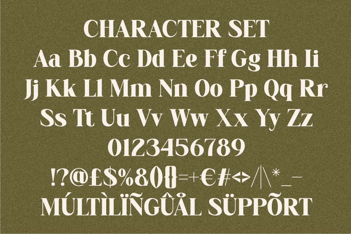
Elarion carries an elegant, artistic, and classic personality with a sense of heritage and calm authority. It can help an accessibility report or inclusive premium brand feel credible without becoming visually rigid. Pair it with a neutral sans serif for functional text and data.
PROS: Refined appearance, trustworthy character, versatile elegance.
BEST FOR: Hospitality, galleries, luxury brands, architecture, and executive publications.
4. Deco Vogue Art Deco Line Font

Deco Vogue uses an Art Deco-inspired linear structure to create an architectural and glamorous display style. Its light construction is effective for large titles, event identities, and carefully spaced editorial compositions. Thin details should be tested against the final background and output size.
PROS: Geometric distinction, elegant line work, premium atmosphere.
BEST FOR: Exhibitions, property brands, luxury events, editorial covers, and cultural projects.
5. Maison Veloria Condensed Font

Maison Veloria features tall, narrow letters with a clean structure, balanced strokes, and subtle vintage charm. Its condensed proportions help longer titles fit into limited spaces while maintaining a polished identity. It works particularly well for organized layouts with generous spacing and clear hierarchy.
PROS: Space-efficient, refined, versatile, and visually controlled.
BEST FOR: Hospitality, retail, restaurants, packaging, menus, and branded reports.
6. Blooming Pages Spring Font
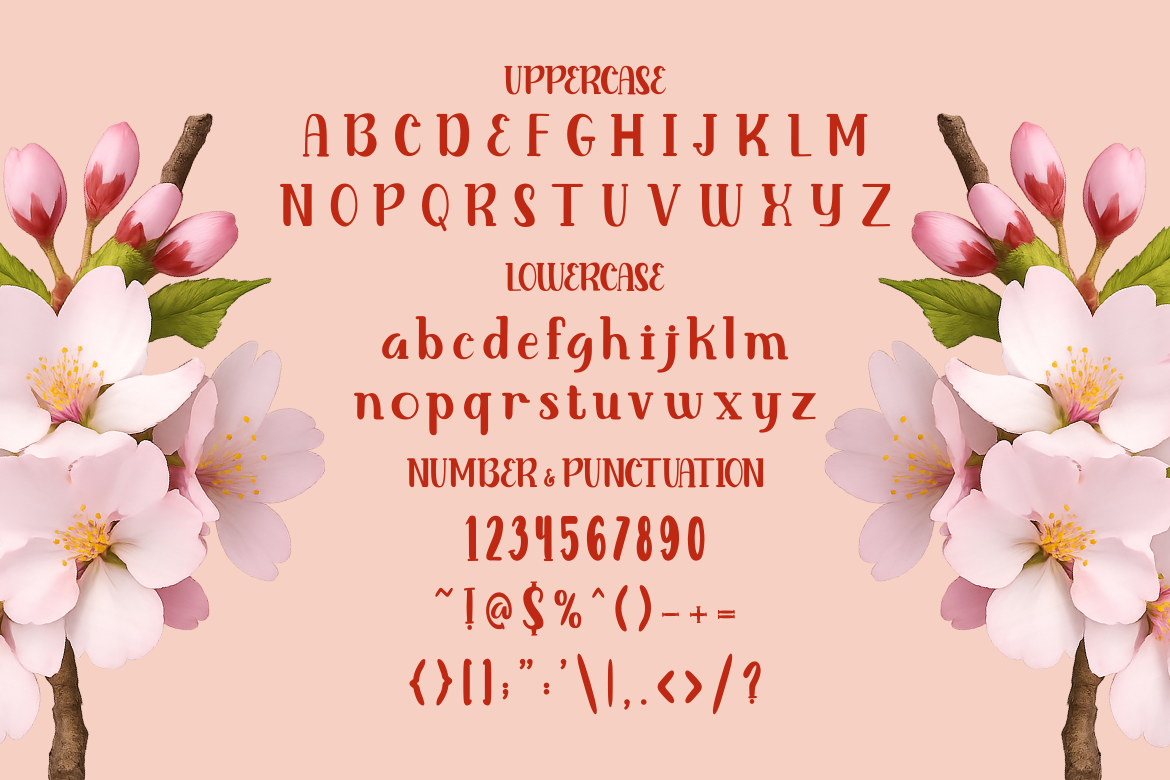
Blooming Pages blends graceful serif character with tall, slim, softly curved letterforms. Its fresh and gentle personality can make inclusive communication feel welcoming rather than institutional. Use it for prominent headlines and supportive brand moments rather than small interface labels.
PROS: Warm character, graceful silhouette, approachable elegance.
BEST FOR: Wellness, beauty, floral brands, community campaigns, and lifestyle platforms.
7. Bellique Logo Script Font

Bellique provides expressive script lettering with substantial strokes and a strong logotype composition. Its human movement can bring energy to campaigns that celebrate participation, independence, or adaptive experiences. Maintain ample size and spacing so connected letterforms remain easy to recognize.
PROS: Dynamic rhythm, bold branding presence, personal expression.
BEST FOR: Sports, fitness, lifestyle campaigns, merchandise, and modern logotypes.
6. Comparison
| Font | Visual Personality | Accessible Design Role | Best Direction |
|---|---|---|---|
| Twisly | Experimental and refined | Large editorial headings | Fashion and culture |
| Liquid Mirage | Fluid and psychedelic | Short campaign statements | Entertainment and technology |
| Elarion | Elegant and authoritative | Report covers and premium titles | Luxury and hospitality |
| Deco Vogue | Geometric and glamorous | Large architectural headings | Events and property |
| Maison Veloria | Condensed and polished | Space-efficient display titles | Retail and hospitality |
| Blooming Pages | Soft and welcoming | Inclusive campaign headings | Wellness and community |
| Bellique | Energetic and expressive | Logos and promotional titles | Sports and lifestyle |
Common Mistakes
A common mistake is delaying accessibility until the product is nearly complete. At that stage, teams may discover inaccessible component architecture, keyboard traps, poor focus order, unsuitable color combinations, or content that cannot be reorganized for screen readers. Retrofitting these problems can require expensive structural changes. Accessibility should be included in user stories, design-system components, content guidelines, vendor contracts, acceptance criteria, and every release cycle.
Another mistake is depending entirely on an automated scanner, AI assistant, or accessibility overlay. A tool may detect missing labels or insufficient contrast, but it cannot reliably determine whether alternative text communicates the image’s purpose, whether the reading order is logical, or whether a complex workflow is understandable. Automated tools are valuable for repeatable checks, but they must be combined with expert review and real user testing.
The final mistake is assuming accessible design must look plain or that a decorative font is automatically inaccessible. Accessibility depends on the complete implementation, including size, spacing, contrast, context, hierarchy, language, and available alternatives. Expressive typography can strengthen a brand, but it should never make essential navigation, instructions, form labels, or error messages harder to understand.
Conclusion
The evolution of digital accessibility shows a clear expansion of responsibility. What began as civil-rights protection developed into technical standards, legal requirements, organizational processes, and a broader commitment to equal digital participation.
The Rehabilitation Act and ADA established foundational rights. WCAG created a shared technical language. The European Accessibility Act expanded accessibility requirements across important commercial products and services. AI now introduces powerful assistive possibilities, but also new responsibilities around accuracy, consistency, transparency, and user control.
Inclusive products are not created by compliance statements alone. They emerge when designers, developers, content teams, managers, and people with disabilities work together from the beginning.
Typography from PutraCetol Studio can add elegance, energy, warmth, or cultural character to that experience. Used thoughtfully alongside readable functional typography, it can help an accessible product feel not only usable, but also distinctive and emotionally engaging.
Explore these fonts and many more at PutraCetol.com to build a business identity that looks professional, trustworthy, and memorable.
Additionally, if you want to explore some free typography options, you can check out Putracetol Studio on Dafont. Happy reading and designing!