
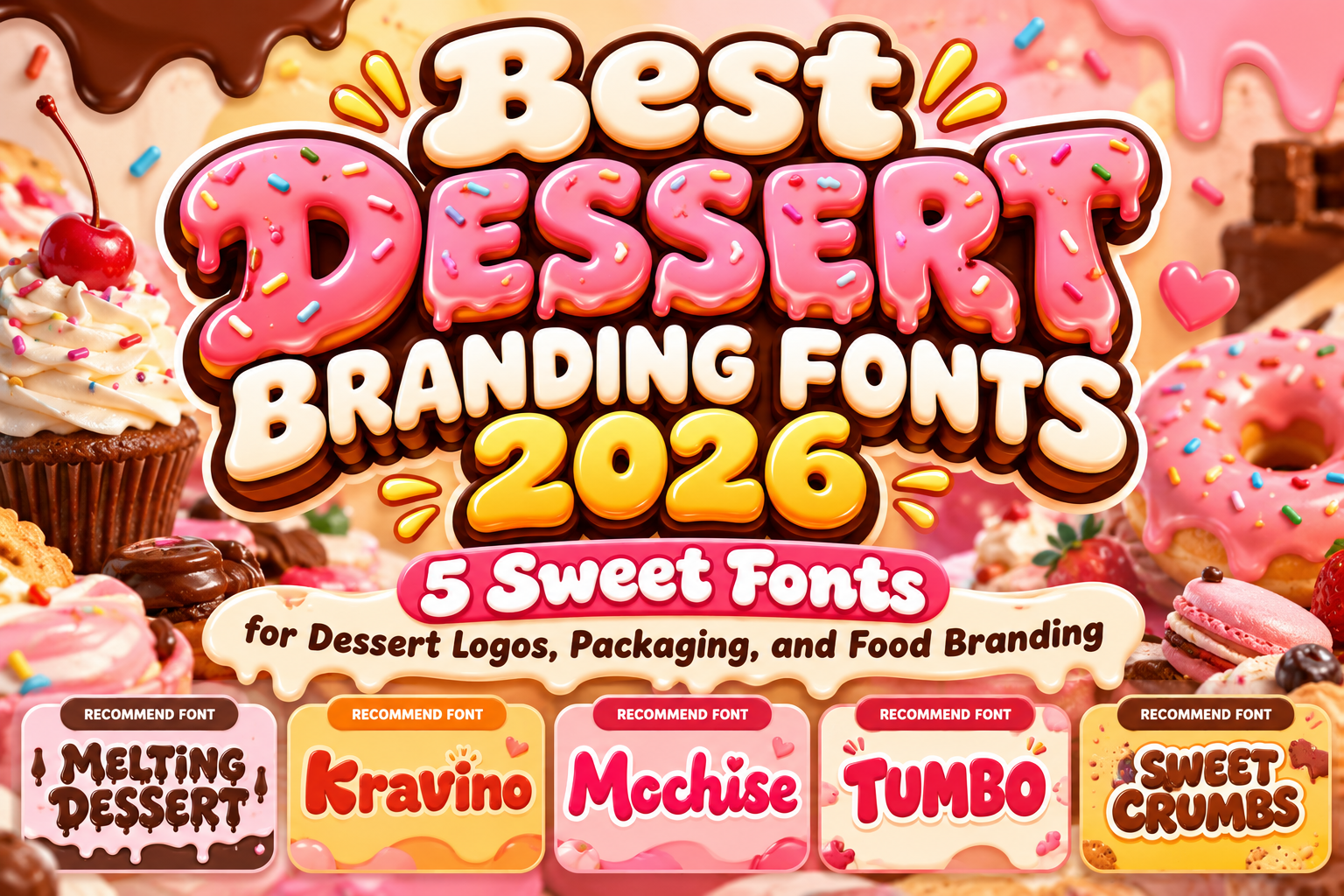
Best Dessert Branding Fonts 2026: 5 Sweet Picks for Packaging and Logos
Before customers taste a dessert, they usually experience it visually. Packaging, store signage, menus, social media posts, and product labels can all shape expectations about whether a product feels creamy, indulgent, homemade, playful, or premium.
That makes typography particularly important for dessert businesses. The best dessert branding fonts 2026 do more than display a brand name. Their shapes can reinforce sweetness, softness, energy, and personality while helping products stand out on crowded shelves and digital feeds.
For designers, agencies, and food entrepreneurs, the goal is to select typography that feels delicious without sacrificing readability or brand consistency.
Initial Suggestion: Match Typography to the Dessert
Start with the personality of the product rather than choosing the cutest font available.
An ice cream shop can benefit from melting or rounded lettering, while a handmade mochi brand may work better with soft script forms. Candy packaging usually allows more exaggerated typography, whereas a bakery selling premium cakes may need playful lettering balanced with a simpler supporting font.
Test your actual product name on packaging before committing. Words such as “Berry Melt,” “Cookie Cloud,” or “Sweet Mochi” can reveal how curves, spacing, and unusual characters behave much better than evaluating an alphabet alone.
Jump to Recommended Fonts
1. Melting Dessert Display Font

Melting Dessert immediately connects typography with the visual language of melting chocolate, frosting, ice cream, and other indulgent treats. Its quirky display construction and flowing forms give dessert packaging an expressive focal point, while alternate characters and OpenType features provide additional flexibility when creating distinctive logos. PutraCetol also positions it for dessert shops, candy products, bakery packaging, and playful food applications.
PROS: Distinctive melting appearance, playful personality, stylistic alternatives.
BEST FOR: Ice cream, chocolate, candy packaging, dessert shops.
2. Kravino Bold Display Font
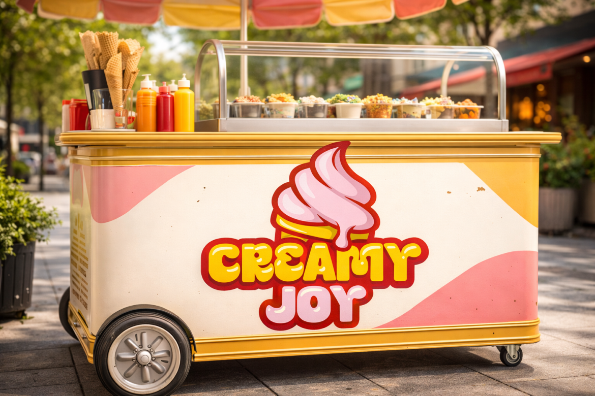
Kravino uses chunky proportions, rounded corners, and slightly irregular curves to create a friendly yet highly visible identity. Its substantial letterforms can hold their presence on packaging, menu headers, storefront signage, and short product names without appearing overly formal. PutraCetol specifically associates the typeface with ice cream, bakery, candy, dessert, and snack branding.
PROS: Strong visibility, cheerful structure, versatile food-branding personality.
BEST FOR: Ice cream stores, bakeries, snack products, family-oriented brands.
3. Mochise Food Font

Mochise takes a different approach through thick, smoothly connected script lettering inspired by soft and chewy desserts. Rounded strokes and flowing connections introduce a handcrafted personality while maintaining enough visual weight for logos and prominent packaging titles. Its character makes it particularly suitable for brands that want sweetness to feel warm, friendly, and personal.
PROS: Soft connected script, handcrafted character, distinctive food personality.
BEST FOR: Mochi products, cafés, bakeries, sweet snacks.
4. Tumbo Bold Rounded Font
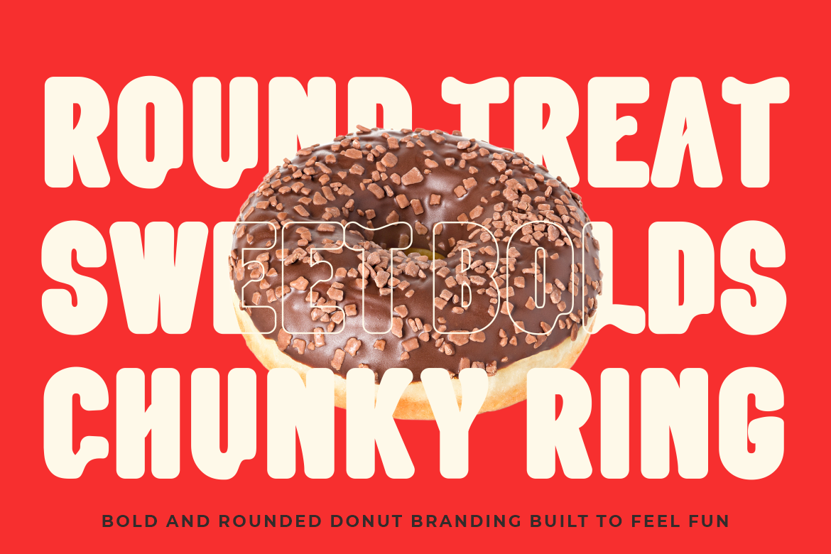
Tumbo combines a heavy body with soft corners and broad, rounded shapes. The result feels cheerful and approachable, making short brand names highly noticeable on boxes, cups, labels, menu boards, and promotional graphics. Its rounded construction is particularly well suited to donut shops, candy brands, bakeries, dessert cafés, and other businesses built around fun food experiences.
PROS: Chunky structure, soft shapes, excellent headline presence.
BEST FOR: Donuts, cookies, bakery packaging, cheerful dessert brands.
5. Sweet Crumbs Playful Food Display Font
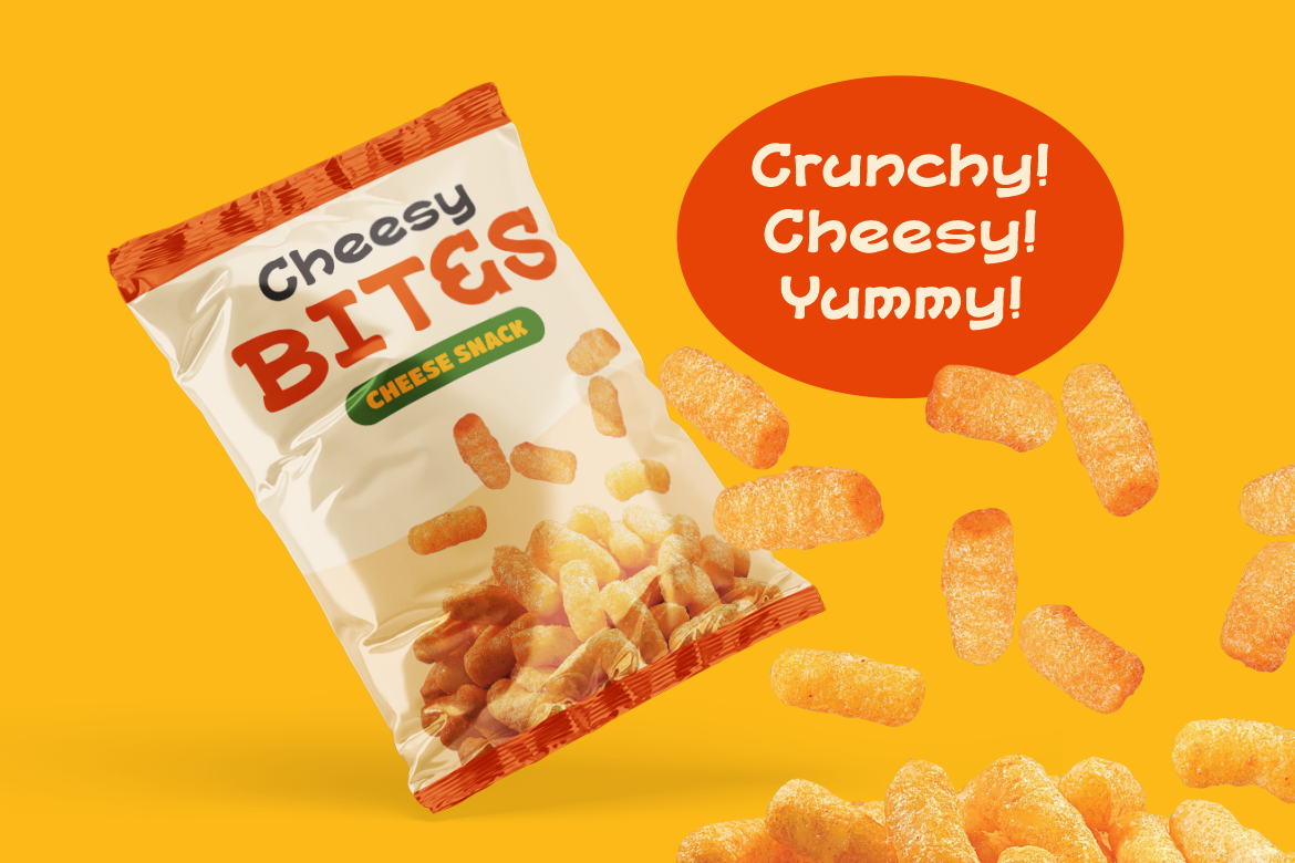
Sweet Crumbs uses soft, chunky, slightly irregular forms to create an inviting handmade mood. It works especially well where a brand needs to feel cheerful rather than polished or corporate, making it useful for product names, packaging, advertising, signage, and social media. Its applications extend naturally across cookies, chocolate, ice cream, snacks, bakeries, and dessert businesses.
PROS: Friendly handmade feeling, expressive shapes, broad food-branding use.
BEST FOR: Cookies, snack packaging, candy shops, playful bakery identities.
Comparison: Which Dessert Font Fits Your Brand?
| Font | Main Personality | Suggested Application |
|---|---|---|
| Melting Dessert | Gooey and playful | Ice cream and chocolate |
| Kravino | Chunky and energetic | Desserts and snack packaging |
| Mochise | Soft and handcrafted | Mochi and boutique cafés |
| Tumbo | Rounded and cheerful | Donuts and bakery branding |
| Sweet Crumbs | Friendly and quirky | Cookies and candy products |
The strongest choice depends on the emotion your dessert should communicate. Melting effects suggest indulgence, rounded typography can communicate softness and friendliness, while script lettering can introduce a more handmade personality.
Common Mistakes in Dessert Typography
A frequent mistake is making every visual element equally playful. A decorative dessert font may work beautifully for a logo or flavor name, but using the same expressive lettering for ingredients, prices, descriptions, and nutritional information can quickly reduce clarity. Build hierarchy instead. Use the display font for the brand name and major headlines, then combine it with a clean serif or sans serif for practical information.
Another problem is choosing typography without testing it on real packaging. A logo that looks attractive on a large monitor may become difficult to recognize on a small ice cream cup or mobile advertisement. Test different sizes, print samples, social media thumbnails, and shelf-distance visibility. Also avoid relying on typography alone to communicate flavor. Color, photography, illustrations, packaging shape, and lettering should work together as one consistent visual system.
Finally, check licensing before commercial production. Logo usage, packaging quantities, advertising, websites, and other commercial applications may require different coverage depending on the font license and distribution method.
Conclusion
The best dessert branding fonts 2026 translate taste and personality into visual form. Melting Dessert can emphasize indulgence, Kravino and Tumbo provide chunky friendliness, Mochise introduces a softer handwritten voice, while Sweet Crumbs gives food branding an approachable playful character.
Choose typography based on the dessert, audience, packaging format, and personality you want customers to remember. Explore these fonts and other food-focused typefaces at PutraCetol Studio to build dessert branding that looks as tempting as the product itself.
Explore these fonts and many more at PutraCetol.com to build a business identity that looks professional, trustworthy, and memorable.
Additionally, if you want to explore some free typography options, you can check out Putracetol Studio on Dafont. Happy reading and designing!