
Cursive fonts bring a sense of elegance, artistry, and personality to design. Whether used for branding, invitations, posters, or digital content, cursive typography can instantly enhance the emotional tone of a project. However, because of their decorative nature, these fonts require careful strategy. When misused, they can appear overwhelming or difficult to read.
This article outlines five essential tips for using cursive fonts professionally, along with practical applications and recommended typefaces from Putracetol.com to help designers create beautiful, balanced, and readable designs.
Understanding the Role of Cursive Fonts
Cursive fonts mimic the fluid strokes of handwritten lettering. Their curves, loops, and connected strokes make them ideal for projects that need warmth, personality, or elegance. These fonts often evoke emotions such as romance, nostalgia, luxury, or creativity making them especially popular in lifestyle branding, event invitations, and artistic marketing campaigns.
But cursive typefaces must be used with intention. The right font can elevate a design; the wrong one can create visual clutter. That’s why understanding the key principles behind cursive typography is essential for every designer.
🎯 5 Tips for Using Cursive Fonts from Putracetol.com
1. Choose Fonts That Fit the Context
Not all cursive fonts work for every project. As expressive as they are, cursive styles should match the message and tone you want to convey.
Ideal contexts for cursive fonts:
- Wedding invitations
- Luxury and boutique branding
- Beauty and lifestyle advertising
- Signature-style logos
- Greeting cards
- Creative posters
For example, Putracetol.com offers elegant cursive-style fonts like Lux Ocean, which works beautifully for restaurant branding or premium food products. Meanwhile, a playful script like Sweete Line suits artistic or feminine-themed content.
Contextual alignment ensures that the atmosphere created by the typography matches the design’s purpose.
2. Prioritize Readability
Cursive fonts can become difficult to read if they’re too decorative or too compressed. Professional designers always prioritize clarity. Even the most artistic script must be legible.
Tips to ensure readability:
- Avoid overly complex flourishes for essential text.
- Use cursive fonts mainly for short phrases, titles, or names.
- Test readability at different sizes, especially on mobile screens.
- Adjust letter spacing manually if needed to improve clarity.
Readable cursive fonts such as Lux Ocean or Sweete Line strike a balance between artistic style and clean structure, making them versatile for professional use.
3. Use Appropriate Sizing
Cursive fonts usually work best in large display formats. Because of their detailed strokes, they lose clarity when placed in long paragraphs or small sizes.
Best uses:
- Headlines
- Titles
- Taglines
- Logo wordmarks
Not recommended for:
- Body text
- Dense paragraphs
- Technical descriptions
Keeping cursive typography in display roles ensures that the design remains clean and professional.
4. Pair Cursive Fonts with Simple Fonts
Pairing is essential when working with decorative typefaces. Cursive fonts shine when matched with clean and neutral typography. This contrast creates visual balance and improves readability.
Common pairings:
- Cursive + Sans Serif
- Cursive + Serif
- Cursive + Condensed Sans
For example:
- Pair Lux Ocean with a modern sans serif like Conventri.
- Match Sweete Line with a soft serif for a classic look.
This approach helps guide the viewer’s eye and maintains a professional hierarchy in the layout.
5. Maintain Design Consistency
Consistency is key in design, especially when using expressive fonts. Once you choose a cursive style, apply it consistently across related materials to strengthen brand identity.
Ways consistency helps:
- Builds recognition
- Creates a cohesive visual theme
- Supports brand storytelling
- Ensures professional presentation
Whether you’re designing a brand kit, a wedding suite, or a marketing campaign, maintaining a uniform typographic tone makes the work feel intentional and polished.
Practical Applications of Cursive Fonts
Logo and Branding
Cursive fonts create personalized and elegant wordmarks. Many premium brands use script typography to communicate exclusivity or heritage.
Invitations & Greeting Cards
Cursive fonts naturally suit celebrations, weddings, seasonal events, and personalized messages. They elevate the emotional value of the design.
Posters & Advertising
Decorative typography draws attention, making cursive fonts ideal for artistic posters, event promotions, or themed advertising campaigns.
Digital Content
Lifestyle blogs, creative Instagram posts, YouTube thumbnails, and Pinterest graphics often use cursive fonts to add personality and a crafted feeling.
Recommended Cursive-Inspired Fonts from Putracetol.com
These curated fonts from Putracetol.com provide both style and readability:
Lux Ocean
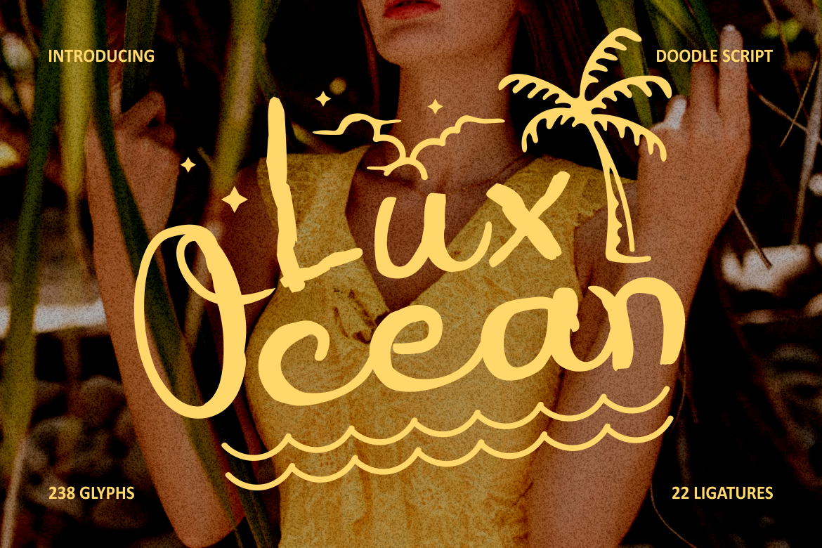
Elegant handwritten aesthetic perfect for food branding, boutique businesses, or lifestyle products.
Sweete Line
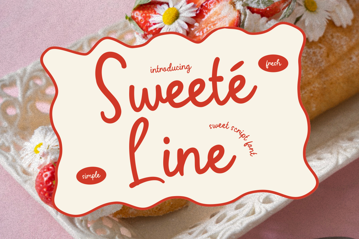
Expressive, feminine, and artistic ideal for social media, beauty brands, or invitations.
Gilded Glint Script Variant

Offers a refined, premium handwriting style for high-end branding or editorial graphics.
Happy Groov Script Variant
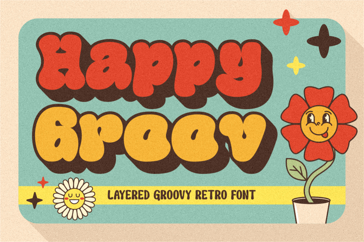
Nostalgic and approachable, suitable for classic-themed designs or vintage culinary content.
Country Foody Script Style

A friendly, warm cursive look ideal for food brands, restaurant ads, or recipe cards. Using these fonts gives designers more flexibility in creating emotional and engaging visual stories.
Why Cursive Fonts Continue to Be Popular
Even as modern minimalism grows, cursive fonts continue to thrive because they bring elements that clean typography cannot replace:
- Emotional connection
- Warmth and personality
- Artistic value
- Human-like expression
These qualities make them timeless tools for storytelling in design.
Conclusion
Cursive fonts can elevate visual communication when applied with intention and professionalism. By choosing the right style, ensuring readability, adjusting size appropriately, pairing thoughtfully, and staying consistent, designers can produce elegant and engaging work.
With curated cursive fonts from Putracetol.com, both beginners and experienced designers can create branding, invitations, posters, and digital content that feel personal, artistic, and refined.
Explore the full collection and start enhancing your designs with typography that speaks with elegance and creativity.
Thank you for taking the time to read this article. If you are looking for more great articles, feel free to visit Putracetol Blog
Additionally, if you want to explore some free typography options, you can check out Putracetol Studio on Dafont. Happy reading and designing!