

The Best Condensed Fonts: Modern Typography for Space-Efficient, Stylish Design
Typography has always played a fundamental role in visual communication, but in today’s fast-paced digital landscape, designers face new constraints: limited screen space, shifting user attention, and the need for clear visual hierarchy. This is where condensed fonts excel. With narrower proportions and compact letterforms, condensed typefaces allow designers to communicate more information without sacrificing clarity, aesthetics, or brand tone.
Over the last decade, condensed fonts have surged in popularity across branding, editorial work, packaging, and digital platforms. Their appeal lies in their ability to feel modern, confident, and highly functional qualities that align with current design trends that prioritize clarity, directness, and visual efficiency.
What Exactly Are Condensed Fonts?
Condensed fonts are typefaces designed with reduced horizontal width, meaning letters are narrower than standard fonts. This structural compression helps maximize space without shrinking the font size or compromising legibility.
While condensed typography is not new it has existed in poster printing and newspaper layouts for over a century its function has evolved. What used to be about space optimization in physical media has now become a style tool for digital branding.
Why Condensed Fonts Matter in Modern Design
Condensed fonts serve both practical and expressive roles. Below are the key reasons they stand out:
1. Space Efficiency
Condensed letterforms reduce horizontal consumption, allowing designers to:
- fit more text into tight spaces
- scale large headlines without wrapping
- maintain balance in narrow layouts
This is particularly useful for mobile interfaces, packaging labels, and editorial designs where real estate is limited.
2. High Legibility at Smaller Sizes
Despite their compact structure, many condensed fonts are engineered for readability. They excel in:
- subheadings
- product labels
- UI elements
- magazine columns
This makes them highly versatile in both print and digital formats.
3. Modern, Minimal, and Confident Aesthetics
Condensed typography carries an inherent sense of structure and refinement. Depending on the style, condensed fonts can communicate:
- boldness
- cleanliness
- sophistication
- technical precision
This explains their popularity in industries such as tech, fashion, lifestyle, and contemporary branding systems.
4. Strong Branding Presence
Brands often use condensed fonts for:
- logotypes
- taglines
- campaign headlines
- packaging
- posters
Narrow letterforms allow text to feel impactful without appearing heavy or oversized.
Where Condensed Fonts Are Commonly Used
Condensed typography appears across a wide range of modern design applications:
| Usage Context | Why It Works |
|---|---|
| Headlines | High visual impact, strong personality |
| Posters | Fits large text into limited space |
| Packaging | Enhances clarity and shelf visibility |
| Logos | Allows boldness without wide spacing |
| Editorial layouts | Maintains hierarchy and readability |
| Digital UI | Efficient for small screens and mobile |
| Sports & athletic branding | Conveys energy and grit |
| Fashion branding | Feels stylish and minimal |
Condensed fonts strike a balance between aesthetics and function, allowing designers to make statements without crowding the canvas.
Examples of Condensed Fonts from Putracetol.com
To illustrate how condensed fonts apply in real-world design, below are notable options from Putracetol’s catalog:
1. Ironcore (Condensed Ligature Font)

Link: https://putracetol.com/product/ironcore-condensed-ligature-font/
Ironcore features bold compressed forms with sharp ligature details. It feels strong, industrial, and confident, perfect for athletic branding, posters, and logo systems that demand impact.
2. Compacture (Condensed Font)
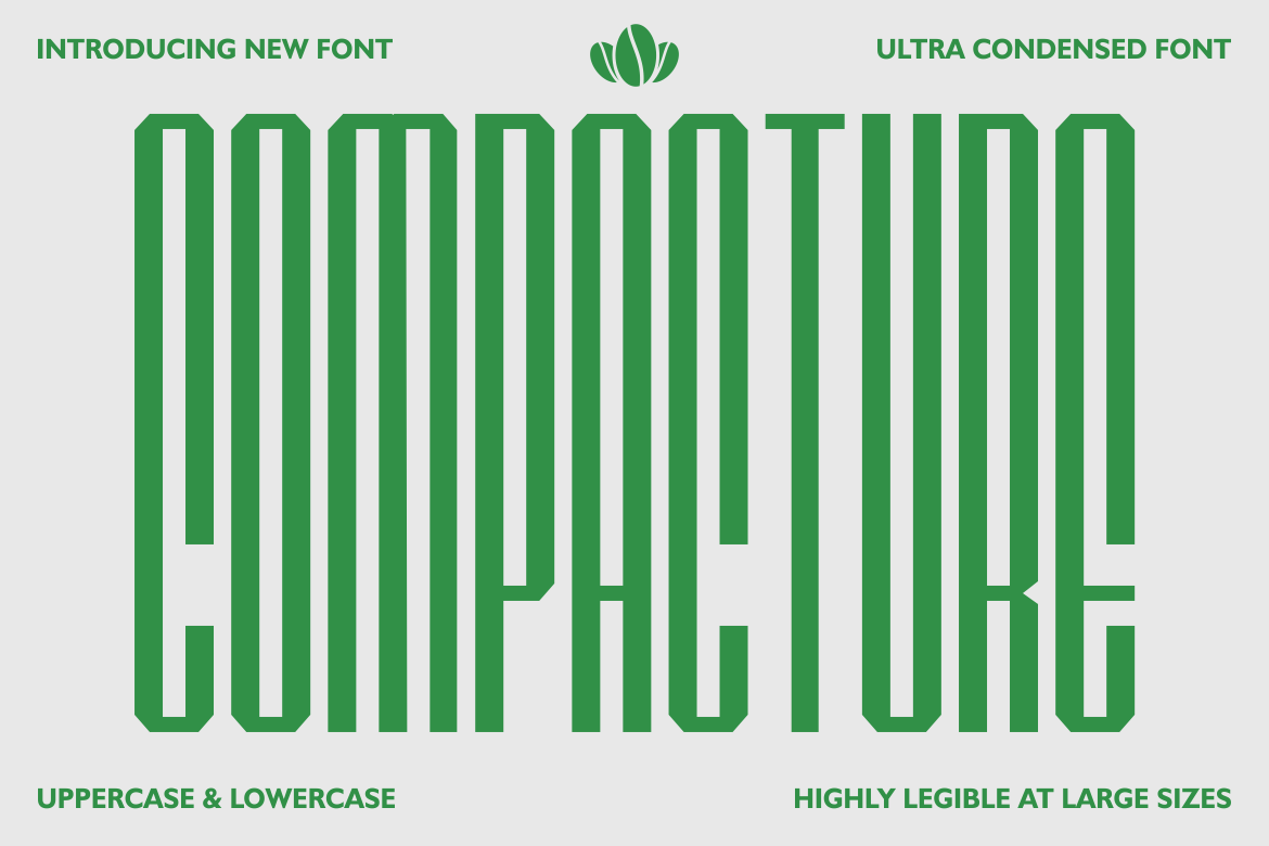
Link: https://putracetol.com/product/compacture-condensed-font/
Compacture leans into minimalist geometry with a clean and modern style. Its narrow proportions make it suitable for branding, editorial layouts, and premium packaging where refinement matters.
3. Styvia (Logo Font)
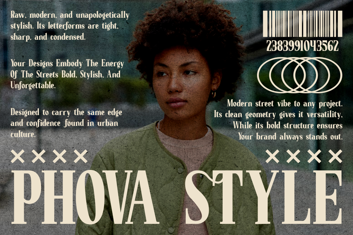
Link: https://putracetol.com/product/styvia-logo-font/
Styvia offers a natural and elegant condensed structure with subtle style variations. Its versatility makes it effective for logo design, identity systems, and fashion branding work.
Together, these three fonts show the range of expression within condensed typography from bold and gritty to elegant and restrained.
Condensed vs. Extended Fonts: A Useful Contrast
Typography exists across a spectrum. On the opposite end from condensed lies the extended category fonts with wide proportions and broad letterforms.
Here’s how they differ:
| Aspect | Condensed Fonts | Extended Fonts |
|---|---|---|
| Width | Narrow | Wide |
| Feel | Modern, efficient, structured | Bold, spacious, luxurious |
| Best for | Packaging, posters, mobile, branding | Sports, billboards, luxury, high-impact campaigns |
| Space usage | Space-saving | Space-consuming |
| Message tone | Efficient and contemporary | Energetic and expansive |
Condensed fonts are often chosen when designers need refinement and information density, while extended fonts are used to create drama and visual dominance.
Tips for Choosing the Right Condensed Font
Because typeface selection affects structure and tone, designers should consider:
1. Brand Personality
Condensed fonts can communicate:
- daring (bold condensed)
- professionalism (clean condensed)
- elegance (refined condensed)
- grit (industrial condensed)
Match the font to the brand’s desired voice.
2. Readability
Avoid fonts that appear cramped at smaller sizes. Always test:
- line spacing
- word spacing
- screen rendering
- print output
3. Use Case
Not all the fonts are suited for body text. Many excel as:
- headlines
- logos
- titles
- section markers
4. Style Consistency
The fonts should integrate naturally within the existing brand typography ecosystem, especially when paired with:
- wide body fonts
- serif companions
- geometric sans-serifs
Benefits of Condensed Fonts (Summary Table)
| Benefit | Explanation |
|---|---|
| Space efficiency | Ideal for limited layout environments |
| Modernity | Aligns with contemporary design trends |
| Flexibility | Functions well in print and digital |
| Strong branding | Offers distinctive visual character |
| Legibility | Maintains clarity at reduced sizes |
| Scalable | Works across signage, posters, and packaging |
Why Condensed Fonts Matter in Branding Today
Brands today operate across a multi-platform ecosystem where typography must scale across:
- storefronts
- websites
- mobile apps
- packaging
- social content
- advertising
- merchandising
The fonts help unify these environments while ensuring consistency and recognition.
They also resonate with modern consumer attitudes favoring minimal, structured, and contemporary design aesthetics.
Conclusion
The fonts have become a powerful typographic tool for designers who want to balance form and function. Their clean, narrow proportions make them ideal for modern branding, editorial work, packaging, and digital platforms. Beyond space efficiency, they offer mood, personality, and professional clarity, qualities that align with today’s design landscape.
For brands and designers seeking a modern and efficient visual language, condensed typefaces are more than a stylistic trend, they’re a strategic asset.
Thank you for taking the time to read this article. If you are looking for more great articles, feel free to visit Putracetol Blog
Additionally, if you want to explore some free typography options, you can check out Putracetol Studio on Dafont. Happy reading and designing!