
In today’s fast-paced digital landscape, space-efficient design has become a defining principle of modern aesthetics. Whether it’s web interfaces, posters, or mobile layouts, designers are constantly challenged to communicate more with less. This is where sans serif condensed fonts shine.
Condensed fonts are narrow, sleek, and powerful. By reducing character width and tightening letter spacing, these typefaces help save valuable space without sacrificing modern appeal. They’ve become indispensable in branding, UI design, and advertising, where every pixel and every inch matters.
This article explores the unique characteristics of sans serif condensed fonts, their practical advantages, and top professional recommendations from Putracetol.com a trusted source for premium and creative typefaces.
1. Understanding Condensed Fonts
Before diving into why condensed fonts are so effective, it’s important to understand what they are and how they differ from traditional sans serif styles.
What Are Condensed Fonts?
Condensed fonts are narrower versions of standard typefaces, designed with tighter spacing between characters. They maintain vertical proportion but compress horizontal width, allowing more text to fit into limited areas while maintaining visual consistency.
A sans serif condensed font removes decorative elements and focuses on clarity and modernity—making it ideal for minimalist and bold design.
Condensed vs. Extended Fonts
| Feature | Condensed Fonts | Extended Fonts |
|---|---|---|
| Character Width | Narrow | Wide |
| Spacing | Tight | Open |
| Readability | Moderate (best for short text) | High (great for long text) |
| Design Purpose | Space-saving, modern | Expansive, elegant |
| Mood / Tone | Bold, contemporary | Relaxed, premium |
Both types serve specific purposes. Extended fonts exude openness and luxury used in editorials and premium branding, while condensed fonts are perfect for posters, logos, packaging, and digital banners where space is limited but impact is essential.
2. Why Designers Choose Condensed Fonts
Condensed fonts have grown increasingly popular in digital design, branding, and advertising, and for good reason. They blend functionality with aesthetics, making them highly adaptable to modern visual communication.
1. Space Efficiency
One of their most practical advantages is space conservation. Condensed fonts allow designers to include more text without cluttering layouts. This makes them perfect for:
- Mobile interfaces
- Billboards or signage
- Magazine covers
- Product packaging
2. Modern and Assertive Look
Sans serif condensed typography convey strength, precision, and modernity. Their vertical emphasis gives text a bold stance, suitable for tech companies, startups, and editorial layouts.
3. Visual Hierarchy and Emphasis
Because condensed typography are naturally bold and tall, they attract attention instantly, making them ideal for headlines, titles, and key visuals.
4. Branding Consistency
Many brands use condensed Typography in logos and taglines to achieve a compact yet memorable identity. Their minimalistic structure complements clean design systems and ensures readability across platforms.
💡 Pro Tip: When using condensed typography, balance them with whitespace and simpler elements to avoid visual crowding.
3. Key Considerations When Using Condensed Typography
While sans serif condensed typography are stylish and practical, they require thoughtful application to maintain balance and readability.
Avoid Long Paragraphs
Because of their tight letter spacing, condensed typography can be hard to read in body text. Use them for headlines, callouts, or navigation elements, not for full articles or paragraphs.
Check Kerning and Line Height
Condensed Typography often have reduced space between characters. Adjust tracking (letter spacing) and leading (line spacing) carefully to ensure optimal legibility.
Contrast with Simplicity
Pair condensed Typography with neutral or minimalist backgrounds to make them stand out. Overly textured or complex backdrops can make condensed text appear cramped.
Pairing Fonts
Condensed typefaces work beautifully when combined with open or geometric sans serifs. This creates visual rhythm and balance between compact and airy elements.
4. Condensed vs. Extended Typography: The Design Dynamics
The distinction between condensed and extended fonts is more than just width, it’s a matter of tone and communication.
- Condensed Fonts speak in bold, efficient language. They imply urgency, innovation, and modernity.
- Extended Fonts, on the other hand, breathe luxury and sophistication. They’re elegant, deliberate, and often used in high-end design.
Designers often mix both to balance contrast and pacing in layouts. For instance, a brand might use condensed typography for titles (assertive tone) and extended fonts for subheadings (refined feel).
The key lies in understanding each type’s psychological impact condensed fonts demand attention, while extended fonts invite admiration.
5. Top 7 Condensed Fonts from Putracetol.com
For designers seeking high-quality fonts that balance beauty and performance, Putracetol.com offers an outstanding collection. Below are some of the best picks tailored for different moods and industries.
1. Ironcore – Bold and Modern
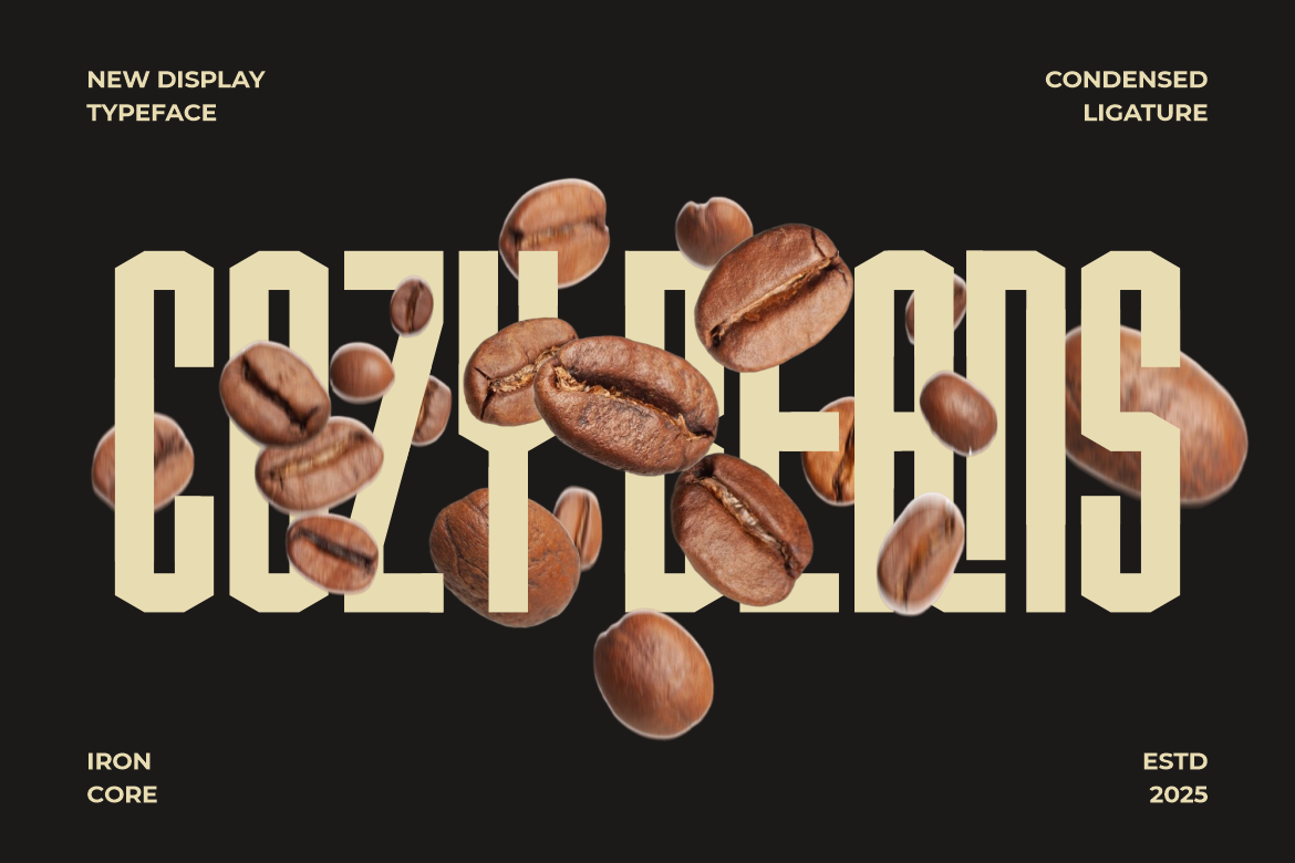
Ironcore embodies confidence and strength. Its tall, narrow design makes it perfect for sports, gaming, or tech branding. The crisp lines and modern appeal ensure clarity across digital and print platforms.
💡 Use for: Headlines, esports logos, posters, and industrial branding.
2. Compacture – Retro with Strong Personality

Compacture merges vintage flair with modern proportions. It has a distinct retro energy, making it ideal for creative campaigns, music covers, and lifestyle branding.
💡 Use for: Retro packaging, café menus, or fashion lookbooks.
3. Country Foody – Nostalgic and Warm

Country Foody offers a playful, handcrafted feel. Its slightly condensed design and charming letterforms make it perfect for culinary brands, restaurant signage, and artisanal packaging.
💡 Use for: Food product labels, bakery logos, and cozy branding.
4. Black Crest – Stylish Retro Versatility

A sophisticated retro font that balances tall proportions with soft curves. Black Crest shines in editorial design and premium branding where nostalgia meets elegance.
💡 Use for: Luxury labels, lifestyle blogs, or vintage posters.
5. Slimetra – Unique and Attention-Grabbing

Slimetra is a sleek, narrow sans serif font with futuristic undertones. Its bold geometry makes it perfect for cutting-edge projects.
💡 Use for: Tech branding, album covers, and minimalist product packaging.
6. Bold Block – Tall and Playful

As its name suggests, Bold Block combines solid structure with a hint of playfulness. Ideal for children’s brands, games, or educational materials, it’s fun yet professional.
💡 Use for: Youth-oriented designs, event posters, and digital banners.
7. Formaxis – Precision and Quality

Formaxis delivers clean lines, uniform strokes, and exceptional balance a refined choice for corporate branding and UI design. It’s the go-to font when professionalism meets modern style.
💡 Use for: Corporate identity, editorial layouts, and app interfaces.
6. Tips for Designing with Condensed Fonts
Using condensed fonts effectively requires a strategic approach. Follow these best practices for optimal results:
✅ 1. Prioritize Hierarchy
Use condensed fonts for titles and emphasis, pairing them with simpler text fonts for supporting content.
✅ 2. Contrast Is Key
Combine condensed fonts with wide or neutral typefaces to balance density and create visual flow.
✅ 3. Adjust for Screen Display
Always test how your condensed font appears on different devices especially smaller screens to maintain legibility.
✅ 4. Maintain White Space
Because condensed fonts occupy less horizontal space, adding ample margins and padding keeps the design breathable.
✅ 5. Experiment with Weight
Varying font weights (light, medium, bold) within a condensed family can add rhythm and depth to your design without needing multiple font types.
7. Where Condensed Fonts Excel: Practical Applications
Condensed fonts thrive in contexts where space is limited but visual power is crucial. Here are a few design settings where they perform best:
- Posters and Flyers: Capture attention with tall, assertive lettering.
- Mobile UI and Web Design: Save screen space while maintaining impact.
- Brand Logos: Build strong, compact wordmarks that remain readable in small formats.
- Editorial Layouts: Ideal for magazine covers or section headers.
- Product Packaging: Perfect for narrow labels or stacked text compositions.
By integrating condensed fonts thoughtfully, designers can enhance clarity, modernize branding, and improve spatial balance.
Conclusion: Small Width, Big Statement
Sans serif condensed fonts prove that less width doesn’t mean less power. They embody modern minimalism, efficiency, and confidence making them a key element in today’s design landscape.
Whether you’re optimizing for mobile screens, crafting a logo, or designing editorial headlines, understanding how condensed and extended fonts differ will help you make smarter visual decisions.
Explore the full range of sans serif condensed fonts at Putracetol.com, featuring bold modern designs like Ironcore, Compacture, Slimetra, and Formaxis. Each one offers a unique balance of form, function, and personality proving that typography, when used wisely, can transform design from ordinary to extraordinary.
Thank you for taking the time to read this article. If you are looking for more great articles, feel free to visit Putracetol Blog
Additionally, if you want to explore some free typography options, you can check out Putracetol Studio on Dafont. Happy reading and designing!