
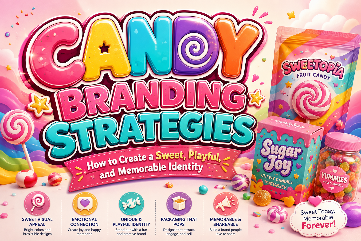
The strongest candy branding strategies begin with emotion rather than decoration. Before choosing bright colors, mascots, or playful typography, decide what customers should feel when they see the product.
A sour candy brand might communicate energetic surprise. Handmade caramels may emphasize warmth and nostalgia. A colorful gummy brand could focus on imagination and discovery, while premium chocolate-covered candy may require a more sophisticated personality.
Choose three emotional qualities, such as joyful, adventurous, nostalgic, magical, playful, or indulgent. Those qualities should guide the logo, packaging, typography, color palette, illustrations, product names, photography, and marketing language.
This consistency matters because candy packaging itself acts as a major communication surface. Research on food packaging shows that visual elements such as color, imagery, characters, and overall brand identity can influence how children perceive and respond to packaged products.
Why Candy Branding Needs More Than a Cute Logo
Candy is a visually competitive category. Products often appear together in colorful retail environments, online marketplaces, party displays, gift boxes, and social media feeds.
A recognizable candy brand therefore needs more than an attractive wordmark. It needs a complete visual system that helps customers identify the product quickly and understand what kind of experience it promises.
A strong system may include:
- A recognizable logo or wordmark
- A limited but expressive color palette
- A distinctive display typeface
- Consistent product photography
- Clear flavor differentiation
- Repeatable illustration or pattern styles
- Packaging shapes that support recognition
- A clear emotional story
The goal is consistency without repetition. Individual flavors can have different colors or characters while still appearing to belong to the same brand family.
Use Bright Colors With a Clear Hierarchy
Color is one of the easiest ways to communicate flavor and personality in confectionery branding.
Strawberry products may use red or pink, citrus flavors can move toward yellow or orange, mint can use green, and berry products may introduce purple or blue. These connections help customers navigate a product range quickly.
However, a candy package does not need every bright color simultaneously.
A practical system might include one dominant brand color, one flavor color, and one contrasting accent. For example:
Brand color: Bubblegum pink
Flavor color: Lemon yellow
Accent: Deep purple
Another flavor could retain the same pink foundation while replacing yellow with lime green. This creates variety while preserving brand recognition.
Packaging research has found that color and imagery are among the visual cues capable of influencing attention and product attitudes, particularly in child-targeted food categories.
Make Typography Part of the Product Personality
Candy typography can be rounded, inflated, handwritten, wavy, striped, bouncy, or intentionally irregular. The letterforms themselves can suggest softness, crunchiness, sweetness, fizz, or surprise.
A marshmallow brand might use soft rounded lettering. Sour candy may benefit from sharper forms and irregular movement. Holiday candy can use peppermint-inspired patterns, while a birthday product can use decorative letters that feel like party graphics.
The key is to maintain recognition.
Use expressive typography for the brand name, flavor name, or campaign headline. Ingredients, nutritional information, instructions, and small supporting copy should use a simpler typeface.
This contrast keeps the packaging playful without making essential information difficult to read.
Give Every Product a Visual Story
Storytelling gives customers something to remember beyond flavor.
A brand might build a fictional candy world in which each flavor represents a location. Another could create small characters with different personalities. A nostalgic confectionery brand might tell stories inspired by fairs, childhood celebrations, family recipes, or traditional candy stores.
The story should appear consistently across:
- Packaging illustrations
- Product names
- Social media
- Website content
- Seasonal campaigns
- Gift boxes
- Point-of-sale displays
The story does not need to be complicated. A simple recurring idea can create stronger brand memory than constantly changing themes.
For brands marketed toward children, storytelling should also be handled responsibly. The FTC has specifically examined marketing practices involving food and children and emphasizes that advertising should remain clearly identifiable rather than blurring entertainment and promotion.
Create Packaging That Works From a Distance
A candy package often receives only a short moment of attention. The customer should be able to recognize three things quickly:
- The brand
- The product or flavor
- The reason it looks different from nearby alternatives
Place the brand name prominently and maintain a recognizable shape or typographic treatment across the range. Flavor details can change, but the visual architecture should remain consistent.
For example, every package could use the logo in the upper third, a large flavor name in the center, and a product window or illustration below it. Color can then distinguish strawberry from cola, lemon, mint, or mixed fruit.
This type of repeated structure allows customers to recognize the family before reading every word.
Turn the Product Into Shareable Content
Candy naturally supports visual marketing because color, texture, shape, and packaging can all become content.
A brand could photograph candies arranged into patterns, create short videos showing flavor combinations, invite customers to vote on a new color, or release limited seasonal packaging.
The most effective content should still look unmistakably connected to the packaging. Use the same typography, colors, illustration language, and photographic direction so that a social post reinforces shelf recognition rather than becoming an unrelated piece of content.
Create Seasonal Editions Without Losing Brand Recognition
Halloween, Christmas, birthdays, weddings, Valentine’s Day, and other celebrations create natural opportunities for confectionery brands.
Instead of redesigning everything, modify selected elements. Keep the core logo while changing the flavor palette, decorative pattern, background illustration, or secondary typography.
A Christmas edition could introduce red, green, peppermint stripes, and snow details. A birthday edition might use confetti, balloons, and bright multicolor accents.
Customers should immediately understand both ideas: this is a special edition, and it still comes from the same brand.
Design for Families, Not Only Children
Playful branding can appeal to children without making the entire identity childish. Parents, gift buyers, retailers, and adult consumers also interact with candy brands.
One approach is to combine expressive display typography with an organized layout. The logo can be fun, while ingredients and product information remain clear. Illustrations can feel cheerful without overwhelming the package.
This creates a brand that works for children, families, gifting occasions, retail displays, and digital marketing.
Because packaging and brand characters can influence children’s preferences, brands serving family audiences should be particularly careful about truthful claims and responsible marketing.
Jump to Recommended Fonts
Candy Form Display Font | Silky Candy | Sugarpop Jingle | Colorful Candy | Kroovella
1. Candy Form Display Font
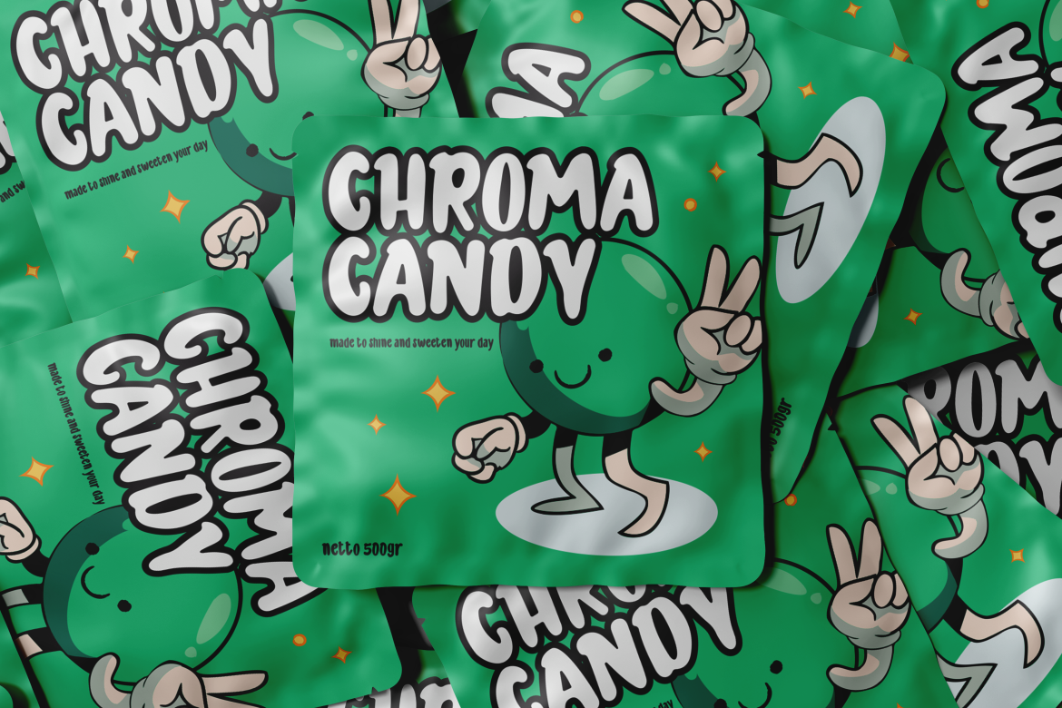
Candy Form uses thick, rounded letterforms with soft, inflated shapes that immediately suggest a sweet and playful product. Its substantial silhouette gives short candy names excellent packaging visibility, while the rounded construction keeps the personality friendly rather than aggressive. This makes it particularly useful when typography needs to function almost like an illustration on bags, boxes, labels, and promotional graphics.
PROS: Thick rounded shapes, strong shelf visibility, playful personality, and memorable display impact.
BEST FOR: Gummies, marshmallows, chewy candy, children’s confectionery, candy shops, packaging, and promotional headlines.
2. Silky Candy

Silky Candy is a sweet, cute, and fun display font designed around a cheerful visual personality. Its character set includes uppercase and lowercase letters, numbers, punctuation, multilingual support, and alternates, giving designers enough flexibility to develop logos, packaging headlines, posters, toys, books, and other playful branded materials. Its softer character is especially useful for brands that want to appear friendly and approachable rather than loud or rebellious.
PROS: Cute personality, alternate characters, multilingual support, and flexible display use.
BEST FOR: Family candy brands, soft sweets, gift products, children’s packaging, greeting products, and playful retail campaigns.
3. Sugarpop Jingle Christmas Candy Font

Sugarpop Jingle is designed specifically around Christmas confectionery, using whimsical letterforms inspired by peppermint swirls, candy canes, gingerbread, and festive holiday energy. The characters have a lively bounce and hand-drawn personality that can turn seasonal packaging into an instantly recognizable Christmas product. Its uppercase, lowercase, numbers, and festive punctuation also make it useful across packaging, gift tags, merchandising, store displays, and holiday campaigns.
PROS: Strong seasonal identity, candy-inspired detailing, cheerful letter rhythm, and excellent festive display value.
BEST FOR: Christmas candy, peppermint products, gift boxes, holiday chocolates, seasonal promotions, mugs, and festive merchandise.
4. Colorful Candy

Colorful Candy is a bold hand-lettered display family built for cheerful and highly expressive visual work. It contains two styles and provides extensive OpenType options including swashes, stylistic sets, contextual alternates, and ligatures, allowing designers to create varied letter combinations instead of relying on one repetitive wordmark. Its energetic construction is particularly effective for branding where color, imagination, and youthful personality are central to the product.
PROS: Two styles, extensive alternates, hand-lettered character, strong playful impact, and multilingual support.
BEST FOR: Candy packaging, chewing gum, chocolate, comics, stickers, children’s products, logos, and colorful promotional design.
5. Kroovella Playful Birthday Font
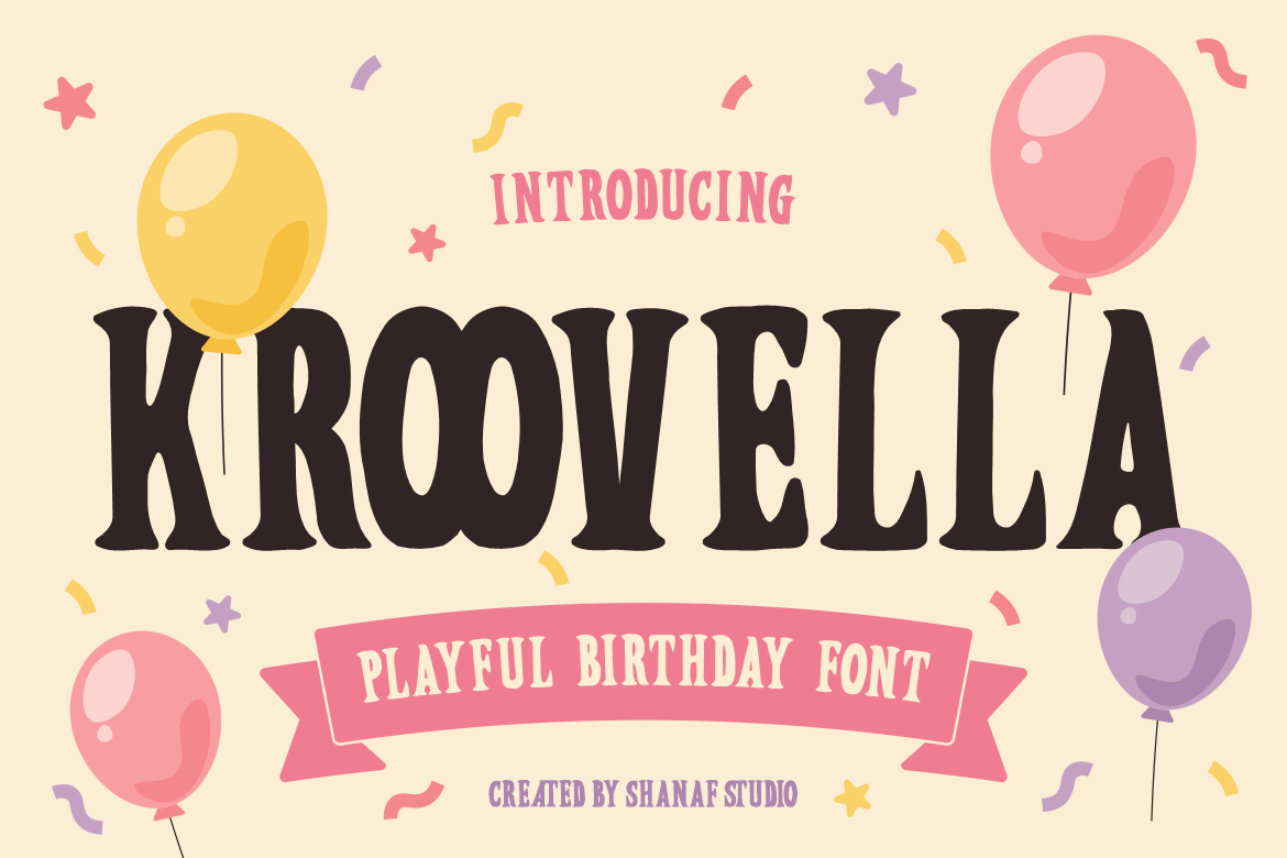
Kroovella combines bold decorative letters with rounded curves, strong vertical structure, playful proportions, and subtle shape variations that create movement across words. Its medium-to-heavy weight provides excellent visibility, while the friendly construction keeps titles and logos welcoming. Although designed around birthday celebrations, the font can easily support candy brands connected to parties, gifting, entertainment, and family occasions.
PROS: Bold readability, lively proportions, festive character, and versatile commercial display use.
BEST FOR: Birthday candy, party favors, confectionery gift boxes, event products, stickers, invitations, and celebratory campaigns.
Comparison
| Font | Visual Personality | Strongest Branding Role | Ideal Candy Direction |
|---|---|---|---|
| Candy Form | Soft and inflated | Main packaging logo | Gummies and chewy sweets |
| Silky Candy | Cute and friendly | Family-focused branding | Soft candy and gift products |
| Sugarpop Jingle | Festive and whimsical | Seasonal campaigns | Christmas confectionery |
| Colorful Candy | Bold and hand-lettered | High-energy packaging | Gum, chocolate, and colorful sweets |
| Kroovella | Joyful and celebratory | Party-focused branding | Birthday candy and event products |
Common Mistakes in Candy Branding
The first mistake is assuming that more color automatically makes packaging more exciting. When every letter, illustration, background, icon, and flavor element uses a different bright color, the hierarchy disappears. Customers may notice the package but struggle to identify the brand or product. Choose a controlled palette and assign specific roles to each color. Keep the brand mark consistent while using secondary colors to distinguish flavors or limited editions.
Another common problem is creating a brand entirely for children while forgetting the adults who often make purchasing decisions. Cartoon characters and playful typography can build emotional appeal, but ingredients, claims, portion information, and product details should remain clear and credible. Marketing aimed at children deserves additional care because packaging, characters, and branding can influence their food preferences, and regulators have specifically examined child-directed food promotion.
The final mistake is using decorative typography everywhere. A candy font may be excellent for the logo and flavor name but difficult to read in small product information, websites, or promotional details. Use expressive lettering strategically, pair it with a cleaner supporting typeface, and test the package at actual shelf size. The strongest candy branding feels playful because the entire visual system is coordinated, not because every available decorative effect has been applied.
Conclusion
Effective candy branding strategies combine color, typography, packaging, storytelling, and emotional positioning into one recognizable experience.
Begin with the feeling the brand should create, then develop a consistent visual system around it. Use bright colors with hierarchy, make flavors easy to distinguish, create packaging that remains recognizable from a distance, and extend the same personality into social media, seasonal editions, and promotional materials.
Typography can become one of the strongest parts of that identity. Candy Form provides inflated sweetness, Silky Candy brings friendly charm, Sugarpop Jingle creates festive holiday energy, Colorful Candy delivers bold hand-lettered personality, and Kroovella turns celebration into a recognizable visual language.
With the right combination of strategy and playful design, a candy product can become more than another sweet on the shelf. It can become a brand customers recognize, remember, and look forward to seeing again.
Explore these fonts and many more at PutraCetol.com to build a business identity that looks professional, trustworthy, and memorable.
Additionally, if you want to explore some free typography options, you can check out Putracetol Studio on Dafont. Happy reading and designing!