
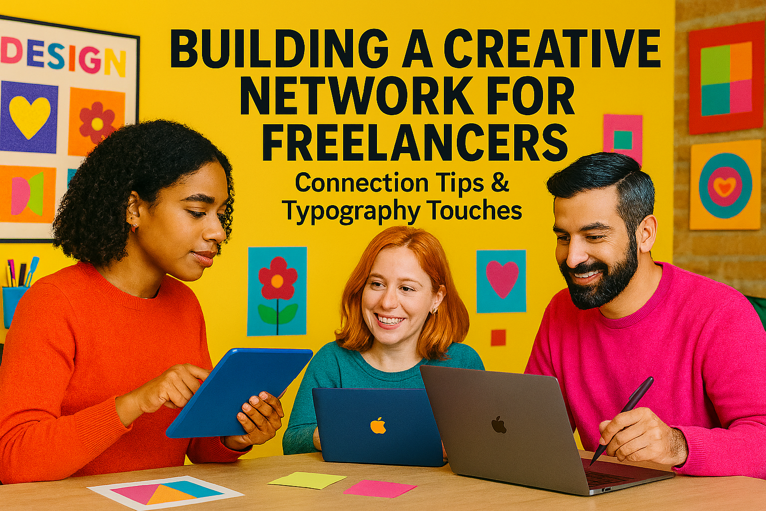
Building a strong professional community is vital when building a creative network, especially for solo creatives and freelancers. A great visual identity can support your outreach so thoughtful font choices can reinforce credibility and personality without distracting from your message.
Start with Authentic, Personalized Outreach
When reaching out, focus on genuine interest. Mention something specific about their recent project or a shared passion. Illustrator Ellice Weaver’s weekly, personal emails show how consistency and authenticity pay off. To match this tone, use a clean but friendly font for headings like De Rolande. Its thin sans-serif style feels professional yet warm. Just be cautious: thin strokes don’t always show well on mobile, and avoid using it for body text where readability is key.
Share Resources with Peer Designers
Rather than aiming for big names, focus on peers. Offer design assets, references, or feedback to start mutual support. For workshop documents or shared resource pages, Honey Berry brings a playful yet legible charm. Its rounded terminals add friendliness just pair it with a simpler serif for structured documents, as it can become hard to scan over several paragraphs.
Balance Self-Promotion with Community Acknowledgment
To stay visible without overshadowing others, comment on peers’ work, tag them on social, and share your process. Designer Leo Natsume suggests letting your work speak, consistent portfolio updates and authentic praise for others foster natural recognition. In your own posts or captions, using Silky Candy for quote highlights alongside a pared-back layout, adds personality without overwhelming the main content. Its brush script charm can feel handwritten, although it can lose clarity in small sizes, so reserve it for headers or logos.
Attend Events, Even Online
When meeting people at events or online webinars, research attendees ahead of time, craft a short pitch, and follow up by name. For visually striking business cards or name badges, bold display fonts like Luxerna Display make a strong impression. Its minimalist geometry is eye-catching, but do ensure high contrast (dark on light) so it’s legible in various lighting conditions.
Nurture Connections Over Time
Network building doesn’t end with an email or handshake it grows through small, consistent gestures. Share helpful articles, congratulate peers on milestones, or offer feedback. Pair these gestures with thoughtful typography in your messaging, subtle cohesion between your choice of fonts and your professional style reinforces how you present yourself.
Why Typography Matters in Your Network
If you’re building a creative network, your fonts aren’t just design choices they’re silent ambassadors of your brand voice. When someone receives an email with carefully selected, readable typography, it conveys that you pay attention to detail. It helps you stand out without being flashy.
Thank you for taking the time to read this article. If you are looking for more great articles, feel free to visit Putracetol Blog
Additionally, if you want to explore some free typography options, you can check out Putracetol Studio on Dafont. Happy reading and designing!