
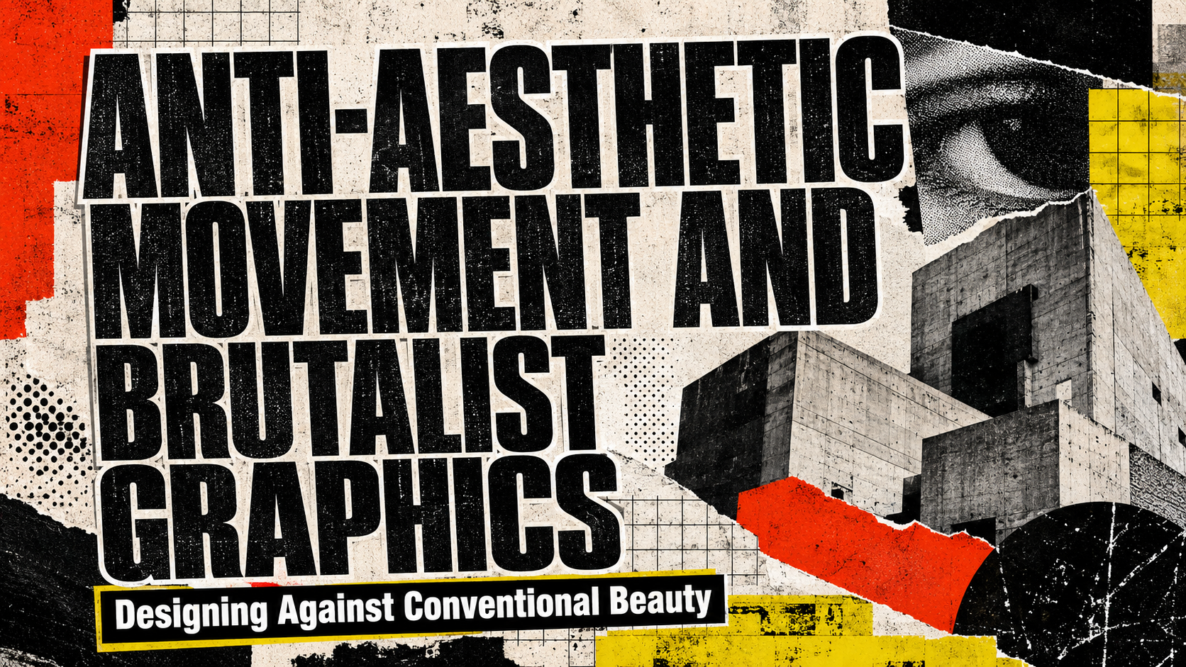
The anti-aesthetic movement / brutalist graphics approach works best when the visual disorder supports an idea. Random distortion, ugly typography, broken grids, and noisy textures do not automatically create meaningful anti-design.
Before opening a design application, define what the project is rejecting.
Is the brand rejecting polished corporate culture? Is an underground music label trying to communicate aggression and independence? Does a streetwear campaign want to challenge luxury minimalism? Is an art event questioning algorithmically optimized, overly perfect digital visuals?
A useful creative statement might be:
The design should feel raw, confrontational, and intentionally unfinished because the brand represents creative work outside polished commercial culture.
That provides a reason for every broken rule.
The strongest brutalist compositions are often highly deliberate underneath their apparent chaos. A headline may be misaligned, an image aggressively cropped, and several type sizes placed together, but the designer still controls attention, rhythm, repetition, and contrast.
Anti-aesthetic design is not the absence of design. It is design that deliberately rejects conventional ideas of refinement.
What Is the Anti-Aesthetic Movement in Graphic Design?
Anti-aesthetic design challenges the assumption that visual communication must always appear elegant, balanced, polished, or conventionally attractive.
Instead, designers may intentionally use:
- Awkward spacing
- Distorted typography
- Clashing colors
- Pixelation
- Scanned textures
- Visible compression
- Rough photocopy effects
- Oversized text
- Misaligned elements
- Repetitive graphics
- Broken grids
- Harsh cropping
- Low-resolution imagery
- Exposed interface elements
- Excessive or intentionally sparse compositions
The objective may be confrontation, authenticity, humor, cultural criticism, rebellion, or simply visual differentiation.
A polished lifestyle brand might remove every imperfection. An anti-aesthetic identity may make imperfections central to its personality.
What Are Brutalist Graphics?
Brutalist graphics borrow the directness and material honesty associated with architectural Brutalism, but they translate those qualities into graphic communication.
Instead of exposed concrete, graphic Brutalism may expose:
- Grid structures
- Raw typography
- Unprocessed photographs
- Browser-like interface elements
- Repeated text
- Hard borders
- Stark black and white
- Basic geometric blocks
- Visible file artifacts
- Uncomfortable spacing
Digital brutalism often avoids the visual smoothness associated with conventional commercial interfaces.
A brutalist poster may look almost like an unfinished layout file. A website can resemble a raw database, terminal, or early internet page. A music campaign might combine enormous typography with grainy images and industrial textures.
The appeal comes from directness.
Anti-Design, Brutalism, and Maximalism Are Not the Same
These styles overlap, but they solve different visual problems.
Anti-Design
Anti-design deliberately challenges familiar design conventions. It may use conflicting colors, strange typography, awkward hierarchy, or intentionally confusing arrangements.
The emphasis is on resistance.
Brutalist Design
Brutalist graphics emphasize raw structure, direct communication, hard surfaces, and exposed visual systems.
The emphasis is on honesty and force.
Maximalism
Maximalist design deliberately uses abundance: more color, decoration, imagery, patterns, and typography.
The emphasis is on richness and excess.
A brutalist composition can be minimal. A black background with one enormous white word and a crude border may feel more brutalist than a highly decorated poster.
An anti-design composition can also be maximalist, but it does not have to be.
Why Anti-Aesthetic Graphics Feel Relevant
Perfect Design Has Become Easy to Produce
Templates, automated layout systems, polished stock photography, and AI-assisted production have made technically clean visual work increasingly accessible.
This has created an interesting reaction.
When every restaurant, startup, lifestyle brand, and creator uses similar grids, neutral sans serifs, soft gradients, rounded cards, and polished imagery, imperfection can become a differentiator.
A deliberately rough visual identity can feel more human because it looks less optimized.
Imperfection Can Communicate Authenticity
Scratches, xerox textures, handwriting, blurred photographs, and irregular layouts can suggest that the work came from a real physical or subcultural environment.
This is especially relevant for:
- Underground music
- Independent publishing
- Punk culture
- Streetwear
- Skateboarding
- Art collectives
- Experimental film
- Alternative nightlife
The imperfections should connect to the culture. Applying photocopy texture to an unrelated luxury banking app would probably feel artificial.
Visual Discomfort Can Create Attention
Most commercial design tries to reduce friction.
Anti-aesthetic graphics can deliberately create a small amount of friction to interrupt familiar visual behavior.
Unexpected letter spacing, strange image scaling, or uncomfortable color combinations can make viewers look twice.
The challenge is keeping enough clarity for the intended message to survive.
Core Elements of Brutalist Graphic Design
Oversized Typography
Large typography is one of the strongest tools in brutalist composition.
Words can fill the entire canvas, extend beyond the edge, overlap photographs, or become structural elements.
Useful approaches include:
- One word occupying most of the poster
- Text running vertically
- Headlines extending beyond the crop
- Letters used as image masks
- Massive numbers for event dates
- Repeated typography as texture
Do not enlarge text randomly. Choose the word that deserves the visual aggression.
Harsh Typographic Contrast
Brutalist typography often combines extremes.
For example:
- Huge headline + microscopic details
- Serif + monospace
- Condensed display + wide grotesque
- Bold uppercase + fragile italic
- Clean type + heavily distressed lettering
The contrast creates tension.
Use a limited number of font families so the composition remains intentional.
Glitch and Digital Corruption
Glitch effects can reference broken technology, corrupted files, surveillance systems, obsolete hardware, or digital overload.
Useful techniques include:
- RGB channel separation
- Horizontal displacement
- Datamoshing
- Pixel stretching
- Compression artifacts
- Screen tearing
- Noise
- Scanner distortion
A single controlled glitch usually creates more impact than applying heavy corruption to every element.
Photocopy and Xerox Texture
Photocopy aesthetics are strongly associated with zines, punk flyers, underground events, and DIY publishing.
Techniques include:
- Crushed blacks
- Overexposed whites
- Grain
- Repeated copying
- Torn paper
- Misregistration
- Dirty scanner edges
The result can make digital artwork feel physical.
Broken Grids
Traditional grids create consistency and order.
Brutalist graphics may deliberately violate them by:
- Shifting columns
- Allowing text to collide
- Breaking margins
- Rotating elements
- Creating uneven alignment
- Using asymmetric whitespace
A broken grid works best when the designer understands the grid being broken.
Complete randomness usually creates confusion rather than tension.
Aggressive Cropping
Images can be cropped so tightly that faces, bodies, or objects become partially unrecognizable.
This can create immediacy and mystery.
Try:
- Enlarging a face until only one eye remains
- Cropping a shoe or product beyond the frame
- Showing only fragments of architecture
- Cutting text through photography
The image becomes material rather than conventional illustration.
Visible Raw Materials
Allow production artifacts to remain visible.
Examples include:
- Registration marks
- Scan numbers
- File names
- Coordinates
- Barcodes
- Crop marks
- Timestamps
- UI windows
- Cursor graphics
- Printer errors
These elements make the process itself part of the visual identity.
Typography for Anti-Aesthetic Design
Condensed Display Fonts
Narrow, tall letterforms create tension and allow large words to occupy limited horizontal space.
They work particularly well for:
- Concert posters
- Streetwear campaigns
- Editorial covers
- Event schedules
Use them extremely large or tightly stacked.
Heavy Grotesque Fonts
A blunt sans serif can feel almost architectural.
Set it in uppercase with aggressive scale contrast or minimal spacing.
This direction works for brutalist layouts that need force without decoration.
Distressed Fonts
Rough edges, scratched surfaces, and broken characters add physical texture.
Use distressed fonts for short titles. For supporting information, move back to a cleaner typeface.
Monospace Fonts
Monospace typography introduces references to terminals, code, labels, technical documentation, and old digital systems.
It can be especially effective for:
- Metadata
- Captions
- Dates
- Coordinates
- Track lists
- Product numbers
A monospace supporting font often gives chaotic compositions a functional backbone.
Experimental Display Typography
Strange cuts, irregular geometry, stretched forms, and unusual ligatures can become the central visual element.
This direction is particularly suitable for fashion, culture, art, and music where memorability matters more than conventional neutrality.
How to Create a Brutalist Poster
Step 1: Reduce the Message
Start with one central statement.
For example:
NOISE IS CULTURE
or:
SYSTEM FAILURE
or:
NOT FOR EVERYONE
The message should support the visual attitude.
Step 2: Establish One Dominant Element
Choose whether the poster will be dominated by:
- Typography
- Photography
- Texture
- Color
- One symbol
Do not let every element compete equally.
Step 3: Build a Basic Grid
Create a functional layout first.
Place the event title, location, date, and supporting information clearly.
Then start breaking selected parts.
This creates controlled disorder rather than arbitrary placement.
Step 4: Distort One Layer
Choose one distortion language.
For example:
- Xerox
- Glitch
- Torn-paper collage
- Scanner noise
- Pixelation
- Ink bleed
Using one consistent distortion technique creates a more coherent identity.
Step 5: Introduce Scale Conflict
Make the main title enormous and supporting information unusually small.
This produces the tension common in brutalist communication.
Step 6: Remove Decoration That Does Not Add Meaning
Anti-design can still become overdesigned.
If a glitch, texture, or symbol contributes nothing to the concept, remove it.
The final composition should feel aggressive because of its decisions, not because it contains every available effect.
Brutalist Graphics for Underground Music
Music is one of the strongest applications for anti-aesthetic visuals.
Genres that can support the approach include:
- Punk
- Hardcore
- Industrial
- Experimental electronic
- Noise
- Underground hip-hop
- Grunge
- Alternative rock
- Techno
Possible treatments include scanned band photography, damaged lettering, extreme black-and-white contrast, track numbers used as giant graphic forms, and distorted release titles.
The visual identity should reflect the sound.
A noisy industrial record can support harsher textures than an atmospheric electronic release, even if both belong to underground culture.
Anti-Aesthetic Design for Streetwear
Streetwear branding often benefits from tension between polished fashion presentation and raw graphic elements.
Try combining:
- Clean product photography
- Aggressive typography
- Barcode graphics
- Unfinished marks
- Utility labels
- Photocopy images
- Oversized product codes
This contrast can make the clothing itself look intentional rather than visually chaotic.
Limited drops can use stronger experimentation than the permanent brand identity.
Brutalist Graphics for Creative Campaigns
Anti-aesthetic design can work for brands that want to question mainstream expectations.
Suitable campaigns might involve:
- Independent art festivals
- Design conferences
- Social commentary
- Youth communities
- Creative software
- Experimental fashion
- Cultural exhibitions
The campaign should have a reason for rejecting polish.
If the brand normally communicates luxury and refinement, a brutalist limited campaign can create deliberate disruption. But the contrast should feel strategic rather than accidental.
Color Strategies for Anti-Aesthetic Graphics
Black and White
This is the most direct approach.
Use deep black, bright white, aggressive type scale, and rough textures.
It works particularly well for punk, editorial, architecture, and underground music.
Acid Colors
Neon green, electric yellow, intense magenta, and digital blue create artificial energy.
Pair one acid color with black rather than using every neon hue simultaneously.
Dirty Industrial Palette
Use concrete grey, dirty beige, rust, black, and off-white.
This creates a more physical and urban atmosphere.
Clashing Primary Colors
Red, blue, and yellow can create deliberate visual discomfort when used in strong blocks.
This approach works for pop-oriented anti-design and contemporary cultural campaigns.
Low-Fi Digital Palette
Use RGB red, green, blue, black, and washed-out screen colors.
Combine them with pixelation and system graphics for early-web or corrupted-digital aesthetics.
Brutalist Layout Techniques for Social Media
Social media often rewards clean, instantly understandable visuals, which makes brutalist work an effective contrast.
Use:
- One oversized phrase
- Hard cropping
- Unexpected vertical text
- Monochrome imagery
- Sharp color blocks
- Visible interface references
- Short looping glitch animation
For a carousel, maintain one recurring visual rule across all slides.
For example:
Slide 1 uses enormous headline text.
Slides 2–5 use the same border and monospace numbering.
The final slide returns to the oversized display style.
This creates consistency beneath the visual disorder.
Anti-Aesthetic Design and Accessibility
Experimental design should not make essential information inaccessible.
There is a difference between creating visual tension and preventing people from completing a task.
Keep critical information such as:
- Event dates
- Addresses
- Ticket links
- Product prices
- Safety information
- Navigation
- Form labels
clear enough to understand.
You can make the campaign headline aggressively experimental while the functional layer remains readable.
This distinction is especially important for websites. A brutalist homepage can have unconventional aesthetics without making keyboard navigation, buttons, forms, or body copy difficult to use.
When Brutalist Graphics Should Not Be Used
Anti-aesthetic design is not appropriate for every brand.
Use caution in environments where visual calm and immediate confidence are central, such as:
- Healthcare instructions
- Financial transactions
- Emergency information
- Government services
- Safety-critical systems
- Long technical documentation
Elements of brutalism can still inspire campaigns or editorial pages, but functional interfaces need predictable usability.
The style is strongest when the visual rebellion supports the audience and context.
Comparison
| Visual Direction | Main Characteristics | Best Application | Main Risk |
|---|---|---|---|
| Brutalist minimalism | Huge text, stark grids, black and white | Editorial, architecture, fashion | Can appear unfinished |
| Glitch brutalism | Pixel distortion, RGB separation, digital noise | Electronic music, gaming, tech culture | Effects can overpower content |
| Xerox anti-design | Grain, torn paper, crushed blacks | Punk, hardcore, underground publishing | Small text can disappear |
| Industrial brutalism | Grey, black, labels, utility graphics | Streetwear, industrial music, events | Can become visually cold |
| Pop anti-design | Clashing colors, odd typography, playful chaos | Youth campaigns and art events | Easy to overdecorate |
| Web brutalism | Raw HTML feel, hard borders, simple structures | Portfolios, creative tools, cultural websites | Usability can suffer |
| Experimental typography | Distorted or unconventional letterforms | Fashion, art, album covers | Readability decreases quickly |
Common Mistakes
The first mistake is confusing anti-aesthetic design with random ugliness. Misalignment, poor typography, low-resolution imagery, and broken grids do not become meaningful simply because they violate conventional rules. Strong brutalist graphics usually contain a clear hierarchy beneath the disruption. Build a working composition first, identify which expectation you want to challenge, and distort that element intentionally. When everything is chaotic, the audience has no visual tension because there is no order left to disrupt.
Another common mistake is applying every anti-design effect simultaneously. Glitch, grain, torn paper, chrome lettering, pixelation, handwriting, scanner artifacts, and neon colors may all fit the broader movement, but using them together often produces visual noise without identity. Select one or two recurring techniques and repeat them throughout the system. A recognizable brutalist identity may be built entirely from oversized condensed typography, black-and-white photography, and one acid-green accent.
The final mistake is sacrificing functional communication in the name of rebellion. An underground concert poster can distort the artist name aggressively, but people still need to find the date, venue, and ticket information. A brutalist ecommerce campaign can look raw without hiding prices or product details. Separate expressive typography from functional typography, maintain readable supporting information, and test the design at its actual size. Anti-aesthetic work becomes more convincing when the designer demonstrates control rather than carelessness.
Conclusion
The anti-aesthetic movement / brutalist graphics represents a deliberate rejection of polished, predictable visual design.
It embraces oversized typography, harsh contrast, damaged textures, glitch effects, photocopy noise, unusual cropping, exposed technical elements, and compositions that may initially appear unfinished or uncomfortable.
The strongest work, however, is rarely accidental.
Successful brutalist graphics begin with a clear idea about what the project is resisting. Underground music may reject commercial polish. Streetwear can challenge luxury perfection. Experimental art may expose the artificial smoothness of digital culture.
Typography is central to this approach. Condensed display fonts can create pressure, heavy grotesques provide architectural force, monospace type introduces technical structure, and distressed or experimental fonts bring imperfection and personality.
The key is controlled opposition. Build a readable foundation, then decide what to break.
When hierarchy, typography, imagery, texture, and cultural context all support the same rebellious idea, anti-aesthetic design becomes more than intentionally ugly graphics. It becomes a visual language for independence, resistance, experimentation, and creative freedom.
Explore these fonts and many more at PutraCetol.com to build a business identity that looks professional, trustworthy, and memorable.
Additionally, if you want to explore some free typography options, you can check out Putracetol Studio on Dafont. Happy reading and designing!