
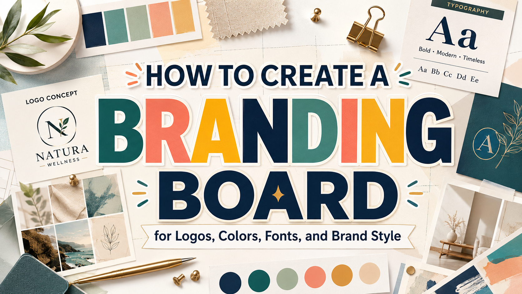
Define the Brand Before Designing the Board
A professional branding board should summarize strategic visual decisions rather than replace the branding process itself.
Before choosing colors, fonts, photography, or decorative elements, define what the brand needs to communicate. A skincare company may want to feel calm, natural, and trustworthy. A technology startup might need to appear intelligent, efficient, and forward-looking. A children’s product can be playful and energetic while still reassuring parents that the business is professional.
Begin with a short brand foundation containing:
- Target audience
- Customer problem
- Brand promise
- Main differentiator
- Brand personality
- Desired customer perception
- Primary applications
Then choose three to five personality words.
For example:
Warm, handcrafted, optimistic, and approachable
or:
Precise, modern, dependable, and intelligent
These words become practical criteria for evaluating every visual element. A font, color, or photograph should not be included merely because it looks attractive. It should support the identity the business is trying to build.
A useful principle is:
The brand strategy explains what the business should mean. The branding board shows how that meaning should look.
What Is a Branding Board?
A branding board is a compact visual document that summarizes the main elements of a brand identity.
It commonly includes:
- Primary logo
- Secondary logo variations
- Brand mark or monogram
- Color palette
- Typography system
- Photography direction
- Illustration style
- Graphic elements
- Patterns or textures
- Example applications
The board gives designers, marketers, business owners, content creators, and external suppliers one clear visual reference.
Instead of searching through several folders to find the correct logo, blue color, heading font, or image style, the team can review the branding board and quickly understand how the identity should appear.
A branding board is sometimes called:
- Brand identity board
- Visual identity board
- Brand style board
- Mini brand guide
- Brand overview
- Brand reference sheet
The exact name matters less than its purpose: to make approved brand decisions easy to understand and repeat.
Why a Branding Board Matters
It Improves Visual Consistency
A brand may appear on websites, social media, packaging, advertisements, email, presentations, signage, invoices, and printed materials.
Without shared rules, each platform may begin to look different.
The social media team might use a bright blue, while the website uses a darker version. One designer may use an elegant serif, while another chooses a geometric sans serif. Product photography could feel premium on the website but casual and inconsistent on marketplace listings.
A branding board creates a common visual reference that reduces these differences.
Consistency does not mean making every asset identical. It means ensuring that every design feels like it belongs to the same brand.
It Makes Production Faster
Designers spend less time making repeated decisions when the primary identity system has already been approved.
They know:
- Which logo version to use
- Which colors are permitted
- Which font leads the hierarchy
- How photographs should look
- Which graphic elements can be repeated
- What should be avoided
This allows more time to focus on the campaign message, composition, audience, and creative execution.
It Simplifies Collaboration
A small business may work with freelance designers, printers, social media managers, developers, photographers, video editors, and packaging suppliers.
Each person needs enough visual direction to represent the brand accurately.
A well-organized branding board creates a shared language between people with different roles. It is especially useful when the company does not yet need a large brand-guidelines document but still requires consistent creative production.
It Helps Business Owners Make Better Decisions
Entrepreneurs often know when a design feels wrong but struggle to explain why.
A branding board gives them specific reference points.
Instead of saying:
“This post does not feel like our brand.”
they can say:
“The typography is too formal, the photography is darker than our approved direction, and the green is outside our brand palette.”
Specific feedback is easier to act on and leads to fewer revisions.
Branding Board vs. Moodboard
A moodboard and branding board are related, but they belong to different stages of the creative process.
Moodboard
A moodboard explores a possible emotional and visual direction.
It may include:
- Reference photography
- Colors
- Materials
- Typography examples
- Architecture
- Fashion
- Packaging
- Illustration
- Cultural references
- Textures
Many of these elements come from external sources and are not final brand assets.
The moodboard helps answer:
What could this brand feel like?
Branding Board
A branding board presents approved identity decisions.
It normally includes final or near-final brand assets such as the selected logo, exact colors, chosen fonts, and confirmed image direction.
It answers:
How should this brand look in practice?
A moodboard encourages exploration. A branding board creates consistency.
Branding Board vs. Full Brand Guidelines
A branding board provides a concise visual summary. Full brand guidelines provide detailed rules.
A branding board may show the primary logo and color palette, while a brand-guidelines document may explain:
- Minimum logo size
- Clear-space requirements
- Incorrect logo usage
- Color combinations
- Typography hierarchy
- Grid systems
- Accessibility standards
- Photography principles
- Tone of voice
- Motion behavior
- Packaging rules
- Digital-interface components
Small businesses and personal brands may begin with a one-page branding board. As the company expands across products, departments, markets, and channels, it may need more comprehensive guidelines.
The branding board can remain the quick-reference page inside that larger system.
The Essential Elements of a Branding Board
1. Primary Logo
The primary logo is the main and most complete expression of the identity.
It may include:
- Wordmark
- Symbol
- Tagline
- Established date
- Descriptive phrase
Display the logo clearly and give it enough space.
Avoid placing it over a busy photograph or decorative texture. The branding board should help viewers examine the logo rather than demonstrate every possible treatment.
2. Secondary Logo
A secondary logo is an alternative arrangement used when the main version does not fit.
For example:
- Horizontal primary logo
- Stacked secondary logo
- Compact wordmark
- Logo without tagline
The secondary logo should feel like part of the same system rather than a separate identity.
3. Brand Mark or Monogram
A brand mark is a simplified symbol that can work in smaller spaces.
It may be:
- Initial
- Monogram
- Icon
- Abstract shape
- Simplified illustration
- Distinctive part of the main logo
Common applications include:
- Social profile images
- Favicons
- App icons
- Product labels
- Stickers
- Watermarks
- Packaging seals
Test the mark at small sizes. Complicated details that look excellent on a presentation may disappear inside a profile image.
4. Color Palette
A branding board should show the approved colors and their practical roles.
Possible roles include:
- Primary brand color
- Secondary color
- Accent color
- Background color
- Text color
- Neutral colors
- Functional digital colors
Include the correct values according to intended production, such as:
- HEX
- RGB
- CMYK
- Spot color references when required
Do not create a large palette simply because several colors look attractive together.
A smaller system is often easier to use consistently.
For example:
| Role | Color |
|---|---|
| Primary | Deep forest green |
| Secondary | Warm cream |
| Accent | Terracotta |
| Text | Charcoal |
| Supporting neutral | Soft grey |
Each color should have a purpose.
5. Typography System
Typography is one of the most important sections of a branding board because it shapes logos, websites, packaging, social media, advertising, and editorial communication.
A practical system may contain:
- Logo or display font
- Primary heading font
- Supporting heading font
- Body font
- Accent style
- Numerical or technical style where relevant
Avoid listing several fonts without explaining their roles.
A stronger board might specify:
Primary Display Font
Used for campaign headlines, packaging titles, and large editorial moments.
Supporting Sans Serif
Used for subheadings, social graphics, and short practical text.
Body Typeface
Used for articles, product descriptions, website paragraphs, and documents.
Designers can explore PutraCetol Studio’s display, serif, sans serif, script, playful, retro, experimental, food, luxury, and industry-specific font collections when developing a typography system with a more distinctive identity.
The expressive font should create recognition. The functional font should protect readability.
6. Photography Direction
Photography can make two brands using similar colors and typography feel completely different.
A branding board may define:
- Lighting
- Background
- Subject
- Composition
- Camera distance
- Color treatment
- Emotional tone
- Level of styling
- Use of people
- Product presentation
For example, a natural skincare brand might use:
- Soft daylight
- Warm neutral backgrounds
- Close material details
- Real skin texture
- Minimal retouching
- Botanical elements used selectively
A technology company might use:
- Structured lighting
- Dark backgrounds
- Precise product close-ups
- Geometric composition
- Cool color accents
- High contrast
Include a few focused references rather than filling the board with many unrelated photographs.
7. Illustration Style
When illustration is part of the identity, show its visual rules.
These may include:
- Line thickness
- Shape language
- Color usage
- Texture
- Perspective
- Character proportions
- Level of detail
- Background treatment
A children’s brand may use bold rounded illustrations with simple expressions. A financial platform might use cleaner geometric diagrams, while an artisan food company could use hand-drawn ingredient illustrations.
The style should be repeatable by more than one illustrator.
8. Graphic Elements
Graphic elements help extend the brand beyond its logo.
They may include:
- Shapes
- Frames
- Lines
- Arrows
- Icons
- Badges
- Stickers
- Dividers
- Doodles
- Decorative symbols
These elements can create recognition across social media, packaging, presentations, and websites.
They should originate from the identity’s visual language. A curve from the logo, a repeated geometric angle, or a distinctive illustration shape can become a reusable brand device.
9. Patterns and Textures
Patterns can help a brand create visual interest without repeating the full logo everywhere.
A pattern may be built from:
- Brand mark
- Initials
- Geometric shapes
- Illustrations
- Botanical elements
- Product symbols
- Repeated typography
Textures can suggest:
- Paper
- Grain
- Fabric
- Wood
- Metal
- Paint
- Digital noise
- Handmade materials
Use texture selectively. Heavy texture can reduce readability and make digital assets feel inconsistent.
10. Example Applications
A branding board becomes more practical when it shows how the elements work together.
Include two or three compact examples such as:
- Social media post
- Packaging label
- Business card
- Website header
- Poster
- Product tag
- Presentation cover
These examples help viewers understand that the logo, colors, typography, and images belong to one coordinated system.
Avoid filling the board with large photorealistic mockups that leave little space for the identity elements themselves.
Start With Brand Strategy
Before creating the board, answer the strategic questions that influence visual identity.
Who Is the Audience?
Identify:
- Age
- Interests
- Location
- Lifestyle
- Purchasing motivation
- Main problem
- Digital behavior
- Expectations from the category
A brand for preschool children communicates differently from a premium service for corporate executives.
What Does the Brand Promise?
The promise explains the value customers should consistently experience.
Examples include:
- Making financial planning easier to understand
- Creating playful educational products
- Offering durable outdoor equipment
- Delivering premium skincare without unnecessary complexity
- Helping independent businesses look more professional
The visual identity should make that promise feel credible.
How Should the Brand Be Perceived?
Choose perception goals such as:
- Trustworthy
- Innovative
- Luxurious
- Friendly
- Playful
- Sustainable
- Bold
- Artistic
- Practical
- Expert
Avoid choosing every positive word.
A brand cannot simultaneously feel highly exclusive, affordable, rebellious, traditional, playful, corporate, and minimalist without creating confusion.
What Makes It Different?
The board should help highlight a real point of difference.
That distinction may come from:
- Audience specialization
- Product quality
- Cultural perspective
- Founder story
- Technology
- Customer experience
- Materials
- Price level
- Creative style
Visual difference is strongest when it expresses a meaningful business difference.
How to Create a Branding Board Step by Step
Step 1: Gather Existing Brand Information
Collect:
- Business name
- Tagline
- Mission
- Audience information
- Competitor references
- Existing logo
- Current colors
- Packaging
- Website
- Social content
- Customer feedback
Identify what should be preserved and what needs improvement.
Step 2: Conduct Visual Research
Study:
- Direct competitors
- Adjacent industries
- Historical references
- Editorial design
- Packaging
- Photography
- Typography
- Materials
- Cultural context
Do not copy one competitor’s finished identity.
Analyze principles such as:
- Visual hierarchy
- Color ratio
- Typography category
- Image treatment
- Density
- Emotional tone
- Level of formality
Combine several sources and translate the findings through the brand’s own strategy.
Step 3: Build Moodboard Territories
Create two or three clearly different directions.
For example:
Direction A: Quiet Confidence
- Elegant serif
- Neutral colors
- Spacious composition
- Restrained photography
- Minimal graphic elements
Direction B: Creative Energy
- Bold display typography
- Bright accent colors
- Asymmetrical layouts
- Expressive imagery
- Strong patterns
The Direction C: Warm Craft
- Hand-drawn elements
- Natural textures
- Earthy palette
- Human-centered photography
- Softer typography
Ask stakeholders to choose a strategic direction before finalizing the identity.
Step 4: Finalize the Logo System
Prepare:
- Primary logo
- Secondary layout
- Compact mark
- Monochrome version
- Light-background version
- Dark-background version
Check whether each variation belongs to the same identity.
Step 5: Define the Color System
Select colors according to:
- Brand personality
- Audience
- Category
- Accessibility
- Digital use
- Print production
- Product materials
Test text-background combinations instead of approving colors as isolated swatches.
A beautiful pale palette may become unusable when every combination has weak contrast.
Step 6: Build the Typography Hierarchy
Test the actual:
- Brand name
- Headlines
- Product titles
- Prices
- Dates
- Body paragraphs
- Buttons
- Captions
- Numbers
Confirm that the fonts work across the intended applications.
For example:
| Role | Typography |
|---|---|
| Brand display | Distinctive PutraCetol display or serif font |
| Main heading | Bold display or supporting family |
| Subheading | Supporting sans serif semibold |
| Body copy | Readable serif or sans serif |
| Accent | Italic, script, alternate, or selected color |
Document capitalization, spacing, and weight rules where necessary.
Step 7: Select Image and Illustration Direction
Choose a limited number of examples that clearly show the intended visual language.
Do not use moodboard references as if the brand owns them. Final commercial photography and illustration should be original, licensed, commissioned, or properly sourced.
Step 8: Add Supporting Graphic Elements
Create patterns, shapes, icons, or textures that extend the identity.
These elements should support layouts without becoming more recognizable than the logo itself.
Step 9: Design the Board Layout
Organize the board according to visual hierarchy.
One useful structure is:
| Area | Content |
|---|---|
| Top left | Primary logo |
| Top right | Secondary logo and mark |
| Middle left | Color palette |
| Middle center | Typography |
| Middle right | Photography or illustration |
| Bottom | Patterns, icons, and applications |
Keep related information close together.
Use enough space to prevent the board from becoming visually crowded.
Step 10: Review the System in Real Applications
Test the identity on:
- Website
- Social post
- Packaging
- Business card
- Presentation
- Advertisement
- Email header
- Mobile screen
The branding board may look cohesive while individual applications reveal weaknesses.
A font may fail at small sizes. A color combination may lack contrast. A detailed logo may become unclear on packaging.
Revise the system before final approval.
One-Page Branding Board Template
A practical one-page board can include the following sections:
Brand Header
- Brand name
- Short positioning statement
- Personality words
Logo Suite
- Primary logo
- Secondary logo
- Brand mark
- Monochrome version
Color Palette
- Primary color
- Secondary colors
- Accent color
- Neutral colors
- Color values
Typography
- Display font
- Supporting font
- Body font
- Sample hierarchy
Image Direction
- Two to four focused references
- Short description of lighting, composition, and mood
Supporting Assets
- Pattern
- Icons
- Illustration sample
- Graphic shapes
Applications
- One social post
- One packaging or print example
- One digital example
The document should remain concise enough to function as a quick reference.
Branding Board Examples by Industry
Beauty and Skincare
A beauty branding board may include:
- Elegant serif wordmark
- Soft neutral palette
- One deeper accent
- Editorial product photography
- Botanical imagery used selectively
- Clean sans serif for product details
Avoid using extremely thin typography for essential packaging information.
Technology Startup
A technology board may use:
- Geometric or experimental display font
- Dark neutral base
- Bright digital accent
- Structured interface photography
- Modular icons
- Grid-based graphic elements
The identity should feel innovative without making the product look complicated.
Children’s Brand
A children’s board may include:
- Rounded playful display font
- Simple sans serif companion
- Controlled bright palette
- Bold illustrations
- Soft geometric shapes
- Friendly photography
Parents and educators may be the buyers, so the design should feel fun and trustworthy at the same time.
Food and Beverage
A food-brand board can use:
- Characterful display typography
- Ingredient-inspired palette
- Product and lifestyle photography
- Hand-drawn illustrations
- Flexible packaging patterns
- Clear functional type for ingredients
The visual system should communicate flavor, quality, and product category quickly.
Professional Service
A consultant or agency may need:
- Distinctive but controlled wordmark
- Restrained palette
- Strong typography hierarchy
- Professional portraits
- Editorial diagrams
- Presentation templates
The branding board should help proposals, reports, social content, and websites feel connected.
How to Use a Branding Board in Daily Production
Social Media
Use the board to determine:
- Headline font
- Background colors
- Photography style
- Graphic shapes
- Logo placement
- CTA treatment
Create reusable templates based on these rules.
Website Design
Develop the interface using:
- Approved colors
- Typography hierarchy
- Image direction
- Icon style
- Brand spacing
- Button treatments
The website should feel like an extension of the identity rather than a separate project.
Packaging
Use the board to align:
- Brand name
- Product typography
- Color coding
- Illustration
- Patterns
- Photography
- Supporting information
Packaging may require more detailed production rules than the board provides, but the board establishes the visual foundation.
Presentations
Create slide templates using the same typefaces, palette, imagery, and graphic elements.
A presentation should be recognizable as part of the brand even when the logo is not visible on every slide.
External Creative Partners
Send the branding board with:
- Correct logo files
- Font files or purchase information where permitted
- Color values
- Image assets
- Relevant licensing guidance
- Required output specifications
Do not expect a supplier to reproduce the brand correctly using only a screenshot of the board.
Branding Board File Formats
Provide the board in practical formats.
Useful for sharing, reviewing, and printing.
PNG or JPEG
Useful for quick previews and cloud folders.
Editable Source File
May be created in:
- Adobe Illustrator
- Adobe InDesign
- Figma
- Canva
- Other professional layout software
The editable file should remain organized with clear names and linked assets.
Asset Folder
Include:
- Logo variations
- Color information
- Licensed or approved imagery
- Patterns
- Icons
- Typography information
- Application examples
The board explains the system. The asset folder provides the files required to use it.
When to Update a Branding Board
A branding board should change when the identity changes, not whenever a new campaign introduces a temporary creative treatment.
Update the board when:
- The logo is redesigned
- The color system changes
- New typography is adopted
- The company enters a different market
- Product architecture changes
- Accessibility problems are identified
- New recurring visual elements become part of the identity
Add a version number and revision date.
For example:
Branding Board Version 1.2 — August 2026
This helps collaborators confirm that they are using the latest approved system.
Comparison
| Brand Resource | Main Purpose | Typical Content | Best Stage |
|---|---|---|---|
| Moodboard | Explore visual possibilities | External references, colors, imagery, materials, type inspiration | Early concept development |
| Branding board | Summarize approved visual identity | Logo, palette, typography, imagery, patterns, examples | After identity approval |
| Brand guidelines | Explain detailed usage rules | Logo rules, type system, colors, imagery, tone, applications | Established or growing brand |
| Brand kit | Store practical assets | Logo files, colors, fonts, templates, images | Daily production |
| Style tile | Preview digital visual direction | Type, colors, buttons, interface elements | Website and UI development |
| Design system | Standardize scalable product design | Tokens, components, patterns, documentation | Digital-product growth |
Branding Board vs. Moodboard
| Branding Board | Moodboard |
|---|---|
| Uses approved assets | Uses exploratory references |
| Creates consistency | Defines possible direction |
| Shared after identity development | Used during research and ideation |
| Practical and specific | Emotional and interpretive |
| Contains exact colors and fonts | May contain approximate inspiration |
One-Page Board vs. Full Guidelines
| One-Page Branding Board | Full Brand Guidelines |
|---|---|
| Quick to understand | More comprehensive |
| Easier for small businesses | Better for large teams |
| Focuses mainly on visual identity | Can include voice, motion, accessibility, and applications |
| Suitable for simple identities | Suitable for complex brand ecosystems |
| Limited usage detail | Detailed correct and incorrect examples |
Common Mistakes
The first mistake is treating a branding board as a moodboard filled with attractive but unapproved inspiration. A practical board should present the actual logo, exact color values, selected typography, and confirmed image direction. External references may still be included when commissioned photography or illustration has not yet been produced, but they should be clearly labeled as direction rather than owned brand assets. Otherwise, team members may mistake inspiration for content that can legally or consistently be reused.
Another common mistake is adding too many visual options. Several logo variations, ten colors, four display fonts, multiple photography styles, and unrelated patterns do not create flexibility. They create uncertainty. The board should help users make decisions faster. Select one primary direction, define a limited number of alternatives for specific situations, and explain each element’s role. A clear system with fewer elements is usually easier to recognize and maintain than a large collection of attractive choices.
The final mistake is designing the board beautifully without testing whether the identity works in real production. A refined serif may disappear on a mobile screen, pale colors may fail accessibility checks, and a complex mark may become unclear on labels or profile icons. Apply the system to social content, packaging, websites, presentations, and printed materials before approval. Confirm font and asset licensing as well, especially when the identity will appear in registered logos, commercial packaging, websites, advertisements, merchandise, or customer-editable templates.
Conclusion
A branding board turns a collection of visual ideas into a practical and repeatable identity system.
It gives designers, business owners, marketers, content creators, developers, and suppliers one clear reference for the logo, color palette, typography, imagery, and supporting graphic language.
The strongest board begins with brand strategy. Define the audience, promise, personality, and desired perception before selecting visual elements. Then organize the approved assets into a concise document that shows not only what the brand uses, but how those elements relate to one another.
Typography deserves particular attention because it appears across nearly every touchpoint. A distinctive display, serif, sans serif, script, retro, playful, or experimental font from PutraCetol Studio can establish a recognizable brand voice, while a functional companion keeps longer communication readable.
The board does not need to contain every rule the company will ever require. Its value comes from making the most important decisions visible, clear, and easy to apply.
When the logo, fonts, colors, imagery, patterns, and applications support the same strategic idea, brand consistency becomes much easier.
The result is not merely a more attractive business.
It is a brand that people can recognize, understand, and remember.
Explore these fonts and many more at PutraCetol.com to build a business identity that looks professional, trustworthy, and memorable.
Additionally, if you want to explore some free typography options, you can check out Putracetol Studio on Dafont. Happy reading and designing!