
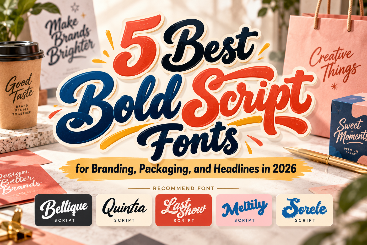
Best Bold Script Fonts 2026: Expressive Typography for Stronger Branding
Bold script typography combines two characteristics that can be difficult to balance: the personality of handwriting and the visual strength of heavy display lettering.
That combination makes it particularly valuable for branding. A strong script wordmark can feel personal without becoming delicate, while thick strokes help logos and headlines survive packaging, signage, social media, and promotional graphics.
The best bold script fonts 2026 are therefore not simply heavier versions of cursive fonts. Their rhythm, letter connections, terminals, proportions, and overall silhouettes determine whether a word feels athletic, handcrafted, nostalgic, elegant, or playful.
For brand designers, the goal is to choose a script that communicates personality immediately while keeping the important words recognizable.
Initial Suggestion: Test the Actual Brand Name First
Script fonts are highly dependent on letter combinations.
A specimen containing carefully selected words may look beautiful, while your actual company name creates awkward joins or competing capitals. Always test the complete brand name, repeated letters, numerals, and important campaign phrases before making a final choice.
Bold scripts also work best when given enough space. Avoid forcing a complex script into long paragraphs, navigation menus, or small product information. Use it for the logo, headline, packaging title, or hero message, then pair it with a simpler serif or sans serif for supporting copy.
Jump to Recommended Fonts
1. Bellique Logo Script Font
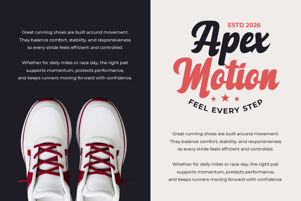
Bellique is one of the strongest options for contemporary logo design because its thick connected strokes, sweeping curves, tapered endings, and energetic baseline create a confident wordmark. The substantial weight provides strong display visibility, while its flowing construction preserves the personal quality associated with script lettering. PutraCetol positions Bellique particularly well for sports, footwear, fitness, apparel, active lifestyle branding, and promotional campaigns. Putra Cetol
Its movement makes it especially effective when a brand needs to suggest speed, performance, or individuality.
PROS: Bold silhouette, strong connections, dynamic rhythm, high logo impact.
BEST FOR: Sports brands, fitness, footwear, streetwear, active lifestyle products.
2. Quintia Modern Brush Script Font

Quintia takes a more handcrafted direction. PutraCetol classifies it as a modern brush script, making it suitable for identities where the lettering should feel expressive and human rather than perfectly geometric. The brush-inspired construction gives logos and headlines a sense of movement that works naturally across lifestyle branding, packaging, posters, merchandise, and social-media campaigns. Putra Cetol
Quintia is particularly useful when a clean corporate font would feel too restrained but an ornate calligraphy style would be too formal.
PROS: Brush personality, natural movement, expressive display quality.
BEST FOR: Lifestyle brands, creative businesses, packaging, posters, merchandise.
3. Last Show Bold Retro Script Font
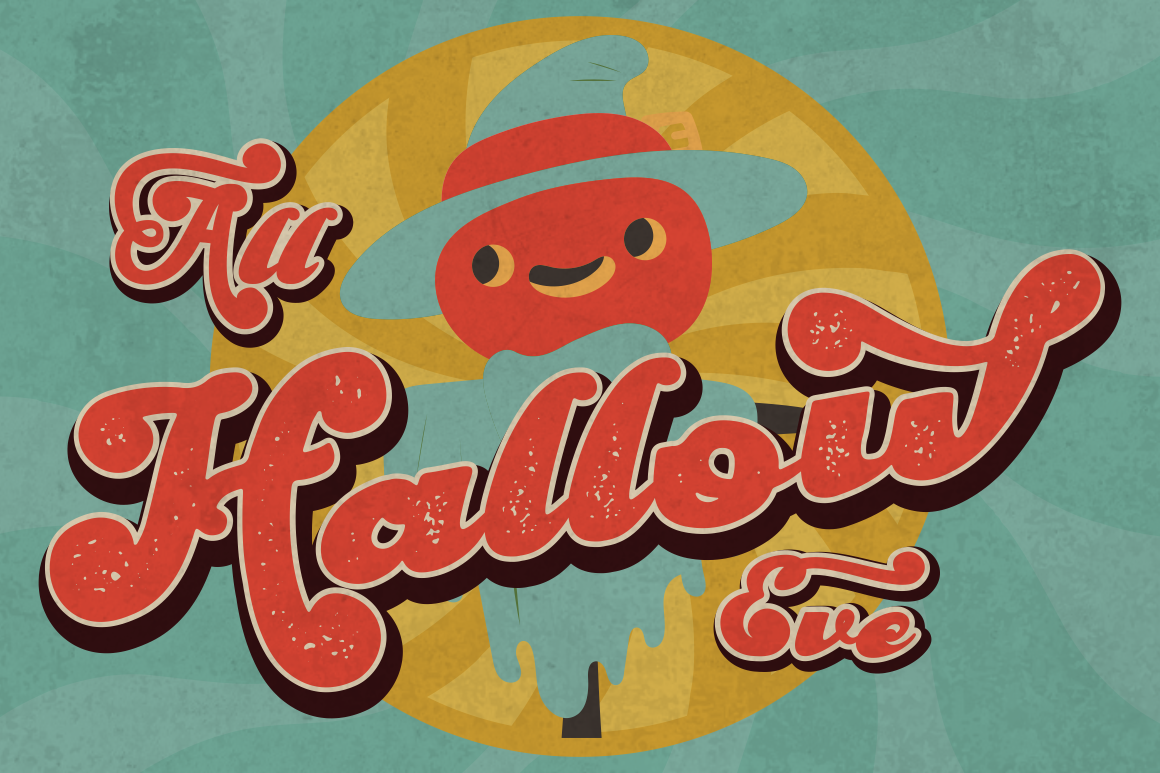
Last Show blends several typographic ideas rather than behaving like a conventional connected script. PutraCetol describes it as a bold retro typeface with vintage script influence, and the family includes both regular and rough versions plus alternative characters. That combination gives designers flexibility to move between cleaner nostalgia and a more weathered vintage appearance. Putra Cetol
Its groovy visual language is especially effective when a brand wants to reference retro advertising without reproducing a purely historical style.
PROS: Regular and rough options, alternates, bold retro character, nostalgic impact.
BEST FOR: Retro logos, packaging, posters, invitations, music and lifestyle branding.
4. Meltily Bold Script Font

Meltily uses thick rounded strokes, soft curves, consistent weight, and flowing connections to create a bold script that feels friendly rather than aggressive. Its slightly inflated forms give the lettering a soft silhouette, while a generous x-height helps maintain clarity in medium and larger display sizes. Creative Market
This makes Meltily particularly attractive for consumer brands that need a strong logo without losing warmth. It can work across food, beauty, lifestyle products, packaging, promotional graphics, and cheerful social content.
PROS: Rounded strokes, approachable weight, smooth connections, strong short-word readability.
BEST FOR: Food brands, beauty, lifestyle products, packaging, friendly commercial logos.
5. Sorele Retro Font
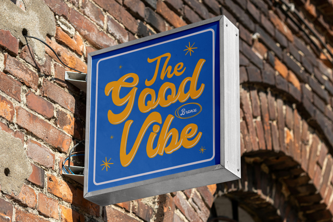
Sorele expands the collection beyond strict script typography. PutraCetol currently categorizes it as a retro family with three styles, making it better understood as a script-adjacent retro branding option rather than a traditional connected bold script. Putra Cetol
That distinction can actually be useful. Designers often pair expressive scripts with retro display typography to create richer identity systems. Sorele can support campaign headlines, secondary marks, packaging, and vintage-inspired visual systems where using script for every element would become repetitive.
PROS: Three styles, retro personality, useful branding flexibility.
BEST FOR: Vintage branding, packaging, campaign graphics, supporting display typography.
Comparison: Which Bold Script Font Fits Your Brand?
| Font | Main Character | Strongest Application |
|---|---|---|
| Bellique | Energetic, athletic | Sports and lifestyle logos |
| Quintia | Expressive, brush-made | Creative and handmade branding |
| Last Show | Groovy, vintage | Retro campaigns and packaging |
| Meltily | Rounded, friendly | Consumer and lifestyle brands |
| Sorele | Retro, versatile | Supporting brand typography |
Bellique is the strongest choice for movement and performance, while Meltily feels softer and more approachable. Quintia offers a hand-painted direction, Last Show emphasizes nostalgia, and Sorele is useful when the design system needs complementary retro display typography.
How to Use Bold Script Fonts Effectively
Bold scripts usually perform best as focal typography.
Use them for the brand name, campaign slogan, hero title, label name, or event headline. Pair them with a restrained supporting font so product descriptions, prices, menus, websites, and longer information remain easy to read.
Contrast also matters. A flowing script paired with a geometric sans serif creates stronger hierarchy than combining several expressive fonts together.
For branding projects, remember that a font license for ordinary design work may not automatically include logo or trademark rights. PutraCetol treats logo and trademark use as dedicated license coverage, so designers should select coverage that matches the actual brand application. Putra Cetol
Common Mistakes
One common mistake is choosing a bold script only because the promotional specimen looks attractive. Script typography behaves differently depending on the word. Capitals can dominate, repeated letters may create awkward rhythms, and certain connections can become visually crowded. Test the exact business name and adjust spacing or alternates before approving a logo.
Another mistake is using bold script everywhere. When the same expressive lettering appears in the logo, paragraph text, menus, buttons, captions, and product descriptions, its personality becomes visual noise. Treat bold script as the distinctive voice and use quieter supporting typography for everyday communication.
Finally, do not sacrifice readability for decoration. Swashes, rough textures, outlines, shadows, and exaggerated effects may strengthen a poster but weaken a small package label or mobile graphic. Test the design at realistic output sizes before production.
Conclusion
The best bold script fonts 2026 combine human expression with enough visual weight to perform confidently in modern branding.
Bellique delivers athletic energy, Quintia adds brush movement, Last Show brings retro nostalgia, Meltily offers friendly rounded strength, and Sorele provides a complementary vintage direction.
Explore these fonts at PutraCetol Studio for logos, packaging, advertising, event graphics, apparel, and promotional campaigns. The most successful choice is not simply the boldest font, but the one whose rhythm and personality naturally match the brand.
Explore these fonts and many more at PutraCetol.com to build a business identity that looks professional, trustworthy, and memorable.
Additionally, if you want to explore some free typography options, you can check out Putracetol Studio on Dafont. Happy reading and designing!