
The best fonts for music branding are not selected simply by matching “rock” with distressed letters or “electronic music” with a futuristic typeface. Genre provides a useful starting point, but the artist’s sound, audience, attitude, lyrical themes, and stage presence should make the final decision.
Two artists may both produce electronic music while needing completely different visual identities. One may create bright dance-pop built for festivals, while another produces dark ambient music centered on isolation and artificial intelligence. Their typography should not communicate the same atmosphere.
Before selecting a font, define the artist through five elements:
- Emotional tone: Euphoric, intimate, aggressive, nostalgic, rebellious, mysterious, or cinematic
- Sound character: Clean, distorted, acoustic, synthetic, rhythmic, atmospheric, or experimental
- Audience culture: Mainstream pop, underground club, independent rock, alternative fashion, or specialist music community
- Visual references: A historical period, subculture, city, technology, movement, or artistic medium
- Primary applications: Streaming artwork, posters, merchandise, stage visuals, social campaigns, or physical packaging
Turn those elements into three or four visual keywords. A psychedelic indie band might choose fluid, surreal, colorful, and immersive, while a hardcore act could use hostile, handcrafted, tense, and underground.
This gives the designer a clearer direction than choosing the loudest or most decorative typeface available.
Why Typography Matters in Music Branding
It Sets an Expectation Before the Music Plays
Typography can indicate the emotional world of a release before the listener hears the first note. Wide liquid forms may suggest psychedelic experimentation. Sharp mechanical letters can communicate electronic precision, while rough brush strokes may signal punk energy and resistance to polished commercial design.
The font does not need to explain the complete sound. Its role is to create an appropriate first expectation and encourage the audience to enter the artist’s visual world.
It Creates Recognition Across the Artist Ecosystem
A music identity now appears across album artwork, streaming profiles, short-form videos, concert listings, merchandise, live visuals, and artist websites. Spotify artist profiles, for example, can bring together music, videos, merchandise, events, and other content, making visual consistency valuable beyond a single release.
YouTube also recommends using the official artist or band name consistently for an Official Artist Channel so fans can locate the correct channel more easily. The typographic presentation can evolve across campaigns, but the name and core identity should remain recognizable.
It Helps Differentiate Artists Within the Same Genre
Genre conventions are useful because audiences recognize them quickly, but they also create similarity. Hundreds of metal bands may use highly distorted blackletter logos, just as many electronic releases use generic geometric sans serifs.
A stronger identity retains enough genre familiarity to set the right expectation while introducing one distinctive feature. That feature might be an unusual terminal, a custom ligature, a particular width, a repeated texture, or an unexpected pairing with photography.
The objective is not to reject the genre. It is to create a version of its visual language that clearly belongs to one artist.
Choosing Music Fonts by Genre and Personality
Psychedelic, Experimental, and Alternative Music
Psychedelic typography often uses inflated shapes, fluid curves, unusual counters, and moving baselines. These features can suggest altered perception, improvisation, dream states, or immersive sound.
This direction works well for psychedelic rock, experimental pop, funk, neo-soul, jazz fusion, rave culture, and music festivals. Because the letterforms already carry substantial personality, the surrounding layout should remain controlled.
Pair a fluid display font with generous space, simple supporting text, and one strong visual system. Too many additional swirls, gradients, textures, and effects can reduce the impact of the title.
Folk, Blues, Americana, and Roots Music
Rough slab serifs and distressed display fonts can communicate age, physical production, travel, craft, and human imperfection. They are suitable for music that draws attention to performance, storytelling, instruments, regional culture, or a sense of history.
Distressing should feel intentional rather than digitally random. Preserve the main structure of the letters so artist names and venue information remain readable on both posters and streaming thumbnails.
A rugged typeface can be paired with documentary photography, paper texture, restrained earth tones, or simple hand-drawn elements.
EDM, Electro, Synthwave, and Dance Music
Electronic music branding can use wide geometry, modular forms, sharp cuts, inline details, and high-contrast digital accents. The typography may reference sound waves, circuitry, light shows, interfaces, or club architecture.
A futuristic font should match the specific subgenre. Bright electro-pop may benefit from rounded geometry and neon color, while industrial techno could use narrower, harder structures. Ambient electronic music may need a calmer and more minimal approach.
Avoid adding a glow effect automatically. The letter construction should communicate a digital identity even when displayed in one color.
Hip-Hop, Rap, and Urban Music
Graffiti-inspired typography can express speed, individuality, place, and street culture. Angular strokes, tagging movement, hand-painted variation, and stretched forms give a wordmark an immediate personal signature.
The style is most effective when it feels connected to the artist’s real visual and cultural direction. Graffiti should not be treated as a generic symbol for every form of hip-hop.
Use expressive lettering for the artist name or release title, then pair it with a clean sans serif for dates, track details, credits, and ticket information. This protects readability while maintaining urban character.
Metal, Hardcore, and Extreme Music
Metal and hardcore fonts often use jagged contours, thorn-like extensions, irregular strokes, dark textures, and compressed silhouettes. These features can communicate aggression, mystery, fear, and underground identity.
Different subgenres require different levels of complexity. A traditional heavy-metal band may use a clear blackletter wordmark, while black metal, death metal, or extreme hardcore can support greater distortion.
Even an intentionally difficult logo needs a usable secondary version. Prepare a simplified wordmark for small streaming images, schedules, digital ads, and merchandise labels.
Punk, Garage Rock, and DIY Music
Punk typography often embraces rough brushwork, torn edges, uneven spacing, photocopied texture, and deliberate imperfection. It can feel immediate, physical, and resistant to overly polished design.
The most effective punk branding still has structure. A poster may look spontaneous while using a clear hierarchy for the band name, date, venue, and ticket information.
Create the disorder intentionally. Random distortion rarely feels as convincing as a system based on one brush style, one texture method, and a limited color palette.
Gothic, Doom, and Dark Alternative Music
Blackletter typography can introduce historical weight, ritual, darkness, authority, or mystery. It works for doom metal, Gothic rock, dark folk, medieval-inspired music, tattoo culture, and alternative fashion.
Traditional blackletter forms may feel ceremonial, while slanted or simplified versions can create a more contemporary direction. Give the letters adequate space and avoid placing intricate forms over equally detailed imagery.
Blackletter is most effective when the music genuinely supports its emotional and cultural associations.
Pop and Contemporary Artist Branding
Pop typography is often less dependent on one historical style. It may use a bold sans serif, polished script, experimental display font, or custom wordmark depending on the artist’s personality.
The key is immediate recognition. A pop identity must often work across social thumbnails, promotional videos, tour graphics, merchandise, collaborations, and beauty or fashion partnerships.
Choose one distinctive feature and repeat it. This could be an unusual capital letter, a color treatment, a condensed shape, or a recognizable custom connection between two letters.
Jazz and Soul Branding
Jazz can move between historical elegance and contemporary experimentation. Classic jazz may suit refined serifs, condensed poster lettering, or restrained Art Deco references. Modern jazz and fusion can support more fluid, abstract, or geometric typography.
Soul, funk, and rhythm-and-blues identities may use warm scripts, bold retro display forms, or psychedelic curves. The correct choice depends on whether the project emphasizes heritage, intimacy, nightlife, improvisation, or modern crossover appeal.
Do not select a typeface from the genre name alone. Listen for the rhythm, texture, and emotional temperature of the specific release.
Build a Complete Music Typography System
Create a Primary Artist Wordmark
The artist name or band name should have one definitive typographic form. Test the actual name rather than evaluating a typeface from its specimen alphabet.
Examine repeated letters, unusual capitals, narrow characters, punctuation, and word length. Adjust kerning manually and use alternates or ligatures only when they improve the complete silhouette.
Prepare several wordmark arrangements:
- Horizontal version
- Stacked version
- Compact version
- Monochrome version
- Small-scale simplified version
- Initial or monogram when appropriate
The goal is to create one identity that can adapt without appearing inconsistent.
Separate Artist Branding From Release Branding
The artist identity should remain recognizable, but every album or campaign can have its own visual atmosphere.
One practical system is to keep the artist wordmark relatively stable while allowing the release title typography, color palette, texture, and imagery to change. Another approach gives every era a different primary style while preserving one repeated symbol, letter treatment, or supporting typeface.
The choice depends on the artist. A legacy band may need greater continuity, while an experimental solo artist may treat visual reinvention as part of the creative identity.
Use a Functional Supporting Font
Decorative music fonts should not handle every piece of information.
Pair the main display typeface with a readable supporting font for:
- Track listings
- Tour dates
- Venue addresses
- Ticket information
- Credits
- Lyrics
- Website navigation
- Product sizes
- Legal and copyright information
The display font communicates personality. The supporting font makes the brand usable.
Establish a Clear Hierarchy
A concert poster may contain an artist name, supporting acts, date, venue, ticket link, sponsor logos, and age restrictions. These elements should not compete at the same level.
A practical hierarchy could be:
| Level | Content | Typography Role |
|---|---|---|
| Primary | Artist or event name | Distinctive display font |
| Secondary | Album, tour, or festival title | Coordinated display or supporting style |
| Tertiary | Date, city, venue, and CTA | Clear sans serif or simple serif |
| Detail | Credits, legal text, and sponsors | Neutral functional typeface |
This allows expressive typography to attract attention without making the practical information difficult to find.
Design for Album Artwork and Streaming Platforms
Work in a Square Format From the Beginning
Album and single artwork is commonly distributed as a square image. Apple recommends album cover artwork measuring 3000 × 3000 pixels, using a 1:1 ratio and RGB color mode. Its asset guidance also prohibits promotional content such as URLs inside album cover artwork.
Design the typography inside a square composition rather than cropping a horizontal poster later. Keep important letter details away from the outer edges and test whether the title remains recognizable at thumbnail size.
An artist name that is clear at 3000 pixels may become unreadable when displayed at a few centimeters on a phone.
Test the Cover at Several Sizes
Review the artwork at:
- Full-resolution presentation size
- Standard mobile-screen size
- Small streaming thumbnail
- Social profile grid size
- Printed CD, cassette, or vinyl insert size
At smaller dimensions, textures may merge, thin lines may disappear, and counters may close. A simplified treatment may be necessary for the smallest placement.
Design Static and Motion Artwork as One System
Motion artwork should feel like an extension of the album cover rather than an unrelated animation. Apple’s current album motion guidance requires the animation to stay focused on the cover art, with the opening frame matching the static album artwork for visual continuity.
Build motion from elements already present in the identity. Liquid letters can flow, rough texture can emerge gradually, electronic lines can pulse, and graffiti strokes can draw themselves on screen.
The static title must remain strong without animation. Motion should deepen the atmosphere, not repair weak typography.
Apply the Identity Beyond Album Covers
Concert Posters
Design the poster for both distance and close reading. The artist name should remain visible across a room, while the date, venue, and ticket information must be understandable at closer range.
Start in one color. Once the hierarchy works, introduce photography, texture, gradients, or lighting effects. A title that depends entirely on multiple effects will be difficult to adapt across venues and printing methods.
Merchandise
T-shirts, hoodies, caps, patches, tote bags, and stickers turn typography into a physical brand asset.
Check how the font behaves in screen printing, embroidery, heat transfer, engraving, and small woven labels. Thin details and tight counters may fail during production.
Merchandise does not need to repeat the album cover exactly. It can use initials, cropped letters, lyrics, symbols, or alternate arrangements while preserving the same visual language.
Social Media and Digital Promotion
Build reusable templates for announcements, release countdowns, lyric posts, live dates, reviews, and behind-the-scenes content.
The design should remain recognizable even when the photograph and message change. Repeat typography, margins, color behavior, and title placement rather than designing every post from the beginning.
Artist Profiles and Video Channels
Streaming and video platforms are part of the same identity system. Spotify allows artists to connect music with videos, merchandise, events, and profile visuals, so the profile should support the release campaign rather than look like an unrelated archive.
Use consistent naming, photography, and visual direction across Spotify, YouTube, websites, newsletters, and ticketing platforms. The exact layout will change, but the audience should recognize the same artist.
A Practical Music Branding Workflow
Step 1: Describe the Sound Without Using Genre Names
Write five words describing the sound and emotional experience. This prevents the project from depending completely on genre stereotypes.
For example:
Dense, mechanical, nocturnal, repetitive, and hypnotic
This description creates a more precise typographic direction than “techno.”
Step 2: Collect Cultural and Visual References
Gather references from record packaging, films, architecture, fashion, photography, stage design, subcultures, and historical printing.
Avoid building the mood board only from other musicians in the same genre. Broader references create more original identities.
Step 3: Test the Real Artist and Release Names
The artist name may need a different typeface from the album title. Test both names in uppercase, lowercase, stacked, and horizontal arrangements.
Check whether the font’s personality remains clear when no effects are applied.
Step 4: Design the Wordmark in Black and White
Solve spacing, proportion, hierarchy, and silhouette before adding color or texture.
A strong monochrome wordmark is easier to adapt to merchandise, stage graphics, press materials, and collaborations.
Step 5: Test the Smallest Application
Reduce the wordmark to a streaming thumbnail or social avatar. Simplify details that disappear and prepare an alternate version when necessary.
Step 6: Build a Repeatable Release System
Create rules for album artwork, posters, social campaigns, merchandise, and motion graphics. The system should be flexible enough for future releases without losing recognition.
Step 7: Document the Identity
A compact guide can define:
- Wordmark versions
- Minimum sizes
- Clear space
- Colors
- Display and supporting fonts
- Texture rules
- Photography direction
- Motion behavior
- Examples of incorrect use
This becomes particularly important when labels, promoters, venues, merchandise suppliers, and freelance designers all create materials for the same artist.
Jump to Recommended Fonts
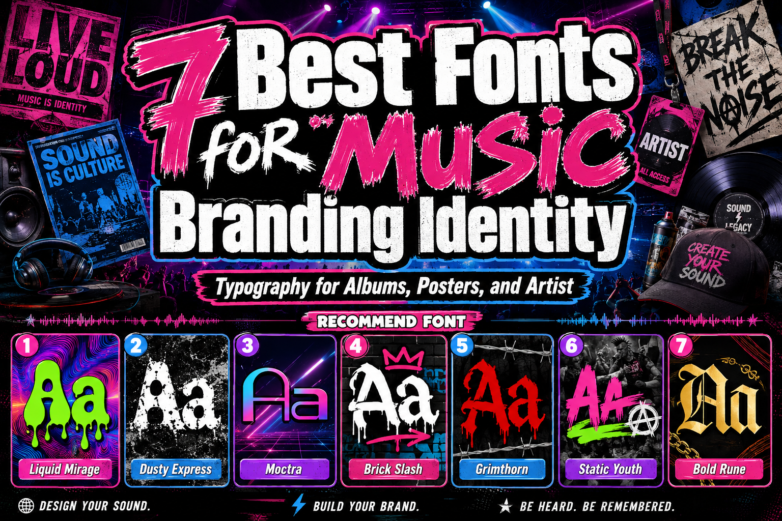
Liquid Mirage | Dusty Express | Moctra Electro | Brick Slash | Grimthorn | Static Youth | Bold Rune
1. Liquid Mirage Psychedelic Style Font
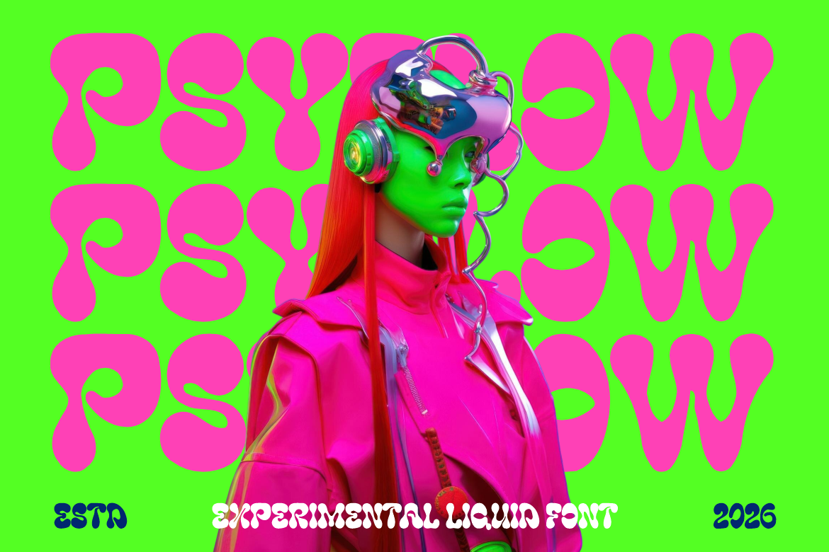
Liquid Mirage uses wide, inflated letterforms with thick rounded strokes, melting curves, soft edges, and bulb-like endings. Its organic shapes create continuous movement across words, allowing typography to become the central visual element of album covers and festival graphics. The combination of retro psychedelic influence and futuristic energy makes it flexible for music that feels surreal, colorful, immersive, or experimental.
PROS: Fluid rhythm, strong headline visibility, expressive rounded shapes, and memorable psychedelic personality.
BEST FOR: Psychedelic rock, experimental pop, jazz fusion, neo-soul, rave culture, electronic festivals, album covers, and nightclub campaigns.
2. Dusty Express Rough Texture Font
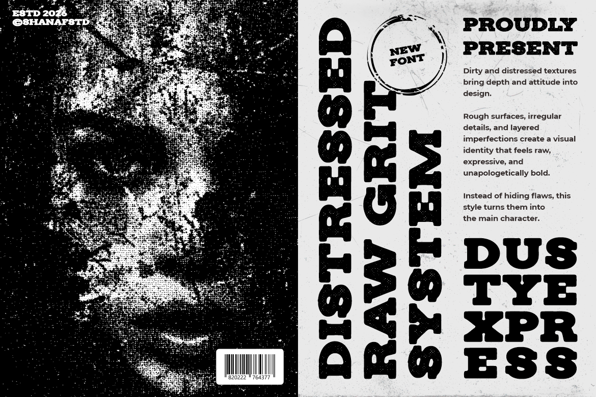
Dusty Express combines wide slab-serif construction with substantial weight, pronounced terminals, and a naturally worn surface. Its distressed texture creates a sense of age and physical production while preserving a solid, recognizable letter structure. It can make an artist identity feel rugged, authentic, and connected to traditional printing, road culture, or handcrafted music scenes.
PROS: Strong slab silhouette, readable distressing, vintage character, and dependable poster presence.
BEST FOR: Blues, Americana, folk rock, country, garage music, road movies, roots festivals, vinyl packaging, and heritage-inspired merchandise.
3. Moctra Electro Font
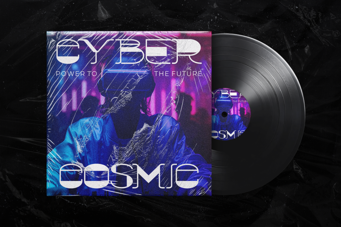
Moctra Electro uses broad geometry, open cuts, solid sections, and narrow inline details to create a clear electronic pulse. Rounded corners keep the construction approachable, while straight cuts and experimental spacing preserve its precise digital character. Its broad character support also makes it practical for coordinated artist logos, release titles, event details, and international campaign materials.
PROS: Futuristic geometry, energetic inline details, clear digital identity, and flexible character coverage.
BEST FOR: EDM, electro-pop, techno, synthwave, DJs, record labels, club nights, festival graphics, podcast artwork, and streaming campaigns.
4. Brick Slash Urban Graffiti Font

Brick Slash uses long angular strokes, pointed edges, stretched curves, and energetic graffiti connections to create a fast urban rhythm. Variation between thin and thick marks gives the lettering a hand-painted quality, while decorative movements help short names feel individually tagged rather than mechanically typeset. It works especially well when the visual identity needs confidence, spontaneity, and a strong connection to street culture.
PROS: Dynamic graffiti movement, sharp visual personality, expressive connections, and strong urban recognition.
BEST FOR: Hip-hop, rap, breakdance events, streetwear collaborations, skate culture, mixtape covers, underground shows, and youth-focused music branding.
5. Grimthorn Hardcore Font
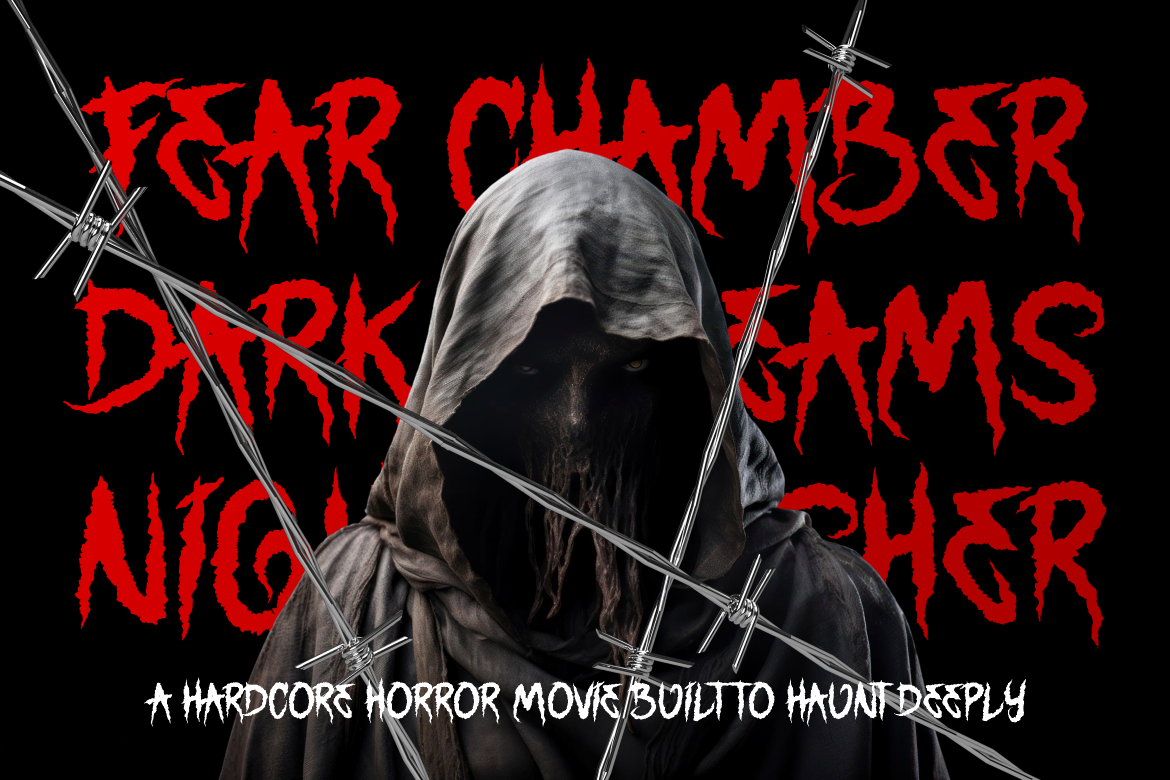
Grimthorn combines tall irregular forms, uneven strokes, jagged contours, and thorn-like extensions. Its distressed construction blends Gothic influence with hardcore aggression, creating a tense silhouette that remains strong enough for major titles and branding. The font is particularly effective when an artist needs an identity that feels dark, threatening, handcrafted, and emotionally intense.
PROS: Aggressive silhouette, intense handcrafted texture, Gothic influence, and immediate underground character.
BEST FOR: Hardcore, heavy metal, dark fantasy music, extreme festivals, horror-inspired releases, gaming soundtracks, concert posters, and alternative merchandise.
6. Static Youth Punk Font
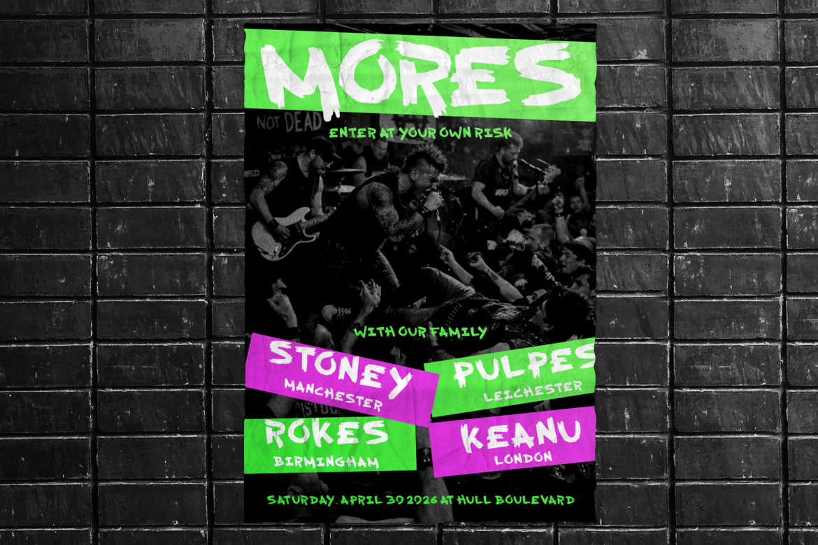
Static Youth uses bold dry-brush strokes, torn terminals, uneven edges, and shifting stroke widths to create an anti-polished DIY attitude. The letterforms feel fast and physically painted, giving headlines movement without depending on digital distortion effects. Its rough structure can make punk and garage campaigns feel immediate, rebellious, and closely connected to handmade posters or independent zines.
PROS: Raw brush texture, energetic movement, strong DIY personality, and impactful display weight.
BEST FOR: Punk, garage rock, grunge, protest music, independent venues, zines, tour posters, streetwear, and rebellious social campaigns.
7. Bold Rune Blackletter Font
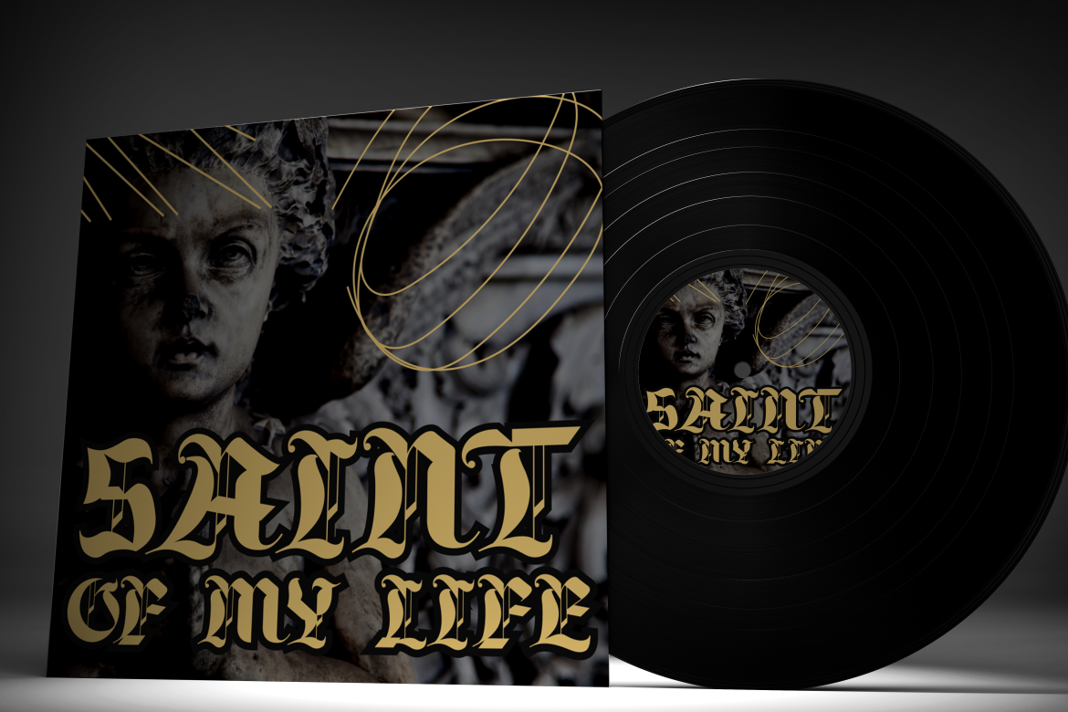
Bold Rune is a dramatic blackletter family with high-contrast Gothic construction and strong decorative forms. Its regular and slanted styles provide two related directions, allowing designers to move between a more ceremonial title and a faster, more aggressive treatment. The recognizable Old English character gives music projects a sense of history, darkness, ritual, and authority.
PROS: Regular and slanted styles, strong blackletter identity, historical atmosphere, and commanding wordmark potential.
BEST FOR: Gothic rock, doom metal, dark folk, tattoo culture, medieval-inspired music, alternative fashion, album titles, and dramatic merchandise.
Comparison
| Font | Visual Personality | Best Music Direction | Strongest Application |
| Liquid Mirage | Fluid, surreal, and psychedelic | Experimental, psych, rave, and fusion | Album covers and festival titles |
| Dusty Express | Rugged, aged, and dependable | Blues, folk, Americana, and roots rock | Vinyl packaging and tour posters |
| Moctra Electro | Digital, energetic, and futuristic | EDM, techno, synthwave, and electro-pop | DJ logos and club campaigns |
| Brick Slash | Urban, fast, and rebellious | Hip-hop, rap, and street culture | Mixtape covers and artist wordmarks |
| Grimthorn | Dark, aggressive, and tense | Hardcore, metal, and horror-influenced music | Band logos and extreme-event posters |
| Static Youth | Raw, handmade, and anti-polished | Punk, grunge, and garage rock | DIY posters and independent merchandise |
| Bold Rune | Gothic, historical, and authoritative | Doom, dark folk, and Gothic rock | Ceremonial album titles and apparel |
Common Mistakes When Choosing Fonts for Music Branding
The first mistake is treating genre stereotypes as a complete branding strategy. A metal act does not automatically need an unreadable logo, and an electronic artist does not always need neon geometric lettering. Those directions can work, but only when they support the specific sound, lyrics, audience, and stage identity. Begin with the emotional character of the music, then use genre conventions as references rather than fixed rules. This creates an identity that feels culturally relevant without becoming interchangeable with other artists.
Another mistake is designing only one album cover instead of building an adaptable artist system. A highly detailed title may look excellent at full size but fail on a streaming thumbnail, tour schedule, cap, ticket, or video title card. Prepare responsive wordmarks, one-color versions, a readable supporting typeface, and rules for future releases. Apple’s album artwork and motion guidance also reinforces the value of continuity between static and animated cover treatments.
The final mistake is adding texture, glow, outlines, distortion, and decorative effects before correcting the typography itself. Build the artist or album name in black and white, adjust the spacing, and confirm that every letter remains understandable. Effects should deepen the musical atmosphere rather than hide weak construction. Before commercial release, also select licensing coverage that matches the real applications, including artist logos, album artwork, paid promotion, websites, merchandise, physical products, and other campaign materials.
Conclusion
The best fonts for music branding translate sound into a visual language that audiences can recognize before they press play.
Psychedelic typography can communicate fluid experimentation, distressed slabs can support roots-driven authenticity, and digital geometry can strengthen electronic identities. Graffiti lettering creates urban movement, rough brush fonts express punk resistance, jagged forms support hardcore intensity, and blackletter typography introduces Gothic authority.
The strongest choice begins with the artist rather than the genre label. Define the emotional promise, test the real name, create the wordmark in monochrome, and build a flexible system for album covers, posters, streaming profiles, merchandise, motion graphics, and social campaigns.
Fonts from PutraCetol Studio provide seven distinctive creative directions. Liquid Mirage builds psychedelic immersion, Dusty Express adds rugged heritage, Moctra Electro delivers digital energy, Brick Slash creates street-level expression, Grimthorn introduces hardcore aggression, Static Youth brings DIY rebellion, and Bold Rune establishes dark historical weight.
When typography, imagery, color, and music all communicate the same world, the font becomes more than a title treatment. It becomes a visual signature that helps listeners remember the artist, recognize each release, and connect more deeply with the music.
Explore these fonts and many more at PutraCetol.com to build a business identity that looks professional, trustworthy, and memorable.
Additionally, if you want to explore some free typography options, you can check out Putracetol Studio on Dafont. Happy reading and designing!