

The best font for YouTube is not necessarily the boldest, thickest, or most unusual typeface available. It is the font that communicates the video’s promise quickly, remains readable inside a crowded recommendation feed, and helps viewers recognize the channel before they consciously read its name.
A gaming channel may need pixel-based typography that signals retro technology. A motorsport creator could benefit from forward-slanting letters that communicate speed, while a horror channel may require distressed forms that establish suspense. Music, commentary, and lifestyle channels can use vintage display typography to create a more editorial or nostalgic identity.
Before selecting a font, define three qualities the channel should communicate:
- Fast, competitive, and energetic
- Retro, entertaining, and expressive
- Digital, futuristic, and technical
- Dark, suspenseful, and cinematic
- Athletic, confident, and nostalgic
- Educational, clear, and authoritative
Use those qualities to build a typography system instead of choosing a different typeface for every upload.
A practical YouTube system contains:
- One primary display font for thumbnail hooks and series titles
- One functional supporting font for smaller information, subtitles, and channel graphics
- One optional accent treatment such as an outline, shadow, italic, or textured version
This gives the channel enough variety for different videos while maintaining a recognizable visual voice.
Why Typography Matters on YouTube
A Thumbnail Has Only a Brief Opportunity to Communicate
YouTube thumbnails appear among competing videos, channel identities, titles, interface elements, and recommendations. Viewers often make a rapid judgment based on the combined effect of the subject, headline, color, and title.
Typography can help them understand:
- What the video is about
- What kind of emotion to expect
- Whether the content feels relevant
- Which element deserves attention first
- Whether the video belongs to a familiar channel or series
The font should communicate the content category without forcing viewers to decode a complicated composition.
A sharp racing font can make an automotive video feel faster before the viewer sees the vehicle clearly. Pixel typography can introduce gaming or digital nostalgia, while an inline vintage font can make a music tutorial or cultural commentary video feel more curated.
Fonts Help Create Channel Recognition
A successful YouTube brand does not need identical thumbnails, but it does need repeatable visual signals.
These signals may include:
- The same headline typeface
- A consistent outline treatment
- A recurring color accent
- Similar text placement
- A stable level of visual density
- Repeated subject cropping
- Familiar series labels
- One recognizable wordmark
The background image may change from video to video, but the typography continues to connect each upload to the same creator.
Recognition is especially valuable when a channel covers several related topics. A consistent font can unify interviews, tutorials, reviews, challenges, and commentary without forcing them into one rigid template.
Current YouTube Thumbnail Requirements
YouTube currently recommends custom video thumbnails at 3840 × 2160 pixels with a 16:9 aspect ratio and a minimum width of 640 pixels. It recommends JPG or PNG files, while upload-size limits differ between desktop and mobile. For Shorts, the recommended uploaded cover ratio is 9:16, and custom Shorts thumbnails are currently managed through YouTube Studio on a computer.
Design at the recommended resolution, but judge the typography at the size viewers will actually encounter.
A large desktop canvas may hide several problems:
- Thin strokes disappearing
- Tight counters closing
- Outline and shadow merging
- Long headlines becoming unreadable
- Decorative details turning into noise
- Text competing with the subject
- Important words becoming too small
After designing, reduce the thumbnail until it resembles a recommendation card on a phone. When the main promise remains understandable, the font and composition are more likely to perform effectively.
What Makes a Strong YouTube Font?
A Distinctive Silhouette
A strong display font creates a recognizable outer shape.
Viewers may identify a chunky pixel title, italic racing word, or horror headline before reading every character. This is valuable because thumbnails are frequently processed as shapes and contrasts before they are read as complete sentences.
A distinctive silhouette can come from:
- Broad proportions
- Forward slant
- Rounded weight
- Inline construction
- Pixel geometry
- Irregular distressed edges
- Condensed athletic forms
The font should look unique without making similar characters difficult to distinguish.
Strong Stroke Weight
Medium-to-heavy display fonts usually perform well in thumbnails because their structures remain visible after scaling.
Very thin typefaces may work for channel banners, editorial covers, or large in-video chapter cards, but they can disappear against photography inside recommendation feeds.
A heavy font does not need to feel aggressive. Rounded corners, open counters, and softer proportions can make thick lettering appear friendly or nostalgic.
Clear Counters
Counters are the interior spaces within letters such as A, B, D, O, P, and R.
Small counters may close when the thumbnail is reduced or when an outline is added. This makes several letters look like solid blocks.
Test difficult combinations such as:
Band8Oand0PandRCandGI,l, and1Sand5
Pixel, horror, and condensed sports fonts need particular attention because their distinctive details may reduce internal space.
A Strong Relationship With the Subject
The font and image should tell the same visual story.
A racing font placed beside a stationary portrait may feel disconnected unless the title or wider content clearly introduces automotive performance. A blood-inspired typeface should not appear on an ordinary educational video simply to attract attention.
Typography should amplify the topic, not misrepresent it.
Build a Three-Role YouTube Typography System
1. Thumbnail Hook Font
This is the most expressive typeface in the channel identity.
Use it for:
- Main thumbnail text
- Series names
- Playlist covers
- Video chapters
- Livestream titles
- Launch campaigns
- Channel trailer graphics
Keep the wording concise enough for the font to remain large.
Useful thumbnail phrases include:
- FINAL LAP
- RETRO GAMING
- DO NOT ENTER
- BIGGEST UPGRADE
- BEFORE VS. AFTER
- HIDDEN FEATURE
- WORST DESIGN
- FULL BREAKDOWN
The title and thumbnail should complement one another rather than repeat the same complete sentence.
2. Functional Supporting Font
Use a quieter typeface for:
- Episode numbers
- Product models
- Small category labels
- Dates
- Subtitles
- On-screen explanations
- End screens
- Charts and comparisons
- Sponsorship information
A neutral sans serif or compact grotesque often works well.
The supporting font should look related to the display typeface without competing with it.
3. Accent Treatment
The accent is usually a treatment, not another unrelated font.
Possible treatments include:
- Outline
- Offset shadow
- Italic version
- Different color
- Distressed variant
- Inline fill
- Pixelated duplicate
- Small handwritten annotation
Use one accent treatment repeatedly so it becomes part of the channel identity.
How Many Words Should a YouTube Thumbnail Use?
There is no universal word limit, but shorter thumbnail text is easier to enlarge and process.
A practical target is often two to five words, depending on the typeface and topic.
Compare:
Too detailed:
I Tested Five Different Racing Games to Find the Most Realistic One
More focused:
MOST REALISTIC?
The video title can explain the complete premise. The thumbnail text should add tension, emotion, result, or contrast.
Possible relationships include:
| Video Title | Thumbnail Text |
|---|---|
| I Tested Five Retro Consoles | STILL WORTH IT? |
| Building the Fastest Budget Racing Setup | FULL SPEED |
| The Horror Game I Could Not Finish | I QUIT |
| Why This Logo Looks Expensive | BEFORE / AFTER |
| Restoring a Forgotten Sports Car | 20 YEARS LATER |
YouTube advises creators to keep titles accurate and concise because misleading packaging can cause viewers to leave, weakening the video’s performance and discoverability.
The same principle applies to typography. An exciting font should strengthen an honest promise rather than disguise an unrelated or weak topic.
Choosing a Font by YouTube Channel Category
Gaming and Technology
Gaming channels can use pixel, arcade, futuristic, or industrial typography depending on the game and audience.
Pixel fonts work naturally for:
- Retro game reviews
- Indie development
- Coding videos
- Arcade history
- Pixel-art tutorials
- Speedrunning
- Classic-console content
Futuristic geometry may be more suitable for current gaming hardware, AI tools, cybersecurity, or science-fiction games.
Keep model numbers, technical terms, and smaller labels in a simpler companion font.
Racing, Automotive, and Motorsport
Racing typography creates motion through:
- Forward slant
- Long horizontal cuts
- Wide proportions
- Aerodynamic details
- Heavy weight
- Mechanical geometry
This direction works well for car reviews, racing games, drifting, motorsport history, garages, motorcycles, and performance upgrades.
A font that already suggests speed can reduce the need for excessive motion blur, flames, or several arrows.
Sports and Fitness
Sports channels benefit from substantial letterforms that communicate strength and competition.
Retro athletic fonts are useful for sports history, running, training, apparel reviews, gym content, documentaries, and event coverage.
Choose a font with clear numbers when statistics, match scores, distances, weights, or performance records appear regularly.
Horror and Dark Entertainment
Horror typography can establish fear through razor-like edges, distressed surfaces, dripping details, or irregular serif construction.
Use it for:
- Horror-game channels
- Halloween content
- Film analysis
- Haunted attractions
- Dark storytelling
- Mystery series
- Practical-effects tutorials
Keep the thumbnail phrase short and place it against a simple enough background for the distressed details to remain visible.
Music, Culture, and Vintage Content
Inline display typography and retro poster lettering can give music, art, film, tattoo, and cultural commentary channels a strong editorial personality.
This direction works for:
- Music tutorials
- Album discussions
- Concert content
- Vintage design history
- Film essays
- Carnival or festival videos
- Creative documentaries
A classic display font can make the channel feel expressive without relying on the extreme visual aggression associated with gaming or horror styles.
Visual Research Before Selecting a YouTube Font
Audit Competitor Thumbnails
Do not choose typography in isolation. Study how fonts behave inside the category.
Collect a sample of:
- Direct competitors
- Adjacent creators
- High-performing recent videos
- Older evergreen videos
- Lower-performing examples
- Your own strongest and weakest thumbnails
Record:
- Font category
- Headline length
- Weight
- Case
- Outline
- Shadow
- Text position
- Subject scale
- Background complexity
- Color contrast
- Relationship with the video title
The goal is not to find one font to copy. It is to identify what has become familiar, what appears overused, and where the channel can create a clearer identity.
Build an Annotated Moodboard
A useful moodboard should explain why every reference matters.
Add notes such as:
- Strong subject-to-background separation
- Large italic title creates motion
- Pixel type signals retro gaming immediately
- Horror texture remains readable because the background is simple
- Vintage inline font creates editorial depth
- Two-color headline remains visible at thumbnail size
- Secondary information uses a neutral companion
This transforms attractive references into practical creative guidance.
Clone the Visual Grammar, Not the Finished Design
Ethical style research studies principles such as scale, hierarchy, color ratio, cropping, and typographic role.
Avoid reproducing another creator’s exact:
- Font treatment
- Photograph
- Pose
- Headline
- Layout
- Color arrangement
- Graphic symbol
- Series identity
Combine several references and filter them through your own channel personality.
A creator may learn that close subject crops and three-word headlines work in the category, then apply those principles using different typography, colors, expressions, and brand elements.
Create Thumbnail Concepts Before Final Production
Instead of making one polished thumbnail, create three simple concept directions.
Concept A: Direct Promise
- Clear subject
- Short explanatory headline
- Strong contrast
- Minimal mystery
Best for tutorials, reviews, and search-driven videos.
Concept B: Emotional Reaction
- Larger face or character
- Strong expression
- One provocative phrase
- Simplified background
Best for commentary, challenges, and entertainment.
Concept C: Visible Result
- Before-and-after image
- Enlarged product or outcome
- Minimal text
- Strong division between states
Best for transformations, restorations, tests, and comparisons.
Use the same font system across the concepts so you are evaluating communication strategy rather than unrelated brand identities.
Test Typography at Thumbnail Size
The Thumbnail Test
Reduce the design until it matches a small recommendation card.
Check whether:
- The subject is identifiable
- The text can be read without zooming
- The first word receives enough emphasis
- The font details remain visible
- The background does not overpower the headline
The Squint Test
Blur your focus or step several feet away.
The dominant subject and primary word should remain clear.
When every element becomes equally visible, the hierarchy may be too weak.
The Grayscale Test
Temporarily remove color.
This reveals whether the design depends entirely on saturation rather than light-dark contrast.
A strong thumbnail should retain visual hierarchy in grayscale before color reinforces it.
The Five-Second Test
Show the thumbnail briefly, then hide it.
Ask the viewer:
- What was the video about?
- Which word do you remember?
- What emotion did it communicate?
- Which channel category did it suggest?
The answers reveal whether the font is helping or distracting.
Measure the Font System With YouTube Analytics
YouTube’s impressions click-through rate measures how often viewers watched a video after seeing a counted thumbnail impression. The platform notes that this metric reflects only eligible impressions on YouTube, so it should be interpreted within the video’s traffic context rather than treated as a universal score.
YouTube Analytics also connects impressions with CTR, views, watch time, average view duration, and audience behavior. This allows creators to evaluate whether the thumbnail attracts relevant viewers and whether the video fulfills the expectation created by its packaging.
A high CTR with weak retention may indicate that the thumbnail creates a misleading promise. A moderate CTR with strong watch time may attract a smaller but more qualified audience.
Evaluate:
- Impressions
- Impressions CTR
- Watch time
- Average view duration
- Early retention
- Returning viewers
- Subscriber conversion
- Traffic source
- Performance by video category
The font is only one variable. Topic, title, subject, channel reputation, upload timing, and audience relevance also influence performance.
Use YouTube A/B Testing Strategically
YouTube currently allows eligible creators to test up to three different titles, thumbnails, or combinations of both. The system evaluates the alternatives and selects the strongest option based on watch-time performance rather than CTR alone.
Use these tests to compare one meaningful visual variable at a time:
- Serif versus sans serif
- Pixel font versus clean technology font
- Text versus no text
- Two-word versus five-word headline
- White type versus colored type
- Outline versus solid fill
- Close crop versus wide composition
- Emotional phrase versus visible result
Do not test three completely unrelated concepts when you want to learn which typographic decision affected performance.
Record the result in a visual research library so future thumbnails benefit from earlier experiments.
Build a Consistent YouTube Brand Kit
Document the typography so editors, designers, and collaborators can produce consistent content.
A useful YouTube brand kit includes:
- Primary thumbnail font
- Supporting font
- Approved font weights
- Standard outline thickness
- Shadow direction
- Headline size range
- Maximum word count
- Approved color combinations
- Text-safe areas
- Series labels
- Channel banner typography
- End-screen typography
- Examples of correct and incorrect use
Consistency reduces production time and makes testing more reliable.
When every thumbnail uses unrelated typography, it becomes difficult to determine whether performance differences come from the topic, font, composition, or brand recognition.
Jump to Recommended Fonts
Classic Ribbon | Turbo Strike | Alpha Forge | Crimson Horror | Vintage Runner
1. Classic Ribbon Display Font
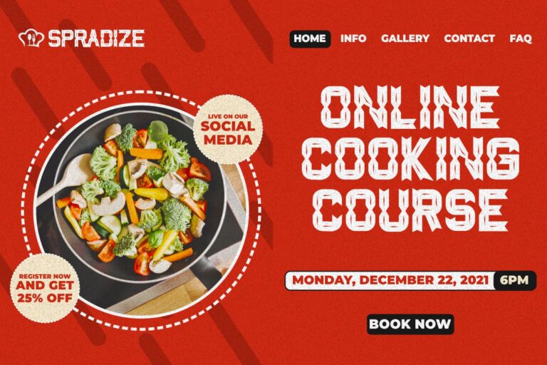
Classic Ribbon is inspired by classic music posters, carnival typography, tattoos, and inline display lettering. Its decorative internal structure gives headlines a nostalgic, crafted personality while retaining enough weight for large thumbnail text. It is particularly valuable for creators who want a vintage visual identity that feels more expressive than a standard retro serif.
PROS: Distinctive inline construction, classic poster personality, strong headline appeal, multilingual support, and broad creative versatility.
BEST FOR: Music channels, film essays, creative tutorials, vintage design, tattoo content, festival videos, cultural commentary, and entertainment branding.
2. Turbo Strike Race Font
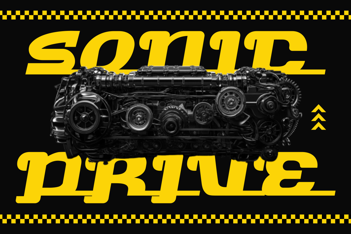
Turbo Strike uses wide proportions, heavy strokes, rounded corners, forward italic movement, and extended horizontal cuts to create visible acceleration. Its aerodynamic construction communicates speed before additional motion effects are added, helping racing thumbnails feel energetic without becoming visually overloaded. The strong silhouette also remains effective across esports graphics, automotive branding, posters, and digital promotions.
PROS: Strong sense of motion, thick display weight, modern motorsport personality, clear large-format readability, and high-energy branding impact.
BEST FOR: Racing games, automotive reviews, drifting, motorcycles, esports, tuning channels, performance products, sports technology, and action content.
3. Alpha Forge Pixel Font
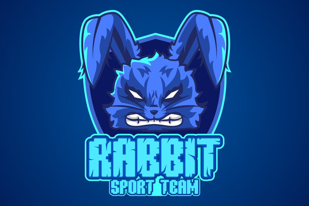
Alpha Forge combines retro-futuristic pixel construction with two coordinated directions: a cleaner block style and a more fractured glitch treatment. This gives creators a choice between readable arcade-inspired branding and a rougher cyberpunk variation for higher-intensity covers. Its block-based silhouette is particularly useful for channels built around games, technology, coding, AI, digital culture, or classic hardware.
PROS: Two coordinated pixel styles, strong retro-gaming recognition, clean block geometry, glitch variation, and high-impact digital personality.
BEST FOR: Gaming channels, retro consoles, coding tutorials, AI content, pixel art, cybersecurity, arcade history, indie development, and technology reviews.
4. Crimson Horror Font
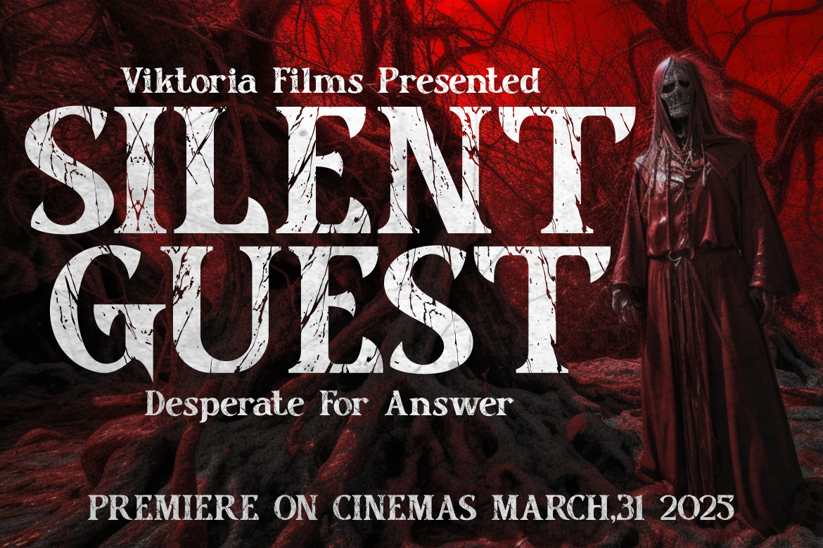
Crimson Horror is a bold horror serif family with sharp edges, irregular contours, distressed textures, and details inspired by slashes and dripping forms. Its four coordinated styles provide enough variation for a recurring horror series, seasonal campaign, or channel identity without requiring several unrelated fonts. Despite its theatrical texture, the underlying serif structure preserves enough clarity for large video titles and promotional graphics.
PROS: Four styles, strong horror atmosphere, distressed serif construction, dramatic readability, and flexible cinematic branding.
BEST FOR: Horror gaming, Halloween videos, haunted attractions, film analysis, dark storytelling, spooky merchandise, cinematic titles, and suspense campaigns.
5. Vintage Runner Display Retro Sport Font
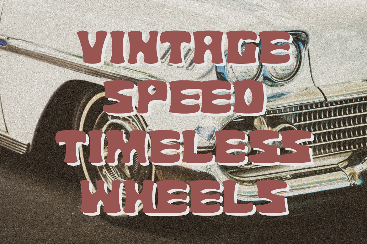
Vintage Runner uses thick, chunky characters with broad proportions, rounded edges, muscular curves, and irregular internal cuts. Its softened athletic construction communicates old-school sporting energy without becoming as rigid as a conventional varsity font. This makes it especially effective for channels that combine sports, motorsport, fitness, road culture, and retro documentary storytelling.
PROS: Broad visual presence, retro athletic personality, rounded readability, emblem potential, and strong merchandising appeal.
BEST FOR: Running, fitness, racing history, sports documentaries, automotive clubs, vintage equipment, training content, road culture, and athletic lifestyle channels.
Comparison
| Font | Main Visual Direction | Strongest YouTube Category | Thumbnail Personality | Best Headline Length |
| Classic Ribbon | Inline vintage display | Music, culture, film, and creative tutorials | Nostalgic, crafted, and expressive | Two to five words |
| Turbo Strike | Italic racing display | Automotive, racing, esports, and action | Fast, competitive, and mechanical | One to four words |
| Alpha Forge | Pixel and glitch display | Gaming, coding, AI, and technology | Digital, retro-futuristic, and technical | One to five words |
| Crimson Horror | Distressed horror serif | Horror, Halloween, film, and dark gaming | Sinister, theatrical, and dramatic | One to four words |
| Vintage Runner | Rounded retro sport display | Fitness, sports, motorsport, and documentary | Athletic, nostalgic, and confident | Two to five words |
Best for Music and Creative Channels
Classic Ribbon provides the strongest vintage editorial direction for music, design, culture, and film-related content.
Best for High-Speed Action
Turbo Strike creates the clearest sense of acceleration for racing, cars, gaming, and competitive content.
Best for Gaming and Technology
Alpha Forge immediately communicates pixel culture, digital systems, retro gaming, and cyber-inspired topics.
Best for Horror Content
Crimson Horror provides several coordinated options for dramatic, frightening, and cinematic thumbnail branding.
Best for Sports and Retro Lifestyle
Vintage Runner combines athletic strength with friendlier rounded forms and old-school visual character.
Common Mistakes
The first mistake is choosing a font entirely because it looks dramatic at full size. Pixel details, inline structures, distressed edges, and narrow counters may look excellent on a large monitor but disappear after the thumbnail is reduced inside a mobile feed. Test every headline at realistic viewing size, keep the wording concise, and simplify outlines or effects that merge with the base letters. The best YouTube font must perform inside the actual platform context, not only inside the design application.
The second mistake is changing the typography every time the topic changes. A gaming channel may use one pixel font for retro content, a random futuristic face for hardware reviews, and an unrelated horror font for one seasonal upload. The individual thumbnails may look attractive, but the channel loses recognition. Maintain one primary system and introduce category variation through color, imagery, accents, or approved secondary treatments. Use a specialized font such as Crimson Horror only when the series or topic genuinely needs a separate sub-identity.
The final mistake is optimizing only for clicks. A highly sensational font, exaggerated phrase, and misleading visual can increase curiosity while attracting the wrong viewers. YouTube recommends accurate packaging, and its A/B testing system evaluates watch time rather than CTR alone because the thumbnail must attract attention and lead into content that fulfills the promise. Build typography around clarity, test several controlled alternatives, and confirm that the selected font license covers monetized YouTube content, channel branding, logos, merchandise, advertising, and any other intended commercial applications.
Conclusion
The best font for YouTube is the typeface that makes a video easier to recognize, understand, and choose without misrepresenting the content.
A strong YouTube typography system balances personality with practical readability. It gives one display font responsibility for the hook, assigns a calmer companion to supporting information, and uses consistent treatments across thumbnails, channel art, playlists, end screens, and promotional content.
Classic Ribbon gives music and creative channels an expressive vintage voice. Turbo Strike introduces aerodynamic speed for racing, gaming, and automotive videos. Alpha Forge brings pixel precision and glitch character to technology and gaming. Crimson Horror creates immediate suspense, while Vintage Runner delivers retro athletic confidence.
Fonts from PutraCetol Studio can help creators move beyond generic bold text and develop a visual language that belongs specifically to their channel.
The strongest process combines font selection with visual research. Analyze the category, build annotated moodboards, study competitors without copying them, create multiple concepts, and test the typography at real thumbnail size.
Then evaluate the complete performance through impressions, CTR, watch time, retention, and A/B testing.
A font should not merely make the thumbnail louder. It should make the promise clearer, the channel more recognizable, and the right viewer more confident about clicking.
Explore these fonts and many more at PutraCetol.com to build a business identity that looks professional, trustworthy, and memorable.
Additionally, if you want to explore some free typography options, you can check out Putracetol Studio on Dafont. Happy reading and designing!