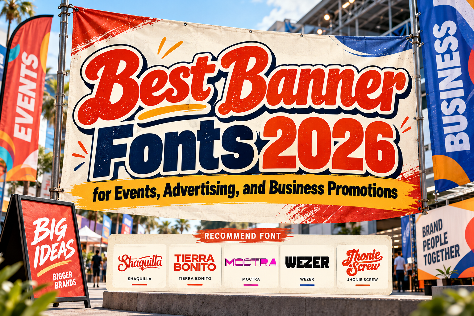
Best Fonts for Banner Design 2026: Typography Built to Get Attention
Banner typography has one major challenge: it must communicate before the audience decides to look somewhere else.
A roadside banner may have only seconds to attract attention. An exhibition banner competes with dozens of surrounding displays, while a digital banner must remain clear even at compact dimensions.
That makes choosing the best fonts for banner design 2026 different from choosing body typography. Banner fonts need strong silhouettes, appropriate weight, recognizable character shapes, and enough personality to support the brand without making the message difficult to understand.
The strongest approach is usually simple: one dominant headline, strong contrast, limited supporting information, and typography selected specifically for the campaign.
Initial Suggestion: Design for the Real Viewing Distance
Never evaluate banner typography only at 100% zoom on a design monitor.
Step away from the screen or reduce the artwork until it approximates its real viewing conditions. A headline that looks enormous inside Illustrator may become surprisingly difficult to recognize when printed across a street or displayed as a small web advertisement.
Short messages work best.
Instead of writing “Visit Our Restaurant Today and Enjoy Our New Mexican Food Menu,” a banner can communicate faster with “NEW TACO MENU” supported by one short secondary message.
Use decorative typography for the headline and a cleaner supporting font for prices, dates, URLs, or event details.
Jump to Recommended Fonts
1. Tierra Bonito Mexican Food Font

Tierra Bonito is one of the strongest choices in this collection when distance readability is important. It uses thick, uniform strokes, broad proportions, rounded counters, and compact spacing, producing a solid headline that remains visually clear even inside busy layouts. PutraCetol specifically highlights its strong distance readability and recommends it for posters, signage, promotional headlines, social banners, restaurants, food trucks, and packaging. PutraCetol Studio
Its playful geometry gives food promotions personality without relying on excessively complicated decoration.
PROS: Wide proportions, heavy strokes, strong visibility, approachable character.
BEST FOR: Restaurant banners, food festivals, street markets, cafés, promotional sales.
2. Moctra Electro Font

Moctra Electro brings a much more futuristic direction. Its wide geometry combines solid forms, open cuts, inline details, straight electronic rhythms, and softened rounded corners, creating a strong technological appearance. PutraCetol recommends it for music events, DJ branding, festivals, gaming, virtual reality, technology startups, entertainment advertising, and banners. PutraCetol Studio
This makes Moctra especially effective when a campaign needs to communicate nightlife, digital culture, speed, or innovation.
PROS: Futuristic construction, wide geometry, memorable electronic personality.
BEST FOR: Tech events, gaming campaigns, concerts, nightclubs, digital products.
3. Wezer Display Bold Font Duo

Wezer provides two coordinated styles: a rounded version and a more distinctive display version. This gives designers flexibility to create contrast within the same campaign while maintaining a related visual identity. The family is specifically positioned for headlines, billboards, banners, posters, branding, and other designs that benefit from quirky, unconventional typography. MyFonts
The two-style structure can be particularly useful for banner systems where the main headline and secondary promotional message need different personalities without introducing an unrelated font family.
PROS: Two complementary styles, bold presence, distinctive personality, versatile hierarchy.
BEST FOR: Creative events, lifestyle brands, product launches, billboards, campaign banners.
4. Jhonie Screw Retro Bold Font
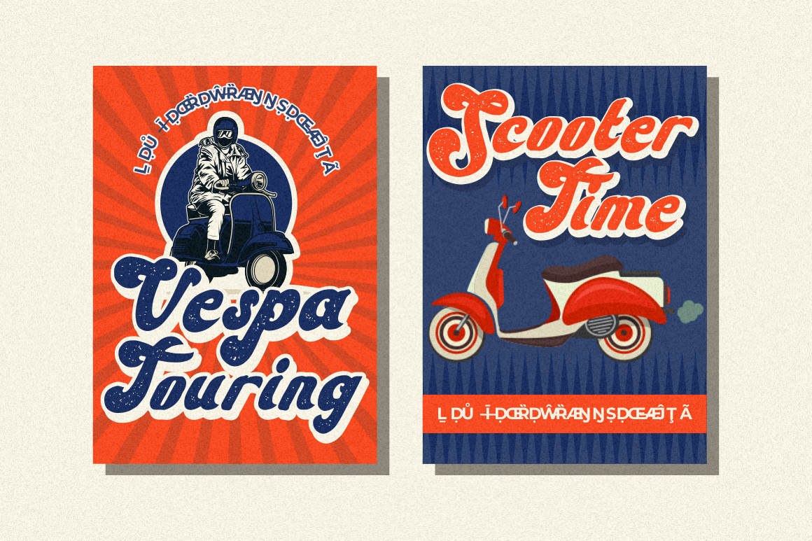
Jhonie Screw is designed around bold retro character with a groovy vintage influence. It includes both clean and textured variations plus numerous alternate characters, allowing designers to move between polished retro branding and a more weathered visual treatment. PutraCetol lists banners, posters, headlines, logos, labels, and titles among its intended uses. PutraCetol Studio
Its heavy personality makes it especially useful when the campaign needs nostalgia to be immediately visible from the headline alone.
PROS: Clean and textured options, alternate characters, bold retro silhouette.
BEST FOR: Vintage events, music promotions, retro retail, festivals, lifestyle campaigns.
5. Shaquilla
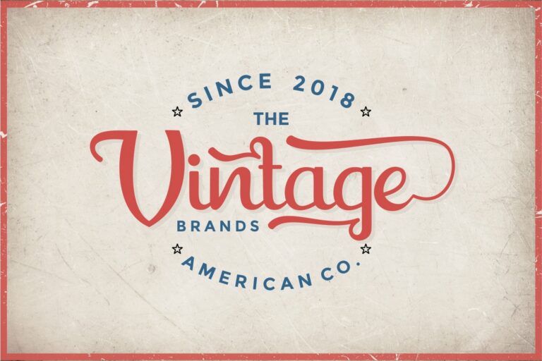
Shaquilla offers a contrasting approach to the heavier display fonts above. It is a modern-classic script with uppercase and lowercase alternates, ligatures, end-letter swashes, numerals, punctuation, and multilingual support. It has been positioned for headers, posters, branding, merchandise, labels, social media, and packaging. Creative Market
Because script forms are more intricate, Shaquilla is strongest when the banner contains a short emotional or elegant phrase rather than a dense informational headline.
PROS: Alternates, ligatures, swashes, elegant handcrafted personality.
BEST FOR: Fashion banners, weddings, beauty brands, lifestyle promotions, boutique advertising.
Comparison: Which Banner Font Fits Your Campaign?
| Font | Visual Direction | Strongest Banner Use |
|---|---|---|
| Tierra Bonito | Bold, friendly | Food and retail |
| Moctra Electro | Futuristic, digital | Technology and music |
| Wezer | Quirky, contemporary | Creative campaigns |
| Jhonie Screw | Retro, bold | Events and vintage branding |
| Shaquilla | Elegant, script | Fashion and lifestyle |
Tierra Bonito offers the most straightforward distance readability, while Moctra, Wezer, and Jhonie Screw prioritize stronger thematic identities. Shaquilla works best when elegance matters more than maximum block-like visibility.
Build Clear Banner Hierarchy
A banner should rarely treat every piece of information equally.
Use three levels:
Primary message
The largest and strongest typography.
Supporting information
A shorter explanation, discount, or event detail.
Action
Website, QR code, date, location, or call to action.
Keep adequate spacing around the headline and avoid placing strong imagery directly behind complicated letterforms. High contrast between text and background is usually more valuable than adding multiple outlines or effects.
For digital advertising, test the design at its actual ad dimensions. A headline that works on a billboard may need to be simplified when converted into a compact display banner.
Common Mistakes
A common mistake is selecting a highly decorative font simply because it looks unique. Banner design is communication at speed. If viewers need several seconds to decode individual letters, the typography is working against the advertisement. Use expressive fonts where they remain recognizable and reserve simpler typography for details.
Another mistake is placing too much information on one banner. Multiple offers, several photographs, five font styles, social handles, addresses, phone numbers, and long descriptions create visual competition. Decide on one primary action and build the hierarchy around it.
Finally, remember that print and digital advertising may require different licensing coverage. PutraCetol distinguishes static printed promotional work from categories such as paid digital advertising and other expanded uses, so designers should select license coverage based on the actual campaign rather than assuming every commercial application is identical. PutraCetol Studio
Conclusion
The best fonts for banner design 2026 combine visibility with a personality appropriate to the campaign.
Tierra Bonito delivers bold readability, Moctra Electro introduces futuristic energy, Wezer provides quirky flexibility, Jhonie Screw creates retro impact, and Shaquilla adds elegant script expression.
The font alone does not make the banner effective. Keep the message short, establish strong hierarchy, maintain high contrast, and test the artwork from its realistic viewing distance.
Explore these fonts at PutraCetol Studio for event banners, retail promotions, advertising campaigns, billboards, food branding, digital ads, and other projects where typography needs to capture attention quickly.
Explore these fonts and many more at PutraCetol.com to build a business identity that looks professional, trustworthy, and memorable.
Additionally, if you want to explore some free typography options, you can check out Putracetol Studio on Dafont. Happy reading and designing!