
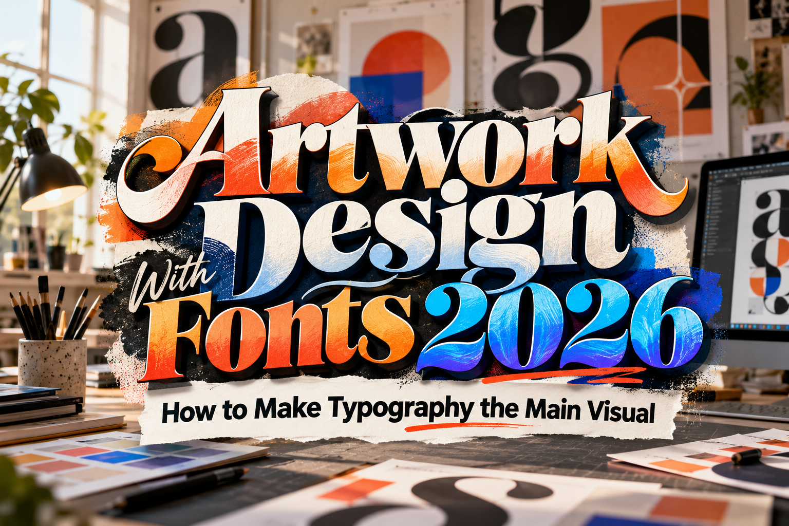
Artwork Design With Fonts 2026: How to Make Typography the Main Visual
Typography does not always need to sit quietly beside an illustration or photograph. In many successful designs, the lettering itself becomes the artwork.
That is the core idea behind artwork design with fonts 2026. Designers are increasingly treating type as shape, rhythm, texture, and visual personality rather than simply a tool for delivering information. A bold display font can dominate a poster, an expressive script can become the emotional center of packaging, and an experimental typeface can give social media content an instantly recognizable identity.
The challenge is knowing how to make typography visually powerful without turning the composition into chaos.
Initial Suggestion: Start With the Message, Not the Effects
Before choosing gradients, shadows, distortion, or illustrations, identify the most important words in the design.
Imagine a coffee brand launching a seasonal campaign called “Slow Morning.” Those two words might become the largest visual element, while the product name, flavor, date, and promotional message remain secondary.
Choose a typeface whose personality supports the message. A soft script could suggest comfort and craftsmanship, while a condensed bold font might create a more energetic urban mood.
Once the typography already feels appropriate in simple black and white, begin adding visual treatment. If the artwork only becomes interesting after multiple effects are applied, the underlying typographic direction may not be strong enough.
Build a Strong Typographic Hierarchy
Hierarchy determines where the viewer looks first, second, and third.
A practical artwork system might contain a dominant headline, a smaller supporting phrase, and minimal informational text. The headline can use an expressive display font, while secondary information should usually use something simpler.
For example, a fictional snack poster could use:
CRUNCH MODE as the main display title,
“Sweet. Loud. Addictive.” as the supporting line,
and product details in a clean sans serif.
Changing size alone is not enough. Contrast can also come from weight, width, capitalization, spacing, alignment, and positioning.
The goal is to make the reading sequence obvious even before the viewer consciously starts reading.
Treat Letters as Graphic Shapes
One of the most effective ways to create font-based artwork is to stop thinking about letters only as text.
Look at the outer silhouette of a word. Notice counters, curves, diagonals, ascenders, and negative spaces. These areas can interact with images and other graphic elements.
A large letter can partially sit behind a product photograph. A word can extend beyond the canvas edge. Letters can overlap illustrations or create containers for texture and photography.
This approach is especially useful for posters, album covers, streetwear graphics, editorial layouts, and packaging.
However, preserve enough recognizable structure that the message remains understandable. Artistic distortion should strengthen the visual concept rather than make viewers decode every word.
Create Depth With Layering
Typography becomes more dynamic when it exists at multiple visual depths.
Place some letters behind the subject and others in front. Add smaller repeated text in the background. Use oversized cropped letterforms as secondary shapes.
For instance, a beverage campaign might place a huge brand name behind the bottle, with only parts of the characters visible. A smaller slogan can sit clearly in the foreground.
You can also create separation through outline, shadow, blur, transparency, or subtle perspective changes.
Use these techniques selectively. Depth works best when one or two layers remain visually dominant.
Combine Fonts With Texture and Illustration
Texture can transform clean digital typography into something more expressive.
A rough display font paired with grain can create a vintage poster feeling. A hand-drawn font combined with doodles may suit playful food branding. Smooth rounded typography with glossy effects can support candy, cosmetics, or futuristic product artwork.
Illustrations should interact with the typography instead of simply filling empty space.
Try extending a leaf around a character, placing a melting effect beneath the baseline, or letting a character overlap an illustrated object. Small relationships like these make the typography feel intentionally integrated into the composition.
Use Color to Support the Typeface
Color can significantly change how typography is perceived.
A heavy black display font may feel aggressive on a red background but sophisticated when paired with cream and muted gold. Rounded lettering can appear youthful with bright colors or premium with a restrained monochromatic palette.
Start with a limited color system. One dominant color, one supporting tone, and one accent are often enough.
High contrast is especially important for social media and mobile screens, where artwork may initially appear as a small thumbnail.
Comparison: Different Approaches to Font-Based Artwork
| Approach | Visual Character | Best Application |
|---|---|---|
| Oversized typography | Bold and immediate | Posters, campaigns |
| Minimal typography | Clean and premium | Luxury branding |
| Layered lettering | Dynamic and dimensional | Social content |
| Textured typography | Handmade or vintage | Packaging, music |
| Experimental distortion | Artistic and unconventional | Fashion, editorial |
| Typography + illustration | Narrative and playful | FnB, merchandise |
There is no single correct approach. The right method depends on the brand personality, audience, platform, and message.
A premium skincare label may need elegant simplicity, while a streetwear campaign can tolerate stronger distortion and visual tension.
Common Mistakes in Font-Based Artwork
A common mistake is using too many expressive fonts in one design. When several typefaces compete for attention, hierarchy becomes difficult to understand. In most cases, one distinctive display font paired with one supporting typeface is enough. Another problem is adding effects simply because software makes them available. Multiple shadows, outlines, gradients, distortions, and textures can quickly hide the original character of the font. Build the composition first, then add effects only when they reinforce the concept.
Designers also sometimes ignore the final viewing environment. Artwork that looks impressive on a large monitor may become unreadable on Instagram, product packaging, or a mobile advertisement. Always test the design at realistic sizes. Check contrast, spacing, letter recognition, and whether the primary message remains understandable within a few seconds.
Finally, do not overlook font licensing. Commercial branding, packaging, social campaigns, templates, and merchandise may require different usage rights. Confirm the license before the artwork is published or distributed commercially.
Conclusion
Successful artwork design with fonts 2026 begins by treating typography as both communication and visual form.
Choose typefaces with a clear personality, establish hierarchy, explore letters as shapes, and use layering, texture, illustration, and color with purpose. The strongest designs do not simply decorate typography. They build the entire composition around it.
For designers developing posters, packaging, social content, logos, and promotional artwork, explore the font collection at PutraCetol Studio to find distinctive display, script, serif, graffiti, food, retro, and experimental typefaces that can become the foundation of your next creative project.
Explore these fonts and many more at PutraCetol.com to build a business identity that looks professional, trustworthy, and memorable.
Additionally, if you want to explore some free typography options, you can check out Putracetol Studio on Dafont. Happy reading and designing!