
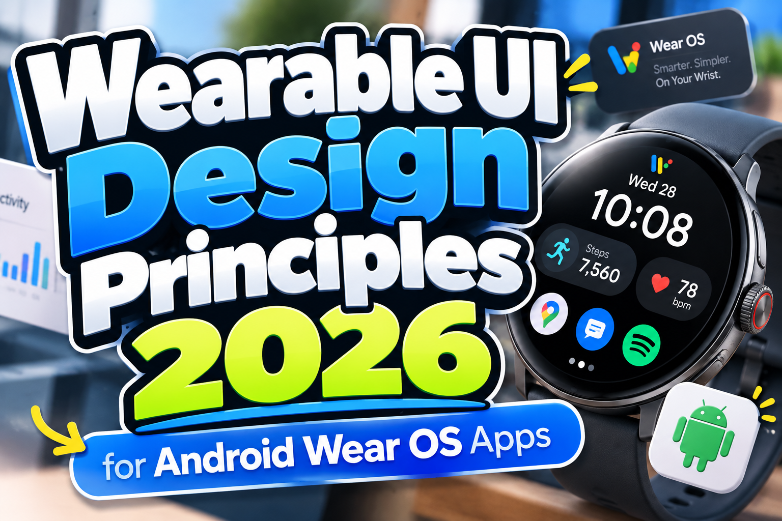
Android Wear OS Design Principles 2026: Designing for the Wrist, Not a Smaller Phone
A smartwatch is not simply a smartphone reduced to a circular screen.
People interact with a watch while walking, exercising, commuting, talking, carrying something, or quickly checking information between other activities. They may give the interface only a few seconds of attention before lowering their wrist.
That context defines the Android Wear OS Design Principles 2026.
Google describes Wear OS as a platform for creating glanceable and increasingly standalone smartwatch experiences that help people stay connected and complete tasks quickly without constantly reaching for their phones. Android Developers
The strongest Wear OS products therefore prioritize critical information, short interactions, contextual relevance, and independence rather than reproducing every feature available in the mobile application.
Initial Suggestion: Ask What Truly Belongs on the Wrist
Before designing screens, reduce the product to one question:
What task becomes genuinely better when it is available immediately on the wrist?
For a fitness app, that might be starting a workout and checking current progress. For transportation, it could be viewing the next departure. A productivity tool might surface the next appointment or let users quickly complete a task.
Google’s guidance recommends concentrating on one or two critical tasks instead of attempting to reproduce a complete application experience. Android Developers
If a workflow requires long documents, complex spreadsheets, extensive data entry, or prolonged concentration, the phone, tablet, or desktop is probably the more appropriate surface.
1. Make Everything Glanceable
Glanceability is the foundation of smartwatch UX.
Users should be able to raise their wrist, identify the important information, and understand what to do next almost immediately.
That means prioritizing:
large key values,
short labels,
clear hierarchy,
recognizable icons,
and limited competing information.
Wear OS provides several surfaces specifically for quick interaction. Complications place highly glanceable information directly on the watch face, while Tiles provide slightly richer information and actions without requiring users to open the full app. Android Developers
Google’s Tile guidance notes that watch interactions can involve roughly seven seconds of screen attention, reinforcing why graphs and statistics should normally be reduced to their most important information. Android Developers
2. Optimize Every Interaction for the Wrist
Keeping an arm raised is physically different from holding a smartphone.
Long workflows can quickly create discomfort or fatigue. Google’s core Wear OS principles explicitly recommend helping users complete tasks within seconds. Android Developers
Reduce taps and avoid unnecessary confirmation screens.
For example, a running app should not require users to navigate through six menus just to begin a familiar workout. Frequently used actions should be immediately accessible.
Large touch targets also matter because the screen is small and the user may be moving. Google’s current Tile guidance recommends maintaining minimum tap targets of approximately 48dp when arranging interactive rows on smaller displays. Android Developers
Efficiency on Wear OS means reducing interaction cost, not squeezing more controls into less space.
3. Design for Round Screens First
Most Wear OS devices use circular displays.
Google notes that a round screen provides about 22% less usable UI area than an equivalent square display, while edge curvature also requires additional consideration for text and controls. Android Developers
Design around the center of the screen, maintain appropriate margins, and avoid placing important text where the circular edge can clip it.
This is particularly important for localization. A compact English button label may become significantly longer in German, Indonesian, French, or another language.
Responsive Wear OS layouts should therefore be tested with different screen sizes, font scaling, languages, and variable content. Android Developers
Designing the most constrained watch first usually produces a stronger layout than shrinking a spacious desktop-style composition afterward.
4. Choose the Right Wear OS Surface
Not every interaction needs a full application screen.
Wear OS provides different surfaces for different levels of attention.
A complication is ideal for persistent information such as heart rate, weather, or progress. A Tile can provide a richer snapshot and quick action. A notification communicates time-sensitive information. The full app is appropriate when the task requires deeper interaction. Android Developers
Imagine a hydration application.
The complication could display today’s water progress. The Tile might show the current amount plus an “Add Water” action. A notification could remind the user when appropriate, while the app could contain detailed history and settings.
Using each surface according to its purpose reduces unnecessary navigation.
5. Make Information Contextually Relevant
A watch travels with its owner throughout the day.
That makes context one of its biggest advantages.
Google recommends considering information such as time, place, and activity when deciding what the application should display. Android Developers
A fitness app could emphasize workout controls while exercise is active. A travel app might prioritize boarding information shortly before departure. A calendar app should focus on the next relevant meeting rather than forcing users to browse an entire monthly schedule.
Context-aware design reduces information density because the system surfaces what matters now.
The goal is not to show everything users could need. It is to predict what is useful in the current moment.
6. Make Important Features Work Offline
Smartwatches cannot assume perfect connectivity.
Users may exercise outdoors, commute underground, leave their phone behind, or experience weak mobile service.
Google therefore includes offline functionality among its fundamental Wear OS design principles, specifically citing situations such as exercising and commuting. Android Developers
Cache important information locally when practical.
A workout should not suddenly become unusable because the watch loses internet connectivity. Music, recent navigation information, timers, stored tickets, and locally captured health data can often continue functioning until connectivity returns.
Standalone usefulness is a major difference between a genuine wearable experience and a remote control for a phone.
7. Use Typography for Instant Hierarchy
Typography on Wear OS must communicate quickly.
Google’s current Wear OS typography system organizes text into roles including Display, Title, Label, Body, Numeral, and Arc. Large Display styles are intended for short, highly glanceable information, while dedicated Numeral roles support prominent metrics such as timers and counts. Android Developers
A fitness screen might therefore make “142” the dominant element while “BPM” remains secondary.
Avoid forcing a custom decorative font into every small interface element. Distinctive typography can strengthen brand moments, but small labels, controls, health information, and notifications need exceptional clarity.
Brands can instead use fonts from PutraCetol Studio more prominently across companion websites, campaign graphics, onboarding artwork, and broader visual branding, while keeping the smartwatch interface optimized for rapid reading.
Comparison: Phone Design vs. Wear OS Design
| Design Area | Smartphone | Wear OS |
|---|---|---|
| Interaction length | Minutes possible | Usually seconds |
| Information density | Moderate to high | Very low |
| Primary goal | Full experiences | Critical tasks |
| Navigation | Multiple screens acceptable | Minimize steps |
| Context | User opens app intentionally | Always available on wrist |
| Connectivity | Often expected | Offline support important |
| Typography | Longer reading possible | Glanceable hierarchy |
| Screen shape | Usually rectangular | Often circular |
Wear OS should complement larger devices rather than imitate them.
Common Mistakes in Wear OS Design
The most common mistake is shrinking a smartphone application onto the watch. Navigation drawers, long forms, detailed dashboards, and dense lists may technically fit, but they ignore the physical context of wrist interaction. Start with the watch use case instead and move complex operations to a more appropriate device. Google explicitly encourages designers to consider which parts of a task belong on the watch and which are better completed elsewhere. Android Developers
Another mistake is overcrowding Tiles with data. A health dashboard containing seven metrics, three charts, and several buttons may be informative on a phone but impossible to interpret quickly on a watch. Prioritize one important metric and perhaps one immediate action, then let users open the full app when they need more detail.
Finally, avoid interactions that rely on hidden gestures or memorization. Wear OS guidance for media experiences specifically recommends visible affordances and consistent patterns rather than hidden gestures that increase cognitive load. Android Developers
Conclusion
The core Android Wear OS Design Principles 2026 can be summarized in one idea: respect the wrist.
Design for critical tasks, make information glanceable, minimize interaction time, embrace circular screens, select the appropriate Wear OS surface, respond to context, and support important functionality offline.
A successful smartwatch application does not contain everything the mobile version offers.
It contains exactly what users need when raising their wrist for a few seconds.
When thoughtful wearable UX is combined with a consistent visual identity across the wider brand ecosystem, designers can create products that feel efficient, recognizable, and genuinely useful rather than merely miniature.
Explore these fonts and many more at PutraCetol.com to build a business identity that looks professional, trustworthy, and memorable.
Additionally, if you want to explore some free typography options, you can check out Putracetol Studio on Dafont. Happy reading and designing!