
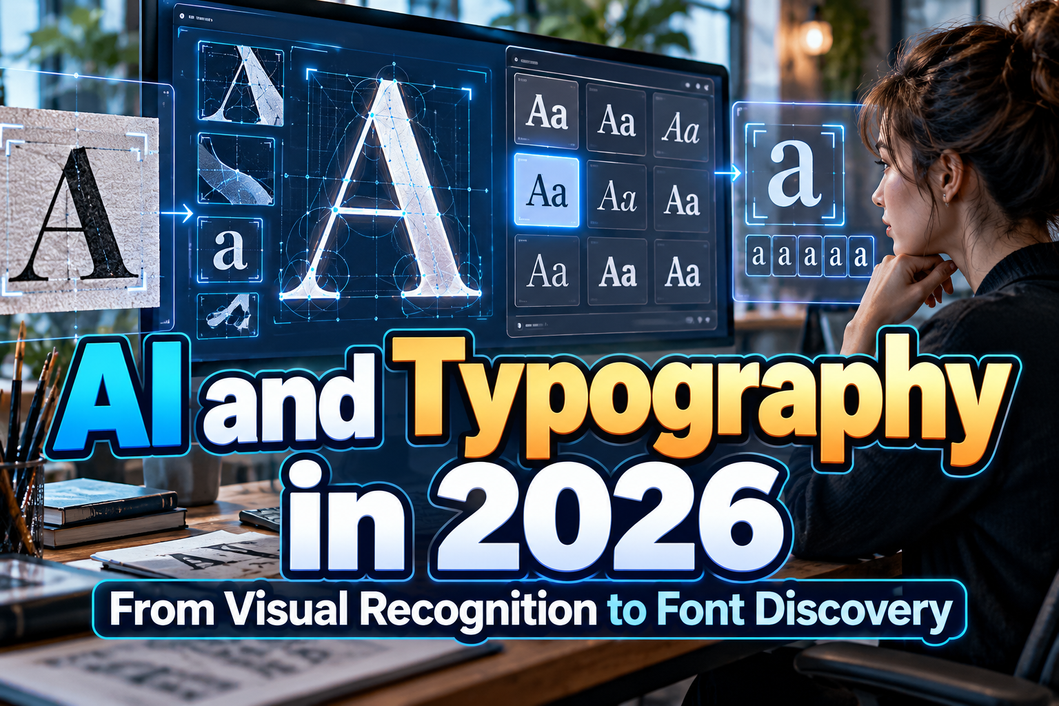
AI Perception of Typography 2026: How Machines Learn to “See” Fonts
Ask a designer to describe a typeface and you may hear words such as condensed, elegant, brutalist, soft, geometric, or handmade. Ask a modern AI system the same question while showing it an image, and it can often produce surprisingly similar language.
But does AI actually “see” typography the way humans do?
Understanding AI perception of typography 2026 requires an important distinction. A traditional text-only large language model does not inspect pixels. Visual analysis becomes possible when language capabilities are combined with image-processing components in a multimodal model. The system can then connect visual patterns with concepts expressed in language.
OpenAI’s current image-input documentation, for example, states that ChatGPT can interpret uploaded images, while also documenting limitations involving small text, rotated content, precise spatial reasoning, and occasional incorrect descriptions.
For typography, that means AI can be a powerful observer and discovery assistant, but not an infallible type expert.
Initial Suggestion: Describe What You See Before Asking for a Font Name
When using AI to analyze typography, begin with visual attributes rather than asking only, “What font is this?”
A better prompt might be:
“Analyze this lettering. Describe its stroke weight, width, contrast, terminals, spacing, texture, serif construction, overall mood, and suitable branding applications.”
This encourages the model to break the design into observable characteristics instead of jumping directly to an exact identification.
For type designers and foundries, the same principle works in reverse. Detailed descriptions such as bold condensed display font with irregular edges and retro sports influence provide stronger semantic signals than generic phrases such as “cool display font.”
How Does AI Interpret the Shape of a Font?
Modern vision-language systems can map visual information and text descriptions into related representations.
One influential example is CLIP, introduced by OpenAI in 2021. CLIP learned visual concepts from large collections of image-text pairs, allowing images to be associated with natural-language concepts rather than only fixed predefined labels. OpenAI also demonstrated that this approach could transfer to tasks including OCR and visual classification.
Applied conceptually to typography, a multimodal system may associate visible characteristics with descriptions such as:
High stroke contrast → elegant or editorial
Thick rounded forms → friendly or playful
Distressed edges → rough, vintage, or grunge
Narrow uppercase letters → condensed display typography
These connections are statistical associations learned from data, not human aesthetic experience. The AI does not experience elegance or nostalgia. It identifies patterns that frequently occur alongside those concepts.
What Can AI Recognize in Typography?
AI can often provide useful analysis at several levels.
At the structural level, it may distinguish serif from sans serif, identify approximate weight and width, recognize scripts, notice rounded versus angular forms, and describe decorative features.
At the semantic level, it can connect these characteristics with possible moods and applications. A heavy geometric font might be suggested for sports branding, while a refined high-contrast serif could be associated with editorial, fashion, or luxury work.
This makes AI especially valuable during font exploration. A designer who does not know formal typographic terminology can describe an intention such as “something dramatic for a luxury fragrance campaign but less traditional than a classic Didone.”
The AI can help translate that concept into vocabulary that makes the search more focused.
AI Is Changing Font Discovery
Font marketplaces are already moving in this direction.
MyFonts’ AI Search allows users to search by mood, tone, use case, and creative intent instead of relying entirely on traditional filters such as classification, weight, or width. The service explains why individual results correspond to the prompt. MyFonts
In May 2026, Monotype also launched a MyFonts app for ChatGPT, allowing users to describe creative requirements conversationally and receive recommendations connected to real, licensable fonts from its catalog.
This represents a significant shift in typography discovery. Users no longer need to know that they want a “humanist sans” before beginning a search. They can start with the creative problem.
For independent foundries such as PutraCetol Studio, this also increases the importance of descriptive product information. Font names alone may be insufficient for future AI-assisted discovery. Visual personality, intended industries, style characteristics, supported features, and real-world applications can all help provide richer context.
Font Recognition Is Different From Font Interpretation
Understanding a font’s style is not the same as identifying its exact commercial name.
Specialized systems can perform image-based matching against known font databases. MyFonts’ WhatTheFont, for example, uses deep learning to compare uploaded lettering against its font collection and return close matches. Its guidance also shows why input quality matters: clear, horizontal text and separated characters improve identification, while supported scripts and image conditions affect results.
A general multimodal AI can instead say that a typeface appears “bold, rounded, retro, and suitable for food packaging.” That may be creatively useful even if it cannot reliably identify the exact font.
These are related but fundamentally different tasks.
Comparison: How Different AI Approaches Handle Typography
| Approach | What It Does Best | Main Limitation |
|---|---|---|
| Text-only LLM | Explains typography concepts | Cannot directly inspect pixels |
| Multimodal AI | Describes visual font characteristics | May misread fine details |
| Visual font identifier | Finds likely database matches | Limited to available catalog |
| Semantic AI search | Matches concepts with fonts | Depends on prompt interpretation |
| Human type designer | Evaluates form, context, and craft | Slower for massive catalog search |
The strongest workflow combines these methods instead of expecting one system to handle everything.
Common Mistakes When Using AI for Typography
One mistake is treating AI descriptions as objective measurements. Terms such as elegant, friendly, aggressive, feminine, futuristic, or premium are contextual interpretations, not fixed properties embedded inside a font. Cultural background, surrounding imagery, spacing, color, and application can dramatically change how typography is perceived. AI suggestions should therefore be treated as creative hypotheses that designers verify visually.
Another mistake is asking AI to identify an exact font from a poor screenshot and then accepting the first answer as fact. Small text, distortion, perspective, compression, unusual alternates, and similar-looking typefaces can all reduce reliability. OpenAI specifically notes limitations with small text, rotation, visual details, and overall accuracy in image interpretation. OpenAI Developers When exact identification matters, combine general AI analysis with a specialized font-matching service and manual comparison.
Finally, do not let AI replace testing. A recommendation may sound perfect in language but fail with the actual brand name, multilingual character set, packaging dimensions, or user interface. Typography remains a visual design decision.
Conclusion
AI perception of typography 2026 is best understood as a connection between visual patterns and language. Multimodal systems can describe letterforms, infer stylistic qualities, translate creative intent into searchable concepts, and make huge font libraries easier to explore.
What they cannot reliably replace is typographic judgment.
Designers still need to evaluate spacing, character consistency, readability, cultural context, licensing, and how a typeface performs in its final environment. AI can narrow the search, explain possibilities, and reveal connections, but humans ultimately decide whether the typography works.
For designers exploring distinctive visual directions beyond automated recommendations, PutraCetol Studio offers original typefaces across branding, display, food, horror, retro, script, serif, and experimental categories that can become part of both human-led and AI-assisted creative workflows.
Explore these fonts and many more at PutraCetol.com to build a business identity that looks professional, trustworthy, and memorable.
Additionally, if you want to explore some free typography options, you can check out Putracetol Studio on Dafont. Happy reading and designing!