
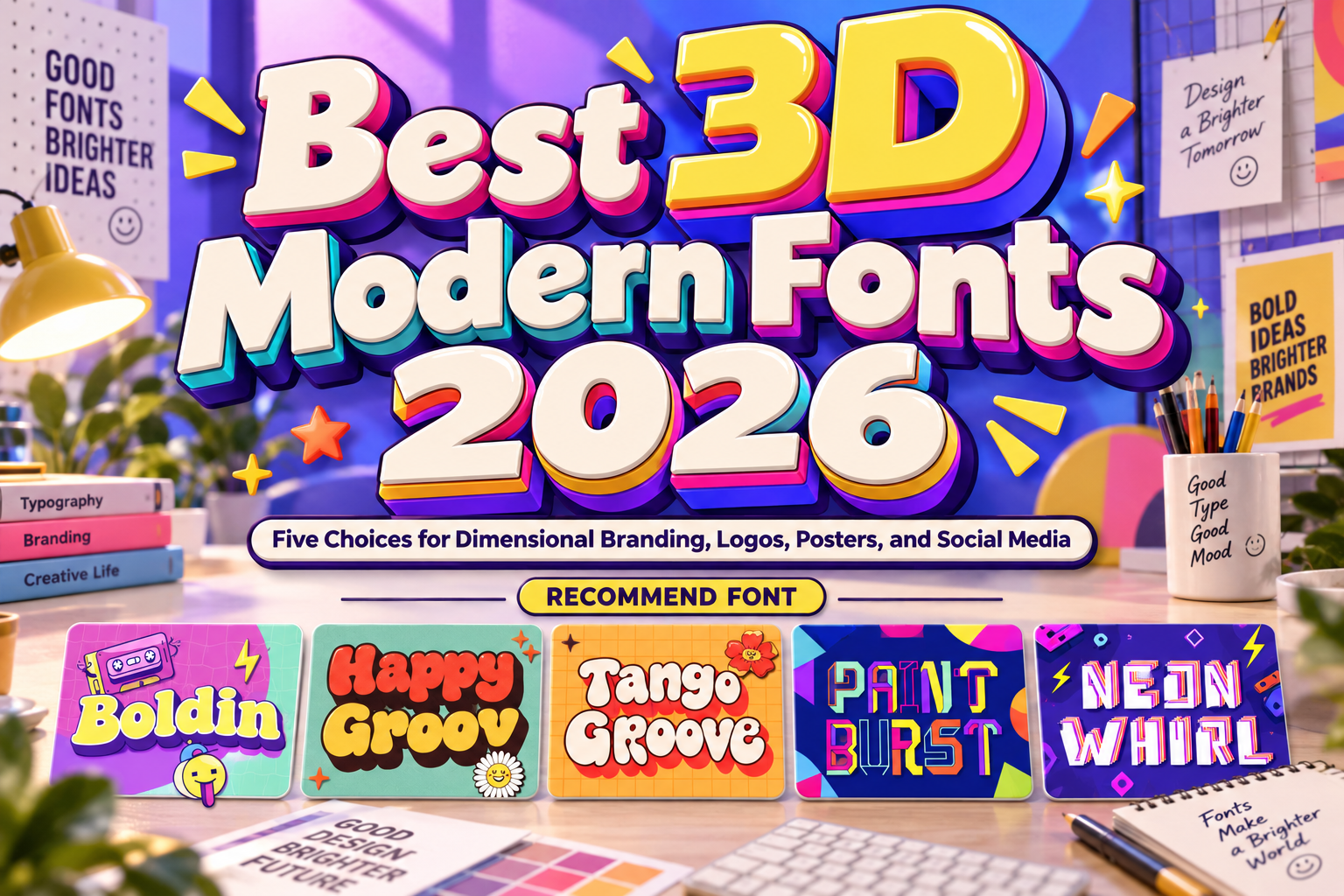
Best 3D Modern Fonts 2026: Give Your Brand Another Dimension
Choose the Effect Before the Font
The best 3D modern fonts for 2026 should make a message distinctive without making it harder to read. Decide whether the project needs rounded depth, nostalgic layering, graphic color separation, or futuristic energy.
This selection focuses on dimensional-looking display lettering. Built-in shadows and stackable styles create depth within graphic artwork; they should not be confused with fully rotatable 3D models.
Use these fonts for logos, campaign titles, packaging names, and app promotional graphics. Keep navigation, subtitles, prices, and longer explanations in a simpler companion typeface.
Test the Whole Word, Not Just the Effect
Set the actual headline and inspect spacing, punctuation, and the open areas inside letters. Compare a poster with a phone-sized preview. Keep the front face clearly distinguishable from shadows and outlines, and simplify the background before adding more decorative effects.
Jump to Recommended Fonts
1. Boldin 3D Font

Boldin combines chunky, rounded letters with thick strokes, smooth curves, and a built-in shadow effect. Its cartoon-inspired construction offers an immediate dimensional look without requiring you to build the shadow shape from scratch. For a playful product launch, try a short title against a plain background and let the substantial letterforms carry the composition.
PROS: Built-in depth, rounded character, substantial strokes.
BEST FOR: Product launches, children’s brands, posters, and social graphics.
2. Happy Groov Layered Retro Font
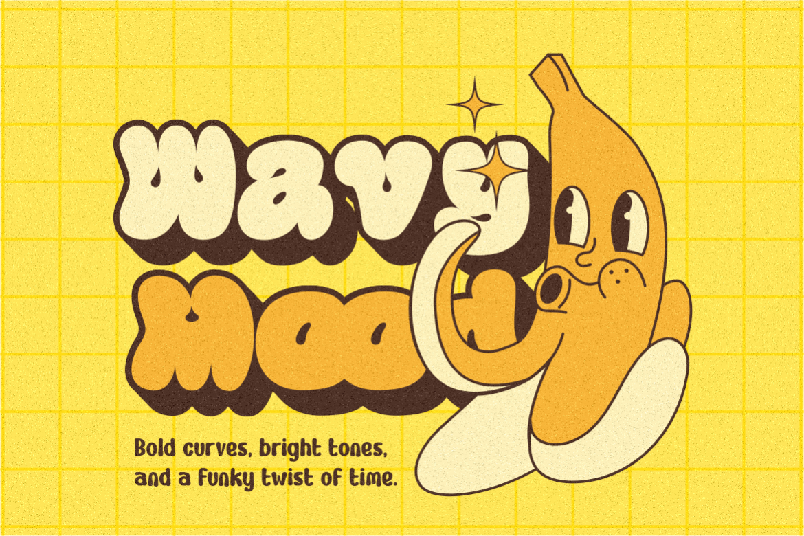
Happy Groov uses inflated curves, generous counters, and a heavy outline influenced by sixties and seventies graphics. Its three-style family provides a layered approach to nostalgic display lettering. Try it for an ice-cream campaign with cream, coral, and a darker supporting layer, keeping flavor descriptions straightforward so the dimensional title remains the focal point.
PROS: Three styles, generous counters, expressive retro outlines.
BEST FOR: Lifestyle packaging, music graphics, merchandise, and cheerful campaigns.
3. Tango Groove Layered Retro Bubble Font
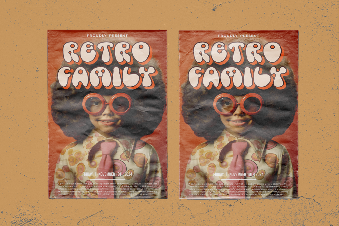
Tango Groove offers three stackable layer styles built around rounded bubble forms and shadowed depth. Its thick contours make the lettering feel sculptural while retaining a distinctly playful direction. For a creative workshop poster, align the styles carefully and assign each layer a clear color role rather than adding unrelated shadow treatments around the word.
PROS: Stackable styles, rounded volume, flexible layered treatments.
BEST FOR: Event identities, toy packaging, party graphics, and retro posters.
4. Paint Burst Unique Colorful Font
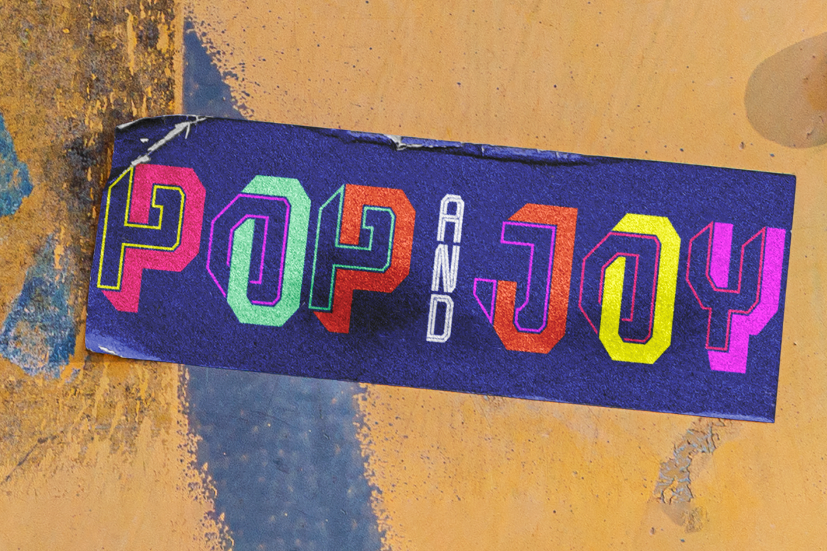
Paint Burst combines geometric forms, modular strokes, and filled, outlined, and sliced segments across five styles. Its strength is graphic layering rather than realistic rounded volume, offering a more abstract direction for dimensional compositions. Try it for a design-festival headline, selecting a focused palette and leaving surrounding space clear enough to reveal the internal structure.
PROS: Five styles, modular details, inventive color-layer combinations.
BEST FOR: Creative festivals, fashion campaigns, editorial covers, and product graphics.
5. Neon Whirl Colorful Font

Neon Whirl uses blocky shapes, bold angles, and stacked neon-style lines to combine retro-game references with futuristic character. Its dimensional impression comes from graphic layering rather than physically glowing tubes. For a technology launch, test the title against a restrained background and keep supporting text free of additional glow or layered effects.
PROS: Stacked linework, geometric rhythm, distinctive futuristic personality.
BEST FOR: Gaming brands, technology promotions, video titles, and digital events.
6. Comparison
Use these suggested applications to shortlist fonts by creative purpose.
| Font | Suggested Creative Direction | First Project to Test |
|---|---|---|
| Boldin | Rounded, cartoon-like depth | Product-launch headline |
| Happy Groov | Outlined retro warmth | Ice-cream packaging |
| Tango Groove | Layered bubble volume | Workshop poster |
| Paint Burst | Abstract graphic color | Design-festival campaign |
| Neon Whirl | Futuristic line layering | Technology-launch title |
Common Mistakes
The first mistake is stacking effects without checking the underlying word. Extra extrusion, outlines, and glows can compete with details already present in the font. Establish a recognizable silhouette, then add only what strengthens the chosen treatment.
Another mistake is approving only an enlarged mockup. Review phone previews, printed samples, and motion exports. Keep an editable master, check how supplied styles behave in your software, and do not assume that every colorful specimen appears automatically when typing.
The final mistake is overlooking usage permissions. PutraCetol distinguishes static artwork from embedded font use. Confirm coverage for your actual combination of packaging, advertising, websites, apps, and customer-editable products before release.
Conclusion
The best 3D modern fonts 2026 offer different paths to dimensional typography, from playful shadows to experimental layering.
Explore these five PutraCetol Studio options with your real headline, then build consistent color, spacing, and supporting typography around the strongest choice. Premium lettering comes from controlled art direction, not simply adding more depth.
Explore these fonts and many more at PutraCetol.com to build a business identity that looks professional, trustworthy, and memorable.
Additionally, if you want to explore some free typography options, you can check out Putracetol Studio on Dafont. Happy reading and designing!