
In today’s world of tattoo culture, words have become one of the most powerful forms of self-expression. A word-based tattoos goes beyond decoration, it becomes a statement, a story, or a personal reminder. Whether it’s a single word like Hope or a short quote like Stay Strong, each design holds deep emotional significance.
But what transforms these words into lasting works of art isn’t only their meaning, it’s the typographic design. The right font can amplify emotion, reflect personality, and influence how the message feels to both the wearer and the viewer. That’s why choosing the right typeface is a crucial part of the tattoo design process.
Typography in tattoo design is not just visual, it’s emotional. Every curve, serif, and line weight carries a certain tone. Fonts evoke feelings, and when they’re inked on skin, those feelings become permanent.
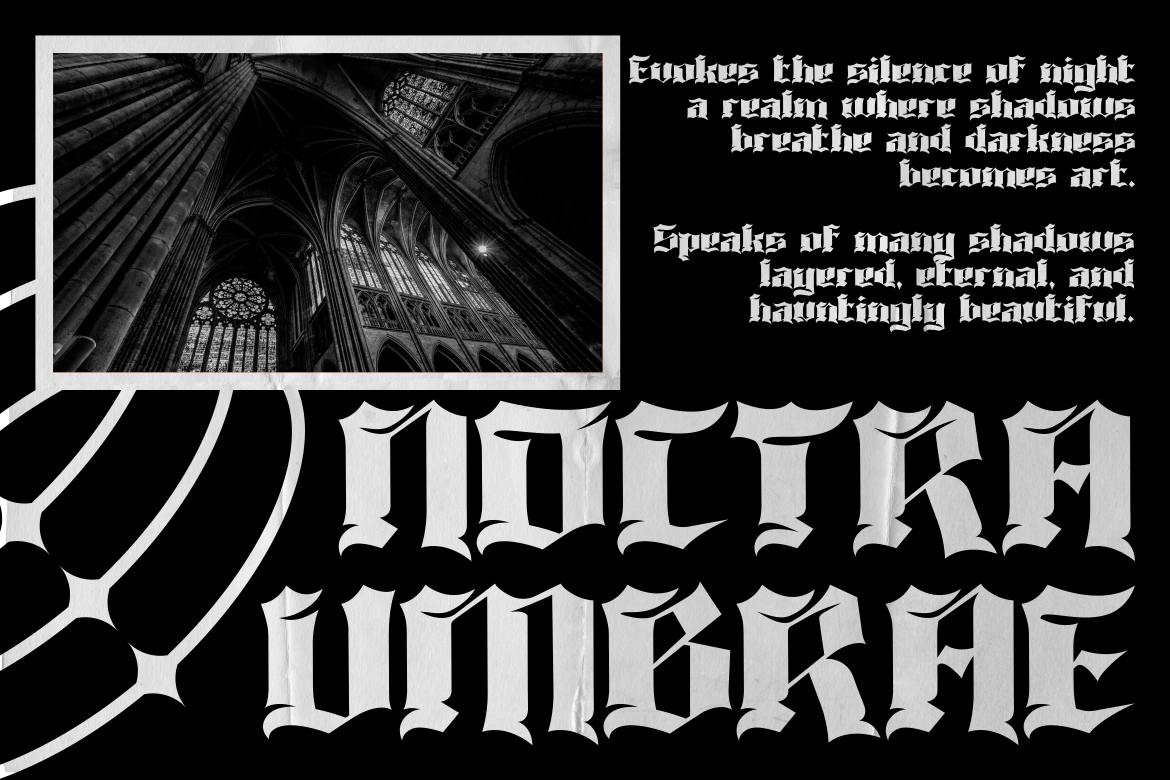
Designers and tattoo artists often use gothic, serif, or sans-serif styles to shape impressions. Gothic fonts channel mystery and heritage, serif fonts suggest tradition and balance, while sans-serif designs look clean and modern.
If you want a custom touch, additional design elements, such as small hearts, geometric lines, or retro shading, can personalize the typography further, turning it into a one-of-a-kind statement.
Selecting what to say is just as important as how it looks. Many people choose motivational or sentimental words that serve as reminders or tributes.
Common single-word tattoos include:
Meanwhile, popular short quotes often include:
These phrases resonate because they’re universal yet personal, capable of capturing a lifetime of emotion in just a few letters.
For those looking for unique, professional fonts suited for tattoo design, Putracetol Studio offers a rich library that perfectly balances style and readability. Here are a few great examples:

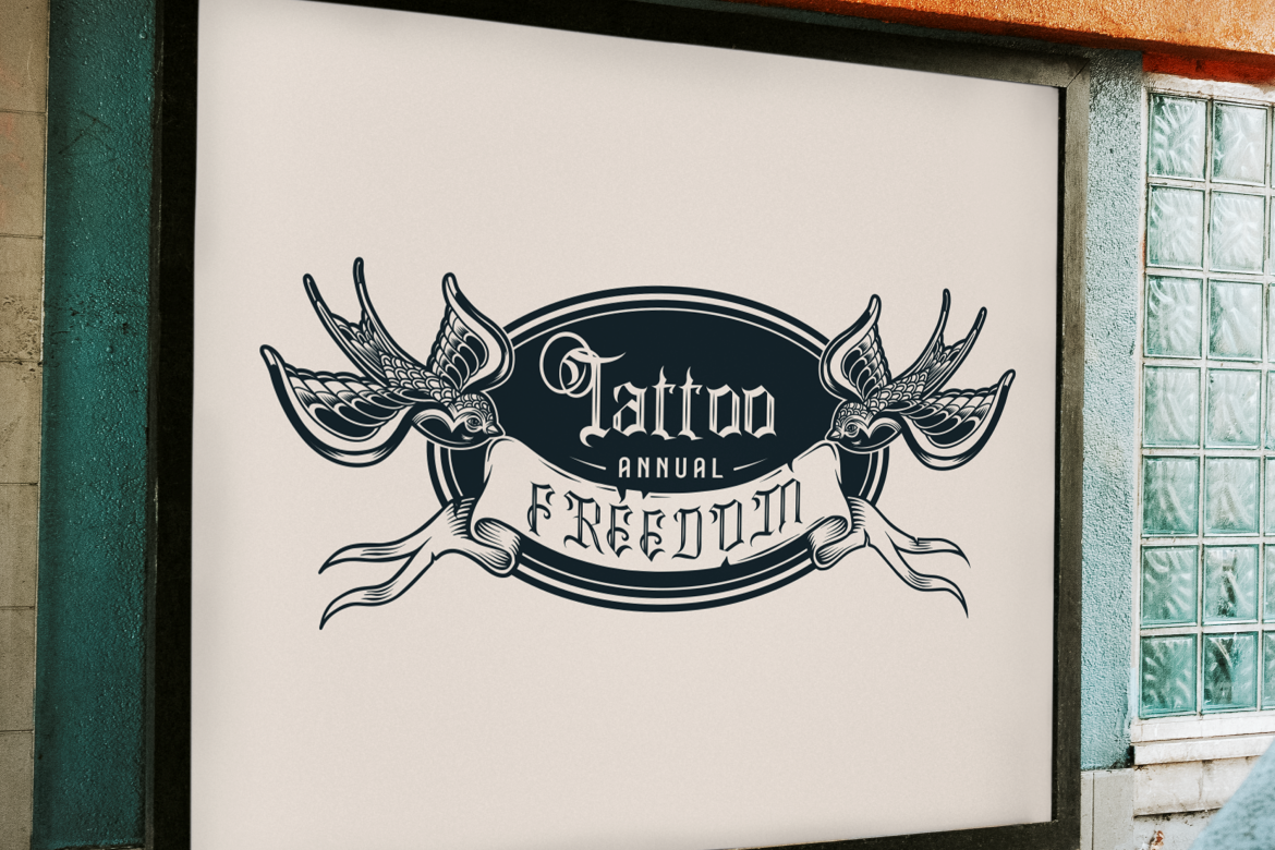
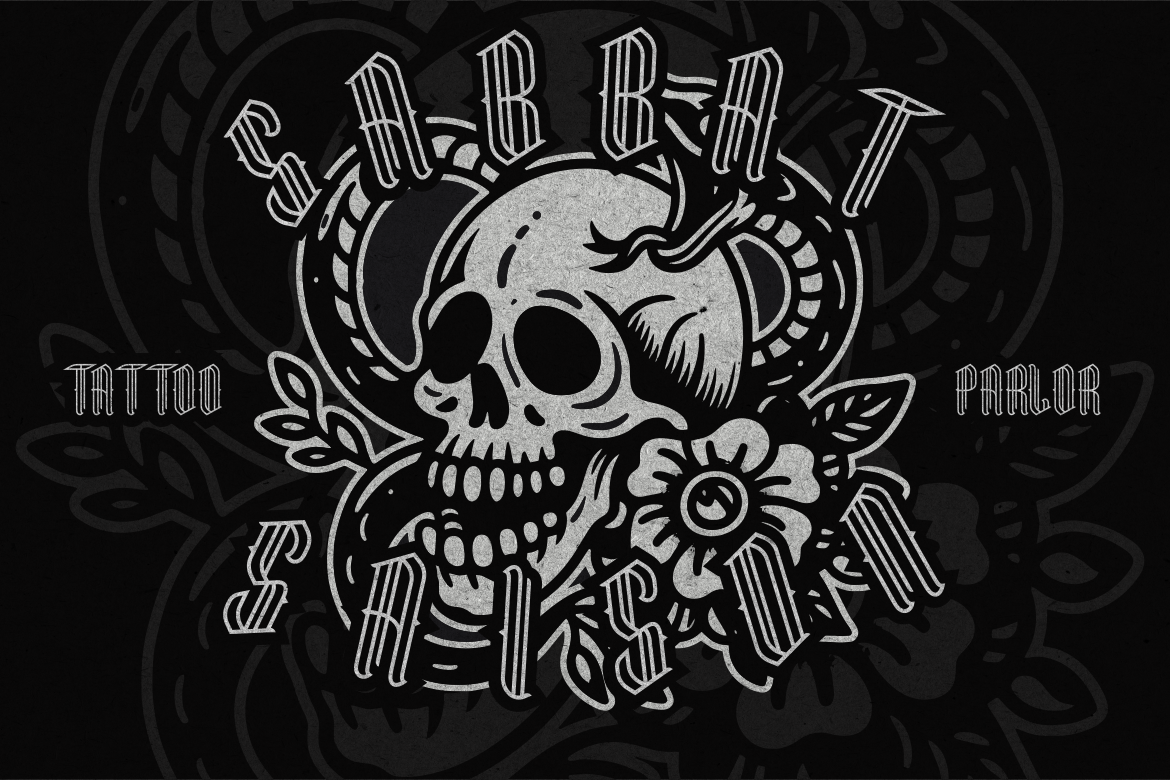
Each of these typefaces enhances the artistic character of word tattoos, making them both readable and visually striking.
Placement determines how your tattoo interacts with your body’s natural lines. Small, minimal tattoos can appear delicate yet personal, while larger scripts make bold declarations.
Popular placements for word tattoos include:
Each location offers different levels of visibility and intimacy, letting the wearer choose how publicly or privately they want to express their story.
Word tattoos may look simple, but technical precision matters. Fine lines and small details can blur over time if not planned carefully. Here are a few essential tips:
By combining technical precision with the right font, your tattoo will remain crisp, legible, and beautiful for years to come.
Modern tattoo design encourages personalization. Many artists modify or blend existing fonts to better reflect a client’s vision. For example:
For truly unique results, working with custom-designed fonts, such as those from Putracetol Studio can transform a simple word into an intricate piece of art.
The journey doesn’t end once the ink dries. Proper aftercare ensures your word tattoo remains clear and vibrant.
Consistent care ensures your tattoo looks as meaningful and beautiful as the day it was created.
Word tattoos capture the power of language in its purest form. They remind us that even a single word can carry profound meaning Faith, Courage, Love, Strength. Through careful choice of font, placement, and design, each tattoo becomes a visual reflection of personal experience and identity.
From typewriter nostalgia to bold blackletter drama, the world of tattoo fonts offers infinite possibilities for self-expression. And with resources like Putracetol Studio, finding the perfect typeface becomes part of the creative journey itself.
In the end, a word tattoo is not just ink, it’s a philosophy, a story, and a promise written permanently on the canvas of skin.
Thank you for taking the time to read this article. If you are looking for more great articles, feel free to visit Putracetol Blog
Additionally, if you want to explore some free typography options, you can check out Putracetol Studio on Dafont. Happy reading and designing!
