
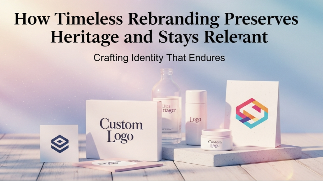
Rebranding is often misunderstood as a complete reinvention. In reality, the most successful rebranding projects are not about abandoning the past, but about refining it. For brands with a long history and strong cultural roots, the challenge lies in evolving without losing identity. This is where a timeless rebranding strategy becomes essential.
This article explores a rebranding project developed by Putracetol.com that focuses on honoring heritage while introducing modern elements. The goal is to preserve the brand’s historical value, cultural depth, and premium character, while ensuring relevance for contemporary audiences. The result is a visual identity that feels elegant, professional, and enduring.
Why Timeless Rebranding Matters
Brands with history carry emotional value. Customers often associate them with trust, quality, and authenticity. A careless redesign can risk breaking that connection. Timeless rebranding respects what already exists and builds upon it thoughtfully.
Timeless rebranding matters because it:
- Preserves brand equity built over generations
- Maintains trust and familiarity
- Avoids short-lived design trends
- Ensures long-term relevance
- Strengthens premium positioning
Rather than chasing novelty, timeless branding focuses on longevity and meaning.
Rebranding Concept from Putracetol.com
The rebranding concept begins with deep respect for the brand’s origins. Instead of erasing history, the new identity carefully highlights it through refined visual language.
Inspired by History
Historical roots serve as the foundation of the new identity. Cultural references, legacy values, and traditional aesthetics are preserved and subtly reinterpreted.
This approach ensures that:
- Long-time audiences still recognize the brand
- Heritage remains visible and respected
- The story behind the product continues
History becomes an asset rather than a limitation.
Timeless Design Philosophy
A timeless design avoids visual trends that fade quickly. Instead, it relies on proportion, balance, and clarity. The branding uses classic structures that remain visually relevant across decades.
Timeless design principles include:
- Clean composition
- Balanced typography
- Restrained decoration
- Thoughtful spacing
This philosophy ensures the brand will not feel outdated as trends change.
Modern Touch for Contemporary Relevance
While honoring the past, the rebranding introduces subtle modern details. These updates ensure the identity feels current without appearing radical.
Modern touches may include:
- Cleaner typography systems
- Simplified logo structures
- Updated color harmony
- Improved digital adaptability
These elements help the brand connect with new audiences while respecting existing ones.
Elegant and Professional Impression
Elegance is central to the new identity. The branding communicates premium quality, exclusivity, and confidence through refined visual choices.
An elegant identity:
- Enhances perceived value
- Builds credibility
- Positions the brand as authoritative
- Supports premium pricing
Professionalism ensures the brand feels trustworthy and well-established.
Key Design Elements
Refined Typography
Typography is one of the most powerful tools in timeless rebranding. Elegant serif fonts are often chosen to bridge tradition and modernity. Their structure conveys heritage, while refined details add sophistication.
Refined typography:
- Communicates history and credibility
- Enhances readability
- Feels formal yet welcoming
- Works across print and digital platforms
Typography becomes the voice of the brand.
Classic Color Palette
Color choices are restrained and intentional. Neutral and warm tones dominate the palette, creating a sense of calm sophistication.
Classic colors:
- Reinforce heritage
- Feel timeless and elegant
- Support premium positioning
- Avoid visual fatigue
These tones ensure consistency across all brand applications.
Simple Yet Iconic Logo
The logo is designed to be memorable without being overly complex. Simplicity ensures longevity, while subtle details reflect cultural richness.
An iconic logo:
- Strengthens brand recognition
- Adapts easily across formats
- Respects historical identity
- Feels confident and enduring
The logo acts as a visual anchor for the entire brand.
Supporting Graphics
Supporting graphic elements add depth and exclusivity. These visuals may include patterns, lines, or motifs inspired by heritage, applied with modern restraint.
Supporting graphics:
- Reinforce cultural storytelling
- Add visual interest
- Maintain consistency
- Enhance premium perception
They complement the main identity without overpowering it.
Font Examples Supporting Timeless Rebranding
Typography choices are crucial in balancing tradition and modernity. The following fonts from Putracetol.com align well with a timeless rebranding strategy.
Deco Vogue
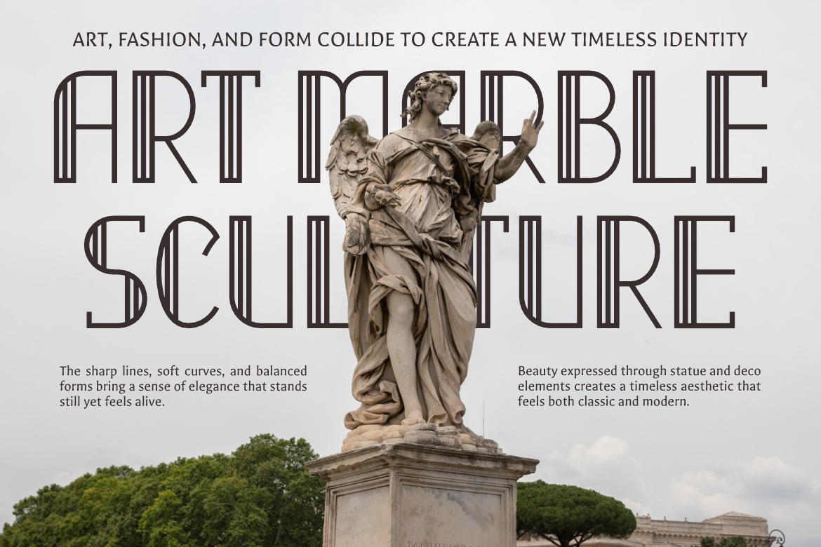
Deco Vogue carries a classic elegance inspired by historical design movements, making it ideal for brands rooted in tradition.
Popdash

A refined font with contemporary clarity. It works well for supporting text and modern applications.
Firanza
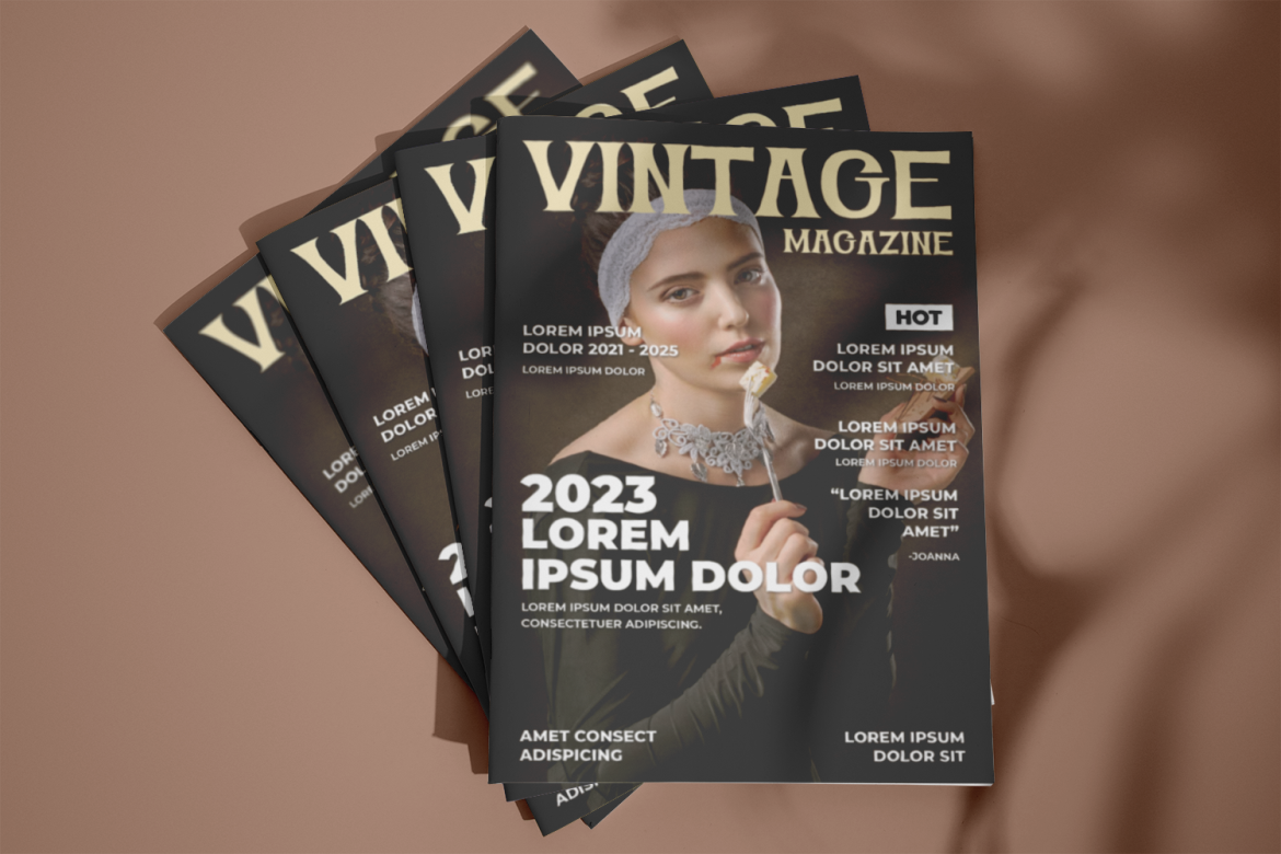
Firanza blends serif elegance with modern proportions, bridging past and present seamlessly.
Luxerna Display

Luxerna Display delivers premium sophistication and is well-suited for logos and key brand statements.
Greatness Culture

This font conveys authority and confidence, reinforcing exclusivity and heritage.
Together, these fonts create a versatile typography system that supports both classic and modern brand expressions.
Balancing Heritage and Innovation
One of the biggest challenges in rebranding is knowing what to change and what to preserve. Timeless rebranding requires careful decision-making.
Successful balance is achieved by:
- Identifying core brand values
- Preserving recognizable elements
- Simplifying rather than reinventing
- Updating functionality without altering meaning
Innovation should enhance heritage, not replace it.
Applications Across Brand Touchpoints
A timeless identity must work consistently across all brand channels, including:
- Packaging and labels
- Print materials
- Signage
- Digital platforms
- Marketing communications
Each application reinforces the same visual language and emotional tone, strengthening brand coherence.
Long-Term Value of Timeless Rebranding
Timeless rebranding is an investment. While trend-based redesigns may offer short-term excitement, timeless identities provide long-term stability.
Long-term benefits include:
- Reduced need for frequent redesigns
- Stronger brand loyalty
- Clear market positioning
- Sustainable visual relevance
The brand becomes resilient rather than reactive.
Conclusion
The timeless rebranding strategy developed by Putracetol.com demonstrates how heritage and modernity can coexist harmoniously. By honoring historical roots, applying refined typography, using classic color palettes, and introducing subtle modern updates, the rebranding creates a visual identity that feels elegant, professional, and enduring.
This approach proves that preserving tradition does not mean resisting change. Instead, it means guiding change with respect, intention, and clarity. The result is a premium brand identity that remains relevant today while honoring the legacy that built it.
Thank you for taking the time to read this article. If you are looking for more great articles, feel free to visit Putracetol Blog
Additionally, if you want to explore some free typography options, you can check out Putracetol Studio on Dafont. Happy reading and designing!