

✨ Experimental Typography: Redefining Visual Expression in Modern Graphic Design
Typography has always played a central role in design—it conveys tone, guides readability, and builds visual identity. But in today’s fast-evolving digital landscape, conventional typography is being pushed aside by a more daring, expressive trend: experimental typography design.
No longer confined to uniform grids or strict legibility, experimental typography dares to disrupt visual expectations. From glitch effects and stretched letterforms to chaotic layering and unconventional alignment, this design movement gives brands and creators a bold new way to stand out.
In this article, we’ll explore what experimental typography is, the techniques behind it, its rising popularity in branding and web design, and how to balance innovation with functionality.
🎨 What Is Experimental Typography?
Experimental typography is a design approach that challenges traditional typographic rules by playing with letterform structure, placement, layering, distortion, and motion. It embraces visual chaos, asymmetry, abstraction, and unpredictability as forms of expression.
Unlike standard typography that prioritizes readability and order, this style:
- Prioritizes emotion and impact
- Uses text as a visual element
- Focuses on form as much as function
It often incorporates techniques such as:
- 3D lettering
- Glitch and distortion effects
- Text masking
- Overlapping colors and shapes
- Asymmetrical layouts
- Variable font experimentation
🧠 Why Experimental Typography Is Gaining Popularity
In a world of template-based branding, standing out visually has become harder. Audiences today are saturated with repetitive styles and polished sameness. Enter experimental typography—a creative rebellion that allows designers to:
- Build distinctive identities
- Evoke emotion beyond words
- Reflect the personality of a brand or idea
- Grab attention instantly
Modern brands like Nike, Off-White, and Adobe have embraced this trend in promotional campaigns to create dynamic, scroll-stopping visuals—especially for Gen Z and digital-native audiences.
🔍 Where It’s Being Used
Experimental typography is showing up in:
- Branding & Logo Design
For brands that want to feel edgy, modern, or artistic. - Album Covers & Posters
Especially in music and fashion, where expression takes priority. - Editorial & Magazine Layouts
To break away from traditional column-based grids. - Web Design
To make headlines, intros, and animations more engaging. - Social Media
To elevate carousel posts, digital flyers, and campaigns.
🖼️ Techniques and Examples of Experimental Typography
1. Layered Typography
Combining multiple font styles and colors to create depth or conflict within the text.
🛠 Try using:
Garis Lengkung – Colorful Font – Adds a vibrant, layered aesthetic suitable for splash screens or posters.

2. Distortion & Glitch
Warping letters using analog-style distortion or digital interference gives a feeling of tension, rebellion, or disruption.
🛠 Try using:
Wasted Punk – Delivers edgy, anarchic energy perfect for underground brands or experimental zines.

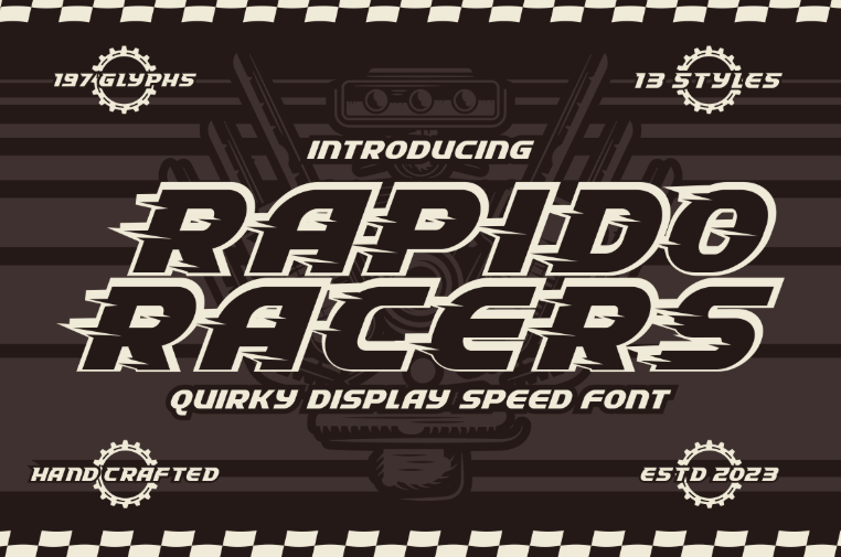
3. Motion Typography
Animating letters to move, react, or morph. Common in digital banners, websites, or video openers.
🛠 While the animation happens in After Effects or Webflow, you can pair it with:
Rapido Racers – Feels kinetic and alive, making it ideal for animated intros.
4. Organic, Hand-Altered Text
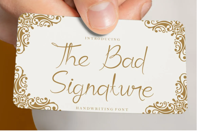
Sculpted, warped, or brush-written letters that feel more expressive and human.
🛠 Try using:
The Bad Signature – Ideal for integrating organic strokes in brand campaigns or personal portfolios.
5. 3D Typography & Depth Illusions
Using shadows, perspective, or extrusion to give text a dimensional, sculptural quality.
🛠 Try using:
Funky Form – Isometric Font – Playfully distorts perception and fits architectural or abstract compositions.

⚖️ Balancing Creativity and Readability
This is where many designers go wrong. When typography becomes too experimental, it risks becoming unreadable or confusing.
Tips to maintain effectiveness:
- Use experimental type for short text, like titles or keywords—not body copy.
- Ensure context helps interpret meaning.
- Pair with simple backgrounds to maintain focus.
- Avoid using all-caps when working with distorted or brush fonts.
- Always consider audience expectations—a fashion ad may allow more liberty than a government website.
Think of experimental typography as a visual spice—used strategically, it transforms a dish. Overdo it, and you lose clarity.
💡 The Psychology Behind Typographic Expression
Typography communicates mood. Rounded, soft fonts feel friendly. Jagged, broken fonts can feel chaotic or rebellious. Experimental typography heightens these emotional cues by:
- Breaking norms (capturing attention)
- Embodying themes (e.g., chaos, nostalgia, tech)
- Creating rhythm through layout and spacing
This style invites viewers to spend time decoding the message—making interaction part of the design.
🔮 The Future of Experimental Typography
With advancements in variable fonts, browser rendering engines, and CSS/JS libraries, the line between static and dynamic typography continues to blur. Expect more:
- Interactive type that responds to mouse or scroll
- Custom typefaces built for brands only
- AI-generated font forms
- Hybrid typography that mixes illustration, motion, and code
For designers, the challenge and opportunity lies in mastering both traditional type principles and experimental freedoms.
✅ Conclusion: Dare to Break the Grid
In an era where attention spans are shrinking and content is everywhere, experimental typography offers something rare—surprise and emotion. It challenges norms, pushes boundaries, and becomes a voice in itself.
But as with any design choice, intention matters. The best experimental typography doesn’t just look different—it communicates better.
Whether you’re creating a rebellious brand identity, an avant-garde portfolio, or a futuristic website, don’t be afraid to experiment. Just don’t forget to let your audience in on the message, too.