
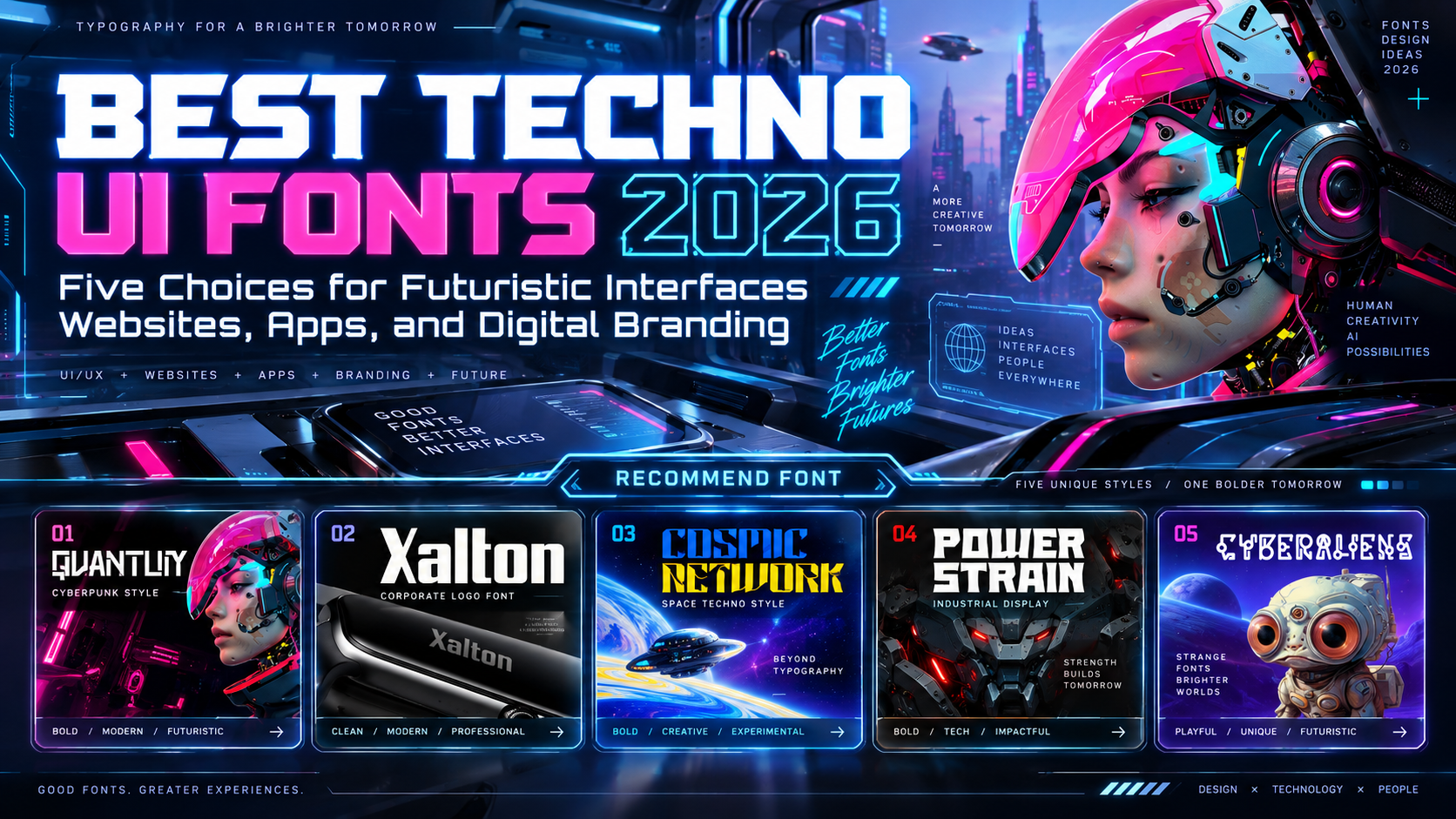
Best Techno UI Fonts 2026: Futuristic Character Without Confusing Users
Separate Brand Expression From Interface Reading
Choosing the best techno UI fonts for 2026 starts with deciding what the typography must do. A product wordmark should establish identity; a payment button should make its action unmistakable.
Treat these five fonts as display and logo candidates for branded interface moments, not a tested ranking of everyday reading fonts. Use them for prominent headings and selected accents, then choose a dependable companion for navigation, forms, descriptions, and data.
What to Test Before Choosing
Set real labels, prices, error messages, and translated headings. Compare I, l, and 1, then O and 0. Check spacing at actual screen sizes, not only in an enlarged prototype.
For digital text, WCAG 2.2 AA generally requires 4.5:1 contrast for ordinary text and 3:1 for qualifying large text, with defined exceptions. Decorative cuts still need practical readability testing.
Jump to Recommended Fonts
1. Quantum Sector Cyberpunk Techno Font
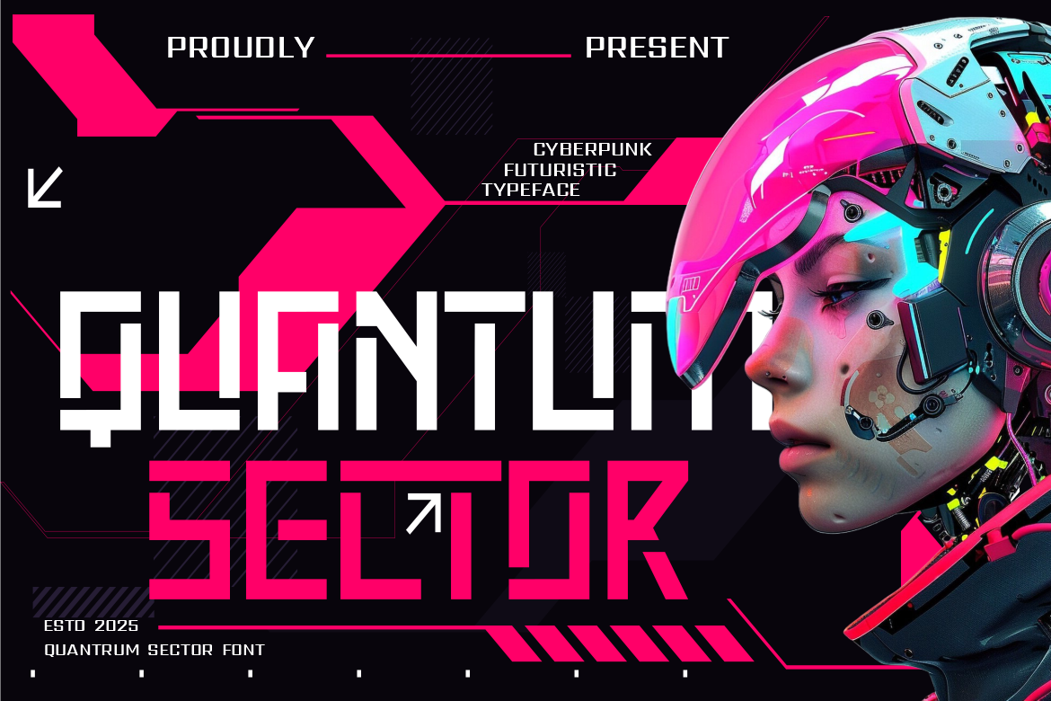
Quantum Sector combines bold angular strokes, pixel-inspired edges, and square-based modular shapes. Its circuitry-like character offers a distinctive direction for technology brands and gaming experiences. Try it for a gaming platform’s main heading, with uncluttered navigation underneath, allowing the title to establish atmosphere without making every interaction feel like a coded message.
PROS: Modular geometry, bold silhouette, recognizable cyberpunk character.
BEST FOR: Gaming websites, esports portals, technology launches, and branded headings.
2. Power Strain Futuristic Industrial Font
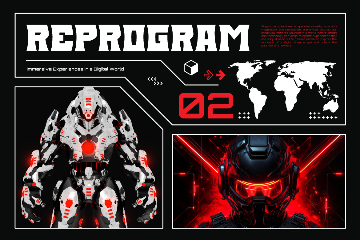
Power Strain uses heavy angular strokes, tall flared shapes, and geometric cuts with an industrial character. Its broad construction makes it a candidate for powerful product introductions rather than delicate interface details. For an industrial-software landing page, place one short headline above straightforward feature descriptions and clearly labeled demonstration controls.
PROS: Substantial weight, engineered shapes, forceful display personality.
BEST FOR: Industrial technology, performance products, launch pages, and promotional headers.
3. Cosmic Network Techno Font
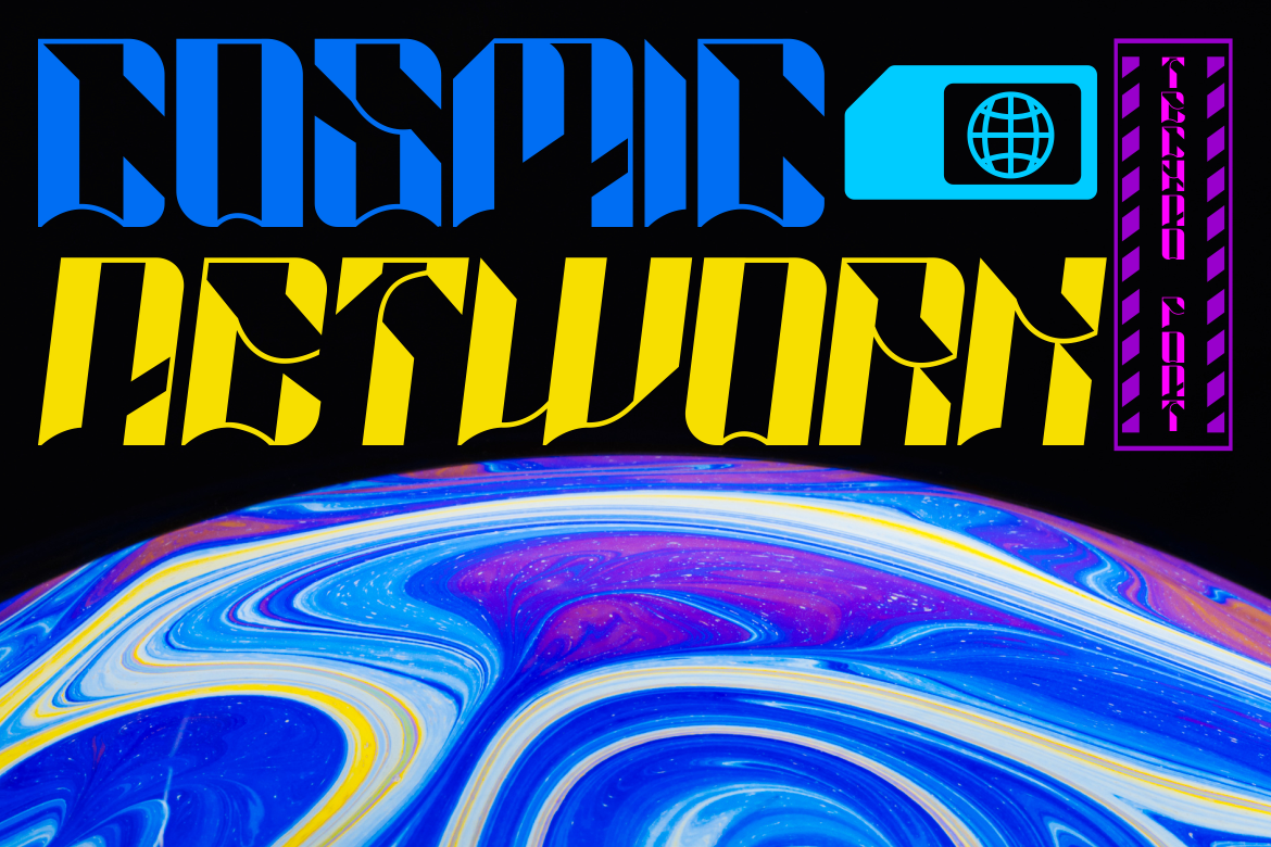
Cosmic Network combines sharp geometric lines, compact spacing, and angular cuts, with Regular and Slant styles. These related treatments provide options for varying campaign energy without changing the underlying visual language. Test the regular style on prominent section headings and reserve the slanted version for short promotional accents, keeping detailed dashboard information in your reading family.
PROS: Two coordinated styles, compact rhythm, structured techno character.
BEST FOR: Digital-product branding, gaming portals, launch campaigns, and section titles.
4. Xalton Corporate Logo Font

Xalton pairs thick, upright strokes and clean geometric edges with rounded inner counters. Its restrained technological influence makes it the corporate-oriented option in this selection, rather than an overt science-fiction treatment. For a business-software brand, test it as the wordmark and homepage headline while preserving ordinary letterforms for account settings, pricing, and support.
PROS: Stable proportions, rounded counters, confident corporate structure.
BEST FOR: Software companies, business platforms, startup identities, and website mastheads.
5. Cyber Aliens Futuristic Sci-Fi Font
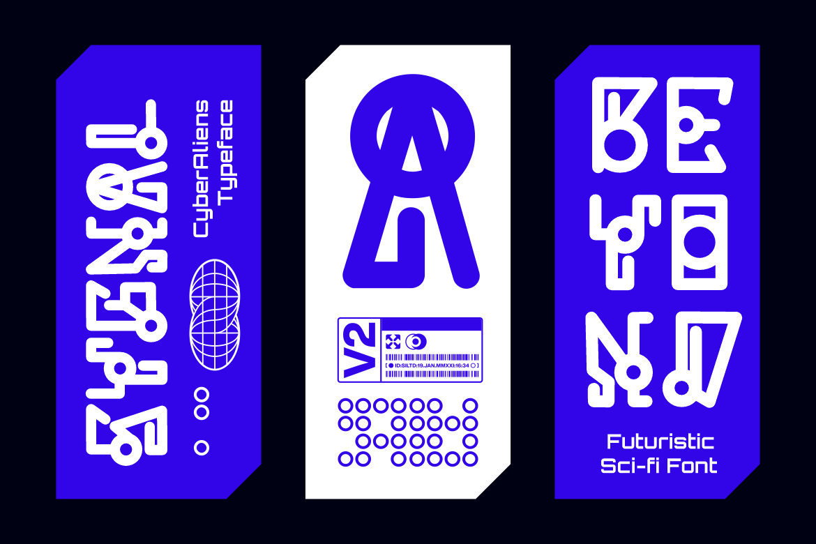
Cyber Aliens uses experimental loops, geometric shapes, and rounded circuitry details that suggest fictional communication systems. Its unusual construction offers strong atmosphere but calls for selective placement when clarity is essential. Try it on a science-fiction community’s welcome banner or short brand name, not on search fields, instructions, or security prompts.
PROS: Experimental loops, distinctive glyphs, imaginative display character.
BEST FOR: Sci-fi communities, immersive campaign pages, game branding, and promotional titles.
Comparison
Use these suggested roles to guide prototyping, not as accessibility ratings.
| Font | Suggested Direction | First Interface Element to Test |
|---|---|---|
| Quantum Sector | Cyberpunk gaming | Main page heading |
| Power Strain | Industrial strength | Product-launch headline |
| Cosmic Network | Structured techno | Section title |
| Xalton | Corporate technology | Wordmark and masthead |
| Cyber Aliens | Experimental science fiction | Short welcome banner |
Common Mistakes
The first mistake is applying the display font everywhere. Keep forms, notifications, and dense tables straightforward. Test task completion with representative users rather than asking only which interface looks more futuristic. A visual preference does not demonstrate easier navigation.
Another mistake is approving a static prototype without testing adaptation. Check light and dark themes, font fallbacks, and longer translations. Support text resizing to 200% without losing content or functionality, as required by WCAG’s Resize Text criterion, subject to its exceptions.
The final mistake is ignoring deployment. Load only the font styles you need, inspect the page before and after fonts arrive, and document typography roles. Confirm permissions for website or app embedding and team use before shipping; do not assume a mockup license covers the finished product.
Conclusion
The best techno UI fonts 2026 should give digital products character without turning essential interactions into visual puzzles.
Explore these five PutraCetol Studio options using your real brand name and interface content. Keep expressive typography focused, test functional reading carefully, and let consistent design decisions connect futuristic aesthetics with a usable experience.
Explore these fonts and many more at PutraCetol.com to build a business identity that looks professional, trustworthy, and memorable.
Additionally, if you want to explore some free typography options, you can check out Putracetol Studio on Dafont. Happy reading and designing!