
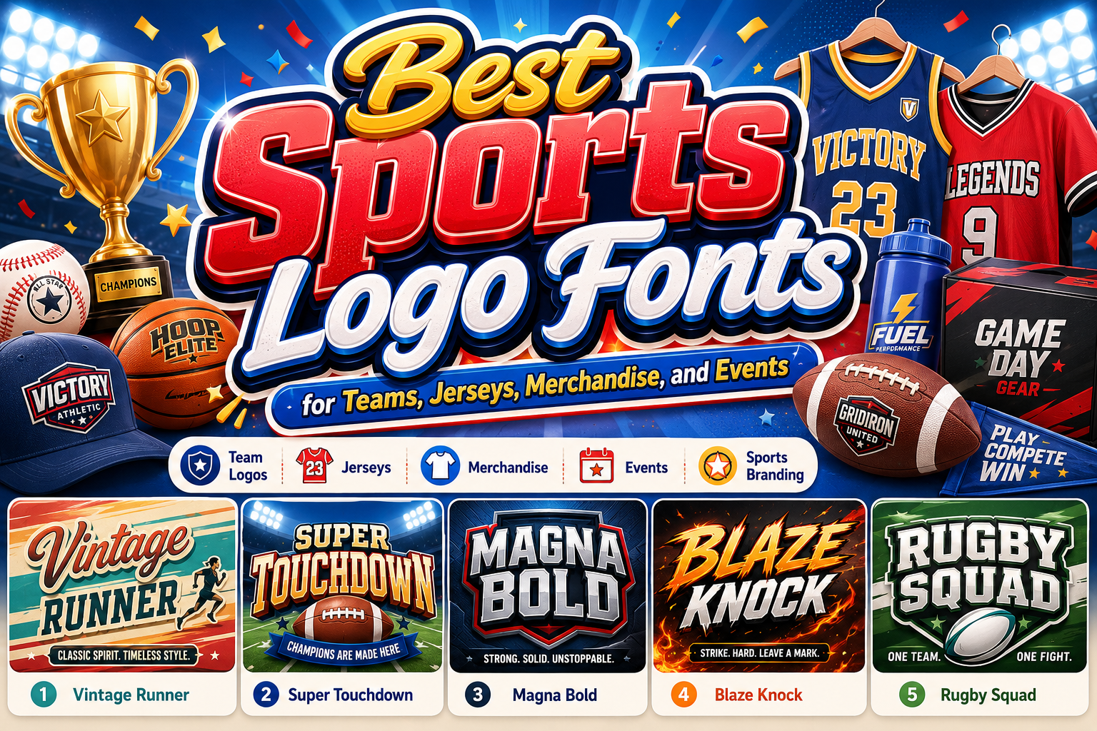
The best sports logo fonts are not simply the thickest or most aggressive typefaces available. They should express the character of the team, club, competition, or athletic brand before viewers read the full name.
A football team may need a solid block font that communicates physical strength. A racing brand might prefer wide letters, forward movement, and retro mechanical details. A fitness company could use sharp geometric forms to express discipline, while a youth sports club may benefit from energetic lettering that feels confident without becoming intimidating.
Begin by defining three qualities the identity should communicate. These might include powerful, fast, disciplined, fearless, traditional, technical, united, or energetic. The selected font should reinforce those qualities through its weight, width, angles, spacing, terminals, and overall silhouette.
The typeface must also work beyond the initial logo presentation. Test it on jerseys, caps, social media profiles, event posters, merchandise, score graphics, websites, sponsor boards, and small mobile screens. A sports wordmark that only looks impressive on a large mockup is not yet a complete identity.
What Makes a Sports Logo Font Effective?
A Strong and Recognizable Silhouette
Sports identities are often viewed from a distance or during moments of movement. The overall shape of the wordmark should therefore remain distinctive even before every letter is read individually.
Wide block letters can create stability. Condensed forms can make a name feel taller and more intense. Slanted characters imply speed, while square serifs can suggest strength and tradition. Rounded corners soften the personality, making the identity feel more accessible.
A recognizable silhouette becomes especially valuable when the logo appears on uniforms, equipment, stadium graphics, or small digital avatars.
Clear Letter Construction
A sports typeface needs personality, but important letters should not become ambiguous. Check whether characters such as C, G, O, S, I, and L remain easy to distinguish.
This becomes even more important when the team name is short. If one letter is misunderstood, the entire identity may become unclear. Decorative cuts, outlines, shadows, and speed lines should enhance recognition rather than interrupt it.
Controlled Energy and Motion
Sports typography often creates movement through angled terminals, diagonal cuts, forward slants, extended strokes, or horizontal details. These treatments can make a static logo feel active.
However, motion should be connected to the brand. A running club may benefit from forward-leaning letters, while a rugby team could use a heavier and more grounded structure. A racing identity might feel fast and mechanical, while a heritage football club may need stability and tradition.
The objective is not to make every logo look fast. It is to make the movement reflect the sport and its culture.
Flexibility Across Multiple Applications
A complete sports identity usually needs more than one logo. The primary wordmark may appear on posters and websites, while a monogram, mascot mark, or simplified badge appears on caps and social profiles.
The font should support several versions without losing its personality:
- Full team name
- Shortened club name
- Initials or monogram
- City or location name
- Founding year
- Player numbers
- Slogans and campaign headlines
A typeface with usable numbers and punctuation can also support jerseys, fixtures, scoreboards, statistics, and season graphics.
Match the Typeface to the Sport
Football and American Football
Block fonts, slab serifs, outlines, and strong geometric forms suit football identities because they communicate structure and physical competition. Layered styles can also support home, away, and special-edition merchandise.
The letters should remain clear when embroidered, printed on a jersey, or placed over action photography.
Rugby and Contact Sports
Rugby branding often benefits from compact forms, sharp angles, substantial outlines, and a powerful stance. The typography can feel more rugged than a general corporate typeface, but it should still remain controlled and professional.
Shield-shaped badges, team initials, and heavy wordmarks work particularly well in this category.
Racing and Motorsport
Racing fonts can use expanded proportions, slanted construction, rounded mechanical forms, or retro automotive details. The typography should suggest speed without relying entirely on motion blur or excessive visual effects.
A racing identity may also include numbers, stripes, badges, and sponsor information, so the wordmark must coexist with a more complex visual environment.
Fitness and Training Brands
Gym and fitness identities usually need strong typography that communicates effort, endurance, and progress. Geometric sans serifs, slab serifs, and angular display fonts are useful for workout programs, supplement packaging, apparel, and motivational campaigns.
A fitness brand should still consider its audience. A competitive bodybuilding gym and a community wellness studio should not necessarily use the same aggressive visual language.
Esports and Digital Competition
Esports branding often combines athletic energy with technological details. Sharp cuts, controlled geometry, extended forms, and futuristic accents can create a suitable digital personality.
The logo should remain readable in streaming overlays, team profiles, merchandise, and tournament graphics. Overly complicated letter construction may disappear at the small sizes common in online competition platforms.
Build a Complete Sports Logo System
Start With the Wordmark
Type the actual team or brand name rather than evaluating a font from its promotional alphabet. Review the relationship between wide and narrow letters, repeated characters, spacing, and overall balance.
Short names may support wide dramatic lettering. Longer names may require a condensed typeface or a stacked composition. Adjust kerning manually in the final wordmark rather than relying entirely on default spacing.
Develop a Monogram or Abbreviation
A compact monogram can become one of the most useful parts of the identity. It can appear on caps, equipment, social avatars, jersey patches, and small promotional items.
Use one or two initials and preserve the same angles, outlines, or structural details found in the full wordmark. The monogram should feel like part of the same family rather than an unrelated secondary logo.
Pair the Wordmark With a Badge or Symbol
A wordmark can be combined with a shield, circle, animal mascot, ball, helmet, wheel, wing, flame, or abstract symbol. The icon should support the sport and team story without duplicating every idea already expressed by the typography.
A rugby identity might place the initials inside a shield. A running club could use a directional stripe. A motorsport brand may add a mechanical badge or race number.
Keep the symbol simple enough to survive embroidery, one-color printing, and small-scale production.
Create a Focused Color System
Sports branding often uses high-contrast colors to increase visibility and emotional intensity. Black and red may feel forceful, while navy and gold can suggest prestige. Bright green and dark charcoal may suit a modern esports identity, while cream and burgundy can support a heritage athletic brand.
Use one dominant team color, one supporting color, and a restrained accent. Prepare one-color, reversed, and grayscale versions so the logo remains usable when full-color reproduction is unavailable.
For digital campaign text, buttons, schedules, and supporting information, maintain sufficient contrast against the background. WCAG 2.2 guidance sets a minimum contrast ratio of 4.5:1 for normal text and 3:1 for qualifying large text, helping functional content remain readable for more users.
Test Uniforms and Merchandise Early
A sports logo may be printed, embroidered, heat-transferred, engraved, or woven. Each production method handles detail differently.
Thin internal lines can disappear during embroidery. Tight counters may close when printed at a small size. Complex outlines can become muddy on textured fabric, while extended decorative strokes may not fit narrow jersey panels.
Create physical or realistic production tests before approving the final identity. Check the design on light and dark garments, curved caps, water bottles, equipment, banners, and promotional products.
Use a Supporting Font for Practical Information
The logo font does not need to handle every piece of content. Pair it with a simpler typeface for schedules, player names, statistics, website navigation, sponsor information, and long descriptions.
The display font provides character, while the supporting typeface maintains clarity. This division allows the identity to remain energetic without making every communication element visually exhausting.
Jump to Recommended Fonts
Vintage Runner Display Retro Sport Font | Super Touchdown Superbowl Sport Font | Magna Bold Sport Bold Font | Blaze Knock Sport Font | Rugby Squad Rugby Sport Font
1. Vintage Runner Display Retro Sport Font

Vintage Runner uses thick, chunky letterforms with broad proportions, rounded edges, strong curves, and irregular internal cuts. Its combination of muscular weight and softened corners creates a retro athletic personality that feels energetic without becoming harsh. The typeface is particularly effective for wordmarks that need old-school motorsport character, classic road-culture appeal, or a bold badge-like silhouette.
PROS: Wide visual presence, rounded readability, retro personality, alternate or ligature support, and strong emblem potential.
BEST FOR: Racing teams, automotive clubs, running events, garages, vintage sportswear, badges, posters, and merchandise.
2. Super Touchdown Superbowl Sport Font
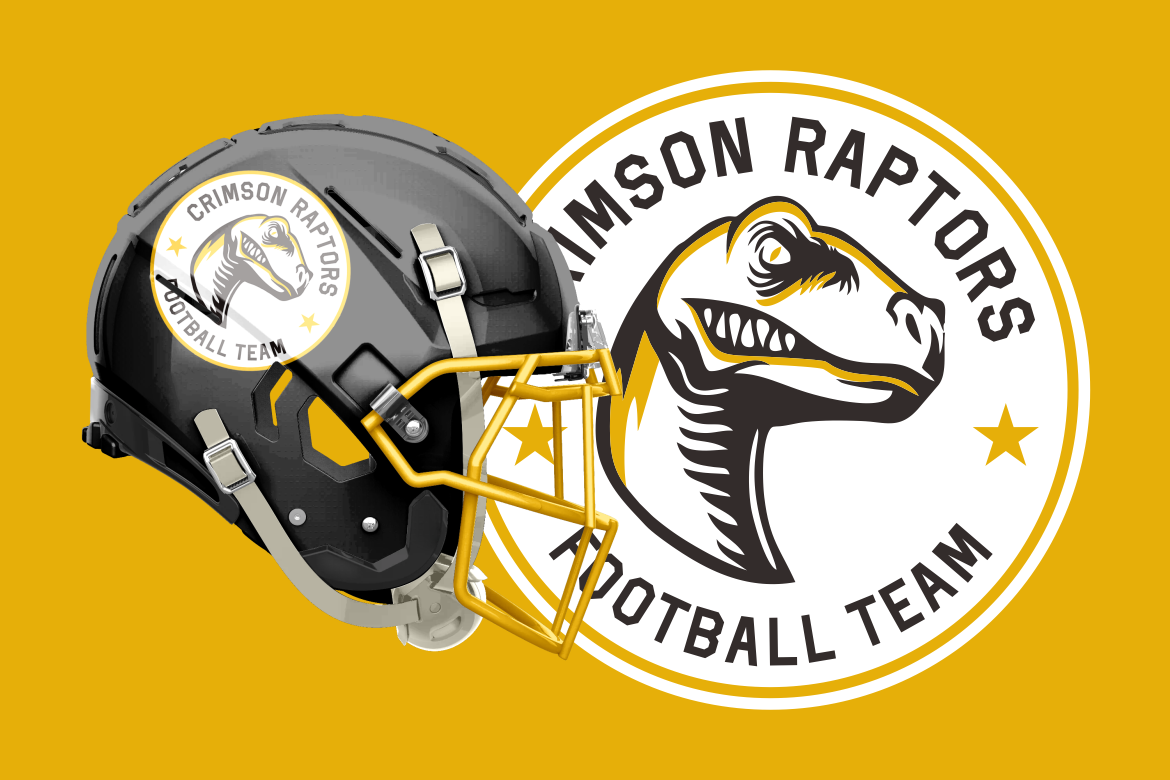
Super Touchdown is built from bold, geometric, block-style characters with sharp edges and a strong American football atmosphere. It includes Regular, Bold, and Outline styles, allowing designers to construct layered wordmarks, promotional headlines, and coordinated merchandise without switching to an unrelated typeface. Its direct structure makes it suitable for identities that need authority, competition, and game-day energy.
PROS: Three coordinated styles, geometric construction, strong headline visibility, useful numerals, and flexible layered applications.
BEST FOR: American football teams, championship events, school athletics, jersey graphics, fan merchandise, posters, and game-day promotions.
3. Magna Bold Sport Bold Font
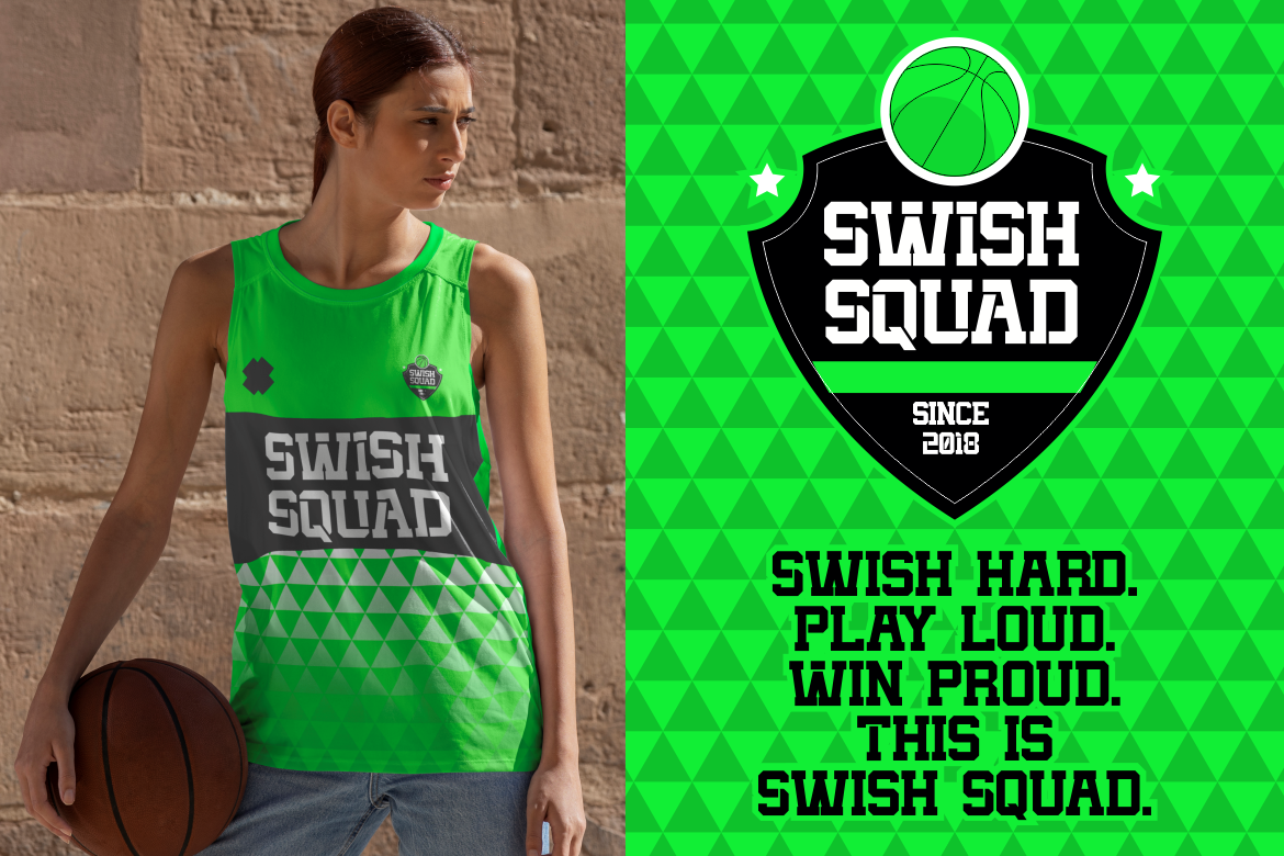
Magna Bold combines heavy slab-serif construction with sharp geometric edges and solid letterforms. Its structure balances athletic elegance with an assertive competitive presence, giving logos and headlines substantial authority while maintaining clarity across print and digital applications. Uppercase, lowercase, punctuation, and numerical support also make it useful for broader sports identity systems rather than isolated wordmarks.
PROS: Powerful slab-serif structure, clear geometry, uppercase and lowercase support, strong numerals, and broad promotional versatility.
BEST FOR: Basketball, gym branding, fitness campaigns, tournament graphics, esports, sports packaging, jerseys, and motivational merchandise.
4. Blaze Knock Sport Font
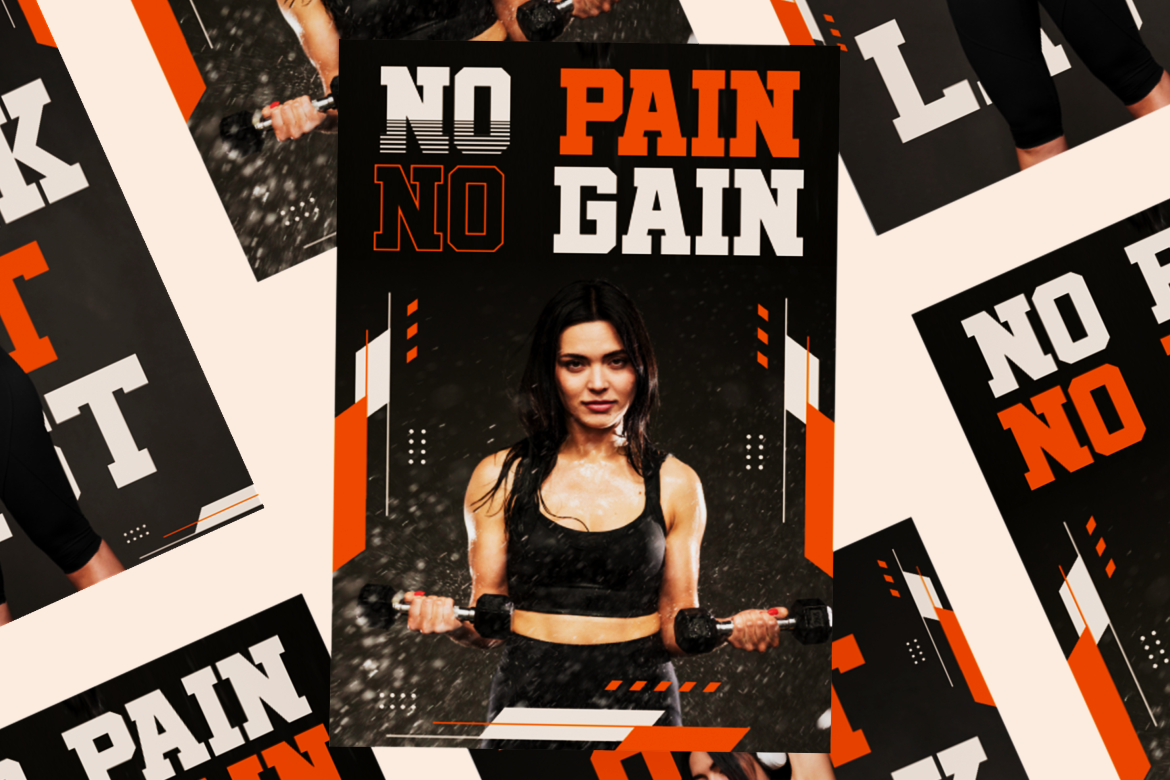
Blaze Knock combines blocky square serifs, dynamic all-cap characters, and selected horizontal line details that suggest speed and momentum. Outline and inline-shadow variations allow designers to build layered titles with greater depth, while the tall, substantial structure remains effective on posters, apparel, and product packaging. It is a strong choice when a sports brand needs vintage grit combined with a cleaner modern edge.
PROS: Strong all-cap silhouette, square serif construction, outline and shadow variations, visible movement details, and high display impact.
BEST FOR: Fitness brands, championship posters, athletic apparel, workout campaigns, action events, sports products, and editorial graphics.
5. Rugby Squad Rugby Sport Font

Rugby Squad features robust block-style letters, sharp angles, strong geometric shapes, and bold outlining inspired by classic jerseys and stadium typography. Its structured but aggressive appearance communicates physical strength, agility, and competitive spirit without sacrificing the clarity needed for digital promotions and smaller graphics. The typeface is particularly effective for identities built around teamwork, contact sport, and club tradition.
PROS: Bold geometric structure, sharp athletic angles, prominent outlines, compact visual strength, and clear team-branding potential.
BEST FOR: Rugby clubs, football teams, contact sports, university athletics, team apparel, event posters, badges, and sports merchandise.
Comparison
| Font | Main Sports Direction | Visual Personality | Strongest Logo Application | Ideal Use |
|---|---|---|---|---|
| Vintage Runner | Retro racing and athletics | Muscular, rounded, and nostalgic | Wide wordmarks and badge logos | Motorsport, running, automotive clubs |
| Super Touchdown | American football | Blocky, authoritative, and competitive | Layered team names and jersey graphics | Football, school sports, championships |
| Magna Bold | Modern multi-sport branding | Strong, geometric, and assertive | Professional team and fitness identities | Basketball, gym, esports, tournaments |
| Blaze Knock | Vintage-modern athletic display | Energetic, tall, and forceful | High-impact campaign wordmarks | Fitness, apparel, posters, action sports |
| Rugby Squad | Rugby and contact sports | Rugged, angular, and united | Shield logos and club identities | Rugby, football, university athletics |
Common Mistakes When Choosing Sports Logo Fonts
The first mistake is selecting a typeface only because it looks heavy or aggressive. Boldness alone does not create a meaningful athletic identity. A racing team, rugby club, fitness studio, and youth basketball program require different emotional signals, even when all four need visual strength. Start with the sport, audience, competitive level, location, and team history. Then select a font whose geometry, width, texture, and movement support that story. Otherwise, the logo may look energetic but remain generic and interchangeable with hundreds of other sports identities.
Another common mistake is adding too many athletic effects. Slants, speed lines, outlines, bevels, shadows, mascots, shields, stars, flames, and distressed textures can each support a sports logo, but applying all of them at once weakens recognition. Begin with a clear one-color wordmark and correct its spacing before introducing secondary treatments. A logo should remain recognizable without gradients or dimensional effects. Additional styling can then be developed for posters, uniforms, and campaigns without becoming essential to the core identity.
The final mistake is approving the logo without testing production and small-size performance. A design may look powerful on a large presentation board but fail when embroidered on a cap, placed inside a social profile, printed on a narrow sleeve, or displayed beside sponsor logos. Fine lines can disappear, outlines can merge, and tightly spaced letters can become unreadable. Test the full wordmark, monogram, badge, numbers, and one-color versions across actual applications. Also confirm that the selected font license covers the intended logo or trademark, team merchandise, apparel quantities, webfont use, advertising, and other commercial applications.
Conclusion
The strongest sports logo fonts combine competitive character with practical performance. They communicate energy, strength, movement, and team spirit while remaining readable across uniforms, merchandise, events, websites, and digital campaigns.
Begin by defining the identity rather than choosing the loudest typeface. Match the letter structure to the sport, build a complete system around the wordmark, and prepare monogram, badge, one-color, and small-scale versions. Pair the display font with simpler supporting typography so schedules, statistics, and promotional details remain clear.
Fonts from PutraCetol Studio provide several distinct paths for athletic branding. Vintage Runner brings retro racing confidence, Super Touchdown supports layered football identities, Magna Bold offers modern multi-sport authority, Blaze Knock combines vintage grit with dynamic impact, and Rugby Squad delivers the solid geometric energy needed for contact sports and club branding.
With the right font and a disciplined identity system, a sports logo can do more than identify a team. It can represent its culture, unite its supporters, strengthen merchandise, and create a visual presence that feels ready for competition.
Explore these fonts and many more at PutraCetol.com to build a business identity that looks professional, trustworthy, and memorable.
Additionally, if you want to explore some free typography options, you can check out Putracetol Studio on Dafont. Happy reading and designing!