
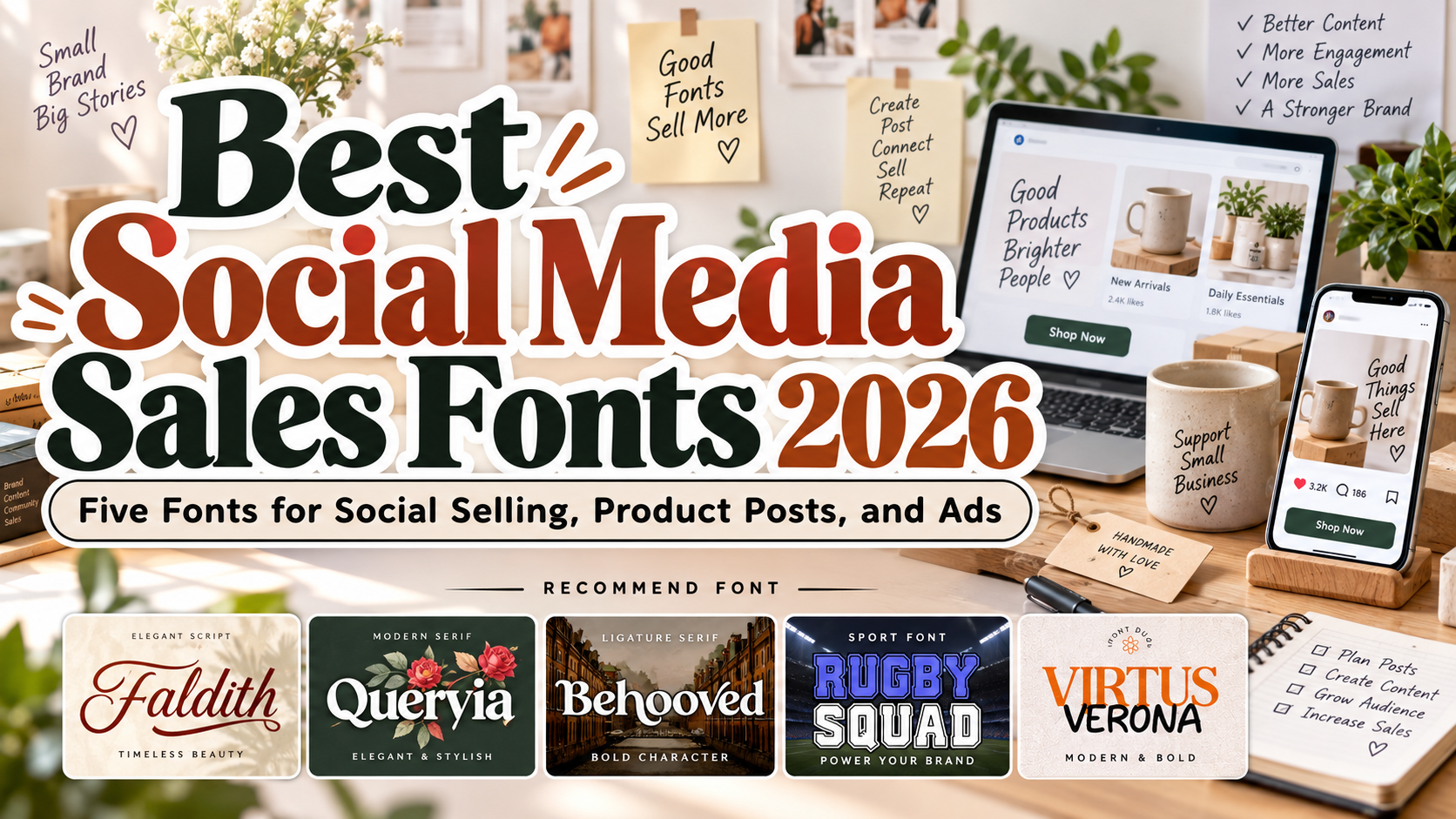
Best Social Media Sales Fonts 2026: Make the Offer Clear and the Brand Recognizable
Start With the Offer
Choosing the best social media sales fonts for 2026 starts with what buyers need to understand: the product, its value, the price, and the next step. Establish that hierarchy before adding decorative lettering.
Use a distinctive font for brand names and campaign headlines, then a simpler companion for dimensions, shipping details, and purchase instructions. These are creative recommendations, not proven conversion rankings.
For a skincare launch, consider refined serif typography. For sportswear, test a stronger athletic headline. Match the visual voice to the actual offer.
Test the Real Content Before Publishing
Set your longest product name, currency symbols, prices, and punctuation. Preview the finished graphic on a phone and check whether someone can identify the offer without zooming.
Keep essential details in the listing text or caption as well as the artwork. Use consistent typography across posts, product pages, and packaging, but adapt layouts rather than shrinking every design into the same template.
Jump to Recommended Fonts
1. Faldith

Faldith uses connected script lettering, sweeping strokes, and a graceful handwritten character. It offers a personal direction for sellers whose products emphasize gifting, celebration, or craftsmanship. For a gift-box campaign, try the collection name in Faldith above a clear product photograph, keeping prices and delivery information in straightforward supporting text.
PROS: Flowing script, graceful capitals, personal visual character.
BEST FOR: Gift sellers, wedding businesses, boutique beauty, and handmade products.
2. Quervia Elegant Serif Font
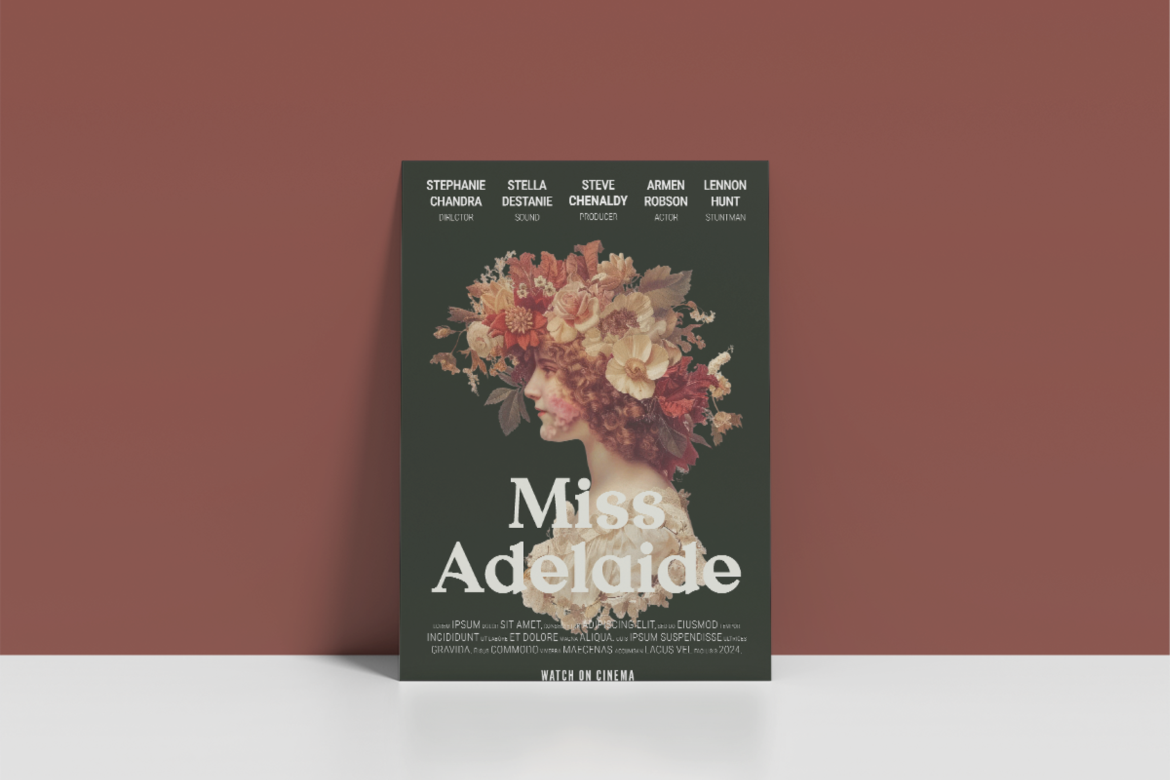
Quervia combines medium stroke contrast, sharp serif terminals, and controlled curves with a classic editorial mood. Distinctive inner cuts add character without relying on elaborate flourishes. Try it for a fragrance collection carousel, repeating the headline style while each slide explains a different scent, size, or purchase option.
PROS: Refined curves, distinctive serifs, composed display structure.
BEST FOR: Fragrance, skincare, jewelry, premium accessories, and boutique collections.
3. Behooved Ligature Serif Font

Behooved combines clean modern serif forms with distinctive ligatures, providing options for customized-looking wordmarks and headlines. Its connected letter combinations offer a different creative direction from conventional product typography. For a jewelry launch, test one signature ligature in the collection name while leaving prices and product specifications unembellished.
PROS: Modern serif character, distinctive ligatures, flexible headline styling.
BEST FOR: Jewelry launches, fashion promotions, beauty campaigns, and editorial product posts.
4. Rugby Squad Rugby Sport Font

Rugby Squad uses block-style letters, angular geometry, and an athletic construction inspired by jerseys and stadium typography. Regular and Outline styles provide alternatives for short promotional headlines. For a training-apparel release, try a solid headline such as “TRAIN YOUR WAY,” then use plain supporting text for sizing, availability, and ordering.
PROS: Athletic character, substantial letterforms, solid and outline options.
BEST FOR: Sportswear, fitness equipment, team merchandise, and active-lifestyle promotions.
5. Virtus Verona Duo Font
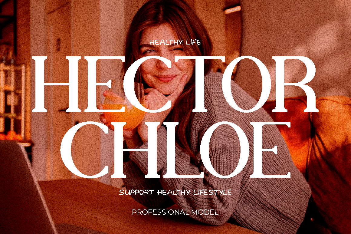
Virtus Verona pairs a serif style with a relaxed handlettered companion, combining structured and personal voices within one duo. This contrast offers a useful starting point for coordinated campaigns. For a lifestyle collection, use the serif for product names and the handwritten style for a short accent such as “Made for weekends.”
PROS: Coordinated pairing, contrasting styles, flexible campaign hierarchy.
BEST FOR: Lifestyle collections, gift brands, fashion accessories, and boutique promotions.
Comparison
Use this comparison to shortlist fonts by campaign type.
| Font | Suggested Brand Direction | First Creative to Test |
|---|---|---|
| Faldith | Personal and gift-focused | Gift-box announcement |
| Quervia | Refined and premium | Fragrance carousel |
| Behooved | Distinctive editorial branding | Jewelry collection post |
| Rugby Squad | Athletic and assertive | Sportswear release |
| Virtus Verona | Polished with personal accents | Lifestyle collection launch |
Common Mistakes
The first mistake is allowing decorative lettering to hide the offer. Keep product names, prices, and purchase instructions clear. Avoid crowding every graphic with multiple fonts, discount badges, and competing slogans. Attractive typography should support honest information, not conceal conditions or exaggerate value.
Another mistake is judging results through likes alone. Test alternative treatments while keeping the product, photography, and offer consistent. Compare qualified inquiries, completed orders, and recurring buyer questions alongside engagement. Do not attribute every sales change to typography.
The final mistake is assuming all social use has identical licensing. PutraCetol measures organic social coverage separately from paid digital advertising, with permissions depending on the selected coverage. Confirm the rights for sponsored content, paid campaigns, merchandise, and other intended applications before publishing.
Conclusion
The best social media sales fonts 2026 should give the brand personality while making its offer easier to understand.
Explore these five PutraCetol Studio options using your real product names and campaign messages. Combine expressive headlines with readable supporting text, truthful photography, and consistent layouts. Choose a visual identity you can sustain across discovery, purchase, and follow-up rather than changing styles with every promotion.
Explore these fonts and many more at PutraCetol.com to build a business identity that looks professional, trustworthy, and memorable.
Additionally, if you want to explore some free typography options, you can check out Putracetol Studio on Dafont. Happy reading and designing!