
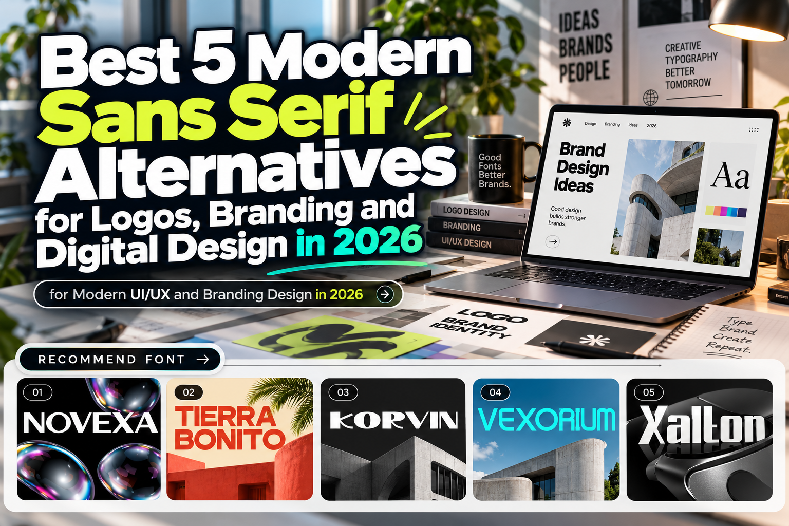
Sans Alternatives 2026: 5 Contemporary Fonts for Modern Branding
Sans serif typography remains one of the most dependable choices in graphic design. Its clean construction works across logos, websites, presentations, packaging, editorial layouts, and digital interfaces. However, relying on familiar neutral sans serifs can also make brands look increasingly similar.
That is where Sans alternatives 2026 become valuable. Contemporary designers can retain the clarity and professional character associated with sans serif typography while choosing letterforms with wider proportions, experimental cuts, stronger geometry, or more specialized personalities.
The goal is not to replace classic sans serif design completely. It is to choose a typeface with enough individuality to make the visual identity memorable.
Initial Suggestion: Decide Whether You Need Neutrality or Personality
Before selecting a modern sans serif, determine its role.
Body copy, navigation, dashboards, and information-heavy layouts generally benefit from restrained typography. Logos, campaign headlines, packaging, and large editorial titles can tolerate much stronger personalities.
For example, a technology startup could use an experimental sans serif for its wordmark while pairing it with a neutral system font for interface text. A restaurant might use a bold display sans on packaging but choose a quieter companion for ingredients and menu descriptions.
Always test the actual words your audience will see. Width, spacing, unusual character shapes, and punctuation can dramatically change how a typeface performs outside its specimen.
Jump to Recommended Fonts
1. Novexa Modern Sans Font
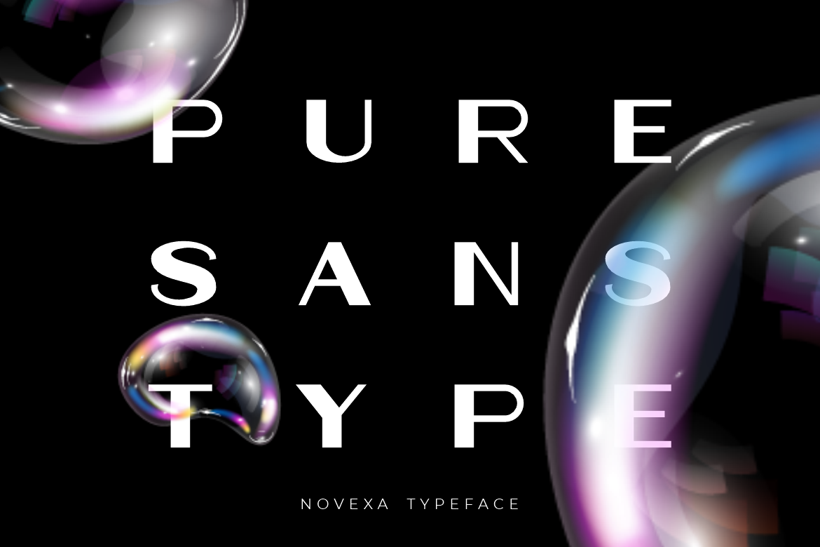
Novexa offers a refined contemporary approach built around wide proportions, clean strokes, smooth curves, and balanced geometric construction. Its spacious letterforms give short names and large headlines a polished presence without excessive decoration, making it adaptable across photography, beauty, architecture, technology, and creative-business branding. PutraCetol also positions it for advertising, magazines, presentations, packaging, and digital products. PutraCetol Studio
The restrained construction makes Novexa useful when you want something more distinctive than a generic geometric sans without moving into highly experimental typography.
PROS: Wide proportions, clean geometry, polished appearance, versatile branding potential.
BEST FOR: Creative agencies, photography brands, architecture studios, technology companies, beauty branding.
2. Tierra Bonito Mexican Food Font

Tierra Bonito demonstrates how far a sans serif foundation can be pushed toward specialized branding. Its thick uniform strokes, wide proportions, rounded counters, and compact spacing create a bold but friendly presence designed to remain noticeable in busy commercial environments. It is especially effective for food businesses where typography needs to communicate energy and personality immediately. PutraCetol Studio
Compared with neutral corporate sans serifs, Tierra Bonito brings significantly more character while retaining clear geometric construction.
PROS: Strong visibility, bold structure, friendly counters, energetic personality.
BEST FOR: Restaurants, food trucks, snack packaging, menu boards, promotional campaigns.
3. Korvin Expanded Display Sans Font

Korvin uses expanded proportions, substantial weight, clean strokes, and generous spacing to produce a broad, confident silhouette. Smooth curves soften its geometric framework, while selected angled cuts add movement and a contemporary technological quality. Its shape works particularly well for short brand names and display headlines that need to occupy space confidently. PutraCetol Studio
This makes Korvin an interesting alternative to conventional condensed or neutral business fonts, especially when a brand wants to communicate scale and modern authority.
PROS: Expanded structure, geometric clarity, strong headline visibility, contemporary details.
BEST FOR: Automotive branding, architecture, startups, agencies, fitness brands, large headlines.
4. Vexorium Modern Experimental Font
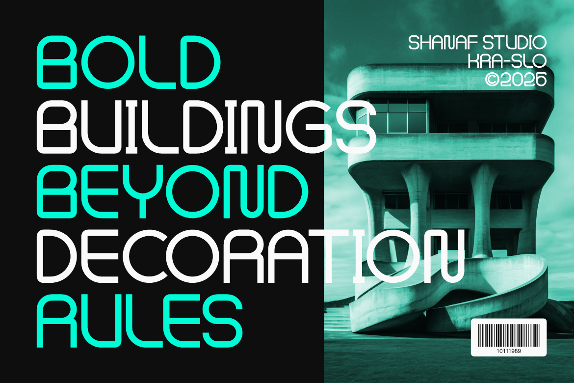
Vexorium takes a more progressive route. Its tall proportions, consistent stroke weight, rounded corners, geometric curves, and unconventional structural details create a futuristic identity while retaining a controlled underlying grid. The result feels architectural and experimental without becoming completely abstract. PutraCetol Studio
For designers who find conventional sans serifs too anonymous, Vexorium can introduce memorable character to logos, presentation covers, posters, packaging, advertising, and editorial headlines.
PROS: Experimental construction, tall proportions, balanced spacing, architectural personality.
BEST FOR: Technology brands, creative studios, property companies, innovation campaigns, editorial display.
5. Xalton Corporate Logo Font
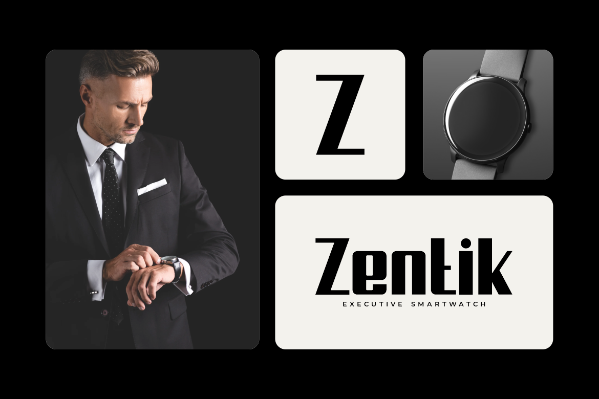
Xalton combines thick upright strokes, strong geometric construction, clean edges, and rounded inner counters. Its visual language feels professional and structured with a subtle technological influence, making it especially relevant for companies that want corporate credibility without relying on a conventional office-style sans serif. PutraCetol Studio
Because of its substantial weight, Xalton is strongest in logos, section titles, presentation covers, and campaign graphics rather than lengthy body text.
PROS: Strong geometry, clean structure, professional character, technological influence.
BEST FOR: Corporate logos, software companies, startups, electronics, business presentations.
Comparison: Which Sans Alternative Fits Your Project?
| Font | Visual Personality | Suggested Application |
|---|---|---|
| Novexa | Refined and spacious | Branding, editorial, creative business |
| Tierra Bonito | Bold and playful | Food and packaging |
| Korvin | Wide and authoritative | Corporate and automotive |
| Vexorium | Experimental and futuristic | Technology and creative industries |
| Xalton | Structured and professional | Business and software branding |
These fonts illustrate an important point about modern sans typography: sans serif no longer means neutral. The same fundamental absence of serifs can support very different visual personalities.
Why Modern Sans Serif Alternatives Matter
Classic sans serif fonts became popular partly because their simple structures adapt easily to different media. That advantage remains relevant in 2026, but branding now operates across increasingly crowded digital environments.
A generic typeface may communicate clearly while doing little to create recognition.
More characterful sans serifs allow designers to maintain clean visual communication while introducing distinctive proportions, terminals, counters, or structural ideas. An expanded font can communicate confidence. Rounded geometry may feel approachable. Tall proportions can appear futuristic, while irregular cuts can suggest experimentation.
The strongest choice depends on the audience and context rather than current fashion.
Common Mistakes When Choosing Sans Alternatives
A frequent mistake is assuming that every sans serif is suitable for body text or interface design. Many contemporary fonts are intentionally designed for display use. Expanded proportions, experimental characters, heavy weights, or unusual spacing may look excellent in a logo but become inefficient in paragraphs or small mobile interfaces. Build a typography system instead: use a distinctive display font where brand recognition matters and pair it with a quieter reading font when necessary.
Another mistake is choosing typography from a single wordmark preview. Test uppercase and lowercase, numerals, punctuation, long company names, multilingual characters, packaging dimensions, social-media thumbnails, and actual website layouts. A beautiful “A” or “R” does not guarantee that the complete character set suits your project.
Finally, confirm licensing before using a font commercially. Logo and trademark use, webfont embedding, applications, advertising, templates, and large-scale corporate distribution can require different coverage. PutraCetol’s current licensing system, for example, separates several of these usage scenarios so buyers can select coverage appropriate to the project. PutraCetol Studio
Conclusion
The best Sans alternatives 2026 preserve the clarity that makes sans serif typography useful while offering more recognizable visual identities.
Novexa provides refined versatility, Tierra Bonito adds playful commercial energy, Korvin creates expansive authority, Vexorium introduces experimental architecture, and Xalton delivers structured corporate confidence.
Instead of searching for one universal replacement for classic sans serif typography, choose according to the role, audience, and personality of the project. Explore these fonts at PutraCetol Studio and test them directly with your brand name, layouts, packaging, and digital content before building the final typography system.
Explore these fonts and many more at PutraCetol.com to build a business identity that looks professional, trustworthy, and memorable.
Additionally, if you want to explore some free typography options, you can check out Putracetol Studio on Dafont. Happy reading and designing!