
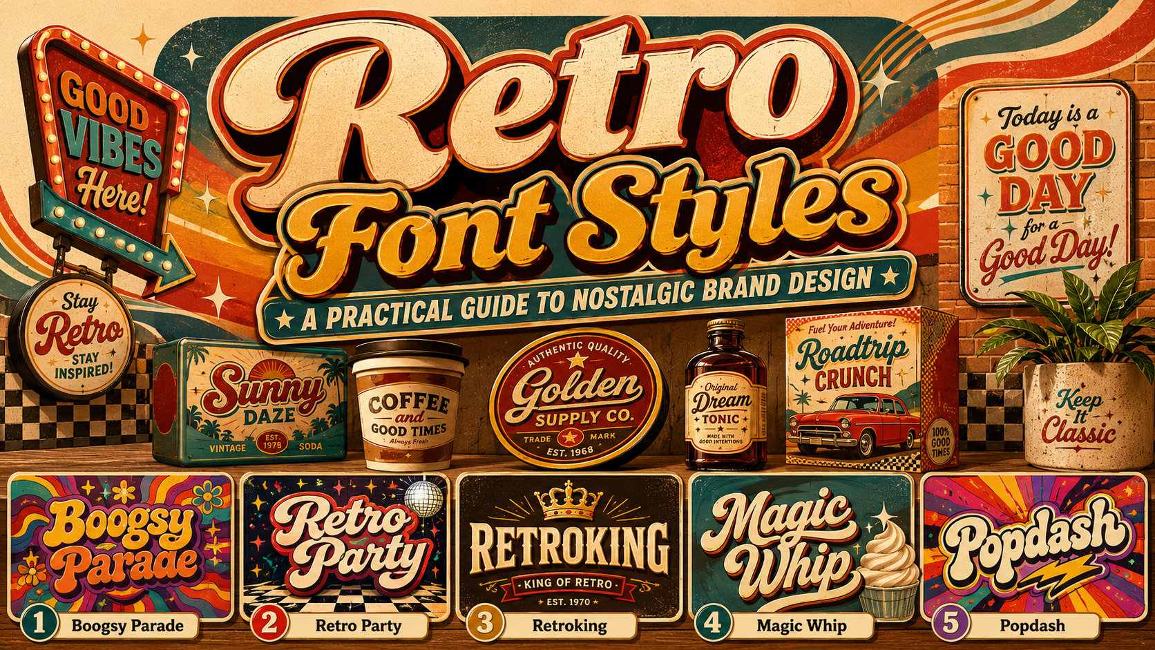
The strongest retro fonts are selected according to a specific visual period, not simply because they look old. Typography inspired by the 1970s communicates something very different from lettering associated with the 1980s or 1990s.
A 70s-inspired identity may use inflated curves, psychedelic proportions, earthy colors, and flowing letter connections. An 80s direction can introduce neon contrasts, energetic scripts, chrome-like effects, or geometric forms. A 90s-inspired design may feel more playful, experimental, colorful, or influenced by early digital graphics and youth culture.
Before selecting a font, define the decade, emotional tone, and intended audience. Decide whether the brand should feel groovy, rebellious, glamorous, playful, handcrafted, or futuristic. This prevents the design from becoming a random mixture of unrelated nostalgic references.
Modern retro typography works best when it captures the personality of an earlier era while maintaining the clarity, scalability, and practical usability required by current digital and print applications.
What Makes a Font Feel Retro?
Retro typography usually uses recognizable visual cues from past advertising, packaging, music, film, fashion, and popular culture. These cues may include exaggerated curves, thick serifs, swashes, inline details, dimensional shadows, rough textures, condensed proportions, or unusual letter connections.
The surrounding design also affects how a typeface is perceived. A simple serif may feel contemporary when paired with white space and neutral colors, but distinctly vintage when combined with faded paper, decorative borders, and muted orange or brown.
Common retro characteristics include:
- Wide and rounded psychedelic letterforms
- Bold scripts with connected strokes
- Strong serifs and exaggerated terminals
- Layered outlines, shadows, and dimensional effects
- Distressed or printed textures
- Condensed forms inspired by posters and signage
- Bright gradients and contrasting color combinations
- Unusual alternates, ligatures, and decorative swashes
The goal is not to use every characteristic at once. A successful visual identity normally selects one or two dominant references and applies them consistently.
Understanding Retro Typography by Decade
1970s Fonts: Groovy, Organic, and Expressive
Typography associated with the 1970s often features rounded shapes, curved baselines, dramatic proportions, and fluid movement. Psychedelic culture, music posters, record covers, and colorful consumer packaging all influenced the period.
These typefaces work well for music, beverages, fashion, festivals, cafés, wellness products, and brands that want a warm, free-spirited personality.
Color combinations may include:
- Mustard, brown, and cream
- Avocado green and warm orange
- Burgundy and dusty pink
- Purple, yellow, and red
- Earth tones with soft gradients
To modernize the look, place expressive lettering inside a clean layout with generous spacing. Avoid covering the entire design with patterns, textures, and decorative shapes.
1980s Fonts: Energetic, Glossy, and Confident
The 1980s introduced several contrasting typographic directions. Bold scripts reflected sports, automotive, and lifestyle branding, while digital and geometric lettering supported technology, arcade culture, and futuristic entertainment.
Popular visual treatments include neon gradients, sharp shadows, metallic finishes, grids, glowing outlines, and strong diagonal movement.
An 80s-inspired font can support fitness brands, music events, entertainment products, apparel, gaming, and nostalgic advertising. Use effects selectively so the typography remains recognizable without depending entirely on glow or chrome.
1990s Fonts: Playful, Experimental, and Youthful
Typography inspired by the 1990s may include bubbly letters, irregular geometry, bright colors, rough alternative graphics, or early computer aesthetics. The decade supported both cheerful pop culture and rebellious underground design.
This direction is suitable for streetwear, children’s products, stickers, creative events, snacks, entertainment, and youth-focused campaigns.
A modern 90s composition can combine a playful display font with a restrained grid, simple photography, and one bold color accent. This keeps the design energetic without making it visually chaotic.
How to Use Retro Fonts in Modern Branding
Create a Recognizable Wordmark
A retro font can turn a short business name into a memorable visual shape. Test the actual brand name carefully because decorative forms, swashes, and unusual proportions can behave differently across letter combinations.
Review uppercase initials, repeated letters, connections, and spacing. Use alternate characters or ligatures to solve awkward combinations and create a more customized result.
Limit the Number of Nostalgic Elements
Retro typography already carries a strong personality. Pairing it with several vintage textures, illustrations, patterns, and effects can make the design feel like a costume rather than a contemporary identity.
Choose one primary typeface, one supporting font, and a controlled visual treatment. For example, combine a psychedelic display font with a neutral sans serif and a simple two-color palette.
Use Display Fonts at Appropriate Sizes
Most decorative retro fonts are designed for logos, headlines, packaging titles, posters, and promotional text. They are not ideal for paragraphs, ingredients, legal information, navigation, or detailed instructions.
Use a simpler supporting typeface for functional content. This protects readability while allowing the display font to remain expressive.
Build Several Logo Versions
Prepare a main wordmark, simplified version, monochrome treatment, and compact icon. A detailed retro logo may work on a poster but become unclear in a social media profile or small product label.
Testing the design at realistic sizes will reveal whether thin details disappear, counters close, or connected letters become difficult to recognize.
Retro Color and Texture Ideas
Typography should guide the supporting visual system. A bubbly 70s font may pair naturally with warm gradients and soft geometric shapes. A bold 80s script could work with strong diagonal lines and bright contrasting colors. A 90s display font may benefit from stickers, scribbles, or playful blocks.
Texture can add authenticity through grain, faded ink, paper fibers, halftones, or light distressing. However, texture should not damage essential letter shapes.
A modern retro brand does not need to look artificially aged. Clean digital color and crisp typography can still communicate nostalgia when the shapes and composition reference the intended era.
Jump to Recommended Fonts
Boogsy Parade | Retro Party | Retroking | Magic Whip | Popdash
1. Boogsy Parade Retro Psychedelic Font
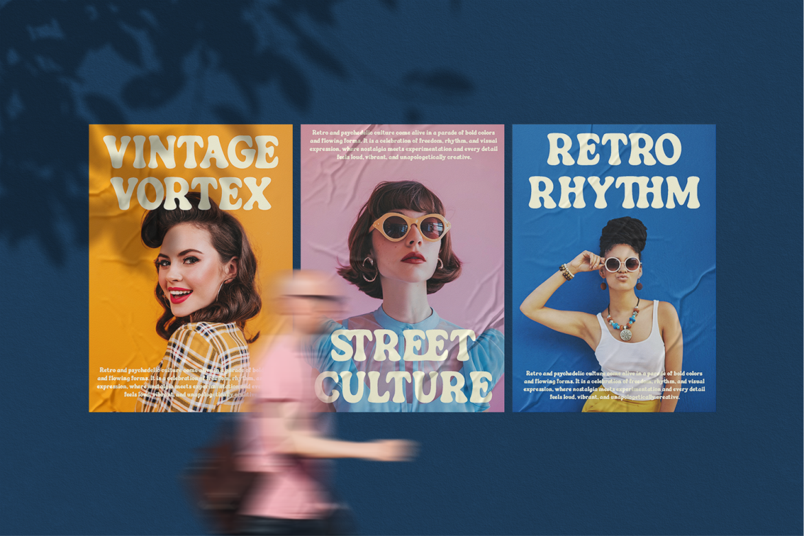
Boogsy Parade is a bold display typeface inspired by retro and psychedelic design culture. Its expressive shapes give short words a strong silhouette, making it useful when typography needs to become the central visual element of a composition. The style is especially suitable for nostalgic branding that should feel colorful, energetic, and intentionally unconventional rather than traditionally elegant.
PROS: Strong display presence, psychedelic personality, memorable silhouette, and expressive visual rhythm.
BEST FOR: Music events, fashion campaigns, posters, creative packaging, merchandise, and entertainment branding.
2. Retro Party
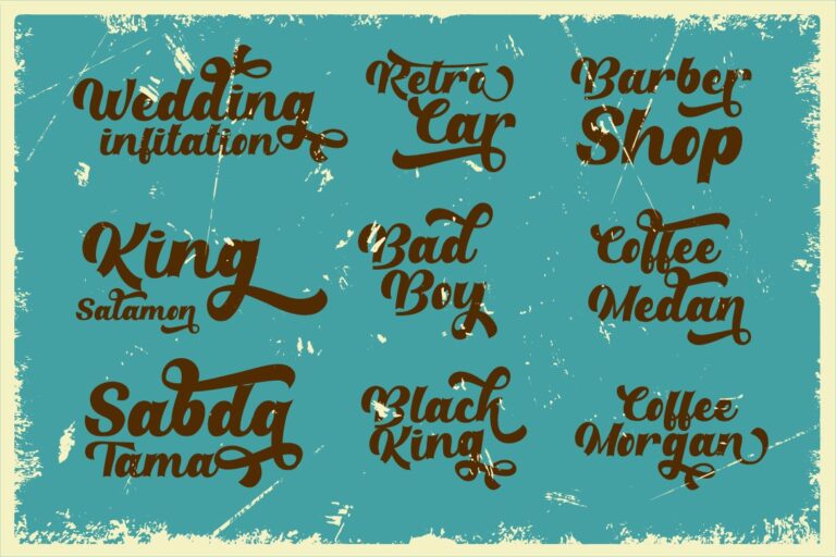
Retro Party combines classic script construction with a more modern retro personality. It includes many alternate characters through OpenType features, giving designers additional control over connections, swashes, and the overall wordmark rhythm. Its flexibility makes it useful across logos, badges, packaging, signs, apparel, posters, and book covers.
PROS: Numerous alternates, multilingual support, flexible lettering options, and broad branding usability.
BEST FOR: Vintage logos, apparel, cafés, signage, packaging, events, and lifestyle products.
3. Retroking

Retroking is a retro-style family supplied in clean and rough versions, allowing designers to move between polished branding and more weathered vintage applications. OpenType alternates make it possible to customize key letters, while the broad character support helps maintain a consistent identity across different materials. The clean version works well for modern layouts, while the rough treatment adds a more authentic printed or handcrafted atmosphere.
PROS: Clean and rough versions, alternate characters, multilingual support, and adaptable vintage character.
BEST FOR: Badges, packaging, T-shirts, posters, signage, book covers, and heritage-inspired branding.
4. Magic Whip Retro Script Bold Font

Magic Whip is a thick, groovy script inspired by classic lettering from the 1970s and 1980s. Its bold connected strokes create immediate movement, while a broad collection of alternative characters provides room for customized logos and expressive headlines. It is particularly effective when a brand needs warmth, confidence, and nostalgia in one recognizable wordmark.
PROS: Bold script construction, extensive alternatives, strong nostalgic character, and energetic movement.
BEST FOR: Logos, brand names, quotes, posters, fashion, food packaging, and promotional headlines.
5. Popdash Retro Psychedelic Font

Popdash uses wide, wavy forms and groovy curves inspired by the playful psychedelic culture of the 1970s and 1980s. Its chunky, fluid proportions create substantial visual impact while retaining enough clarity for logos, headlines, packaging, and magazine titles. The font feels nostalgic but remains suitable for modern creative work that needs color, motion, and free-spirited personality.
PROS: Wide expressive shapes, strong readability at display sizes, fluid rhythm, and modern retro versatility.
BEST FOR: Album covers, festivals, fashion branding, packaging, posters, stickers, and social media graphics.
Comparison
| Font | Main Retro Direction | Visual Personality | Strongest Application |
|---|---|---|---|
| Boogsy Parade | Psychedelic display | Bold and unconventional | Music and creative campaigns |
| Retro Party | Classic retro script | Stylish and adaptable | Logos, badges, and apparel |
| Retroking | Clean and textured vintage | Flexible and authentic | Packaging and heritage branding |
| Magic Whip | Bold 70s–80s script | Groovy and energetic | Wordmarks and promotional headlines |
| Popdash | Wide psychedelic display | Playful and free-spirited | Posters, festivals, and packaging |
Common Mistakes When Using Retro Fonts
The first mistake is combining references from too many decades without a clear reason. A 70s psychedelic font, 80s neon grid, 90s sticker pattern, and distressed Victorian border may each look interesting separately, but together they create an unclear identity. Select one primary period and use other influences only as restrained supporting details. A consistent historical direction makes the brand easier to understand and remember.
Another common mistake is relying on effects instead of typography. Shadows, chrome, gradients, outlines, textures, and distortion can support a retro style, but they cannot repair weak spacing or an unsuitable typeface. Start with a clear wordmark in one color. Adjust the letter combinations, scale, and proportions before adding decorative effects. The design should remain recognizable even when printed in monochrome.
The final mistake is using a decorative font for every piece of content. Retro display type may be excellent for a logo or poster headline but difficult to read in product descriptions, menus, captions, or navigation. Pair it with a clean supporting font, maintain sufficient contrast, and test the design across actual output sizes. Before using the font commercially, confirm that the selected license covers the intended logo, website, packaging, merchandise, advertising, or editable product application.
Conclusion
The best retro fonts do more than imitate old lettering. They capture the emotion of a particular period and reinterpret it for a current audience.
A psychedelic display font can communicate 70s creativity, a bold script can bring back the confidence of 80s branding, and a playful experimental style can suggest 90s pop culture. The most effective results combine these nostalgic references with contemporary spacing, readable supporting typography, and a controlled color system.
Fonts from PutraCetol Studio offer several distinct paths into retro design. Boogsy Parade and Popdash provide psychedelic energy, Retro Party supports flexible script lettering, Retroking offers both clean and textured vintage treatments, and Magic Whip creates a powerful groovy wordmark. Used with a clear brand strategy, these typefaces can make logos, posters, packaging, and promotional campaigns feel nostalgic without becoming outdated.
Explore these fonts and many more at PutraCetol.com to build a business identity that looks professional, trustworthy, and memorable.
Additionally, if you want to explore some free typography options, you can check out Putracetol Studio on Dafont. Happy reading and designing!