
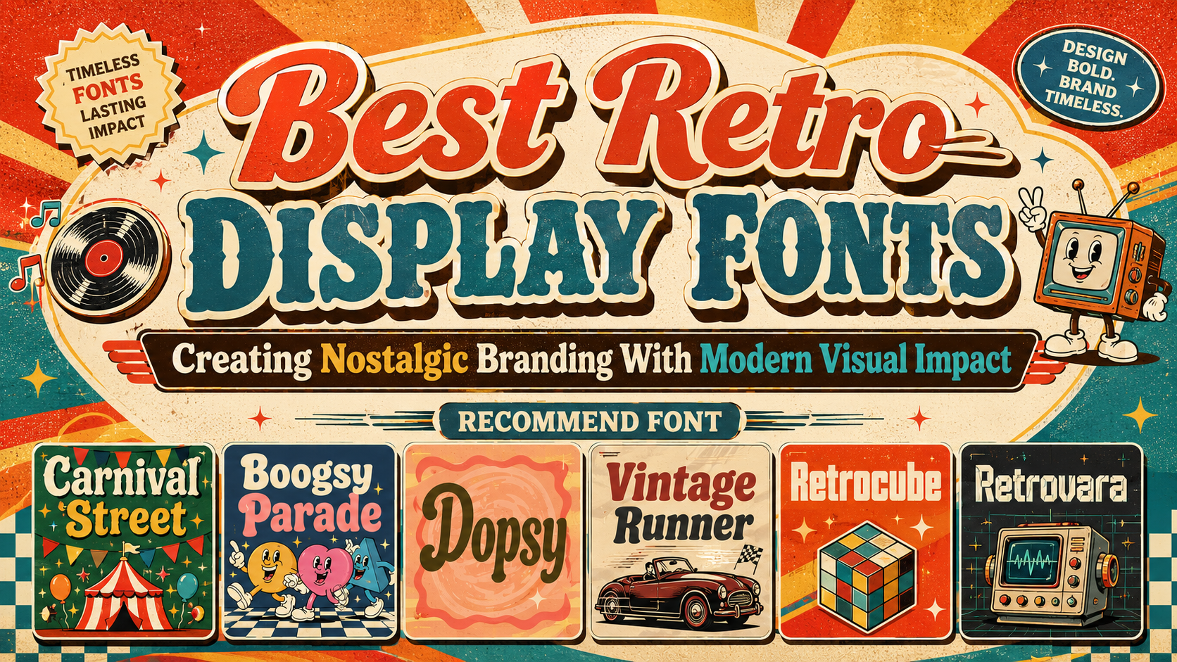
The best retro display fonts do more than make a design look old. They use recognizable visual references from earlier decades to communicate a specific personality.
A 1970s-inspired typeface may feel fluid, psychedelic, colorful, and free-spirited. An 1980s direction can appear faster, more technological, athletic, or connected to arcade culture. A 1990s-inspired identity may use heavier geometry, compact spacing, experimental proportions, or playful commercial graphics.
Before browsing fonts, define two things:
The visual period: Which decade or design culture should influence the project?
The emotional message: Should the brand feel playful, rebellious, energetic, handcrafted, comforting, futuristic, or premium?
A useful brief might say:
Create a bold 1970s-inspired identity that feels joyful and experimental, but keep the supporting layout clean enough for contemporary packaging.
That instruction is more valuable than simply requesting a “vintage logo.”
The font should express nostalgia, while the wider system ensures the project still feels relevant to a modern audience.
What Are Retro Display Fonts?
Retro display fonts are expressive typefaces influenced by historical advertising, signage, packaging, music, entertainment, sports, technology, or popular culture.
They are generally created for prominent use rather than long reading.
Typical applications include:
- Logos and wordmarks
- Poster headlines
- Packaging titles
- Album covers
- Fashion campaigns
- Social media covers
- Product collections
- Event identities
- Storefront signs
- Editorial covers
- Merchandise
- Advertising
Their visual character may come from rounded curves, psychedelic distortions, square geometry, layered construction, rough texture, thick serifs, italic movement, or mechanical cuts.
The word display is important. These typefaces work best when they are large enough for their proportions and details to become visible. They are not normally intended for paragraphs, instructions, legal information, or dense interface text.
Why Retro Display Typography Remains Effective
It Creates Immediate Emotional Recognition
Retro typography can suggest an atmosphere before the audience reads the complete message.
Broad psychedelic letters may evoke music, festivals, and creative freedom. Chunky athletic forms can suggest motorsport, physical energy, and classic American signage. Rounded food-oriented typography may communicate warmth, handmade production, and familiarity.
These associations help brands establish a mood quickly.
The typeface does not need to reproduce one historical period perfectly. It needs to select the most useful visual qualities and reinterpret them for the project.
It Makes Short Words More Memorable
Display typography gives a brand name a distinctive outer silhouette.
A wide, rounded wordmark creates a different shape from a condensed racing title or a square techno logo. That silhouette can become recognizable across posters, packaging, signage, and social media.
This is especially valuable for brands with short names because the typography can carry much of the identity without requiring an additional symbol.
It Connects Branding With Storytelling
A retro font can become the starting point for a larger visual world.
The curves, terminals, spacing, and textures may inspire:
- Illustration shapes
- Packaging borders
- Background patterns
- Icon styles
- Motion graphics
- Photography treatment
- Product labels
- Merchandising graphics
A psychedelic font might inspire fluid patterns and warm gradients. A square retro font could lead to modular layouts and geometric icons. A carnival serif may support rough paper textures, decorative frames, and celebratory color combinations.
Typography becomes more useful when it influences the full identity rather than appearing as an isolated headline.
Retro Typography by Visual Era
1970s: Groovy, Psychedelic, and Organic
A 1970s-inspired direction often uses wide proportions, bulbous curves, wavy rhythm, soft terminals, and exaggerated letter connections.
This style is especially suitable for:
- Music and festivals
- Fashion
- Beverages
- Creative studios
- Lifestyle products
- Entertainment
- Art communities
Warm orange, mustard, burgundy, avocado green, cream, and purple can reinforce the period. A modern composition should still use controlled spacing and a limited number of supporting elements.
1980s: Sport, Speed, Technology, and Entertainment
An 1980s-inspired display font may use italic movement, broad athletic shapes, mechanical cuts, chrome-like details, neon colors, or arcade geometry.
It works well for:
- Automotive brands
- Sports and fitness
- Gaming
- Electronic music
- Technology events
- Apparel
- Entertainment campaigns
The typography can feel energetic without depending on excessive glow, motion blur, or metallic effects. Start with a clear one-color wordmark before introducing production treatments.
1990s: Bold Geometry, Compact Layouts, and Playful Experimentation
A 1990s-inspired direction may use square characters, thick strokes, compact spacing, bright commercial colors, or early digital references.
This style can support:
- Streetwear
- Youth branding
- Creative technology
- Stickers
- Posters
- Retail products
- Media and entertainment
The decade offers enough variety for both clean block typography and more unusual digital experimentation.
How to Modernize Retro Display Fonts
Use a Contemporary Grid
An expressive vintage font can feel current when placed inside an organized layout.
Use clear alignment, generous margins, consistent spacing, and one dominant focal point. This prevents the design from becoming a collection of unrelated nostalgic effects.
A groovy headline inside a spacious editorial composition can feel more sophisticated than the same headline surrounded by several patterns, badges, stars, and illustrations.
Pair It With a Neutral Supporting Font
One of the safest systems is:
Retro display font for personality
Modern sans serif for practical information
The display font can handle the logo, campaign title, flavor name, or poster headline. The supporting font can handle descriptions, dates, prices, ingredients, and calls to action.
This contrast allows the retro typeface to remain expressive without weakening readability.
Limit Decorative Effects
Outlines, shadows, grain, gradients, highlights, and dimensional treatments can strengthen a vintage style. They should be introduced only after the typography works in one color.
A weak wordmark will not become stronger simply because it has several layers.
Begin with:
- Letter selection
- Kerning
- Word shape
- Scale
- Layout
- Color
- Texture or dimensional effects
This order keeps the design structurally sound.
Use Modern Photography
Contemporary photography can prevent a retro typeface from making the entire identity feel like a historical reproduction.
For example, pair:
- Psychedelic typography with clean product photography
- Retro sport lettering with modern automotive imagery
- Carnival serif typography with documentary event photography
- Rounded café lettering with minimal food styling
- Square display typography with contemporary fashion portraits
The tension between old and new often creates the strongest result.
Using Retro Display Fonts in Logos
A retro font can make a short business name visually distinctive without requiring a separate emblem.
Test the real name in several arrangements:
- Uppercase
- Lowercase
- Title case
- Horizontal
- Stacked
- Curved
- Inside a badge
- With an initial or monogram
Check repeated letters and difficult combinations. Rounded characters can create large visual gaps, while square or condensed forms may need additional spacing to prevent crowding.
Use alternate characters or ligatures only when they improve the complete wordmark.
One signature letter is often more memorable than decorating every possible character.
Retro Display Fonts for Packaging
Packaging needs to attract attention while still communicating practical information.
Use the retro font for:
- Brand name
- Product line
- Flavor
- Collection title
- Limited-edition message
- Short product promise
Use simpler typography for:
- Ingredients
- Quantity
- Instructions
- Warnings
- Contact information
- Regulatory text
A rounded retro font can make bakery or dessert packaging feel warm and familiar. Psychedelic lettering can energize beverages, fashion accessories, or music-related merchandise. Square techno typography can support gaming products, electronics, or retro-futuristic packaging.
Always test the design at the real package size. Decorative details that appear clear on a large mockup may disappear on a small label.
Retro Display Fonts for Posters and Events
Posters allow display typography to become the central artwork.
A practical hierarchy might use:
Primary: Event or campaign name
Secondary: Theme or supporting phrase
Functional: Date, venue, price, and website
The primary title can be oversized, cropped, rotated, or layered. The practical information should remain easy to locate.
Carnival typography can support street markets and cultural celebrations. Psychedelic fonts work naturally for music festivals and creative gatherings. Retro sport lettering is effective for races, competitions, and automotive events.
The font should immediately communicate the type of experience being promoted.
Retro Fonts for Fashion and Music Branding
Fashion and music both benefit from typography with a strong cultural identity.
A fashion collection can use retro display lettering for:
- Collection names
- Campaign headlines
- Apparel graphics
- Lookbook covers
- Labels and tags
- Social media announcements
Music projects can use it for:
- Artist wordmarks
- Album titles
- Concert posters
- Festival graphics
- Merchandise
- Streaming artwork
The visual era should support the sound or fashion direction. A psychedelic typeface may suit experimental music, while square techno lettering can reinforce synthwave, electronic, gaming, or retro-futuristic projects.
Retro Color Palette Ideas
Groovy 1970s
Mustard, orange, brown, cream, dusty pink, and avocado green.
Retro Sport
Red, navy, cream, warm grey, and black.
Arcade and Techno
Electric blue, purple, magenta, black, silver, and bright cyan.
Vintage Food Branding
Warm red, butter yellow, dark brown, cream, and muted green.
Contemporary Retro
Black, off-white, one nostalgic accent, and generous negative space.
The palette should support the font without forcing the design to imitate every visual cliché associated with a decade.
Jump to Recommended Fonts
Carnival Street Rough Classic Display Font | Boogsy Parade Retro Psychedelic Font | Dopsy Retro Display Font | Vintage Runner Display Retro Sport Font | Retrocube Retro Square Display Font | Retrovara Retro Techno Display Font
1. Carnival Street Rough Classic Display Font

Carnival Street combines a heavy serif foundation with slightly irregular edges, textured contours, and a carved handmade quality. Its moderately wide proportions and softened serif terminals create a playful classic mood that recalls vintage circus lettering and festive street signage without losing the strong structure needed for modern headlines. It is particularly effective when a project needs celebration, heritage, and visual energy in one recognizable wordmark.
PROS: Heavy serif presence, rough handcrafted texture, strong readability, festive personality, and nostalgic signage character.
BEST FOR: Carnivals, street markets, music festivals, cultural events, posters, invitations, packaging, stickers, entertainment branding, and promotional campaigns.
2. Boogsy Parade Retro Psychedelic Font
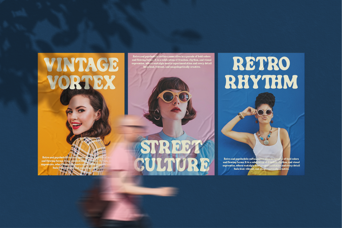
Boogsy Parade uses thick rounded strokes, broad proportions, inflated curves, and gently uneven contours to create a fluid psychedelic rhythm. Its substantial weight keeps short headlines visible, while the organic distortion gives logos and titles the playful energy associated with groovy retro culture. The result feels nostalgic and expressive without becoming so distorted that the words lose their clarity.
PROS: Wide psychedelic forms, strong headline visibility, friendly rounded terminals, organic rhythm, and immediate 1970s-inspired personality.
BEST FOR: Music events, creative festivals, retro cafés, fashion, entertainment, album covers, magazine titles, packaging, stickers, and expressive logo design.
3. Dopsy Retro Display Font

Dopsy is built from thick, smooth, and rounded letterforms with slightly condensed proportions and compact spacing. Short ascenders and descenders keep the word shapes visually tight, while wide counters and exaggerated terminals preserve a warm, approachable character at display sizes. Its combination of retro signage influence and modern clarity makes it especially useful for brands that want nostalgia to feel friendly rather than theatrical.
PROS: Soft vintage personality, compact word shapes, broad counters, smooth curves, and strong food-and-lifestyle appeal.
BEST FOR: Cafés, bakeries, dessert brands, menus, storefronts, packaging labels, greeting cards, invitations, book covers, stickers, and cozy product branding.
4. Vintage Runner Display Retro Sport Font
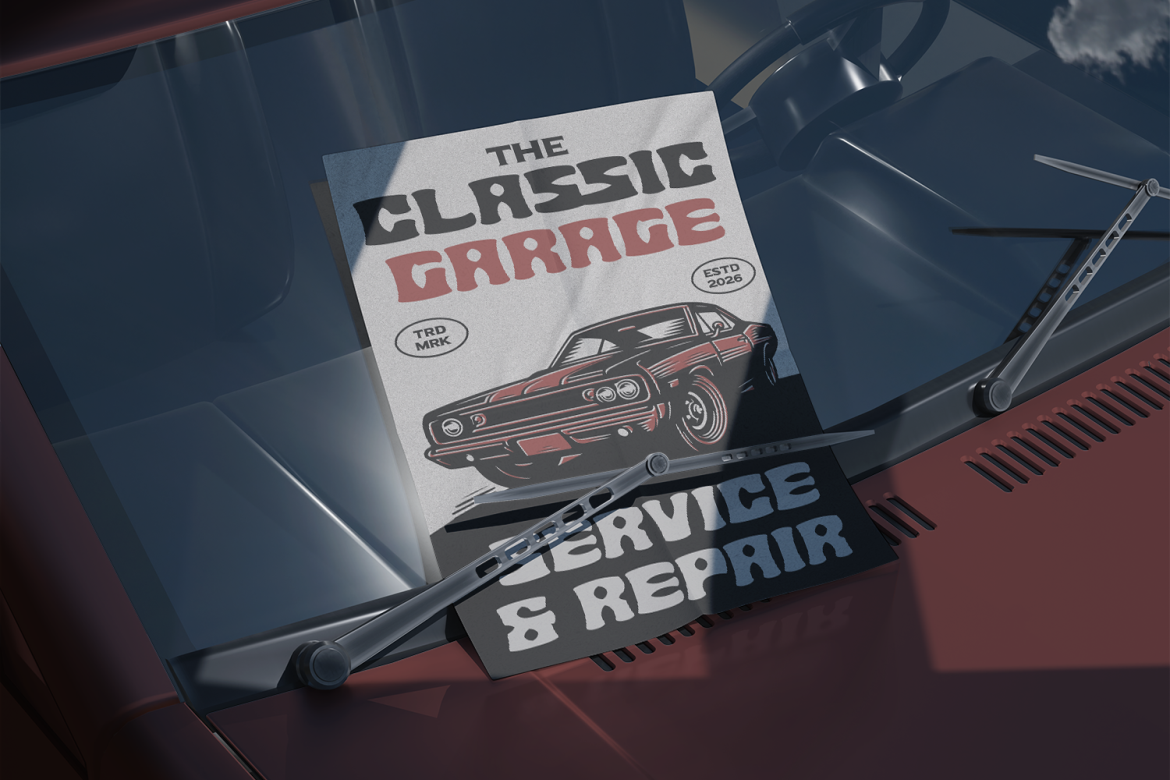
Vintage Runner combines thick, chunky construction with wide proportions, rounded corners, muscular curves, and irregular inner cuts. The typeface balances solid athletic weight with enough softness to remain approachable, creating a visual connection to retro motorsport, garage culture, classic Americana, and old commercial signage. Its dense forms work particularly well in badges, emblems, short titles, and merchandise where immediate recognition matters.
PROS: Broad athletic silhouette, strong visual weight, rounded readability, handcrafted inner details, and clear retro motorsport character.
BEST FOR: Racing events, garages, car clubs, automotive brands, sports campaigns, apparel, cafés, barbershops, YouTube covers, badges, and vintage merchandise.
5. Retrocube Retro Square Display Font
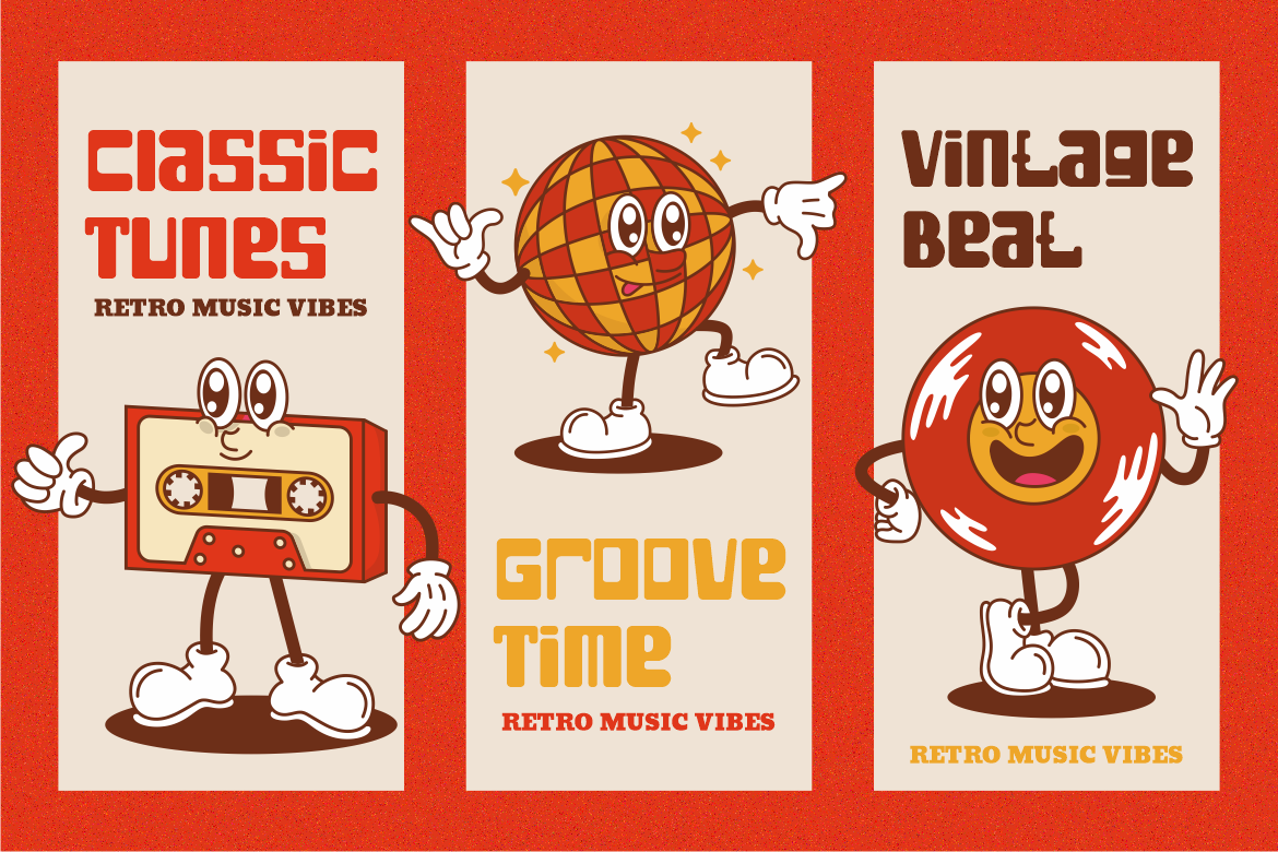
Retrocube relies on wide square geometry, consistent heavy strokes, compact spacing, and stable proportions. Firm outer corners give the typography authority, while softer rounded counters prevent the characters from becoming excessively rigid or industrial. This balance creates a retro block style that feels organized, confident, and modern enough for branding systems that need nostalgia without rough texture or psychedelic decoration.
PROS: Strong square construction, high display readability, balanced compact spacing, friendly internal curves, and versatile retro-modern character.
BEST FOR: Logos, advertising, posters, film titles, classic music visuals, magazine covers, book covers, stickers, creative studios, lifestyle brands, and bold business identities.
6. Retrovara Retro Techno Display Font
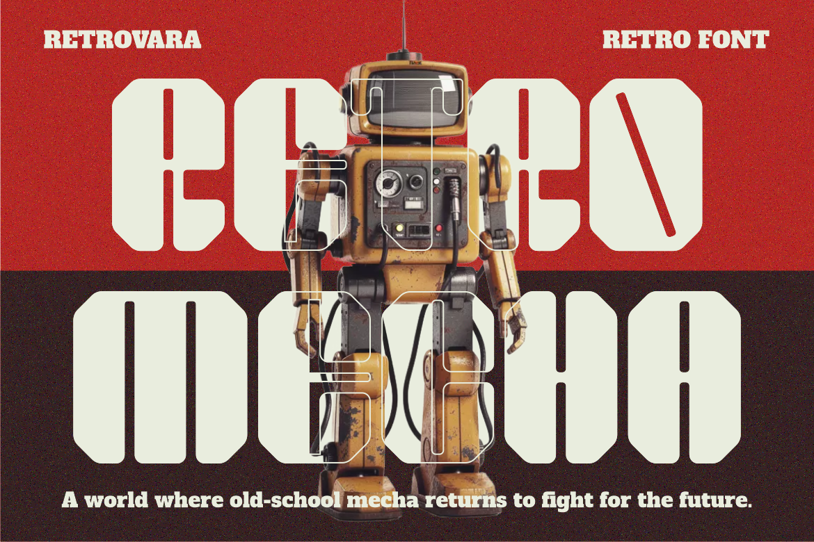
Retrovara blends broad, structured letterforms with thick strokes, controlled spacing, rounded edges, and subtle geometric interruptions. Its construction feels solid and serious, while the combination of vintage proportions and techno-inspired cuts gives it a distinctive retro-futuristic voice. It is a strong choice for brands that need nostalgic energy but want to avoid the softer or more playful tone of groovy display typography.
PROS: Bold structured forms, retro-techno personality, consistent visual rhythm, clear numerals and symbols, and strong professional presence.
BEST FOR: Technology branding, electronic music, gaming, industrial products, film titles, posters, packaging, magazine covers, merchandise, and retro-futuristic campaigns.
Comparison
| Font | Main Retro Direction | Visual Personality | Strongest Application | Ideal Brand Mood |
|---|---|---|---|---|
| Carnival Street | Circus and festive street signage | Rough, celebratory, and handcrafted | Events, posters, and cultural branding | Lively and nostalgic |
| Boogsy Parade | 1970s psychedelic display | Groovy, organic, and expressive | Music, fashion, and creative campaigns | Free-spirited and colorful |
| Dopsy | Rounded food and café retro | Warm, friendly, and compact | Packaging, menus, and lifestyle logos | Cozy and approachable |
| Vintage Runner | Motorsport and athletic nostalgia | Muscular, energetic, and confident | Automotive, sports, and merchandise | Strong and adventurous |
| Retrocube | Square block retro | Stable, clean, and authoritative | Logos, editorial titles, and advertising | Organized and bold |
| Retrovara | Retro-futuristic techno | Structured, technical, and powerful | Technology, gaming, and electronic culture | Serious and futuristic |
Best for Festivals and Event Branding
Carnival Street provides the strongest combination of rough texture, festive personality, and classic decorative serif construction.
Best for Psychedelic 1970s Design
Boogsy Parade offers the broadest curves and most fluid visual rhythm for groovy branding, music, and expressive fashion.
Best for Food and Café Branding
Dopsy creates a warm and friendly vintage personality that works naturally with packaging, menus, signs, and dessert products.
Best for Sports and Automotive Design
Vintage Runner provides the strongest athletic silhouette and nostalgic road-culture character.
Best for Clean Retro Geometry
Retrocube is the most structured option for brands that want bold vintage personality without distressed or highly decorative details.
Best for Retro-Futuristic Branding
Retrovara combines vintage confidence with geometric techno elements for technology, gaming, industrial, and electronic-music identities.
Common Mistakes When Using Retro Display Fonts
The first mistake is combining references from too many decades without a clear strategy. A design may use a 1970s psychedelic font, 1980s neon grid, 1990s sticker graphics, distressed Victorian border, and mid-century color palette at the same time. Each element may look interesting separately, but together they make the identity historically and emotionally unclear. Choose one primary era and one supporting influence, then repeat their shapes, colors, and compositional rules consistently.
Another common mistake is applying the display font to every piece of content. Retro fonts are often created for logos, headlines, packaging names, and other short statements. Their unusual widths, textures, curves, or compact spacing can make long paragraphs, ingredient lists, event schedules, prices, and digital navigation tiring to read. Give the retro typeface one focused role and pair it with a clean supporting font. The contrast will make the display lettering appear more distinctive while preserving usability.
The final mistake is using effects before correcting the typography itself. Shadows, outlines, gradients, grain, chrome, and dimensional layers can create strong vintage atmosphere, but they cannot repair poor kerning, awkward line breaks, closed counters, or an unsuitable typeface. Build the title in black and white, test it at realistic sizes, and simplify details that disappear on packaging or mobile screens. Before commercial release, also confirm that the selected license coverage matches the intended logo or trademark, webfont, advertising, packaging, merchandise, publishing, or interactive use.
Conclusion
The strongest retro display fonts combine nostalgia with enough clarity and flexibility to function in modern branding.
They do not simply reproduce old lettering. They extract recognizable qualities from earlier visual cultures and adapt them for contemporary logos, packaging, posters, fashion, music, social media, and advertising.
Carnival Street brings rough festive charm, while Boogsy Parade delivers broad psychedelic movement. Dopsy creates a friendlier café-inspired vintage identity, and Vintage Runner adds muscular motorsport confidence. Retrocube offers stable square geometry, while Retrovara connects retro proportions with a more technical and futuristic voice.
Fonts from PutraCetol Studio provide six distinct paths into vintage-inspired design rather than one generic retro look.
Begin by defining the era, audience, and emotional purpose. Test the actual brand name, refine the spacing, use decorative features selectively, and pair the display font with practical supporting typography.
When color, imagery, layout, and lettering all reinforce the same visual story, retro typography becomes more than nostalgia.
It becomes a memorable contemporary brand asset.
Explore these fonts and many more at PutraCetol.com to build a business identity that looks professional, trustworthy, and memorable.
Additionally, if you want to explore some free typography options, you can check out Putracetol Studio on Dafont. Happy reading and designing!