
Best Fonts for Product Packaging 2026: Typography That Helps Products Stand Out
Assign Every Font a Clear Role
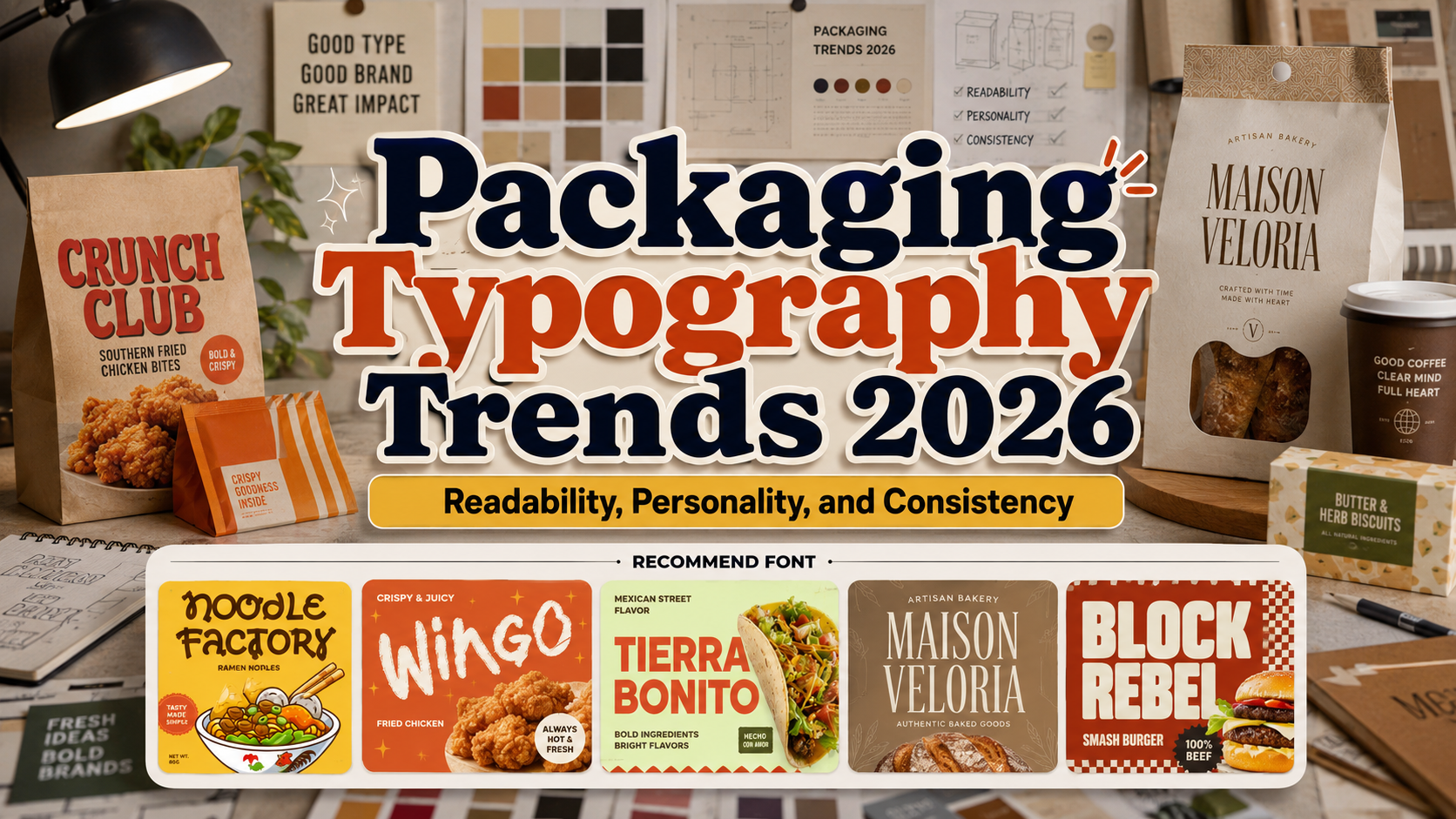
The best fonts for product packaging 2026 should attract attention without making the product difficult to understand. Use a distinctive display font for the brand name, product line, or flavor, then pair it with a simpler typeface for ingredients, quantities, instructions, and legal information.
Print the design at actual size and view it from shelf distance. A wordmark can look impressive on a monitor but fail when counters close, details disappear, or a long name no longer fits the label.
Why Typography Matters in 2026 Packaging
Packaging now has to perform on physical shelves and small ecommerce thumbnails. Current 2026 reports highlight typography-first layouts, tactile minimalism, character-led branding, and expressive color. The goal is not to follow every trend, but to choose typography that gives the product a recognizable voice across retail and digital channels.
Jump to Recommended Fonts
Noodle Factory | Wingo | Tierra Bonito | Maison Veloria | Burger Riot Bold
1. Noodle Factory Curly Food Font
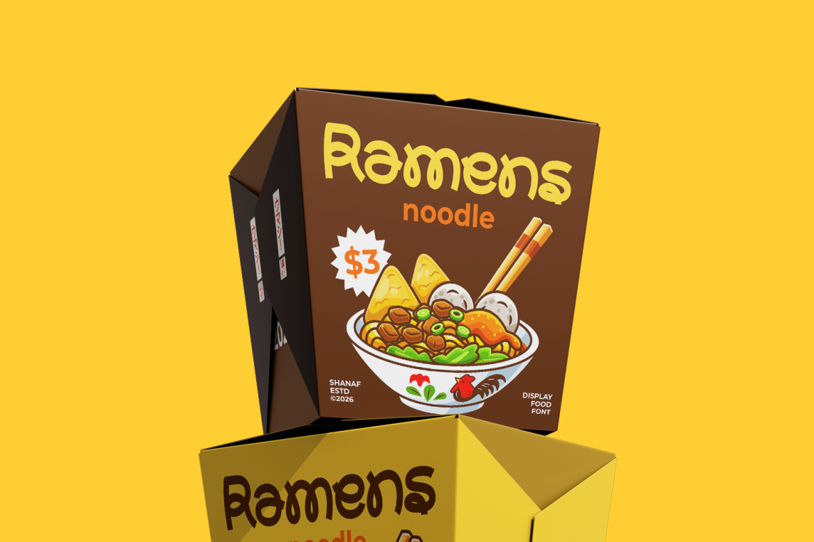
Noodle Factory uses flowing forms, rounded terminals, looping details, and irregular curves inspired by noodles. Its warm rhythm makes packaging feel friendly and flavorful while preserving clarity for prominent product names.
PROS: Distinctive food character, welcoming curves, strong logo personality.
BEST FOR: Noodles, ramen, sauces, snacks, cafés, and family-oriented packaging.
2. Wingo Food Font
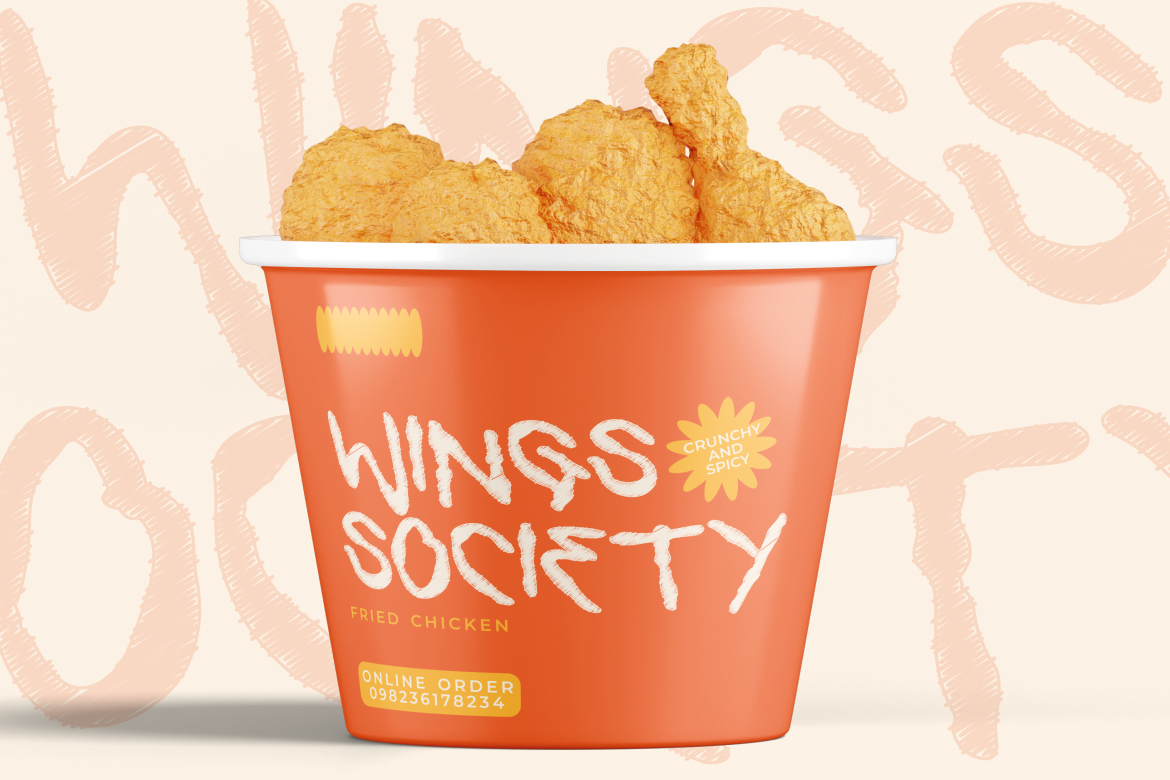
Wingo combines marker-inspired strokes with organic edges and energetic movement. Its medium-to-heavy construction gives street-food packaging a spontaneous personality that remains visible from a distance.
PROS: Energetic texture, bold visibility, handcrafted tone.
BEST FOR: Fried chicken, wings, burgers, barbecue, takeaway, and food festivals.
3. Tierra Bonito Mexican Food Font

Tierra Bonito uses thick geometric strokes, broad proportions, rounded counters, and compact spacing. It feels festive and contemporary, helping short product names stand out on colorful packaging.
PROS: Strong distance readability, friendly geometry, compact headlines.
BEST FOR: Mexican food, salsa, tacos, spicy snacks, restaurants, and market-style branding.
4. Maison Veloria Condensed Font
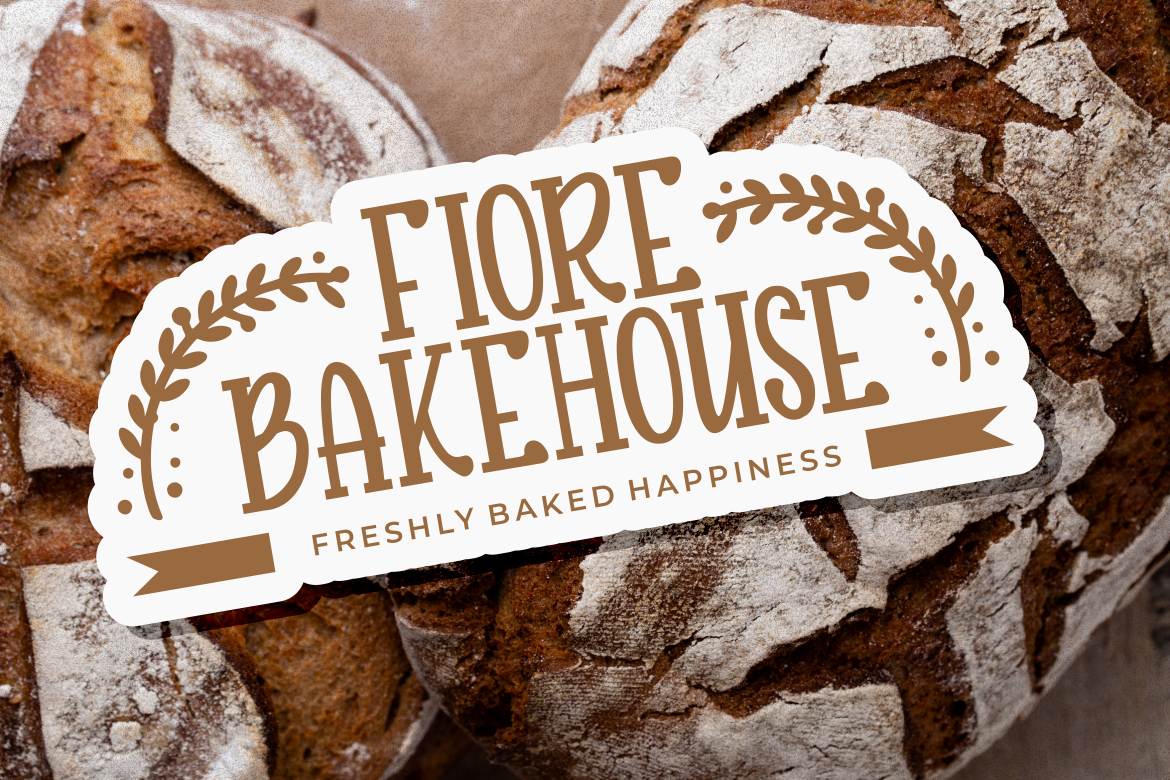
Maison Veloria features tall, narrow letterforms, smooth strokes, and subtle vintage warmth. Its condensed width helps longer names fit limited label space while creating a polished artisan identity.
PROS: Space-efficient, elegant, refined, and versatile.
BEST FOR: Bakeries, coffee, gourmet food, cosmetics, candles, and premium labels.
5. Burger Riot Bold Font
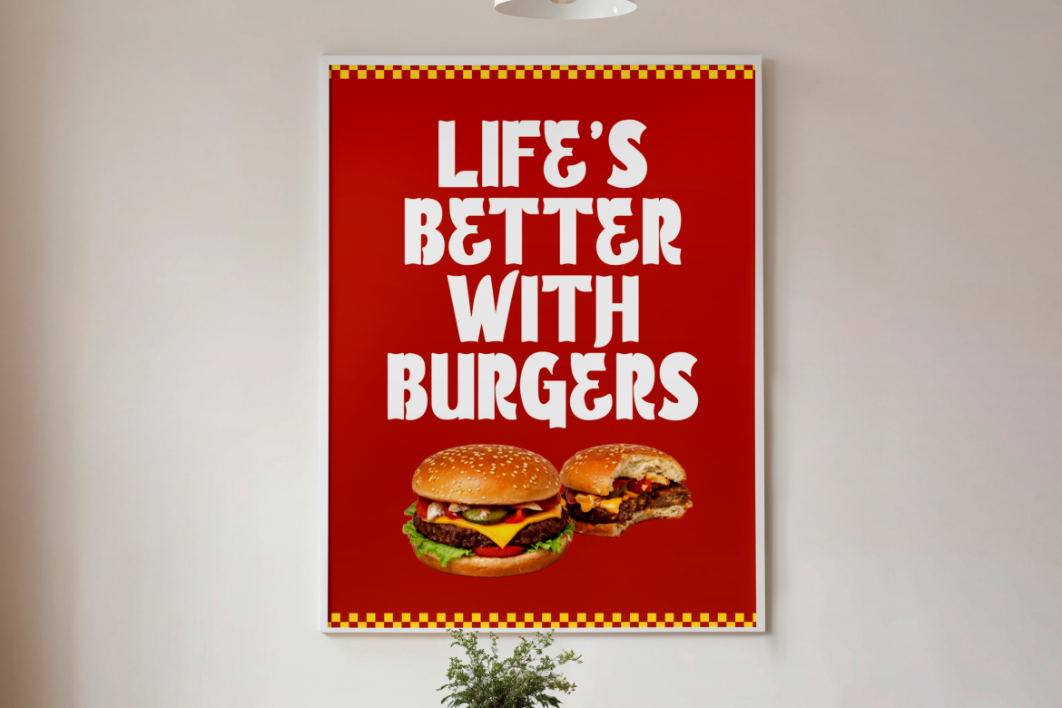
Burger Riot Bold uses heavy, tall letterforms and a strong vertical rhythm. Its solid silhouette creates immediate front-of-pack impact for brands competing on crowded shelves or in small online previews.
PROS: Powerful weight, clear silhouette, energetic presence.
BEST FOR: Burgers, snacks, street food, beverages, youth products, and bold retail packaging.
Practical Packaging Typography Tips
Keep the front panel focused on the brand, product name, variant, and one meaningful benefit. Build hierarchy through scale and spacing before adding outlines or shadows. Test the font on curved containers, matte surfaces, and small labels because production can change how the letterforms appear.
Use alternates selectively, and confirm that the license covers packaging quantity, logo use, advertising, and other commercial applications. PutraCetol’s current licensing system separates static packaging production from additional uses such as registered trademarks, webfont embedding, and digital advertising.
Comparison
| Font | Main Personality | Strongest Packaging Direction |
|---|---|---|
| Noodle Factory | Curly and handcrafted | Friendly food and beverage |
| Wingo | Raw and energetic | Street food and fast food |
| Tierra Bonito | Bold and festive | Mexican and spicy products |
| Maison Veloria | Refined and condensed | Artisan and premium goods |
| Burger Riot | Heavy and confident | High-impact FMCG branding |
Common Mistakes
The first mistake is choosing a display font only because it looks impressive in a large specimen. Packaging is viewed from a distance and reduced to ecommerce thumbnails, so test the real brand name, flavor, numerals, and punctuation at final size.
Another mistake is using the decorative font for every information layer. Ingredients, weights, instructions, and warnings should not compete with the product name. Let the display face build recognition and a functional companion protect readability.
The final mistake is combining typography, tactile finishes, mascots, and strong colors without one central idea. Select a dominant personality, use consistent rules across every SKU, and verify production requirements and licensing before launch.
Conclusion
The best fonts for product packaging 2026 balance recognition, readability, and emotional positioning. Noodle Factory creates handcrafted food charm, Wingo adds street-market energy, Tierra Bonito delivers festive geometry, Maison Veloria supports refined labels, and Burger Riot provides powerful shelf impact.
Use these PutraCetol Studio fonts where identity matters most, then support them with functional typography. Strong packaging helps customers recognize the brand, understand the product, and remember it after leaving the shelf.
Explore these fonts and many more at PutraCetol.com to build a business identity that looks professional, trustworthy, and memorable.
Additionally, if you want to explore some free typography options, you can check out Putracetol Studio on Dafont. Happy reading and designing!