
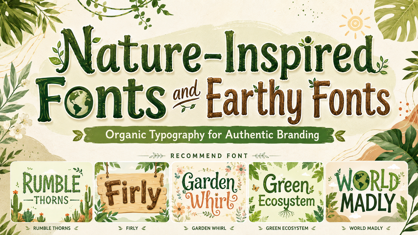
The strongest nature-inspired fonts and earthy fonts begin with a specific environment or material. A desert-inspired brand should not look identical to a botanical skincare company, a forest retreat, or an organic children’s product.
Begin by defining the natural world that belongs to the brand.
A cactus-inspired display font can communicate toughness, dry landscapes, and playful outdoor energy. Wooden typography may suggest craftsmanship, warmth, and durability. Floral letterforms can feel artistic and decorative, while root, leaf, and globe-inspired variations are useful for environmental campaigns with a broader ecological message.
A useful creative brief might describe the desired personality as:
- Wild, rugged, and adventurous
- Botanical, graceful, and handcrafted
- Warm, rustic, and family-friendly
- Playful, educational, and environmentally aware
- Calm, natural, and premium
This is more effective than requesting a design that merely “looks green.”
Nature-inspired branding becomes memorable when the typography, colors, materials, photography, and product story all reference the same ecosystem.
What Are Nature-Inspired Fonts?
Nature-inspired fonts are typefaces whose letterforms reference organic materials, living forms, landscapes, or natural movement.
They may be influenced by:
- Leaves and flowers
- Tree branches and roots
- Wood grain and carved timber
- Cactus thorns
- Stones and rough surfaces
- Vines and climbing plants
- Water and flowing curves
- Clouds and soft natural forms
- Earth, globes, and ecosystems
- Handcrafted outdoor signage
Some earthy fonts communicate nature through literal decorative elements, such as petals or leaves built into the characters. Others use irregular outlines, softened curves, rough textures, or carved shapes to create a more subtle organic impression.
These typefaces are normally designed for prominent display applications rather than continuous reading. They can bring immediate personality to a logo, package, book cover, poster, campaign headline, or product collection.
What Makes a Font Feel Earthy?
Organic Irregularity
Natural forms are rarely perfectly symmetrical. Earthy typography often introduces small variations in edges, proportions, curves, or stroke widths.
This irregularity can make the design feel handcrafted rather than mechanically generated. The effect should remain controlled enough for the words to be recognized quickly.
Tactile Texture
Wood grain, carved marks, rough outlines, and uneven ink can suggest physical materials.
Texture is useful for artisan products, sustainable fashion, food packaging, outdoor events, and independent creative brands. It can also give a digital design a more human presence.
Botanical Details
Petals, leaves, stems, roots, branches, and vines can be integrated into letterforms or used as alternates.
Botanical details are especially effective for florists, skincare, herbal products, garden businesses, wellness services, and seasonal campaigns.
Soft Natural Curves
Not every nature font needs rough edges. Flowing curves can suggest water, wind, plants, and growth.
These shapes work well for wellness, beauty, hospitality, and lifestyle brands that want a calmer relationship with nature.
Solid Material Forms
Chunky letters inspired by wood, rocks, logs, or carved signs can communicate durability and warmth.
This direction suits family brands, craft products, outdoor experiences, organic snacks, toys, and educational projects.
Why Earthy Typography Works in Branding
It Makes the Brand Story Visible
Typography can communicate the product’s atmosphere before the customer reads the full description.
A cactus-style font can suggest a desert garden, a bold outdoor event, or a playful plant shop. A wooden font may support a story about craftsmanship, natural materials, or family-friendly exploration.
This makes the font more than decoration. It becomes an early piece of the brand narrative.
It Creates an Alternative to Generic Eco Branding
Many environmentally positioned brands use similar combinations of green leaves, neutral sans serif typography, kraft paper, and beige photography.
Those elements can work, but they may also make unrelated businesses look interchangeable.
A more distinctive nature-inspired font can help the identity express a specific environment, product character, or customer experience. The brand can feel natural without repeating the same visual formula used throughout the category.
It Adds Warmth to Digital Design
Digital branding can sometimes feel overly polished and impersonal. Organic letterforms introduce irregularity, material references, and movement.
This is valuable for ecommerce, social media, digital magazines, creative communities, and websites that need to communicate a handmade or human-centered personality.
It Connects Packaging With the Product
Typography can reflect the expected texture or origin of a product.
A wooden display face may work naturally on craft snacks, toys, outdoor products, or rustic gifts. Floral typography can strengthen a botanical candle, herbal tea, or beauty collection. Root- and leaf-inspired styles can support environmental education and Earth Day campaigns.
The visual cue should match something real about the product rather than creating an unsupported impression.
Main Styles of Nature-Inspired Typography
Botanical Fonts
Botanical fonts integrate leaves, flowers, stems, or vines into the letterforms. They can feel whimsical, elegant, decorative, or vintage depending on their structure.
They work well for:
- Florists
- Botanical skincare
- Herbal products
- Wedding stationery
- Garden centers
- Tea packaging
- Wellness brands
- Seasonal campaigns
Use botanical typography for the logo or central headline, then support it with a clean serif or sans serif for practical information.
Wooden and Rustic Fonts
Wood-inspired fonts often use thick forms, carved details, irregular surfaces, or stable proportions.
They can express craftsmanship, play, adventure, durability, or traditional production.
Useful applications include:
- Handmade products
- Organic food
- Family brands
- Toys
- Outdoor activities
- Craft workshops
- Rustic hospitality
- Educational materials
Wooden typography can feel playful or premium depending on the surrounding design. Bright colors create a child-friendly identity, while dark green, cream, and natural photography can produce a more mature result.
Desert and Cactus Fonts
Desert-inspired typography uses spikes, thorns, rugged textures, and bold forms.
This direction is particularly effective for:
- Plant shops
- Succulent brands
- Outdoor festivals
- Western-inspired packaging
- Summer campaigns
- Gardening products
- Children’s books
- Desert travel branding
Cactus typography is naturally expressive, so it should be used in short titles rather than dense copy.
Environmental and Ecosystem Fonts
Environmental fonts may incorporate trees, roots, leaves, globes, branches, or other visual symbols associated with the planet.
They are especially useful for campaigns where the environmental subject should be immediately recognizable.
Possible applications include:
- Earth Day materials
- Environmental education
- Recycling campaigns
- Community gardens
- Children’s activities
- Sustainability reports
- Eco-conscious packaging
- Green events
The design should still explain the actual initiative. A nature-themed font can establish visual context, but it cannot prove environmental performance.
Flowing Organic Fonts
Fonts inspired by water, wind, vines, or plant growth often use continuous curves and gentle movement.
They can communicate calmness, restoration, softness, and natural rhythm.
This makes them suitable for:
- Wellness
- Spas
- Natural beauty
- Yoga
- Retreats
- Sustainable fashion
- Fragrance
- Lifestyle products
The strongest results usually combine flowing typography with generous space and restrained imagery.
How to Choose an Earthy Font for a Brand
Define the Natural Reference
Avoid mixing unrelated environmental references.
A desert identity does not automatically need leaves, waves, mountains, wood, and floral patterns at the same time.
Choose one dominant natural direction and one supporting influence.
For example:
- Cactus and dry earth
- Forest and carved timber
- Garden flowers and vines
- Water and smooth stone
- Roots and soil
- Tropical plants and warm sunlight
This creates a more coherent identity.
Match the Font to the Product Personality
A playful gardening brand and a premium botanical serum may both use nature-inspired typography, but they need different levels of decoration.
A children’s plant kit can use chunky letters with visible leaves and branches. A premium serum may require a quieter serif with one delicate botanical alternate.
The font should communicate the product’s price, audience, and emotional character as well as its environmental theme.
Test the Real Brand Name
Type the actual name before committing to a font.
Examine:
- Long and short words
- Repeated letters
- Decorative collisions
- Uppercase initials
- Numerals
- Punctuation
- Small internal spaces
- Performance in monochrome
Highly decorative letters may behave differently from the polished words used in a font specimen.
Assign a Supporting Typeface
Earthy display fonts usually need a functional companion.
A simple humanist sans serif can make playful nature fonts easier to use. A restrained serif may pair well with a wooden or botanical display face when the brand needs a more editorial tone.
Use the supporting font for:
- Product descriptions
- Ingredients
- Instructions
- Prices
- Dates
- Website navigation
- Buttons
- Long-form content
- Legal information
The display font brings atmosphere. The supporting font makes the brand usable.
Nature-Inspired Color Palettes
Forest and Parchment
Use deep forest green, warm parchment, charcoal, and muted gold.
This palette works for premium tea, botanical skincare, sustainable hospitality, and artisan food.
Desert and Clay
Combine terracotta, cactus green, warm cream, sand, and dark brown.
This direction supports plant shops, outdoor products, Western-inspired campaigns, and handmade lifestyle brands.
Garden and Bloom
Use leaf green, dusty pink, floral yellow, lavender, and soft white.
This palette is effective for florists, invitations, craft products, beauty, and spring campaigns.
Wood and Moss
Combine timber brown, moss green, beige, black, and a small warm orange accent.
Use it for organic snacks, outdoor brands, toys, coffee, workshops, and rustic packaging.
Water and Stone
Use mist blue, deep teal, warm grey, off-white, and charcoal.
This creates a calmer natural identity for wellness, spas, sustainable fashion, and personal-care products.
Applying Earthy Fonts Across Different Industries
Eco-Friendly Products
Nature-inspired typography can help reusable, refillable, recycled, or responsibly sourced products establish an immediate connection with environmental values.
However, the brand should explain the specific product improvement rather than depending on natural imagery alone. In U.S. marketing guidance, the FTC advises against broad, unqualified claims such as “green” or “eco-friendly” and recommends making environmental benefits clear and specific.
A font can create the right emotional context, but materials, sourcing, packaging, and verified claims must support that context.
Wellness and Natural Beauty
Wellness brands can use flowing botanical typography to communicate calmness and care.
Pair decorative headlines with soft photography, simple information hierarchy, and enough space around the product. Avoid making ingredient details or usage instructions overly delicate.
A natural visual identity should make the experience feel clearer, not less readable.
Sustainable Fashion
Earthy fonts offer an alternative to the minimal sans serif identities common in fashion.
A handcrafted wooden font can support an outdoor or workwear collection. Floral lettering can give a limited capsule a more artistic direction, while root- or branch-inspired typography can strengthen a campaign about material origins.
Keep the base fashion identity consistent and use the nature-inspired font for collection names, campaign titles, or selected packaging moments.
Organic Food and Beverage
Typography can make natural ingredients, regional production, and handcrafted processes easier to communicate visually.
Wooden and rustic fonts work well for coffee, bread, granola, snacks, sauces, and farm products. Floral or garden fonts can suit tea, honey, botanical drinks, and seasonal foods.
The package should still prioritize product name, flavor, weight, and ingredients. Decorative typography should not make customers search for essential information.
Art and Creative Communities
Nature-inspired display fonts can become almost illustrative in posters, books, installations, workshops, and community events.
Artists can enlarge, crop, layer, or repeat the letterforms to create patterns and visual textures.
The typeface can also inspire supporting elements such as carved borders, root-like lines, floral frames, or abstract landscapes.
Using Earthy Fonts in Digital Design
Display fonts should be used selectively on websites and social media.
They are effective for:
- Homepage hero titles
- Campaign landing pages
- Product names
- Social media covers
- Event announcements
- Editorial introductions
- Seasonal promotions
Use live, readable text for body content and essential information whenever possible.
For digital text, WCAG 2.2 recommends contrast of at least 4.5:1 for normal text and 3:1 for qualifying large text. W3C also notes that unusual or thin letterforms can appear fainter in practice, so stronger contrast may be appropriate.
Natural color palettes often contain muted greens, browns, creams, and greys. Test them carefully because an earthy palette can still produce low-contrast content.
Build a Complete Earthy Brand System
A strong natural identity should define more than the logo.
Document:
- Primary display font
- Supporting typeface
- Font sizes and hierarchy
- Natural color palette
- Texture rules
- Photography direction
- Illustration style
- Packaging materials
- Icon shapes
- Social media templates
- Website use
- Monochrome alternatives
For example, a botanical tea brand might use a floral display font for product names, a readable serif for descriptions, deep green and cream as the main colors, and close-up photography of real ingredients.
A family gardening brand could use a playful ecosystem font, a rounded sans serif, brighter colors, simple plant illustrations, and activity-based photography.
The font becomes more powerful when it belongs to a repeatable system.
Jump to Recommended Fonts
Rumble Thorns | Firly | Garden Whirl | Green Ecosystem | World Madly
1. Rumble Thorns Cactus Style Display Font
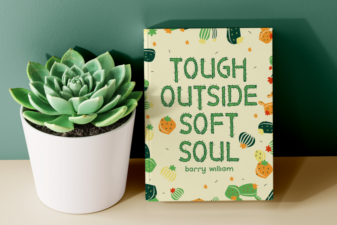
Rumble Thorns turns cactus thorns into a playful display language through sharp spikes, bold strokes, and visible hand-drawn texture. Its balance of rugged details and whimsical proportions gives desert-themed branding strong personality without making the words feel purely aggressive. The font is particularly useful for short titles, packaging names, posters, and campaigns that need an immediate outdoor or plant-focused identity.
PROS: Distinctive cactus details, bold headline visibility, handcrafted texture, playful ruggedness, and strong thematic recognition.
BEST FOR: Plant shops, succulent products, desert events, gardening brands, children’s books, summer campaigns, Western-inspired packaging, and outdoor merchandise.
2. Firly Wooden Font

Firly is a playful wooden display font built from chunky, stable characters with rounded edges and subtle irregular details that suggest carved timber. Its slightly tall proportions give headlines presence, while the softened structure keeps the font approachable for family, children’s, and food-related design. The combination of warmth, clarity, and natural material inspiration makes it useful for brands that need an earthy personality without heavy distressing.
PROS: Warm wooden character, strong headline readability, approachable rounded edges, organic details, and family-friendly appeal.
BEST FOR: Organic snacks, toys, learning materials, craft businesses, family brands, book covers, outdoor activities, stickers, and rustic product packaging.
3. Garden Whirl Display Font

Garden Whirl incorporates floral shapes, petals, and blooms directly into its curves and edges, creating typography that feels both decorative and organic. Its irregular but coordinated forms can add a handcrafted garden atmosphere to logos, invitations, packaging, and editorial titles. The font works especially well when the brand needs visible botanical storytelling rather than a subtle natural reference.
PROS: Integrated floral motifs, artistic letterforms, strong decorative value, playful vintage character, and memorable botanical detail.
BEST FOR: Florists, botanical beauty, wedding stationery, tea packaging, garden events, greeting cards, magazines, book covers, and seasonal campaigns.
4. Green Ecosystem Quirky Nature Theme Font
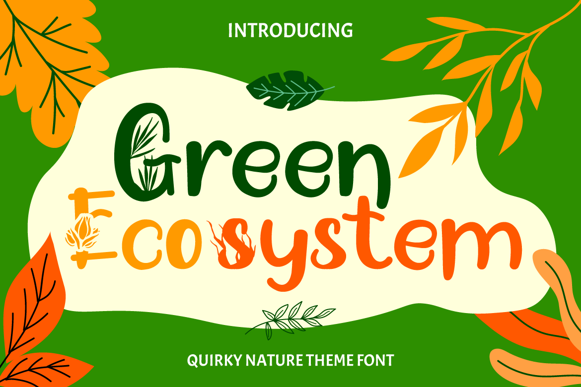
Green Ecosystem is a playful nature-themed family inspired by leaves, trees, flowers, branches, and roots. Its bouncy thin-to-thick construction is supplied in six variations, allowing designers to create related typography across packaging, invitations, children’s materials, and environmental campaigns without repeating one identical treatment. This flexibility makes it particularly valuable for broader identity systems built around growth, nature education, and creative ecology.
PROS: Six coordinated variations, broad environmental vocabulary, playful rhythm, natural storytelling, and flexible campaign use.
BEST FOR: Environmental education, children’s brands, community gardens, eco events, craft projects, invitations, stickers, playful packaging, and nature-focused logos.
5. World Madly Display Font
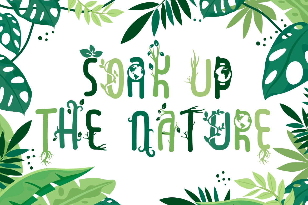
World Madly uses rounded, condensed letterforms and an environmental theme to create a cheerful visual identity. Its ten styles reference elements such as branches, globes, leaves, roots, vines, and trees, giving designers an unusually broad set of related options for Earth-centered communication. The family is especially useful when one campaign needs several themed titles while maintaining a consistent overall personality.
PROS: Ten coordinated styles, rounded readability, extensive nature motifs, high campaign flexibility, and strong Earth-focused recognition.
BEST FOR: Earth Day campaigns, sustainability events, environmental education, children’s publishing, green initiatives, posters, clothing, stickers, packaging, and community activities.
Comparison
| Font | Natural Inspiration | Main Personality | Strongest Branding Role | Ideal Sector |
|---|---|---|---|---|
| Rumble Thorns | Cactus and desert thorns | Rugged, playful, and bold | Desert-themed logos and campaign headlines | Gardening, outdoor, kids, and summer brands |
| Firly | Carved wood and timber | Warm, solid, and approachable | Family-friendly logos and packaging | Food, crafts, toys, and education |
| Garden Whirl | Flowers and garden blooms | Decorative, artistic, and whimsical | Botanical product names and invitations | Beauty, weddings, tea, and florists |
| Green Ecosystem | Leaves, roots, branches, and trees | Bouncy, creative, and educational | Flexible nature-themed identity systems | Kids, ecology, crafting, and community projects |
| World Madly | Earth, globes, leaves, vines, and roots | Cheerful, condensed, and environmentally focused | Multi-style campaign typography | Earth Day, education, events, and green initiatives |
Common Mistakes
The first mistake is treating every natural brand as if it needs green leaves, kraft paper, and the same rustic color palette. This approach may communicate the general category, but it does little to distinguish a desert plant shop from a botanical skincare company, sustainable fashion label, organic snack brand, or environmental education program. Define the specific ecosystem, material, and emotional tone first. A cactus font should support a different visual world from a floral or wooden typeface.
Another mistake is using decorative earthy fonts for every piece of information. Leaves, branches, thorns, petals, and wooden details can make a logo or package highly memorable, but they may reduce clarity in ingredients, navigation, product instructions, prices, dates, and long descriptions. Assign the nature-inspired font to major identity moments and use a simpler companion for functional text. Test the composition at its real size because fine floral details can disappear, thorn-like forms may merge, and carved textures can fill during printing or embroidery.
The final mistake is using natural typography as proof that a product is sustainable. A green color palette, botanical illustration, or environmentally themed font can create an emotional association, but it does not verify the product’s materials, production, packaging, or environmental impact. Keep claims specific and supportable, explain what has actually improved, and let the typography reinforce those facts. Before production, also confirm that the chosen font coverage matches the intended logo, packaging, website, advertising, merchandise, or other commercial application.
Conclusion
The best nature-inspired fonts and earthy fonts bring a specific part of the natural world into the brand identity.
Rumble Thorns communicates desert energy through cactus-inspired spikes. Firly translates carved wood into a warm and approachable display style, while Garden Whirl turns petals and floral shapes into decorative typography. Green Ecosystem provides six playful variations based on leaves, trees, branches, flowers, and roots. World Madly expands the idea further through ten coordinated Earth- and plant-inspired styles.
Choose the font according to the product, audience, and natural reference rather than relying on a generic eco aesthetic. Give the display face one focused role, pair it with readable supporting typography, and connect it with a coherent palette, material direction, imagery style, and brand story.
Fonts from PutraCetol Studio can help eco-friendly businesses, wellness brands, sustainable fashion labels, organic food companies, and creative communities build visual identities that feel more authentic and memorable.
When the typography reflects something real about the product or experience, nature becomes more than a decorative theme. It becomes part of how the audience understands and remembers the brand.
Explore these fonts and many more at PutraCetol.com to build a business identity that looks professional, trustworthy, and memorable.
Additionally, if you want to explore some free typography options, you can check out Putracetol Studio on Dafont. Happy reading and designing!