
Museums are more than places where objects are displayed. They are spaces of storytelling, education, and cultural preservation. Every visual element inside a museum, from exhibition panels to wayfinding signage, plays a role in shaping how visitors experience and understand the content. Among these elements, typography is one of the most influential.
Choosing the right fonts for museum design is not just a matter of aesthetics. Typography affects readability, atmosphere, emotional tone, and even how credible and authoritative an exhibition feels. Well-chosen fonts help guide visitors smoothly through galleries, provide clarity for informational text, and reinforce the museum’s identity.
This article explores recommended fonts for museum design, focusing on how typography can balance historical character, artistic expression, and modern usability. Drawing inspiration from curated font selections at Putracetol.com, we will look at font styles that work particularly well in exhibition spaces and explain why they are effective.
Why Typography Matters in Museum Design
Museums serve a wide and diverse audience. Visitors vary in age, background, and familiarity with the subject matter. Typography must therefore support clarity and accessibility while also respecting the cultural and historical context of the exhibition.
Strong museum typography helps to:
- Improve readability from various distances
- Create a calm and respectful atmosphere
- Support learning and comprehension
- Strengthen institutional identity
Typography becomes a silent guide, helping visitors navigate information without distraction.
The Role of Typography in Exhibition Experience
Typography influences how visitors move through a museum and how long they engage with displays.
In exhibition design, typography is used for:
- Wall texts and object labels
- Section titles and headlines
- Directional signage and wayfinding
- Promotional materials and posters
Each of these applications requires fonts that are not only visually appropriate but also highly legible and consistent.
Key Considerations When Choosing Fonts for Museums
Before exploring specific font recommendations, it is important to understand the principles that guide typographic decisions in museum environments.
Readability at Multiple Distances
Museum text is often read from different distances. Visitors may read wall titles from several meters away and object descriptions from close range.
Fonts should:
- Remain clear at both large and small sizes
- Have distinct letterforms
- Avoid overly thin strokes
This ensures information remains accessible without straining the eyes.
Respect for Historical and Cultural Context
Many museums deal with historical artifacts and cultural heritage. Typography should complement, not overshadow, the subject matter.
Fonts that reference historical styles can:
- Reinforce authenticity
- Create emotional connection
- Support storytelling
However, they must still feel balanced and readable in modern contexts.
Visual Consistency Across Spaces
Museums often consist of multiple galleries and exhibition themes. Typography should unify these spaces through consistent font usage and hierarchy.
Consistency:
- Enhances professionalism
- Builds institutional identity
- Improves navigation
A clear typographic system is essential for large exhibition spaces.
Recommended Fonts for Museum Design from Putracetol.com
Putracetol.com offers a variety of fonts that suit museum environments. The following recommendations balance classic aesthetics, modern clarity, and artistic expression.
Stencil Fonts

Stencil fonts are inspired by industrial markings and street art. In museum design, they are often used selectively for emphasis.
Why Stencil Works in Museums
Stencil fonts:
- Add an artistic and expressive touch
- Create strong visual impact
- Work well for headlines and section titles
They are particularly effective in:
- Contemporary art museums
- Temporary exhibitions
- Interactive or experimental galleries
Used sparingly, stencil typography adds character without overwhelming the exhibition.
Slab Serif Fonts
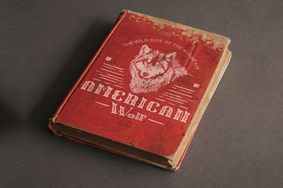
Slab serif fonts have thick, block-like serifs and were widely used in the 19th century. They are known for their strong presence and high legibility.
Benefits of Slab Serif in Museum Design
Slab serif fonts:
- Are easy to read from a distance
- Feel sturdy and authoritative
- Evoke vintage and historical aesthetics
They are ideal for:
- Posters and billboards
- Exhibition titles
- Educational panels
Their visual weight helps anchor text in large spaces.
Virtus Verona
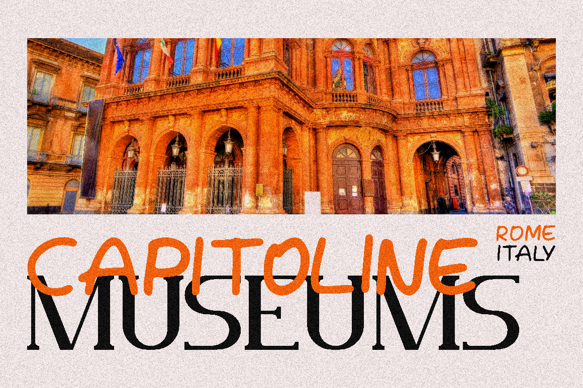
Virtus Verona is a classic font inspired by 18th-century typography. It reflects elegance, tradition, and refinement.
Why Virtus Verona Is Ideal for Museums
Virtus Verona:
- Evokes historical authenticity
- Feels formal and timeless
- Works well for official applications
It is particularly suitable for:
- Museum logos
- Permanent exhibition titles
- Institutional branding
This font reinforces credibility and cultural depth.
Votrag

Votrag is a modern sans serif font inspired by contemporary museum design approaches, including institutions like design museums.
Advantages of Votrag in Exhibition Spaces
Votrag:
- Offers clean and modern letterforms
- Maintains excellent readability
- Balances tradition with contemporary design
It is well suited for:
- Informational text
- Modern exhibitions
- Wayfinding systems
Votrag ensures clarity without appearing sterile or generic.
Combining Fonts in Museum Design
Museum typography often benefits from combining different font styles to create hierarchy and contrast.
A common approach is:
- Use a classic or serif font for titles and branding
- Apply a modern sans serif font for body text
- Introduce expressive fonts like stencil for accents
This combination allows museums to respect tradition while remaining accessible and engaging.
Typography and Storytelling in Museums
Museums are storytellers. Typography supports narrative flow by guiding visitors through information in a structured and intuitive way.
Good typographic storytelling:
- Breaks content into manageable sections
- Uses hierarchy to highlight key messages
- Maintains a calm reading rhythm
Fonts should support the narrative, not distract from it.
Typography for Wayfinding and Signage
Clear navigation is essential in museum environments. Typography must be legible, consistent, and intuitive.
Effective wayfinding fonts:
- Have simple shapes
- Use clear spacing
- Remain readable at a glance
Sans serif fonts like Votrag perform well in these contexts.
Accessibility in Museum Typography
Museums serve diverse audiences, including children, elderly visitors, and people with visual impairments. Typography should be inclusive.
Accessibility considerations include:
- Adequate font size
- High contrast between text and background
- Avoiding overly decorative fonts for body text
Accessible typography ensures that information is available to everyone.
Digital and Interactive Displays
Modern museums increasingly use digital screens and interactive displays. Typography must adapt to these formats.
Fonts used on screens should:
- Render well at different resolutions
- Maintain clarity under various lighting conditions
- Support touch-based interaction
Modern sans serif fonts are often the best choice for digital exhibits.
Museum Branding and Typography
Typography also plays a major role in a museum’s brand identity beyond exhibition spaces.
Consistent font usage across:
- Websites
- Printed materials
- Social media
- Signage
Helps build a recognizable and trusted institutional image.
Why Putracetol.com Is a Strong Resource for Museum Fonts
Putracetol.com curates fonts that are not only visually appealing but also practical for professional environments like museums. The fonts are designed with balance, readability, and character in mind.
Designers benefit from:
- Diverse font styles
- High-quality craftsmanship
- Fonts suitable for both print and digital use
This makes it easier to create cohesive and meaningful museum typography systems.
Common Typography Mistakes in Museum Design
To avoid undermining the visitor experience, designers should be careful of common mistakes such as:
- Using overly decorative fonts for long texts
- Inconsistent font usage across galleries
- Poor contrast between text and background
Awareness of these issues helps maintain clarity and professionalism.
Conclusion
Choosing the right museum design fonts is essential for creating exhibition spaces that are engaging, readable, and culturally appropriate. Typography shapes how visitors perceive information, navigate spaces, and connect emotionally with content.
The font recommendations from Putracetol.com, including Stencil, Slab Serif, Virtus Verona, and Votrag, offer a balanced mix of classic heritage, artistic expression, and modern clarity. Together, these fonts allow designers to craft museum identities that feel authentic, elegant, and accessible.
When typography is chosen thoughtfully, it becomes an invisible guide that enhances learning, storytelling, and overall visitor experience. In museum design, good typography is not decoration. It is a fundamental part of communication.
Thank you for taking the time to read this article. If you are looking for more great articles, feel free to visit Putracetol Blog
Additionally, if you want to explore some free typography options, you can check out Putracetol Studio on Dafont. Happy reading and designing!