
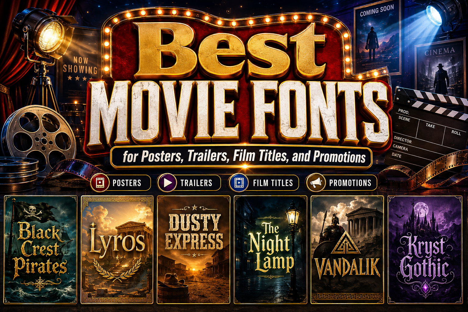
The strongest movie fonts are chosen according to the story’s emotional promise, not simply because they look dramatic. Before comparing typefaces, identify what viewers should expect from the film.
A pirate adventure might promise danger, mystery, and exploration. A Greek epic may need monumentality, heroism, and historical weight. A supernatural thriller could require unease and psychological tension, while a gritty road film might benefit from worn, industrial typography.
Write three words that define the film’s atmosphere. These might include ancient, unsettling, rebellious, elegant, brutal, mysterious, romantic, or futuristic. The chosen typeface should communicate those qualities through its proportions, weight, contrast, texture, spacing, and letter construction.
Typography becomes one of the audience’s earliest encounters with a film. It appears in announcement graphics, teaser posters, trailers, festival listings, streaming thumbnails, merchandise, social posts, and the opening title sequence. A successful title design should therefore establish a recognizable visual identity before viewers know every detail of the story.
Why Movie Typography Matters
Film typography does more than display a title. It helps frame how the audience interprets the project.
Tall carved letters may suggest mythology or historical scale. Distressed slab serifs can communicate conflict, labor, age, or survival. Blackletter typography may evoke medieval history, dark fantasy, rebellion, or Gothic horror. Clean geometric forms can support science fiction, while graceful high-contrast serifs often fit prestige drama, romance, or period stories.
The font also influences the perceived production style. A carefully composed wordmark can make a small independent film feel deliberate and professionally positioned. A poorly matched typeface can make an otherwise serious story look generic, misleading, or unintentionally humorous.
The objective is not to reveal the entire plot through typography. It is to establish the correct emotional doorway into the story.
Match the Font to the Film Genre
Action and Adventure
Action titles usually need immediate visibility and a strong silhouette. Bold condensed lettering, angular cuts, forward slants, and substantial weights can communicate momentum and physical intensity.
An adventure film may introduce more historical or thematic detail. Pirate stories can use controlled blackletter forms, while exploration films might incorporate rugged texture, carved details, or badge-like compositions.
Avoid relying entirely on explosions, metallic effects, or speed lines. The wordmark should still feel powerful when shown in one color.
Historical Epics and Mythological Films
Historical and mythological titles often benefit from monumental proportions, classical serifs, carved forms, and disciplined spacing. The typography should suggest scale, heritage, and authority without becoming a theatrical imitation of an ancient inscription.
A clean Greek-inspired display font can work for a serious historical drama, while a more symbolic or runic interpretation may be appropriate for mythic fantasy. The difference depends on whether the film presents history, legend, or a fictional world influenced by antiquity.
Horror and Thriller
Horror typography can use sharp terminals, unstable shapes, distressed surfaces, Gothic structures, or unusual spacing to create tension. The treatment should correspond to the type of fear in the story.
A supernatural period film may need ornate Gothic lettering. A psychological thriller could use cleaner typography with subtle distortion. A slasher film may benefit from rough, direct forms, while folk horror can combine historical construction with organic or ritualistic details.
The most frightening title is not necessarily the most damaged or illegible one. Controlled discomfort is usually more effective than visual chaos.
Science Fiction
Science-fiction films often use geometric sans serifs, extended letterforms, modular construction, digital cuts, or unusual spacing. These features can suggest advanced technology, artificial intelligence, space travel, or unfamiliar civilizations.
The visual direction should reflect the world of the film. A clinical AI drama may require restrained precision, while a cyberpunk story can use more aggressive mechanical details. A retro-futuristic project may draw from older technological lettering rather than contemporary minimalism.
Romance and Prestige Drama
Romance, biography, and prestige drama frequently use elegant serifs, restrained scripts, or minimal sans serif typography. These styles can communicate intimacy, literary depth, refinement, or emotional seriousness.
Typography should remain sensitive to the tone. A romantic comedy can feel lighter and more spontaneous, while a tragic period romance may need greater formality and contrast.
Comedy, Animation, and Family Films
Rounded letters, irregular baselines, exaggerated proportions, and colorful display typography can support humor and accessibility. The design should feel expressive without appearing careless.
A family film title also needs to work for adults who select tickets, streaming content, or merchandise. Playfulness and professional composition should exist together.
Build a Complete Film Title System
A movie identity needs more than one attractive title treatment. It should function as a coordinated system across promotional formats.
Create a Primary Title Lockup
The primary lockup combines the title’s typography, spacing, scale, and any essential symbol or visual treatment. It should work on the main poster and establish the definitive identity of the film.
Test the actual title rather than evaluating the typeface from its alphabet specimen. Repeated letters, long words, punctuation, and narrow characters can significantly affect the final composition.
Prepare Responsive Variations
A wide theatrical poster, vertical social story, streaming thumbnail, trailer end card, and merchandise print do not offer the same space.
Prepare horizontal, stacked, compact, and monochrome versions. A long title may require a two-line composition, while a simplified monogram or recognizable initial can support profile images and small promotional placements.
Separate the Title From Functional Typography
The movie font should usually handle the title, major campaign phrase, or selected section headings. Release dates, cast names, subtitles, legal information, ticket details, and platform labels need a more functional companion font.
This contrast allows the title to remain distinctive while keeping essential information easy to scan.
Develop a Consistent Motion Language
In a trailer or title sequence, the font can fade, fragment, expand, emerge from texture, or move through space. Motion should extend the title’s personality rather than act as an unrelated effect.
A mythological title might appear as if carved from stone. A thriller title could be revealed through unstable light. A rugged action title might emerge from smoke, dust, or worn surfaces.
The static title should still work without animation. Motion enhances the identity, but it should not be responsible for making the title readable.
Design Movie Posters for Both Distance and Thumbnail Viewing
Traditional film posters may be viewed across a theater lobby, while digital artwork is often encountered as a small thumbnail. The title must perform in both conditions.
Test the artwork at full poster size and at approximately the size it would appear on a streaming interface. Check whether the title remains recognizable over photography, whether important counters stay open, and whether thin strokes disappear.
A title can use texture, glow, outline, or shadow to separate itself from the image, but these effects should be controlled. Strengthen the contrast between the title and the background before adding several decorative layers.
Film campaigns should also account for translated or localized titles. Another language may require more characters or different proportions. Build enough flexibility into the title architecture to prevent localized versions from looking compressed or secondary.
Use Texture and Effects With Restraint
Movie typography frequently uses metallic surfaces, smoke, fire, stone, blood, grain, erosion, glow, or three-dimensional depth. These effects can strengthen the atmosphere when they support the story.
Begin with the title in plain black and white. Correct the spacing, line arrangement, scale, and hierarchy first. Once the basic wordmark is strong, introduce texture or dimensional effects selectively.
A rough action title might need a worn surface but not flames, sparks, smoke, bevels, and a metallic gradient simultaneously. A Gothic film title may need ornamental letterforms but not several additional borders and symbols.
The underlying typography should remain recognizable when effects are removed.
Connect the Film Title With the Wider Campaign
The film’s typography should appear consistently across theatrical posters, trailers, festival materials, press kits, websites, soundtrack artwork, merchandise, and social promotions.
Consistency does not require repeating the exact same layout. The campaign can use cropped letters, initials, textures, or supporting type while preserving the main title’s recognizable features.
For example, a pirate adventure could reuse the pointed serifs and dark engraved texture of its wordmark across character posters. A Greek epic might extend its angular geometry into borders and chapter cards. A horror campaign could use the title’s irregular rhythm in teaser messages without showing the complete logo every time.
This creates a visual world around the film rather than a single isolated poster.
Jump to Recommended Fonts
Black Crest Pirates Font | Lyros Greek Font | Dusty Express Rough Texture Font | The Night Lamp | Vandalik 2 Type Greek Font | Kryst Gothic Font
1. Black Crest Pirates Font

Black Crest Pirates is a bold blackletter display typeface built around tall, slightly condensed forms, sharp curves, pointed serifs, and dramatic thick-to-thin contrast. Its combination of angular cuts and controlled curves creates an old-world atmosphere without sacrificing the power needed for a modern cinematic title. The design can immediately suggest dangerous voyages, hidden kingdoms, cursed treasures, or dark historical adventure.
PROS: Strong pirate identity, dramatic blackletter construction, commanding title presence, and effective historical atmosphere.
BEST FOR: Pirate adventures, maritime fantasy, medieval films, dark historical dramas, mystery posters, book adaptations, and themed entertainment.
2. Lyros Greek Font
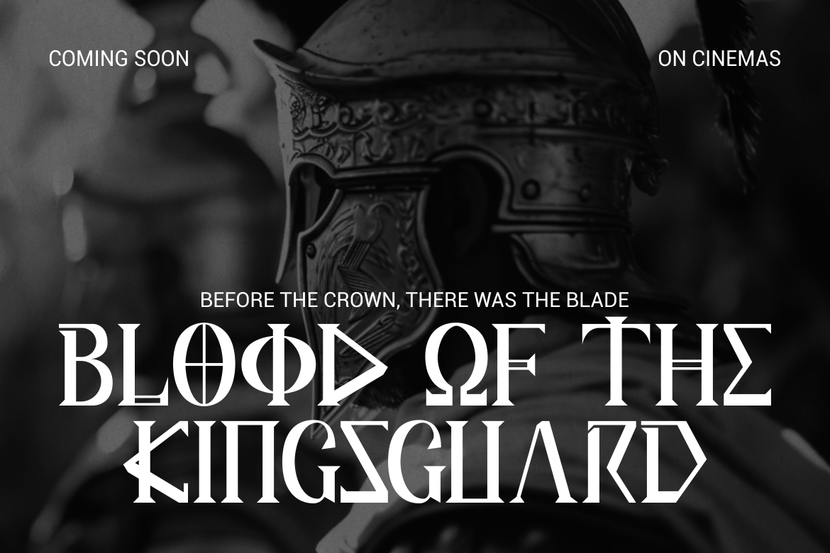
Lyros takes inspiration from classical Greek forms and stone-carved typography, using tall proportions, strong vertical emphasis, sharp angles, and carefully cut terminals. Its clean geometry gives titles a monumental and authoritative quality, while the controlled weight preserves clarity in large poster compositions. The font is especially useful when a film needs to communicate heroism, ancient civilization, political power, or epic scale without looking excessively ornamental.
PROS: Monumental silhouette, disciplined geometry, strong historical association, and clear cinematic readability.
BEST FOR: Greek epics, historical dramas, mythology, archaeological adventures, war films, prestige documentaries, and ancient-world exhibitions.
3. Dusty Express Rough Texture Font

Dusty Express combines a wide, heavy slab-serif structure with sturdy proportions, pronounced terminals, and an authentically worn surface. Its distressed treatment introduces age and physical texture while keeping the underlying letters clear and forceful. This balance makes it valuable for film titles that need to feel rugged, industrial, handcrafted, or connected to difficult landscapes and working-class environments.
PROS: Strong slab construction, readable distressed texture, bold silhouette, and convincing heritage character.
BEST FOR: Westerns, road movies, survival stories, crime dramas, industrial documentaries, rural narratives, action films, and music-related cinema.
4. The Night Lamp
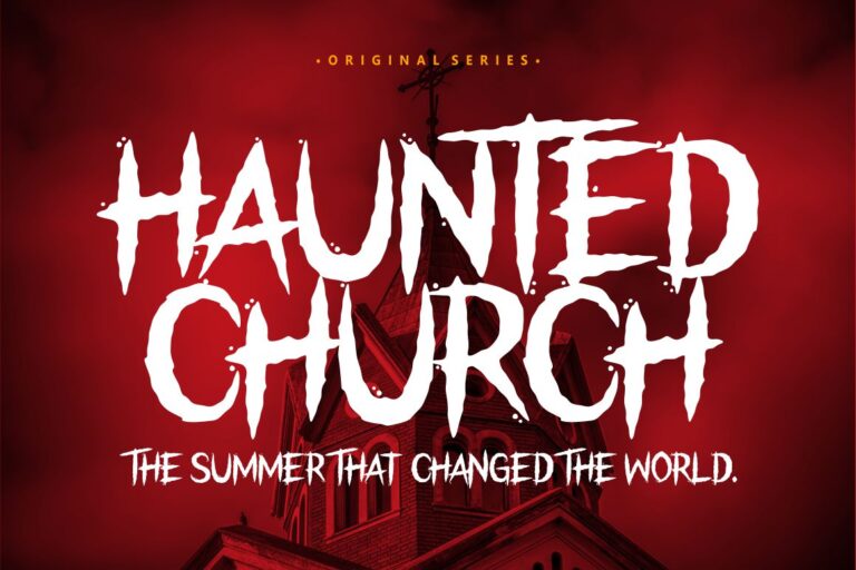
The Night Lamp is a horror display font developed specifically for frightening, suspenseful, and thriller-oriented projects. Its dark visual language gives titles an immediate connection to Halloween, supernatural storytelling, and unsettling cinematic themes, while its complete character support makes it useful across posters, covers, promotional phrases, and digital campaigns. It is a practical choice when a production needs recognizable horror character without building the entire title from custom illustration.
PROS: Immediate horror atmosphere, strong thematic focus, uppercase and lowercase support, and versatile promotional use.
BEST FOR: Supernatural horror, haunted-house stories, thrillers, Halloween films, dark comics, slasher campaigns, and suspense posters.
5. Vandalik 2 Type Greek Font

Vandalik combines narrow vertical forms, triangular details, sharp angled cuts, straight bars, and runic-like curves influenced by Greek visual traditions. Compared with a more formal classical typeface, it feels symbolic, handcrafted, and myth-driven, making it especially useful for stories that blur history and fantasy. Its distinctive forms can turn a short film title into a strong emblem while preserving a consistent rhythm across large display text.
PROS: Mythic personality, memorable geometric construction, symbolic details, and strong thematic differentiation.
BEST FOR: Mythological fantasy, legendary heroes, ancient mysteries, role-playing adaptations, historical fiction, fantasy posters, and cultural documentaries.
6. Kryst Gothic Font
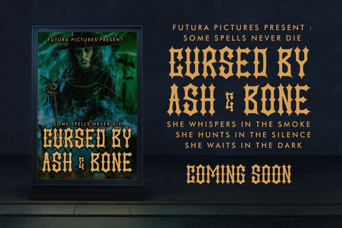
Kryst Gothic uses tall, narrow forms, firm stroke contrast, pointed terminals, angular cuts, and tight spacing to create an intense blackletter rhythm. Its medium-to-bold weight gives titles substantial presence while retaining enough definition for large display applications. The typeface feels raw, rebellious, and uncompromising, making it effective for films built around darkness, occult themes, underground culture, or Gothic emotion.
PROS: Sharp Gothic structure, powerful vertical rhythm, dark emotional intensity, and strong wordmark potential.
BEST FOR: Gothic horror, dark fantasy, occult thrillers, metal documentaries, underground cinema, vampire stories, and psychological campaigns.
Comparison
| Font | Visual Personality | Strongest Film Genre | Best Application |
|---|---|---|---|
| Black Crest Pirates | Mysterious, historical, and adventurous | Pirate and medieval adventure | Film logos, posters, and fantasy campaigns |
| Lyros | Monumental, heroic, and disciplined | Historical epic and mythology | Main titles, theatrical posters, and chapter cards |
| Dusty Express | Rugged, aged, and industrial | Western, action, and road drama | Posters, festival artwork, and merchandise |
| The Night Lamp | Frightening, theatrical, and suspenseful | Horror and thriller | Teaser posters, trailer cards, and Halloween campaigns |
| Vandalik | Mythic, symbolic, and unconventional | Ancient fantasy and legend | Emblem-style titles and fantasy promotions |
| Kryst Gothic | Dark, rebellious, and intense | Gothic horror and dark fantasy | Wordmarks, album-film crossovers, and underground campaigns |
Common Mistakes When Choosing Movie Fonts
The first mistake is choosing typography from a generic idea of the genre rather than the specific story. Not every horror film needs dripping letters, and not every historical drama needs Roman-style capitals. A quiet psychological thriller may require restrained typography, while a supernatural period film can support more elaborate Gothic detail. Begin with the narrative, setting, audience, and emotional conflict. The genre should narrow the direction, but the story should make the final decision.
Another common mistake is adding cinematic effects before solving the typography itself. Metallic gradients, smoke, blood, stone textures, glow, shadows, and dimensional bevels can make a title look dramatic in a large mockup while hiding weak spacing or unclear characters. Build the title in one color first, adjust the kerning and line arrangement, and test it at poster and thumbnail sizes. Add only the effects that improve atmosphere or separation from the background. A strong title should remain recognizable when converted to monochrome.
The final mistake is treating the film title as an isolated poster element. The typography must also function in trailers, press kits, streaming platforms, festival programs, social graphics, subtitles, merchandise, and localized campaigns. Prepare responsive versions early, select a readable supporting typeface, and test the design over different images and aspect ratios. Before commercial release, confirm that the font coverage matches the intended film branding, advertising, merchandise, digital, and distribution uses.
Conclusion
The best movie fonts establish atmosphere before the first scene begins. Their weight, proportions, texture, contrast, and historical references help audiences recognize whether a story promises adventure, mythology, fear, conflict, elegance, or rebellion.
Begin with the film’s emotional promise, then match the typography to the genre and narrative world. Build a complete title system rather than a single poster treatment, prepare responsive variations, and keep functional campaign information readable. Effects should strengthen an already effective wordmark rather than compensate for weak construction.
Fonts from PutraCetol Studio offer several cinematic directions. Black Crest Pirates creates dark maritime adventure, Lyros delivers monumental Greek authority, Dusty Express introduces rugged physical texture, The Night Lamp establishes immediate horror tension, Vandalik brings ancient mythology into a more experimental form, and Kryst Gothic provides uncompromising dark intensity.
Used thoughtfully, cinematic typography can become more than a title. It can serve as the visual signature that connects the film, trailer, poster, merchandise, and audience experience into one memorable identity.
Explore these fonts and many more at PutraCetol.com to build a business identity that looks professional, trustworthy, and memorable.
Additionally, if you want to explore some free typography options, you can check out Putracetol Studio on Dafont. Happy reading and designing!