
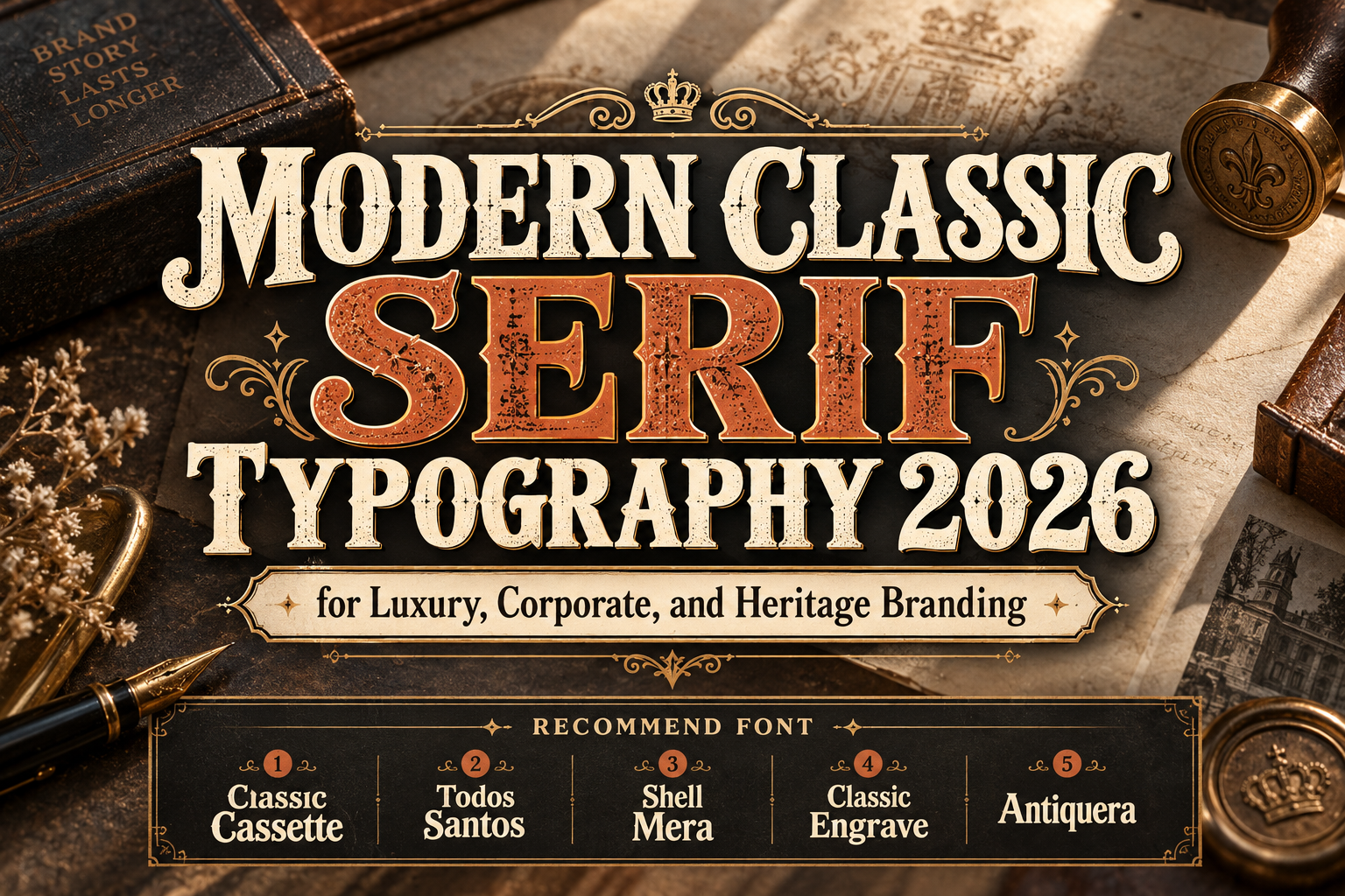
Serif Classic Modernism Fonts for Timeless Branding 2026
Typography trends change quickly, but serif lettering continues to occupy a special place in branding.
Serifs can communicate history, craftsmanship, editorial sophistication, stability, and authority. When those classical characteristics are combined with cleaner layouts and contemporary proportions, the result can feel timeless rather than old-fashioned.
That is the appeal behind Serif classic modernism fonts for timeless branding 2026.
The idea is not limited to strict historical Modernist typography. For contemporary branding, it describes a broader approach where traditional serif or vintage display construction is presented through modern spacing, restrained color, strong hierarchy, and simplified visual systems.
This combination is especially effective for luxury products, fashion, hospitality, publishing, premium food and beverage, cultural institutions, and companies that want to communicate confidence without depending on short-lived trends.
Initial Suggestion: Start With the Brand’s Desired Level of Heritage
Before choosing a classic serif, decide how strongly the brand should reference the past.
A law firm may need restrained authority. A boutique hotel can use more romantic detailing. A whiskey label can support ornamental engraving, while a modern fashion company may need only subtle vintage influence.
Also consider where the font will appear.
Highly decorative serifs are excellent for logos, packaging, titles, and campaign headlines but may become distracting in paragraphs or small interface text. A reliable strategy is to let the characterful serif establish the identity, then pair it with a quieter supporting typeface for practical information.
Jump to Recommended Fonts
1. Classic Cassette Vintage Display Font

Classic Cassette takes nostalgia in a highly distinctive direction through letterforms inspired by cassette imagery, tape reels, and decorative swashes. PutraCetol describes its retro character as especially effective for album covers, posters, and other designs that benefit from an unmistakable vintage reference. PutraCetol Studio
It is less of a conventional corporate serif and more of a classic-modern display accent, making it ideal when timeless branding needs personality rather than restraint.
PROS: Memorable vintage concept, decorative details, strong storytelling potential.
BEST FOR: Music brands, retro campaigns, posters, apparel, entertainment identities.
2. Todos Santos Slab Serif Font

Todos Santos brings classic branding into a more versatile slab-serif structure. Inspired by traditional American diner and small-town signage, it combines clean bold lines with enough elegance for logos, packaging, editorial design, and headline typography. The family includes uppercase and lowercase letters, numerals, punctuation, symbols, and multilingual support. PutraCetol Studio
Its strength lies in balancing vintage familiarity with a sufficiently clean construction for contemporary applications.
PROS: Strong slab serifs, clean structure, multilingual support, recognizable vintage personality.
BEST FOR: Restaurants, heritage brands, packaging, editorial headlines, classic logos.
3. Shell Mera Slab Serif Font
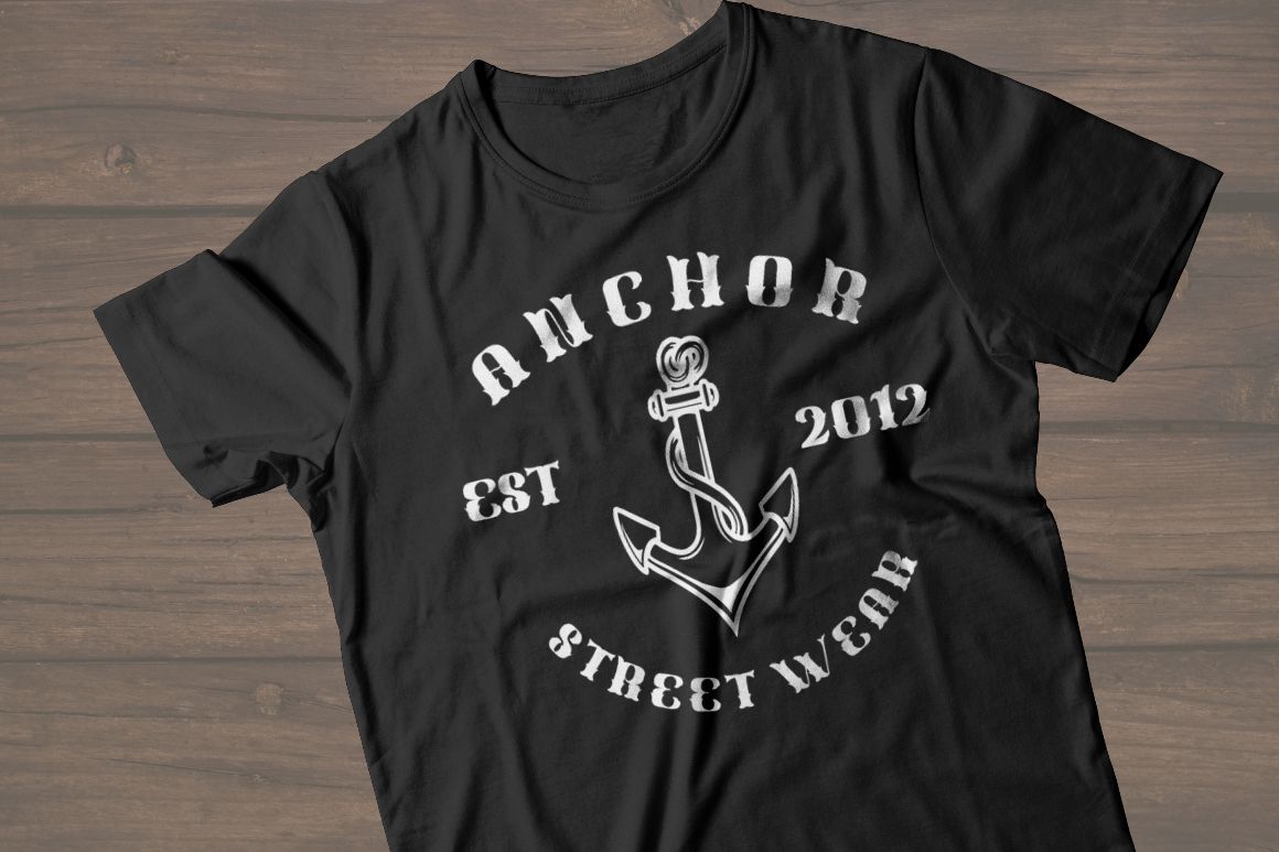
Shell Mera is a more playful interpretation of the slab-serif tradition. Inspired by 1970s cowboy and sheriff posters, it introduces deliberately varied character heights and uneven baselines, giving words a handcrafted rhythm. It also includes OpenType features such as stylistic alternates, contextual alternates, swashes, and ligatures. MyFonts
This makes Shell Mera particularly useful when a brand needs heritage without looking overly formal.
PROS: Numerous alternates, irregular baseline, strong 1970s personality, flexible OpenType options.
BEST FOR: Food brands, lifestyle businesses, event graphics, vintage packaging, distinctive wordmarks.
4. Classic Engrave Classic Font
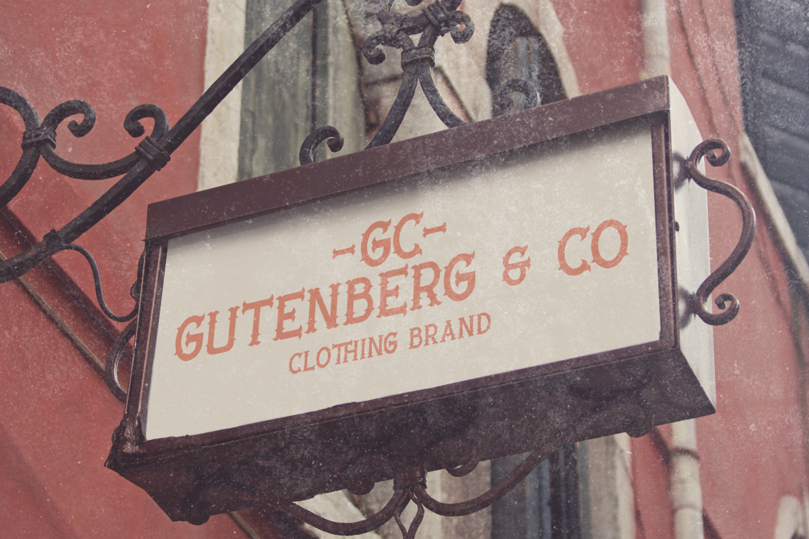
Classic Engrave draws directly from historical engraving, traditional book covers, Western signage, and ornamental serif lettering. Its detailed serifs, handcrafted curves, sharp edges, and bold presence give it an antique quality that can feel premium when surrounded by a restrained modern layout. PutraCetol recommends it for branding, packaging, invitations, book covers, posters, luxury projects, and whiskey-label aesthetics. PutraCetol Studio
It is particularly strong when the goal is to communicate craftsmanship, heritage, and exclusivity.
PROS: Engraved details, historical atmosphere, dramatic serif construction, premium character.
BEST FOR: Luxury packaging, spirits, boutique branding, book covers, heritage identities.
5. Antiquera Classic Vintage Serif Font
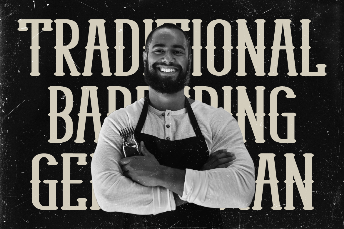
Antiquera offers a cleaner route into vintage branding. Its tall, solid proportions and medium-to-bold visual weight create confident large-scale typography without relying on excessive ornamentation. The typeface is classified as a vintage font by PutraCetol and is positioned as a serif family for branding and display applications. PutraCetol Studio
That balance makes Antiquera particularly useful for designers who want classic character while keeping the overall brand system relatively modern.
PROS: Strong proportions, clear display presence, controlled vintage styling, modern versatility.
BEST FOR: Corporate branding, fashion, editorial titles, packaging, contemporary heritage brands.
Comparison: Which Classic Serif Style Fits Your Brand?
| Font | Main Character | Best Branding Direction |
|---|---|---|
| Classic Cassette | Nostalgic, decorative | Music and creative branding |
| Todos Santos | Clean, classic slab | Heritage and commercial brands |
| Shell Mera | Playful, Western | Lifestyle and food branding |
| Classic Engrave | Ornamental, historical | Luxury and premium heritage |
| Antiquera | Strong, refined | Modern classic branding |
For understated timelessness, Antiquera and Todos Santos are the easiest starting points. Classic Engrave delivers more historical luxury, Shell Mera introduces personality, while Classic Cassette works best when nostalgia itself is central to the identity.
How to Make Classic Serif Branding Feel Modern
The surrounding design system matters as much as the font.
Pair ornate typography with generous whitespace. Restrict the color palette. Avoid unnecessary shadows, frames, textures, and decorative flourishes when the letterforms already contain strong character.
A Classic Engrave logo on a restrained cream-and-black package can feel sophisticated and contemporary. The same lettering surrounded by multiple ornaments, distressed textures, and elaborate borders may immediately shift toward historical reproduction.
Modernism in branding is therefore often created through how the serif is used, not simply through the typeface itself.
Common Mistakes
One common mistake is assuming every serif automatically communicates luxury or authority. Serif categories vary enormously. Slab serifs can feel bold and approachable, engraved styles can suggest heritage, and irregular vintage lettering may communicate creativity rather than corporate stability. Match the typeface’s actual personality to the brand instead of choosing it solely because it has serifs.
Another mistake is using decorative fonts for every layer of communication. A beautiful vintage serif may create an exceptional logo but become difficult to read in product descriptions, website menus, or small labels. Build hierarchy by pairing expressive typography with a simpler supporting family.
Finally, avoid making “timeless” synonymous with “old.” Strong modern branding selectively borrows historical typography while using contemporary photography, spacing, color, and composition. The objective is longevity, not imitation of a specific century.
Conclusion
Serif classic modernism fonts for timeless branding 2026 offer designers a powerful way to combine heritage with contemporary visual clarity.
Classic Cassette brings creative nostalgia, Todos Santos offers versatile slab-serif confidence, Shell Mera introduces handcrafted character, Classic Engrave delivers ornate sophistication, and Antiquera provides a cleaner modern-classic direction.
Explore these fonts at PutraCetol Studio and choose the style that matches the amount of history, elegance, and personality your brand actually needs. With thoughtful hierarchy and restrained art direction, classical serif typography can remain relevant long after temporary design trends disappear.
Explore these fonts and many more at PutraCetol.com to build a business identity that looks professional, trustworthy, and memorable.
Additionally, if you want to explore some free typography options, you can check out Putracetol Studio on Dafont. Happy reading and designing!