
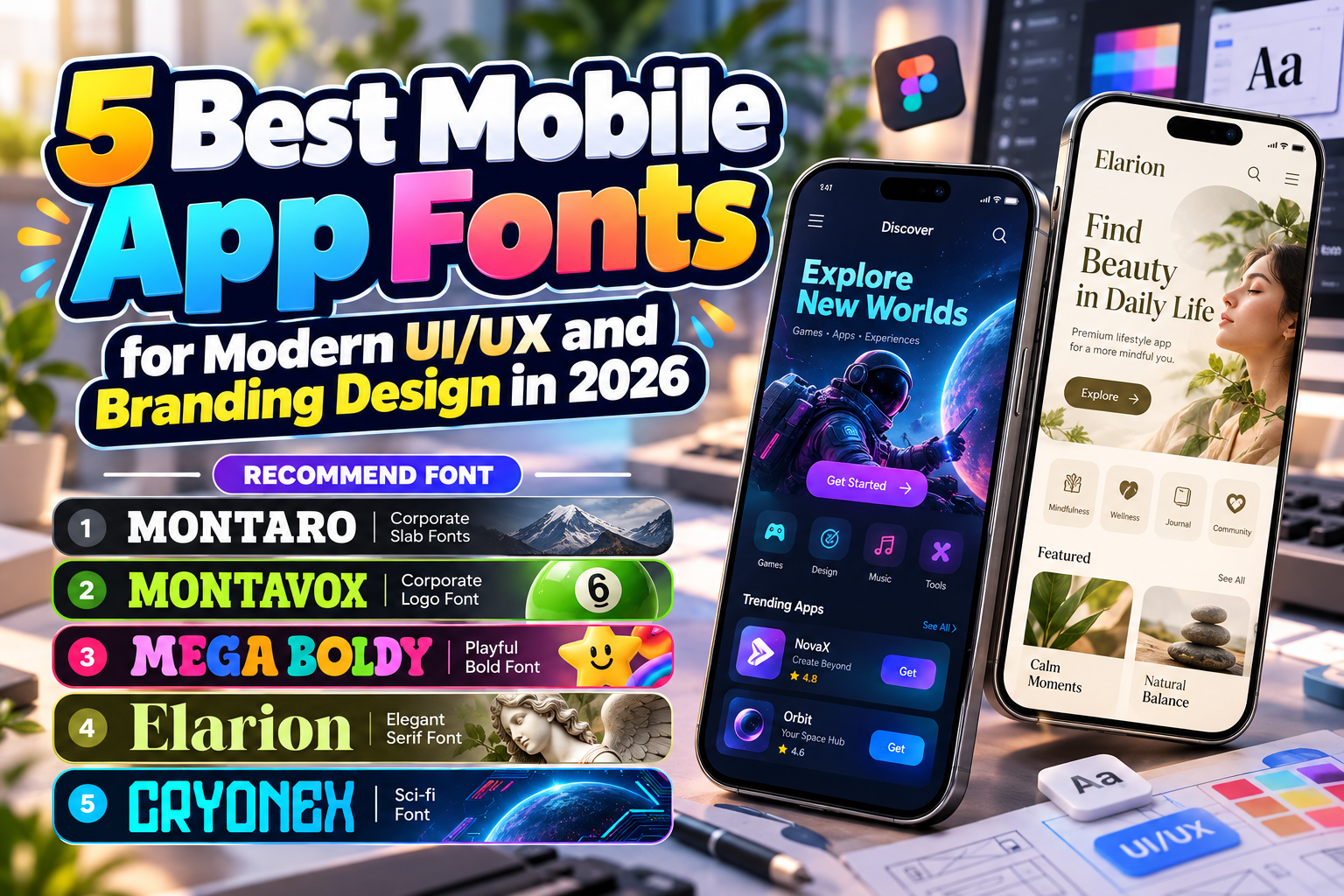
Best Fonts for Mobile Apps 2026: Typography for Better UI and Stronger Branding
Typography in a mobile app has two jobs. It must help users understand the interface quickly, but it also needs to contribute to the product’s identity.
That balance makes selecting the best fonts for mobile apps 2026 more complicated than simply choosing a fashionable typeface. Small screens, accessibility settings, multiple device sizes, localization, and interface density all affect whether a font actually works.
Apple specifically recommends ensuring that custom fonts remain legible across sizes and support accessibility features such as Dynamic Type. It also suggests that branded custom fonts can work effectively for headlines and subheadings while system fonts handle smaller body copy and captions. Apple Developer
For many apps, that hybrid strategy offers the strongest combination of personality and usability.
Initial Suggestion: Give Every Font a Specific UI Role
Do not begin by asking, “What font should my whole app use?”
Instead, define roles such as brand headline, screen title, navigation, button label, body copy, caption, number display, and promotional banner.
An expressive font might work beautifully for an onboarding headline such as “Start Your Journey” but feel uncomfortable across hundreds of settings labels. A restrained system font can handle functional content while a more distinctive typeface creates recognition at important brand moments.
Test every candidate on real screens rather than static specimens. Apple recommends testing layouts across different devices, localizations, orientations, and user-selected text sizes because larger accessibility text can change the entire layout. Apple Developer
Jump to Recommended Fonts
1. Montaro Corporate Slab Font
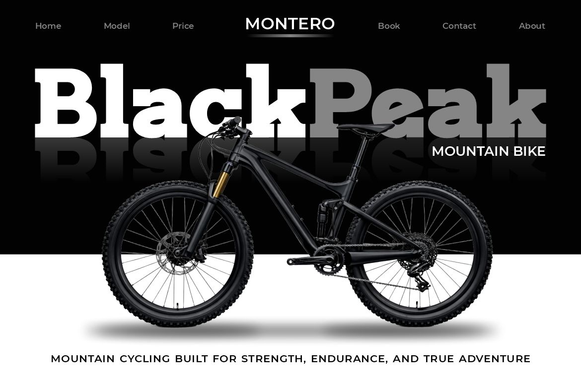
Montaro is a strong display-oriented slab font with a sporty, structured personality. PutraCetol positions it for cycling, sports businesses, corporate identity, and bold branding, making it useful for fitness apps, activity trackers, sports communities, and performance dashboards where the interface needs a confident visual voice. PutraCetol Studio
Use it for onboarding headlines, section titles, achievement screens, or branded statistics rather than dense paragraphs. Pairing it with a neutral UI sans serif can preserve clarity throughout the rest of the interface.
PROS: Strong identity, compact visual presence, sporty corporate character.
BEST FOR: Fitness apps, cycling apps, sports dashboards, activity platforms.
2. Montavox Corporate Logo Font
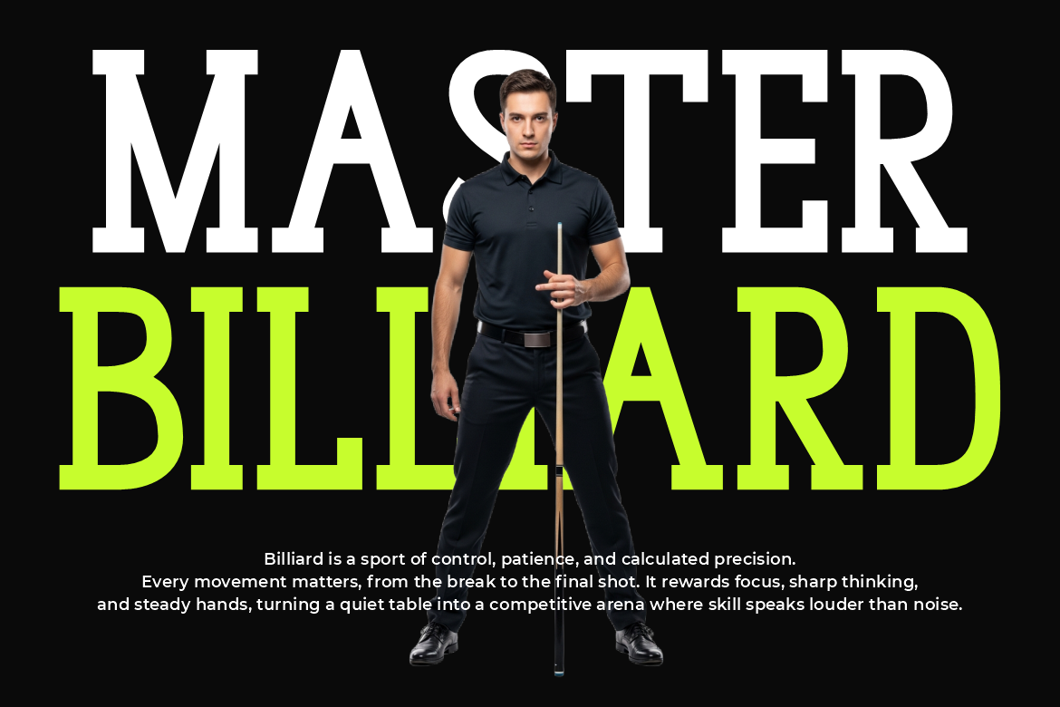
Montavox is a bold slab serif featuring substantial vertical strokes, solid rectangular serifs, and structured geometric proportions. Its authoritative appearance can give financial, enterprise, productivity, or B2B applications a stronger brand layer, particularly on launch screens, account dashboards, premium subscription pages, and major section titles. PutraCetol Studio
Because the forms are intentionally substantial, it is better used selectively than as a default font for small interface text.
PROS: Structured construction, strong hierarchy, professional personality.
BEST FOR: Business apps, productivity software, finance dashboards, B2B products.
3. Mega Boldy Playful Bold Font

Mega Boldy takes mobile typography in a much friendlier direction. Its chunky rounded forms, exaggerated bounce, and playful proportions make it suitable for children’s apps, casual games, learning products, food ordering experiences, and entertainment platforms that need energetic visual personality. The font includes uppercase, lowercase, numerals, punctuation, and multilingual characters. PutraCetol Studio
Try it for onboarding messages, badges, rewards, promotional cards, or major category headings rather than navigation menus filled with small labels.
PROS: Bold visibility, rounded personality, cheerful character, multilingual coverage.
BEST FOR: Kids’ apps, casual games, educational platforms, playful lifestyle products.
4. Elarion Elegant Serif Font
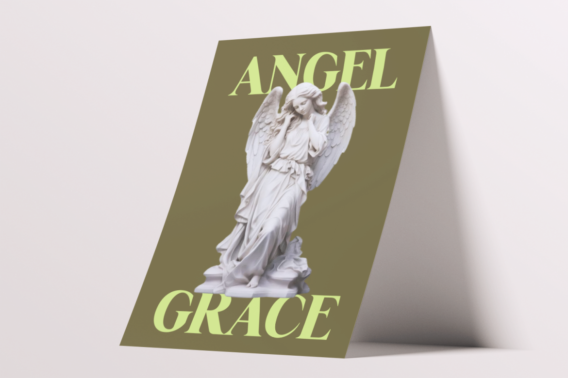
Elarion brings tall letterforms, refined contrast, graceful curves, and polished serif construction. Its calm editorial personality can help fashion, beauty, hospitality, cultural, wellness, or premium lifestyle apps stand apart from the geometric sans serifs commonly used in digital products. PutraCetol Studio
It works particularly well for large screen titles, editorial stories, quotations, product features, and premium onboarding screens. Use a simpler companion font for dense descriptions and very small UI controls.
PROS: Elegant character, balanced proportions, refined brand expression.
BEST FOR: Fashion apps, beauty platforms, luxury services, editorial experiences.
5. Cryonex Sci-Fi Font

Cryonex combines tall condensed proportions, medium-bold strokes, angular terminals, and rounded internal corners. Its compact construction creates a futuristic mechanical character while preserving enough structure for large digital titles, making it useful for gaming, robotics, AI, VR, and technology-focused interfaces. PutraCetol Studio
Its condensed shape can also save horizontal space in model names, leaderboard headings, or futuristic dashboard modules. Reserve it for visual identity and high-priority interface elements rather than continuous reading.
PROS: Condensed structure, futuristic character, space-efficient headlines.
BEST FOR: Gaming apps, AI products, robotics interfaces, VR and tech platforms.
Comparison: Which Mobile App Font Fits Your Product?
| Font | Main Personality | Recommended UI Role |
|---|---|---|
| Montaro | Sporty, structured | Fitness headings and stats |
| Montavox | Corporate, confident | Business dashboards |
| Mega Boldy | Playful, friendly | Kids and casual apps |
| Elarion | Elegant, editorial | Premium lifestyle screens |
| Cryonex | Futuristic, technical | Gaming and technology UI |
These fonts are strongest as brand-facing interface typography. For long reading, captions, form fields, accessibility-heavy interfaces, and dense navigation, pairing them with a highly legible system or UI typeface is usually the safer strategy.
Common Mistakes in Mobile App Typography
One frequent mistake is using an expressive display font everywhere. A distinctive typeface can make an onboarding screen memorable but quickly become tiring when used for settings, chat messages, error text, buttons, and long articles. Create a typography hierarchy instead. Reserve personality-driven fonts for moments where branding matters and use highly readable typography for repetitive functional content.
Another mistake is designing only at one font size. Users may increase system text size significantly for accessibility. Android’s font scaling system, for example, supports nonlinear scaling so larger text remains practical for readability rather than simply enlarging every element by the same percentage. Android Developers Test whether labels wrap correctly, cards expand, and buttons remain usable when typography grows.
Finally, do not forget licensing. Embedding a commercial font inside an iOS, Android, game, or software product is different from using it in a static mockup. PutraCetol’s current EULA states that apps, games, software, and other embedded uses require explicit license coverage, so confirm the appropriate app usage rights before shipping. PutraCetol Studio
Conclusion
The best fonts for mobile apps 2026 combine brand personality with disciplined UI usage. Montaro and Montavox bring strength, Mega Boldy adds playful energy, Elarion creates an elegant premium atmosphere, and DCryonex supports futuristic digital experiences.
The key is not forcing one font to perform every task. Use distinctive typography where users should feel the brand, then protect readability with a practical supporting typeface for functional interface content.
Explore these fonts at PutraCetol Studio and test them directly within your app layouts, screen sizes, accessibility settings, and real product content before finalizing your mobile typography system.
Explore these fonts and many more at PutraCetol.com to build a business identity that looks professional, trustworthy, and memorable.
Additionally, if you want to explore some free typography options, you can check out Putracetol Studio on Dafont. Happy reading and designing!